


English subtitles available

Pg. 3
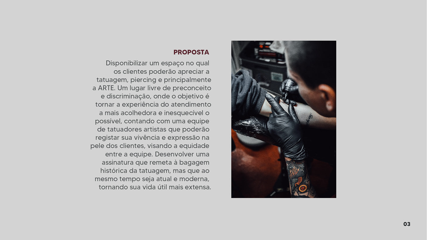
EN: Provide a space in which customers will be able to appreciate tattoo, piercing and, mainly, ART. A place free from discrimination, where the goal is to make customer experience the most welcoming and unforgettable as possible, with a tattoo artist crew who will be able to register their soul and expression in customers' skin, establishing equity among the team. The goal was to develop a signature with historical references of the tattoo world, but at the same time be something modern and minimalist, making its service life more extensive.

Pg. 4
EN: It was decided to use the fonts "Caslon CP Wash" and "Mermaid Swash", who would bring a retro look, but at the same time something modern, features that coincide with the proposal of the company. The types were merged into one single name, and then there was a process of alteration and distortion of the letters so that they would became more harmonious with each other, causing more unity between them.

Pg. 5
EN: Process of adding graphic elements to the logo. First, I tried to insert an ink drop on the "O". Then, I tried to create a visual effect to represent a traditional tattoo machine between letters "I" and "N". At the end, the chosen logo ended up being the one in the middle, with the two ink drops.

(safety margin)

Color Palette and Fonts for text use.

Testing the color palette on the logo.

Minimum size usable (1,5cm) and another forms of using the logo.


Thank you :)
Project developed for 2th period class at Design graduation


