

Remake #2
Brief: Remake one of your pieces 3 times with 3 different obstructions.
Obstruction #2: Words, commercial.
Project brief: create a series of 4 abstract landscape 'posters' that create a sense of rhythm.


This is my original piece. I chose to work with these posters because they felt original and nice despite being simple. I think they are an interesting outcome based on the project brief.
What do I make? I think about whether to break the original brief and work on something completely different or to stick with the same format and design 4 posters again. The obstruction of making something commercial definitely begs for making something different as the original posters are quite artistic. First though, I should have a look at the other obstruction: Words.


I think to myself - I do want to stick to the brief and stay true to the original challenge, or else the opportunities are endless. When looking at my mindmaps it becomes clear, that it is obvious to work with lyrics. Maybe I could make some nice posters with famous song texts?


But I’m not satisfied with myself yet. I force myself back into the process. I have a look at Pinterest and see some cool logo that give me a sense of rhythm - maybe I should design 4 clean logos? I start gathering some pins on Pinterest with rhythm logos.

It really frustrates me that I can’t come up with a clear and good idea of what to make, but I think I just have to sleep and come back again tomorrow.
I start the next day by challenging what I already thought about and try to come up with other interesting ideas. I think about taking some special words and illustrating them in a way that show the meaning of the word. That would surely make some nice posters - but it doesn’t have so much to do with rhythm.


I think it’s quite difficult to use all my obstructions and the brief. Make 4 abstract posters giving a sense of rhythm. Obstruction: Words. And it has to be commercial. I feel the time pressure because we have 1 day less this week. I have to make something today or else it will feel very rushed.
After a good talk with my feedback group Jakob gives me the idea of looking at the sender because that could give me some new ideas.

After a bit of research I find out that there’s something called ‘The Big Four’ in the world of record labels. EMI, Sony Music, Universal Music Group og Warner Music Group. But in 2012 the big four became the big three when Universal bought EMI. 4 was the perfect number, but oh well.
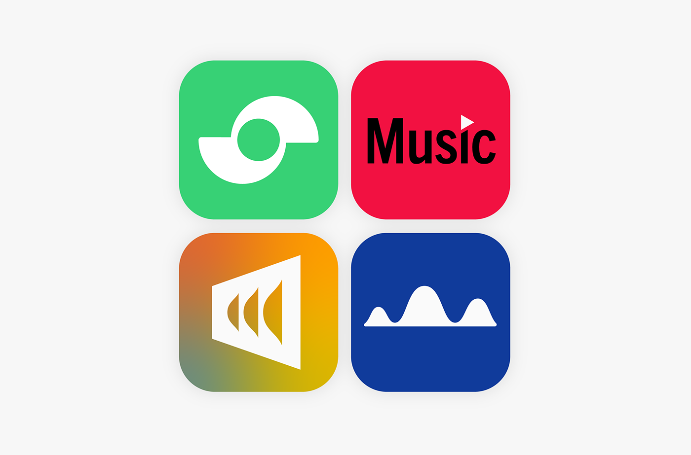
I think it would be an interesting challenge to make some logo redesigns of some the biggest music streaming services. I choose: Spotify, YouTube Music, Deezer and SoundCloud. Easier said than done, but I just feel the urge to get startet with at least something. Making a logo in a day is challenging but I have to make 4 now. Let’s go!


It’s very hard to redesign such big brands, but I’m not so afraid of not doing well, I just want to make these logo because I think it’s satisfying to make logos.
Spotify has a great logo already. Some things come to mind though - I wanna tighten the typography and make it a bit more neat. I like the circular icon and I think I wanna do something similar.
I feel very motivated and come up with a lot of possible design sketches and directions. I always start in black & white when doing logo designs - that way I can focus on the shape.
If I had more time I would just go on like this and try a ton of ideas, but I’m quite limited, to I stop with this design, which I think looks a bit like and old volume dial.
Now let’s have a look at the typography. I found this great font called Objektiv Mk1, which I think suits the design well. It is very minimalistic, but not naive and weird looking. I modify it a bit and end up with this.
I like the green color, but maybe a bit less intense? I want to make the color a little less childish but still very fresh.
For the logo layout I think the current version is very good, so I just make the same side by side version - and it’s done!


I think the YouTube Music logo could be a lot better than it is. It looks a lot like the YouTube logo right now.
I want to make something in the simple style of YouTube, but without just being the same.
For this one I didn’t make a lot of sketches. I just couldn’t come up with much that fit the very simple logo I was going for. That was a bit annoying, but in the end I think the logo idea I stuck with was pretty neat.
For the typography I use the font Trade Gothic, which I think fits very well. It’s a bit less modern than the one YouTube uses, but somehow the greater character of Trade Gothic looks fitting. I adjusted the font a tiny bit and replaced the i’s dot with a tiny play button in red.
The red color is 255, 0, 0 in YouTube’s logo right now, but I want something a bit more welcoming and less intense.
This logo doesn’t need layouting, it already works as it should.


Deezer’s logo uses quite a contemporary font at the moment and a nice gradient in the mark. As Deezer focuses on fine musical quality I think it would be nice to make something a bit more luxurious.
I had a hard time coming up with ideas for this logo for some reason. I ended with something representing sound waves of some kind - I’m not so satisfied but I’m just out of time.
For the font I choose to use the plain old Helvetica - or in this instance Adobe’s Neue Haas Grotesk remake in its 75 Black weight. I balanced the ‘z’ and opened the ‘r’ a bit to increase balance and legibility.
Deezer already uses a nice freeform gradient, so I thought I’d do the same just update the colors, for a retro-modern look.
The mark works nicely with the logotype, but not as well as an icon.


SoundCloud’s logo is my favourite of the bunch. It’s just so obvious what brand it is. Nice. This one will be difficult to remake.
I contemplated making a type-only logo, but it just didn’t work out very nice. I end up with something that also resembles a cloud and some sound but in a new way. The logo is nice, but very wide - it won’t work so well as a standalone icon, but I still like it so I’ll stick with it.
For the logo as a whole, I wanted something a bit more welcoming and round, so the font I choose is a great one: Frank New Extrabold. Based off the geometry of Franklin Gothic it pays homage to an old great, but with updated letterforms. I think the uppercase is particularly nice and balanced. I leave it practically untouched for the final logo.
For the color I went with something completely different - a dark blue, which I think fits well with the cloud and looks more professional.
Luckily the mark looks super nice on top of the logotype. Done!


Thank you for watching :)


