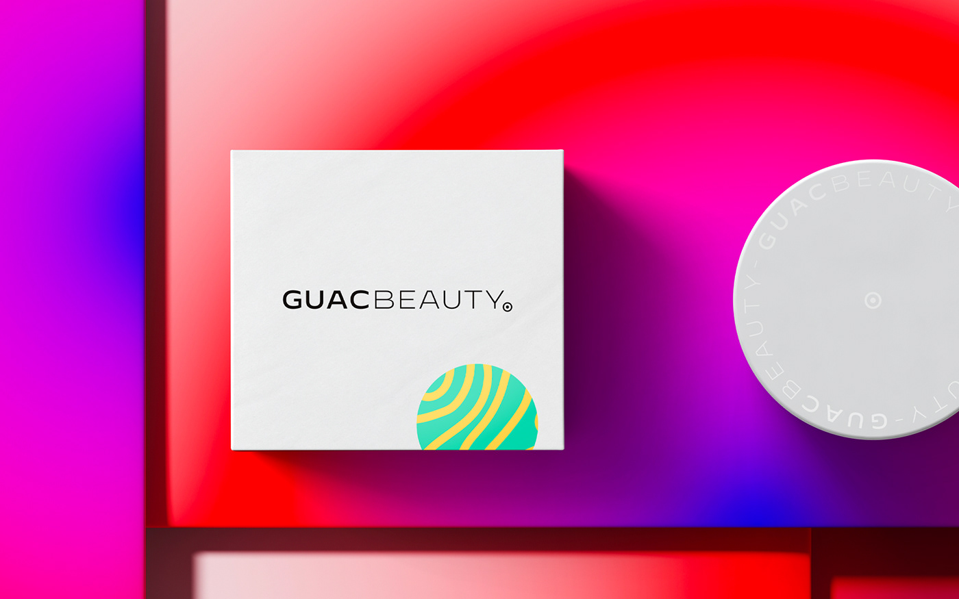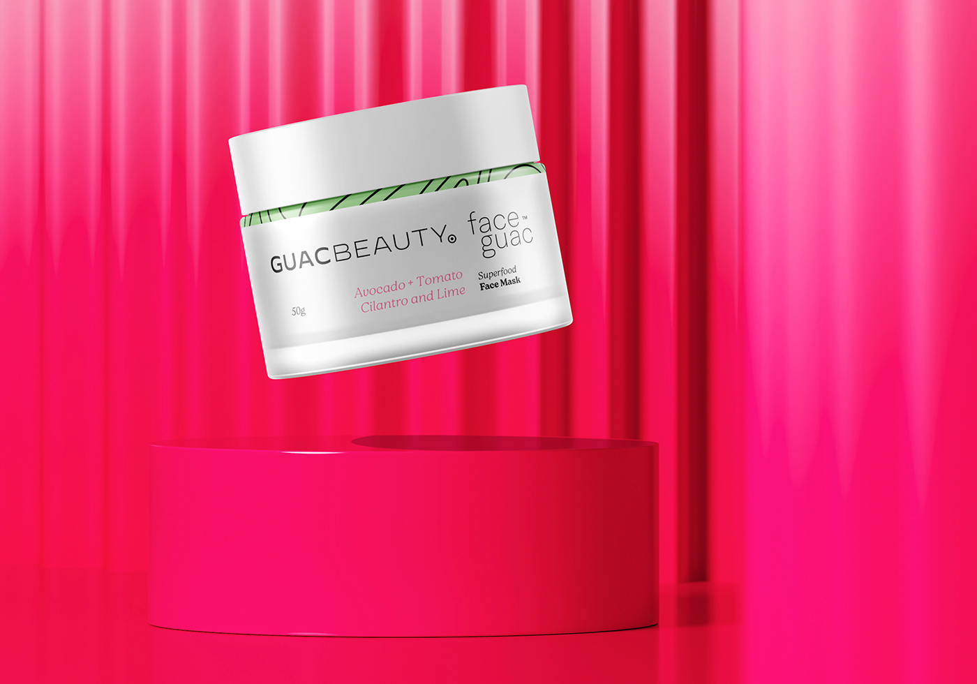

GuacBeauty - Faceguac™
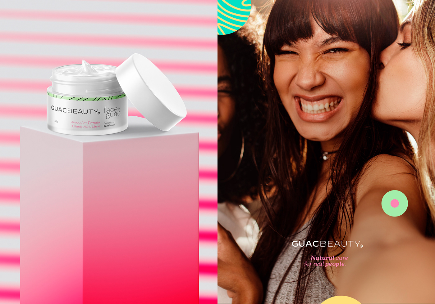
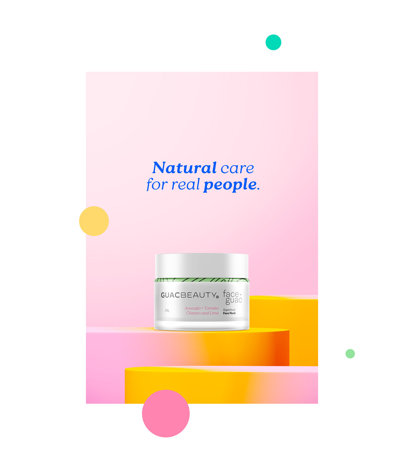
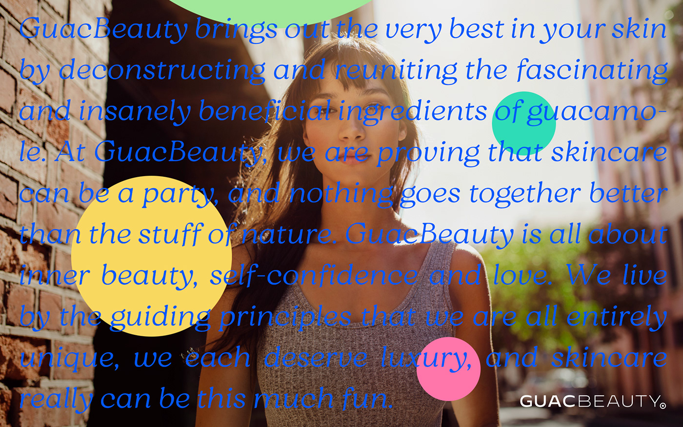
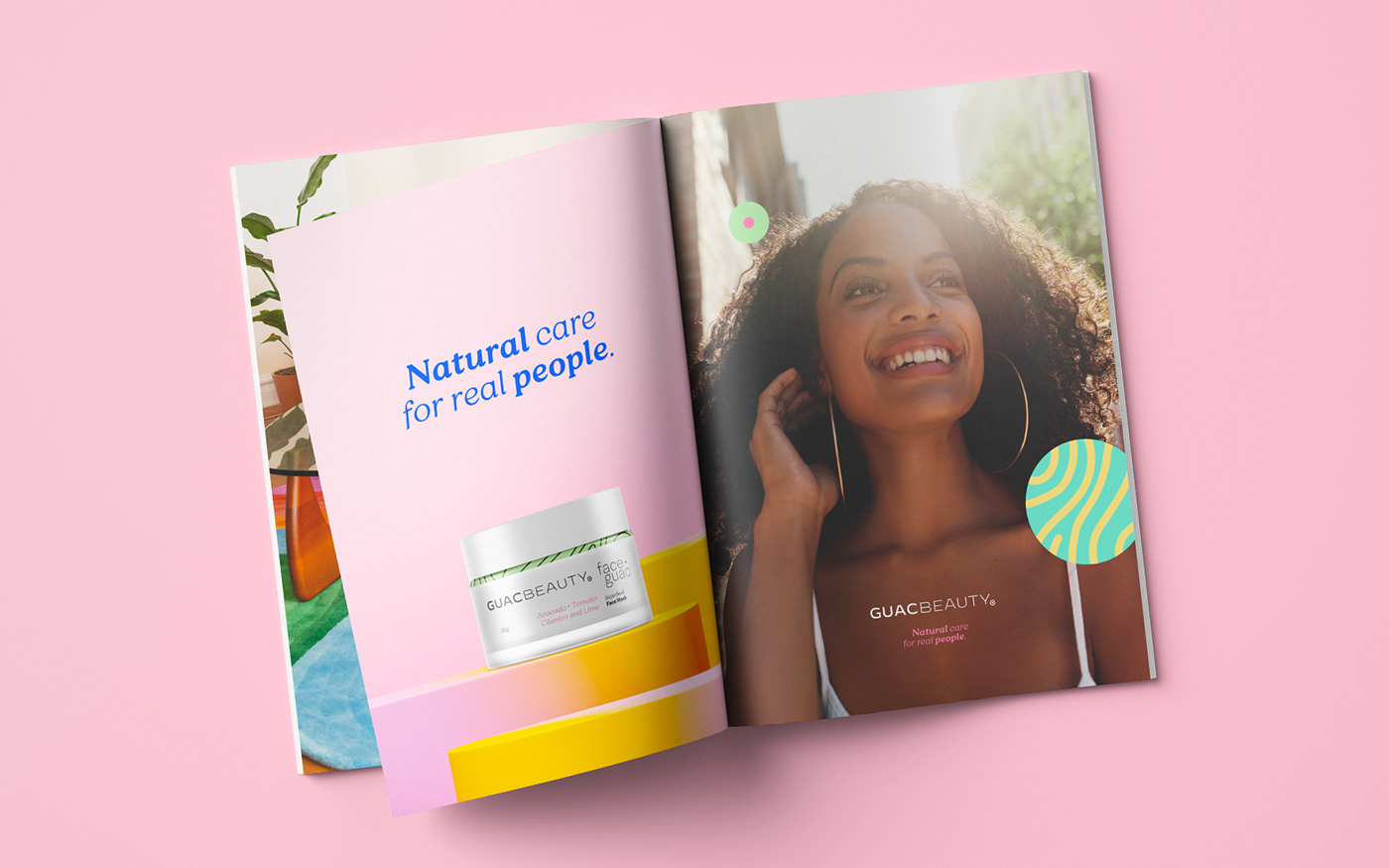
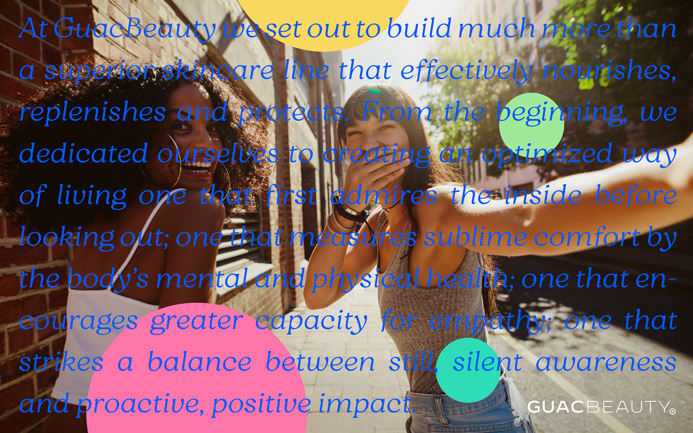
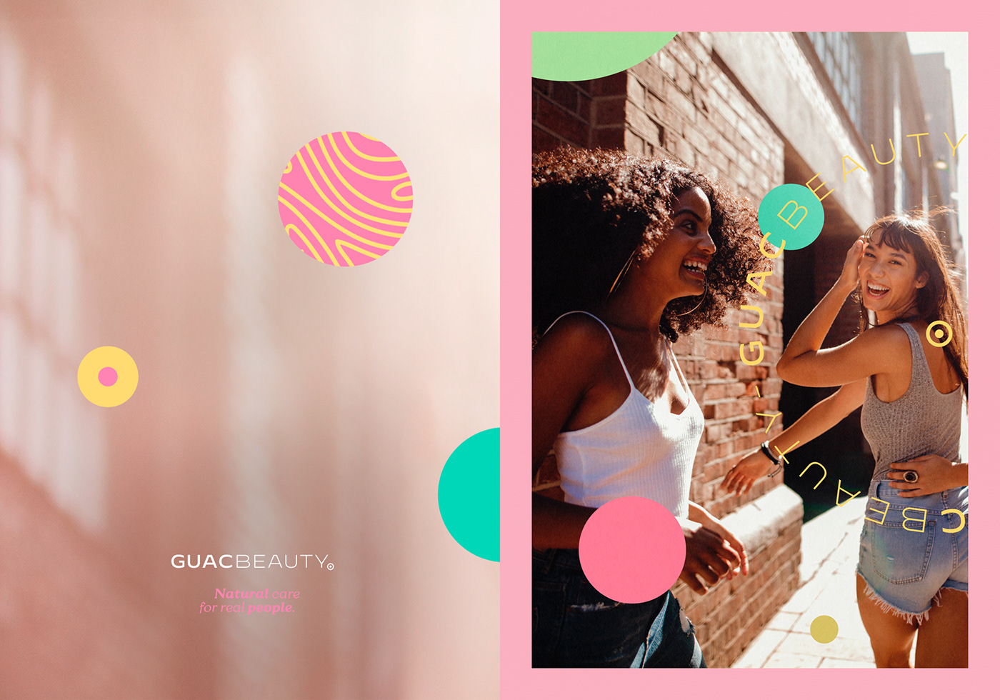
The GuacBeauty brand is made with organic assets and super fruits, but its objective was not to be seen as a natural cliché but as a young, happy brand that owns a proprietary graphic universe.
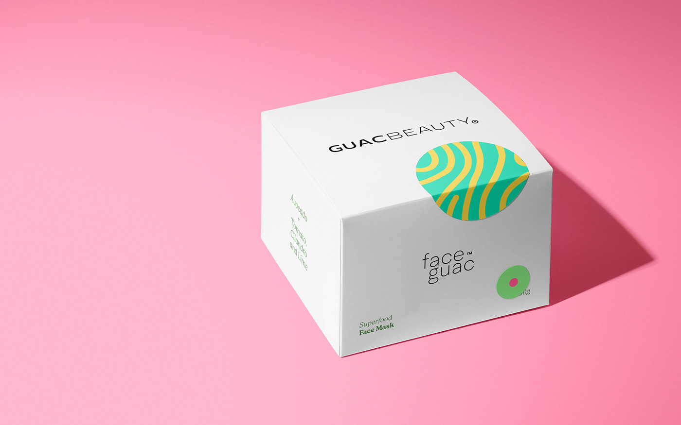
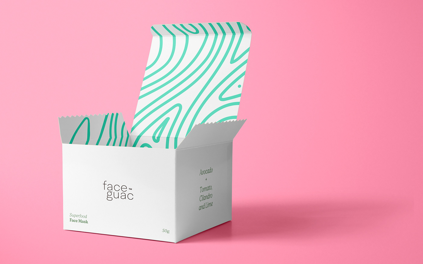
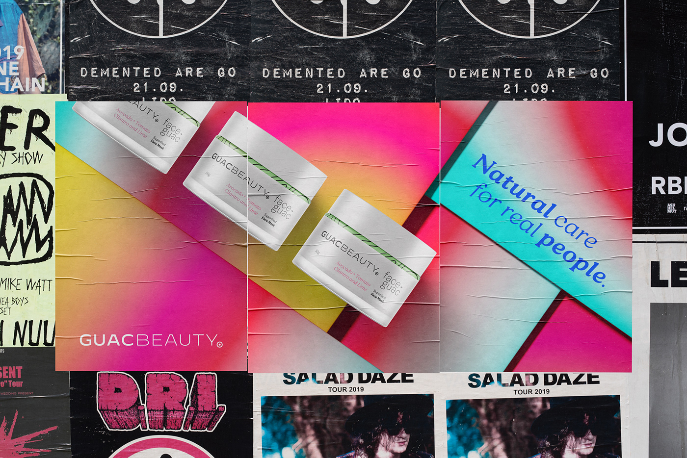
For GuacBeauty, the logo, brand identity, 1st product label (FaceGuac) and packaging were created. To do this, initially it was necessary to understand all the customer's needs and their perspective of future launches. They will have a great line of natural skin and body care products.
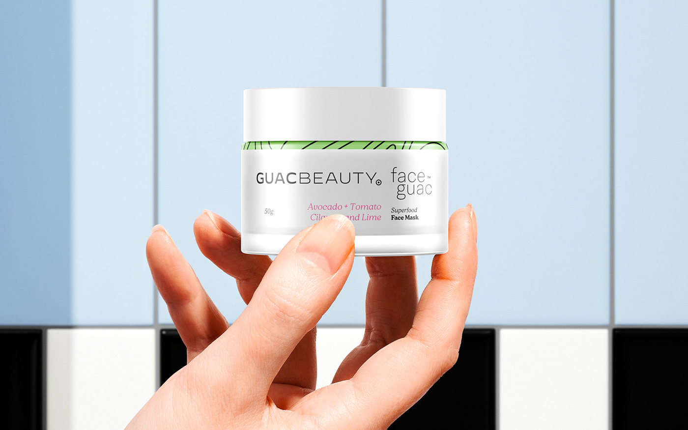
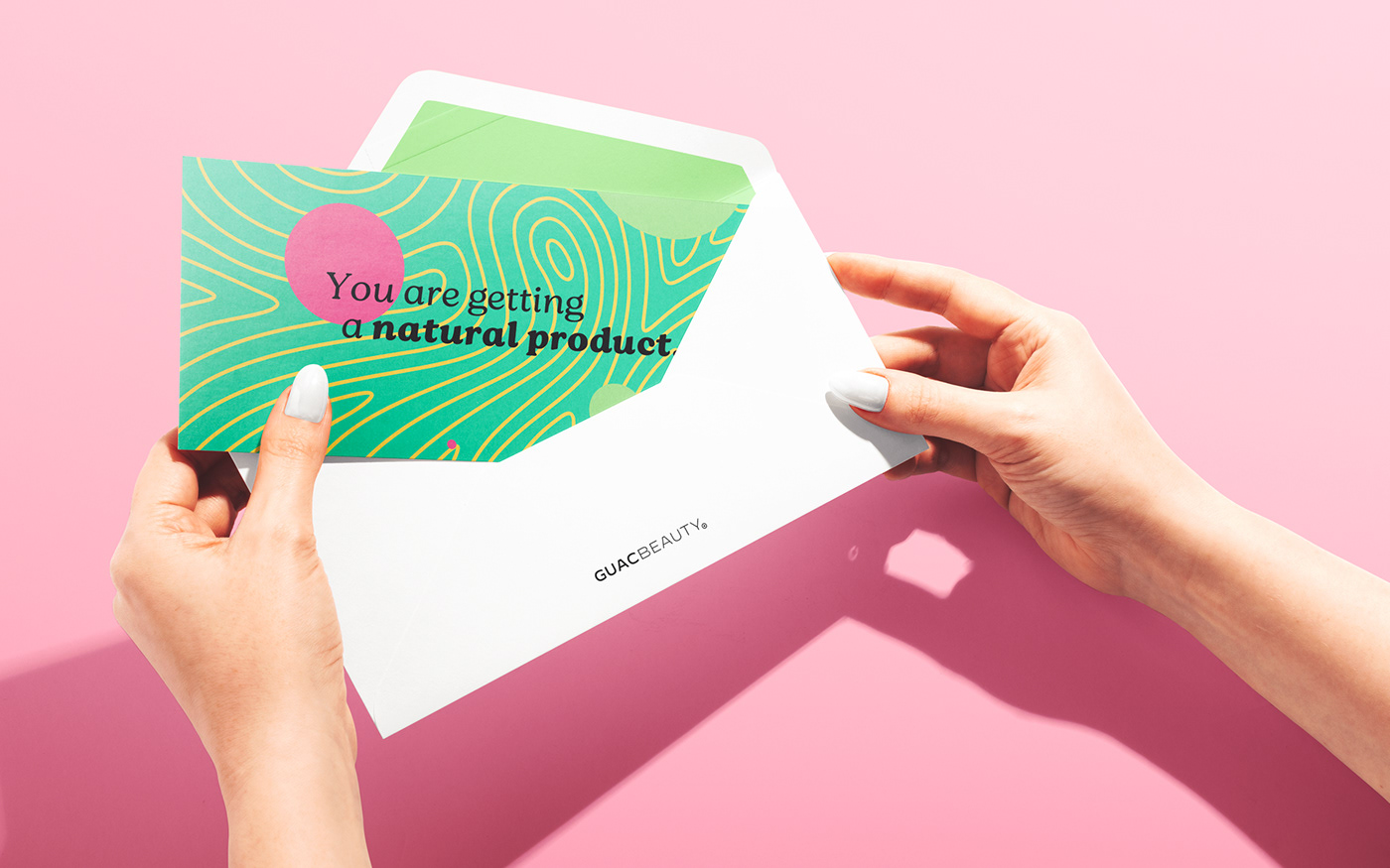
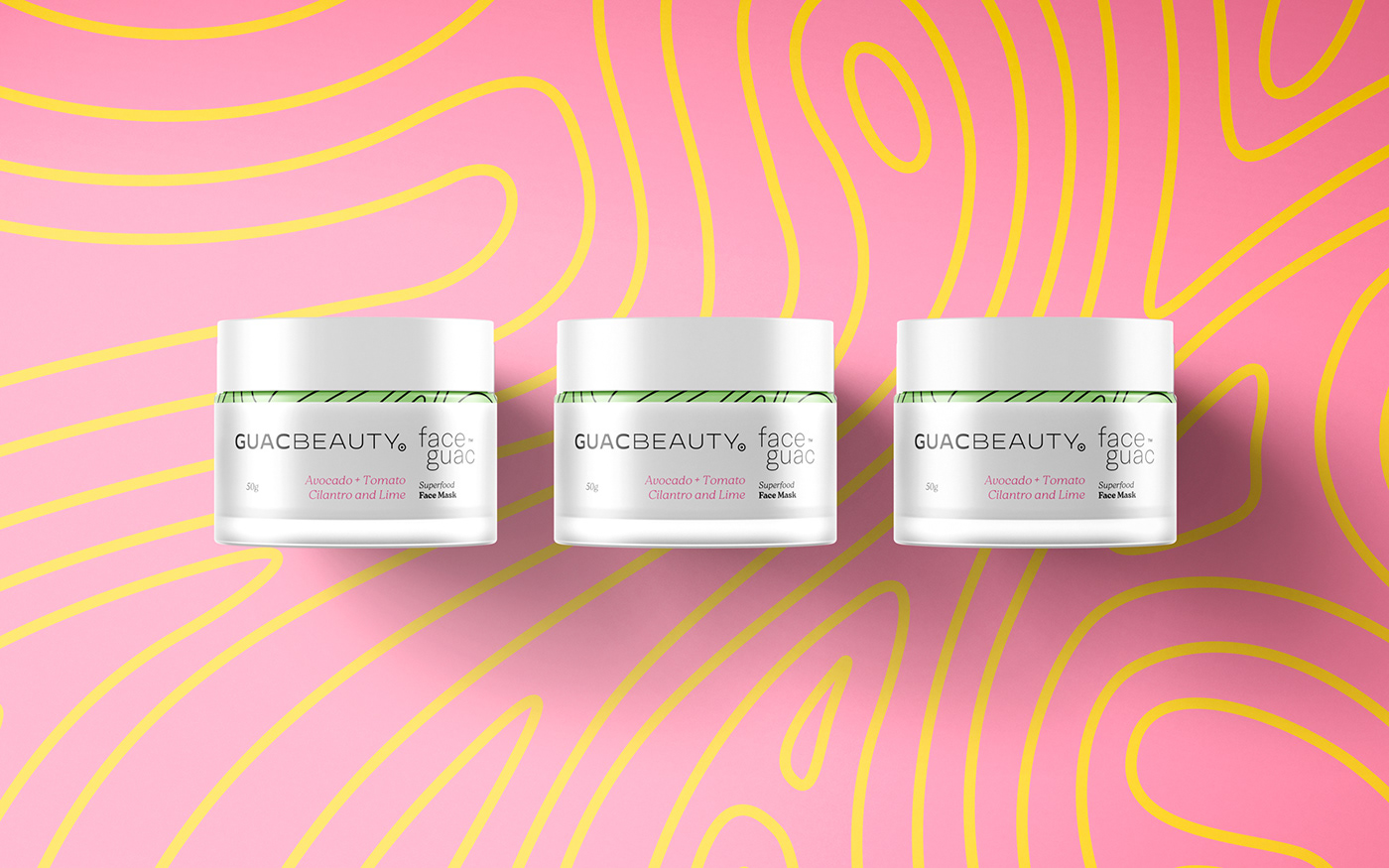
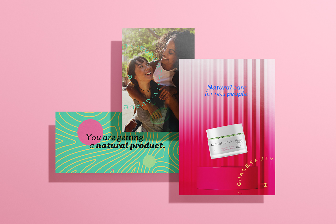
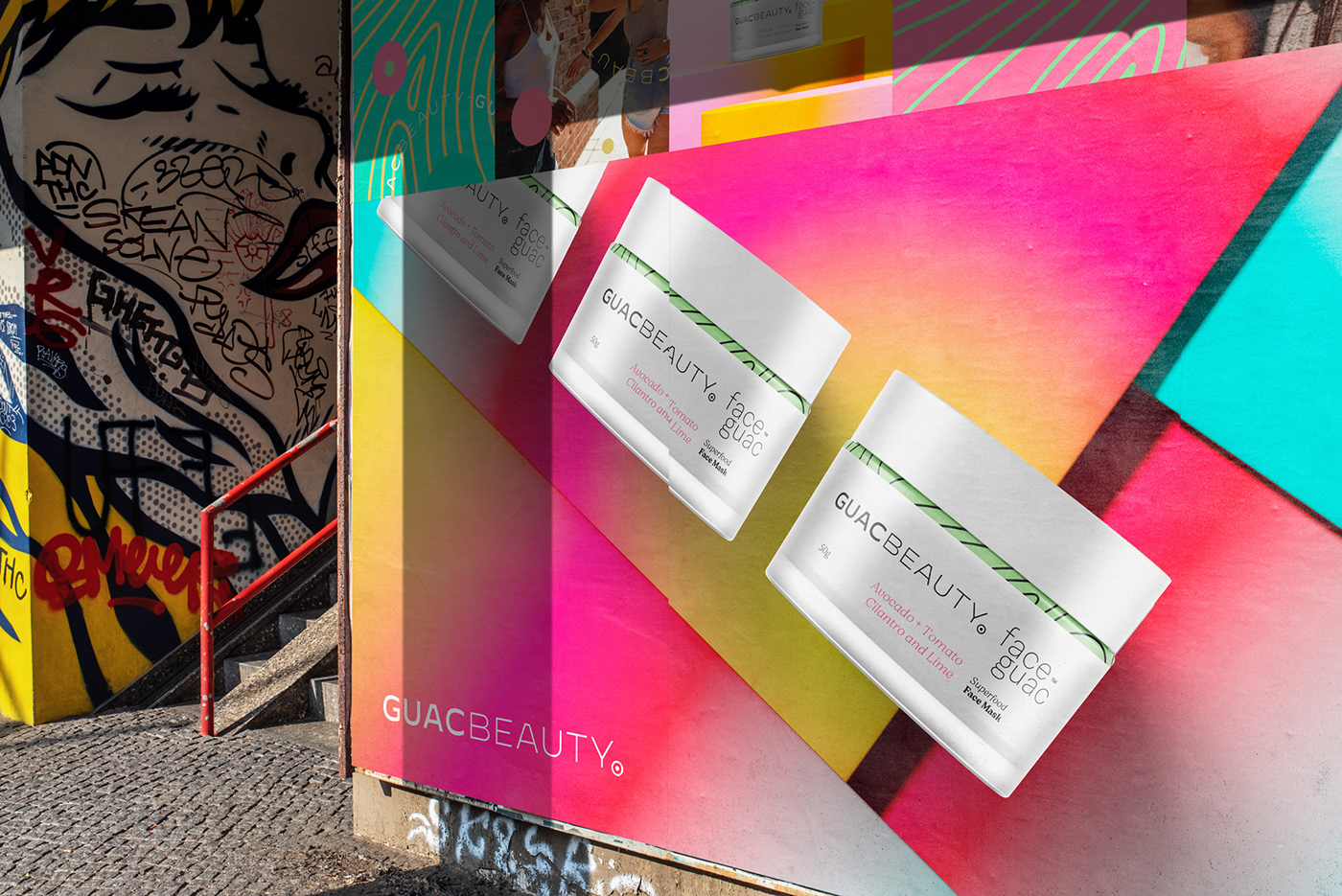
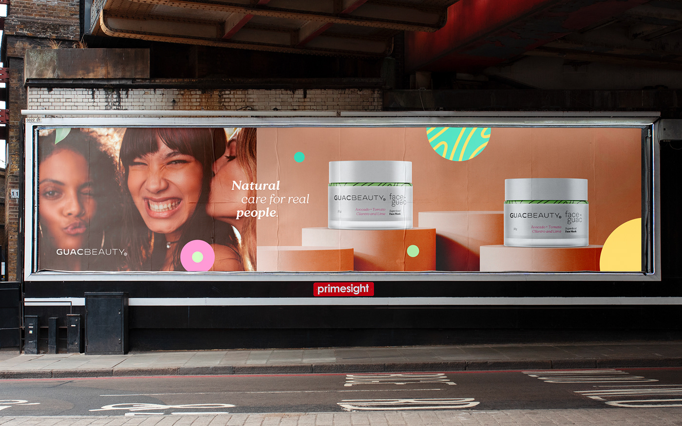
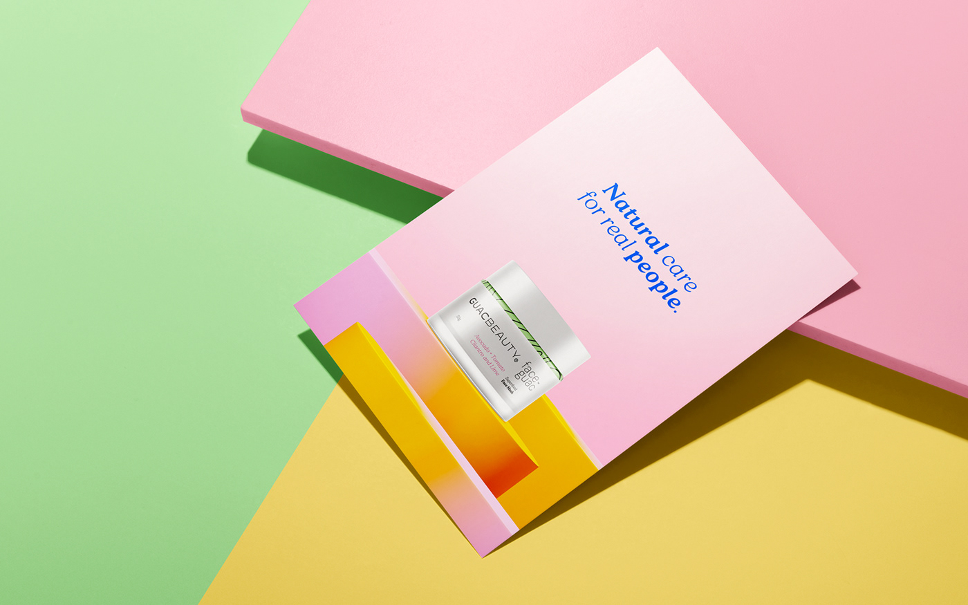
The packages were designed to have the minimum of information, just as the formulation of the products has only the essential and natural. But inside it is full of life and where the natural becomes effective.
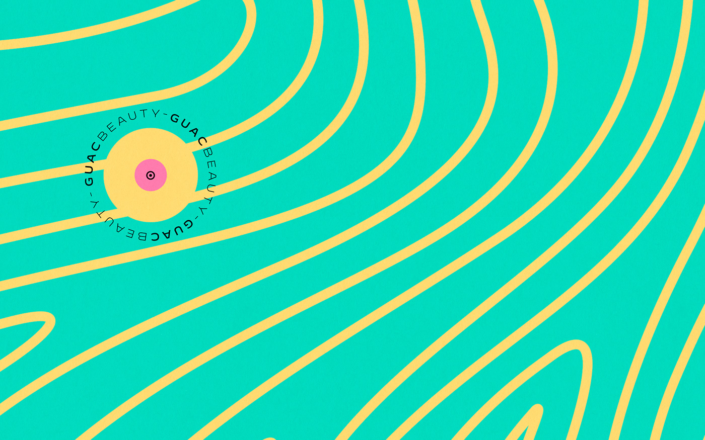
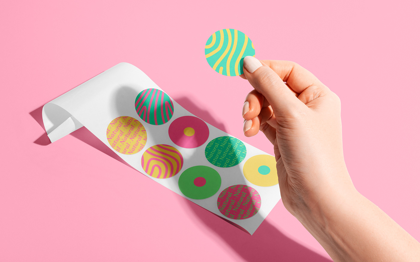
The use of stickers was planned to add the sensation of handmade and apply freshness and joy to the packaging, in the shape of the avocado core, the main asset of the brand. That's why so many beautiful and colorful balls.


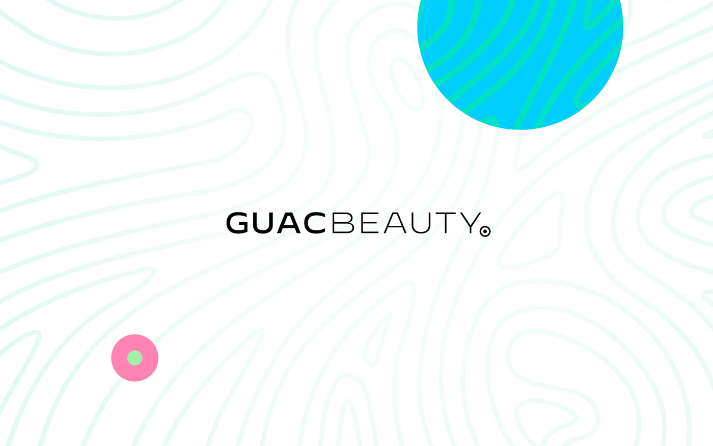
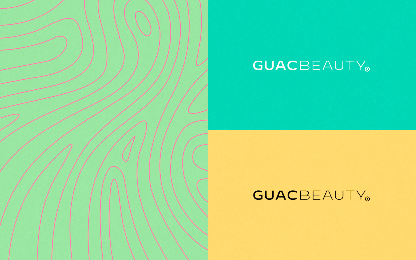
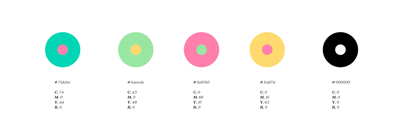
The main idea of the brand identity is the organicity of the natural environment, its freshness and how everything relates in a simple way. For this purpose, an illustration was created that represents this ecosystem in a fluid way, inspired by the layers of skin in a conceptual way. The contrasting logo was built with a hard typography, because although the brand is natural, it uses technology and precision for its elaboration. Along with all this we have a powerful, lively and cheerful color palette, combined with the illustration, generating countless graphic possibilities.