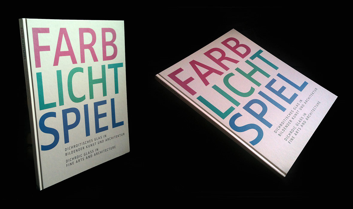
The Cover of this book was printed on special stock which, dependent on the angle light falls on it, changes it’s color and has a similar iridescent effect like nacre. The assumingly mono-colored typography has also slight changes in color tones to manifest the theme of the book which is about dichroic glass in art and architecture and its effects.
A special challenge was the very different quality of images delivered and amount of projects to choose from, and bringing this to a homogenous design.
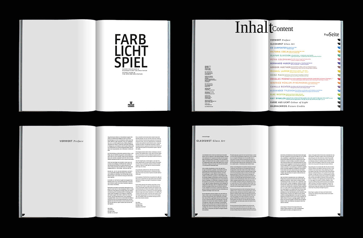
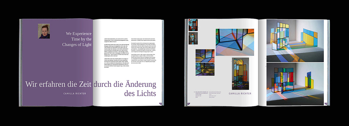
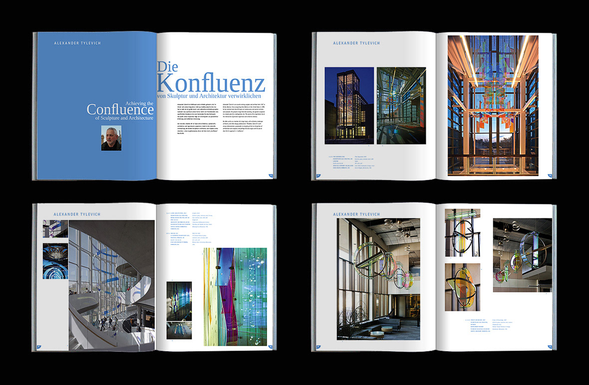
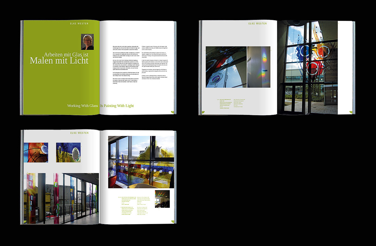
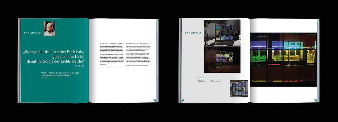
The whole book is bi-lingual, so on every page both languages (English and German) had to be included. Only the title was not translated because of a game of words not possible in English.