


Cadenza Sounds Record Label, Concept Brand Promo Video by Emershae Passmore. This semester I brought my Cadenza Sounds Record Label concept back to life and expanded on it by creating a promotional video for the brand.
PROMO VID FINAL DESIGN
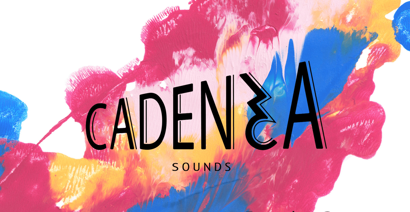
Cadenza Sounds is a Record Label, based in Melbourne, targeted towards young adults ages 17-25. A cadenza is an extended solo in a concerto and so the record label aims to support individuals in the music industry and provide them with opportunities for their solo moment. This promotional video aims to encapsulate and represent this demographic through bright colours, bold text and representation of young individuals within the video.
RESEARCH
VISUAL RESEARCH

This moodboard shows the text, colours, vibe, pace and energy to be encapsulated in and inspiring my video. I particularly love the scratchy writing of 'LET GO' and the bold, clean cut 'REAL LOVE' text.


I came across this orange wall (image 1) while on holidays with family. I love the texture this physical form of colour has and wanted to use it in my video to create added depth rather than just digital colour. I discovered image 2 while waiting for the bus after I had challenged myself to go from the tutorial class at Kelvin Grove back to Gardens Point without looking at my phone, aiming to notice interesting things I otherwise may not. Though slightly muted, it was very interesting to see a building using Cadenza's brand colours (pink, orange and blue).


These pieces of design encouraged me to not be afraid to let elements overlap. https://www.instagram.com/p/B_1HbMBHc5i/ https://www.instagram.com/p/CEDRsDhnmkj/
MOTION RESEARCH
https://www.youtube.com/watch?v=s10kvu0_Cjs
00:35s - 00:42s shows a beautiful use of colour and slow motion footage which I hope to use in my video. It also made me think about the importance of wardrobe and what I want the people in video to be wearing.


I was inspired by this videos use of big block text, bright colours and video and how these elements worked together, transitioned and moved seamlessly together. Despite being about a very topic/product and different atmosphere, this video definitely had an influence on the direction of my own project. https://www.instagram.com/p/CMgsBxXLCi4/


I love the effect of the split panels moving in different directions and revealing a video underneath. https://www.instagram.com/p/B_03HinHqQM/


I am also a dancer and so to really understand the music used in my video, I danced to it. This gave me key insights into the important beats that needed to be hit and a much deeper understanding of the timing and what sorts of movements suit the music. I then considered how my physical movements could be represented digitally. For example, images 1 - 3 show my arms extending and then retracting again which was portrayed by text sliding onto the screen and then back off at certain points in the music (00:01 - 00:04). Image 4 was one of the major beats and I did a handstand which quickly snapped into the split handstand, pictured, and was followed by a fluid roll to my stomach. This is represented in my video by quick changes of colour followed by video footage (00:18 - 00:22).
TECHNICAL RESEARCH
https://www.youtube.com/watch?v=xq7Kh8QbQ0I
Pace and energy is such an important part of my video and being able to speed uptake footage to align was very important.
https://www.youtube.com/watch?v=dE6ZdVZTQss
This video helped me fade the music in and out at the start and end of my project to create a more seamless viewing and listening experience.
PROCESS
Mind Map:
I drew this mind map directly after deciding on my concept and is an exploration of the environment around the environment of the concept. It is great to look back after completing the project and to see that the basis of my final outcome is consistent with my original vision especially in regards to 'pace,' 'streets, bricks, walls, paths' and the key words.

Concept Map:
This concept map makes progress on the mind map and explores concepts more directly related to my promotional video. It especially explores the end user in greater depth and how to best appeal to them.

Thumbnails:
These thumbnail sketches portray my exploration and ideation of initial concepts. This is also my brainstorming of possible transitions, some of which were used in the final video.

Story Boards:
20 boards representing approximately 30 seconds.


Film Footage:
Footage used in video, filmed by me. Locations: Mudjimba, Sunshine Coast and Westfeild Carindale. These locations allowed for great use of the theme colours (the orange wall and blue sky) and portray an industrial, built up location to represent Melbourne City. The clothing items worn in the videos were carefully selected to portray the brand (a pink jacket and an orange and blue t-shirt). The actors were also filmed engaging with musical activities (sing and playing the guitar) to ensure the target market and end user is clear. Using a young girl (17) and an older boy (24) ensures a wide range of the target market will feel identified in the video. This idea supports the text which will also describe the target audience.


These key frames are a development of my story boards and portray still moments that will be depicted in my video. This stage of key framing ensured greater conceptualisation of ideas and allowed me to to iron out some transitions and make sure my ideas were firm before putting them into After Effects.
Stylistic Features:
I enjoyed using the Lemon Milk font due to its bold, consistent, clean appearance and enjoyed the contrast Edo SZ is to this, bringing a more human, relatable feeling to the work.

Working in After Effects:
These images show some of the most difficult timing and transitions I worked with. Image 1 and 2 take place between 00:12 and 00:24. These sections follow a very upbeat energetic part of the video but struggled to maintain that energy as the obvious beats of the music seemed to slow down a bit. I overcame this by focusing on more subtle nuances in the music and trying to bring them to the surface. I did this by making the text flash and inserting more flashes of colour. I also added small snippets of video in between to create more motion and movement thus increasing the feeling and perception of pace.


Music:
https://www.youtube.com/watch?v=uzwUNS0IjC8&list=PLRBp0Fe2GpgnIh0AiYKh7o7HnYAej-5ph&index=9
The music used in my video. I chose this music as it is upbeat, fast faced, energetic and engaging, therefore representing the brand. The strong beast also give me lots to work with in terms of effective timing.
Prior commencing DVB301 I had never touched Adobe After Effects and was skeptical of my ability to bring my visions and planning to life, however this project quickly became something of a passion. I then chose to push myself and undertake a fast paced project which required a keen sense of timing and many different, alternating elements working in synchrony. The design elements of colour, shape and contrast have come together to create a dynamic, energetic composition and I feel it achieves the goal of successfully appealing to its target market. Choosing a brand that I had made in a previous class and being able to expand upon it and see it grow in this way has been so rewarding and brings this project quite close to my heart. I very much enjoyed the research process of this project, especially the motion research. I had not previously engaged in a large amount of this research but now understand the value of it for any project, whether it be motion or not.


