
Mecpock - Soluções automotivas | 2020
EN | Mecpock is a service and business intermediation company in the automotive sector for individuals or companies. It offers, through a digital platform, solutions for: requesting automotive services, automotive parts and products, in addition to providing solutions for making payments, serving in a specialized way and according to the needs of each client. The name "Mecpock" is inspired by the combination of two words that means pocket mechanics in Portuguese.
PT-BR | Mecpock é uma empresa de intermediações de serviços e negócios do setor automotivo para pessoas físicas ou jurídicas. Ela oferece através de uma plataforma digital soluções para: solicitação de serviços automotivos, peças e produtos automotivos, além de disponibilizar soluções para efetuação de pagamentos, atendendo de forma especializada e de acordo com as necessidades de cada cliente. Seu nome é inspirado na junção de duas palavras que traduzidas à lingua portuguesa significam mecânica de bolso.
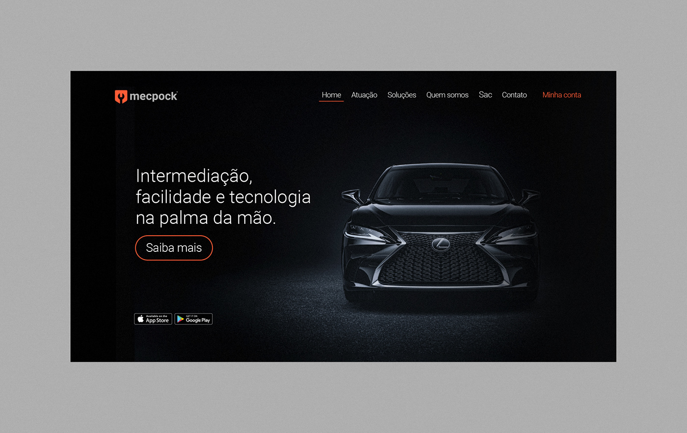
EN | Purpose of the brand: Mecpock operates throughout the country seeking to simplify the lives of drivers and mechanics who need quality parts or repairs in their daily lives, offering a safe and complete service through an application on the smartphone that is always at hand. Through this digital platform, people can request and pay without difficulties, combining fast work and the quality that everyone deserves.

EN | Creative solutions:
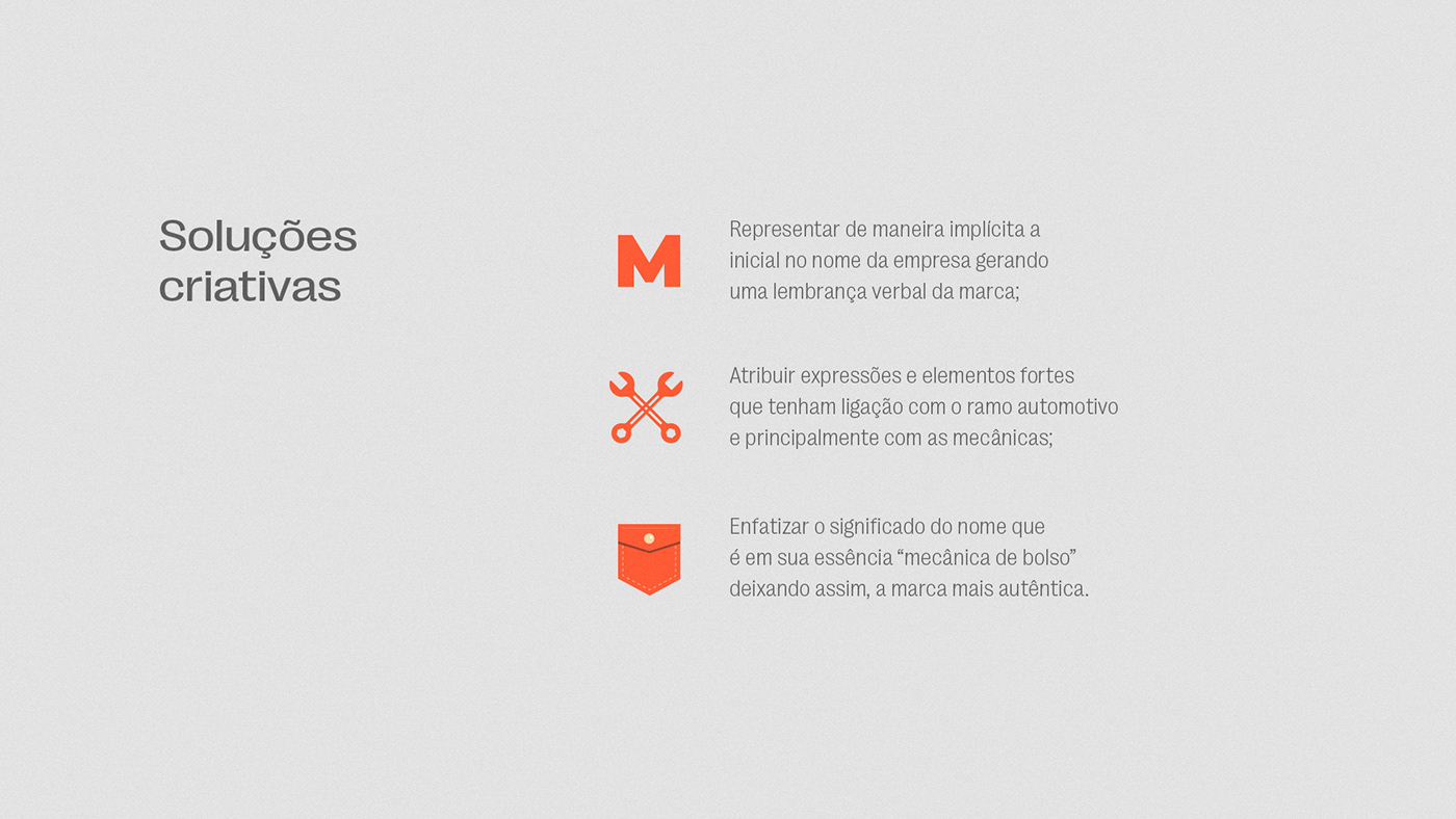
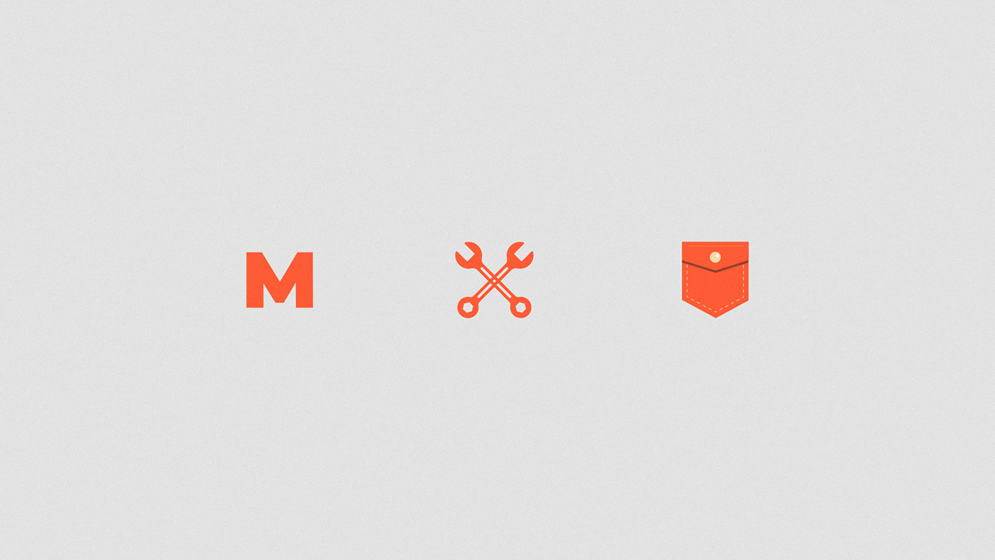
1. Represent the initial in the company name, expressing a verbal reminder of the brand;
2. Attribute strong expressions and elements which have a connection with the automotive industry and mainly with mechanics;
3. Emphasize the name's meaning, which is in essence “pocket mechanics” thus leaving the most authentic brand.
2. Attribute strong expressions and elements which have a connection with the automotive industry and mainly with mechanics;
3. Emphasize the name's meaning, which is in essence “pocket mechanics” thus leaving the most authentic brand.

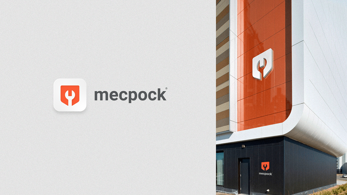
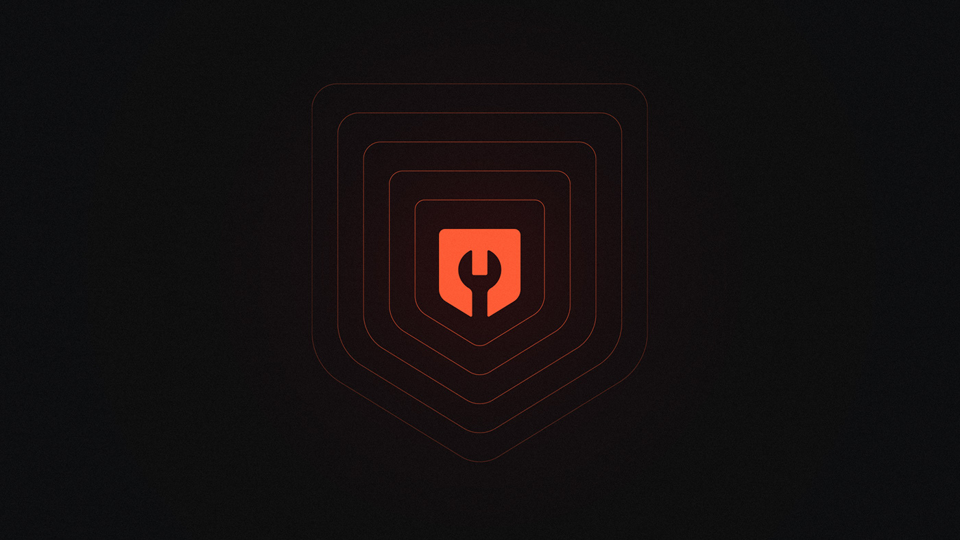
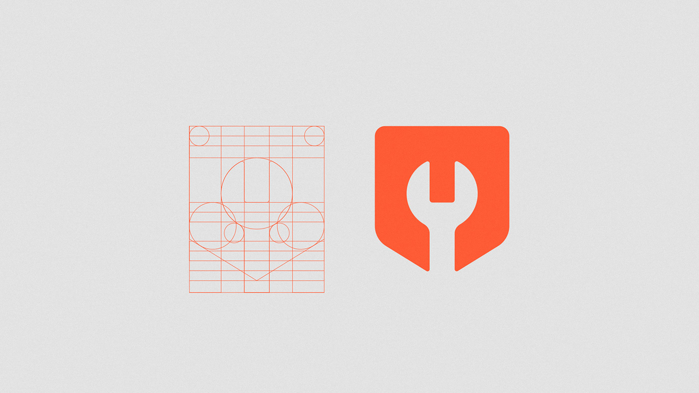
EN | Inside the idea of a defined symbol, the grid construction process was initiated before that, horizontal and vertical lines to end in a pleasant and visually harmonious result. As we can see on the side, the symbol is all symmetrical and through the study of the gestalt we can clearly see the spanner, which is a common tool used by mechanics, the shape of the pocket around the symbol and finally the letter M implied.
PT-BR | A partir da ideia de símbolo definida, o processo de construção do grid foi iniciado utilizando módulos áureos circulares e linhas horizontais e verticais para chegar em um resultado agradável e visualmente harmônico. Como podemos ver ao lado, o símbolo é inteiramente simétrico e através do estudo da gestalt, vemos claramente a chave de boca, que é uma ferramenta comum utilizada pelos mecânicos, o formato do bolso ao redor do símbolo e por fim a letra M de forma implícita.

EN | A typography chosen to compose the logo is a Sans Serif called “Roboto”, a font that was modified in order to maintain shapes that represent the idea of a more flexible and modern brand. The optical adjustment between the letters was also applied, visually forming a fit between them and making the reading more pleasant. We tried to use a lower case (minuscule) because in addition to giving the feeling of a friendly brand, it is also widely used in service companies with some technological appeal (Ex.: Facebook, amazon, etc.)
PT-BR | A tipografia escolhida para compor o logotipo é uma Sans Serif chamada “Roboto”. Uma fonte que foi modificada buscando manter formas que representassem a ideia de uma marca mais flexível e moderna. O ajuste óptico entre as letras também foi aplicado, formando visualmente um encaixe entre elas e tornando a leitura mais agradável. Buscou-se utilizar a caixa baixa (minúscula) pois além de passar a sensação de uma marca amigável, também é muito usado em empresas de prestação de serviço com algum apelo tecnológico (Ex.: facebook, amazon, etc.)


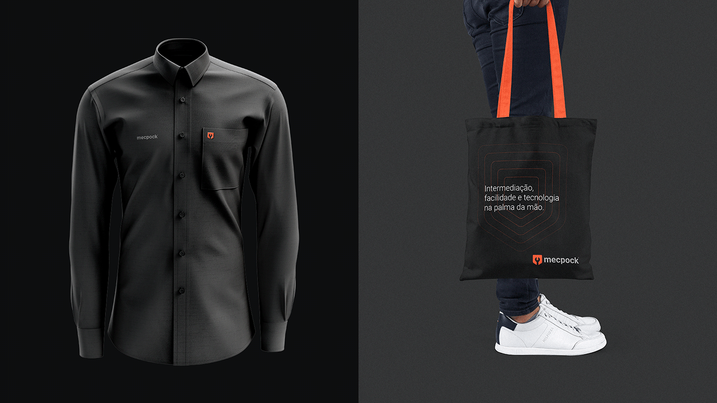
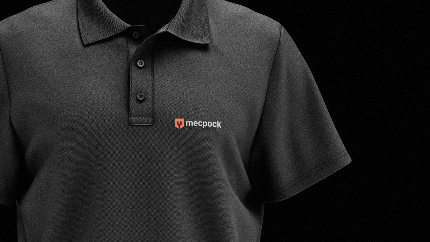
EN | Based on market research and focusing on the current positioning of the company, the main palette chosen to compose the brand is accompanied by shades of orange and black. They are colors that transmit action and energy, however, they also refer to elegance and sophistication. A secondary palette was defined in these colors, which serves as a support to compose the visual identity, especially in the digital ones
PT-BR | Baseado na pesquisa de mercado e focando no posicionamento atual da empresa, a paleta principal escolhida para compor a marca é acompanhada por tons de laranja e preto. São cores que transmitem ação e energia, porém, também remetem à elegância e sofisticação. Foi definido uma paleta secundária baseada nessas cores, que serve de apoio para compor a aplicação da identidade visual, principalmente nos meios digitais.