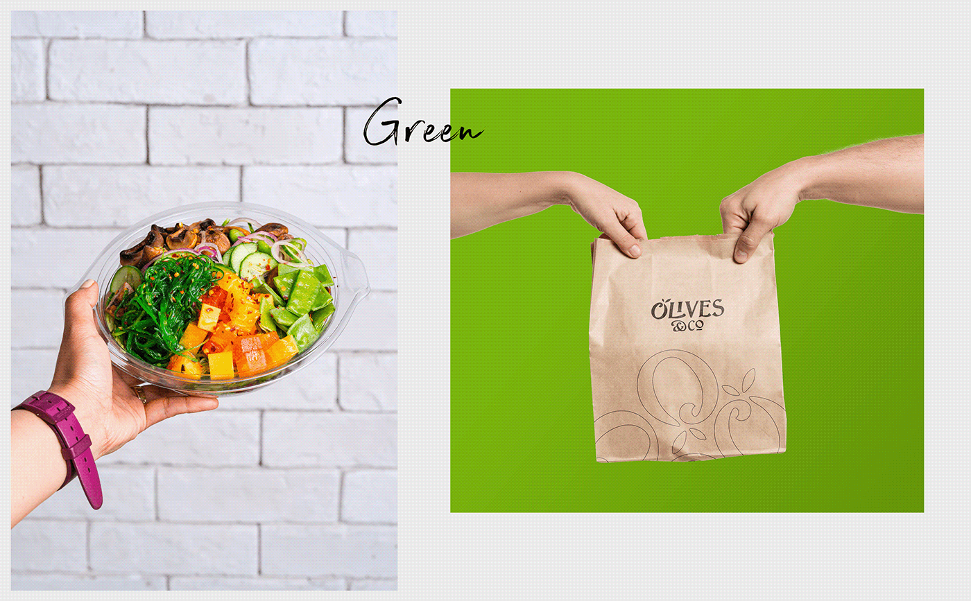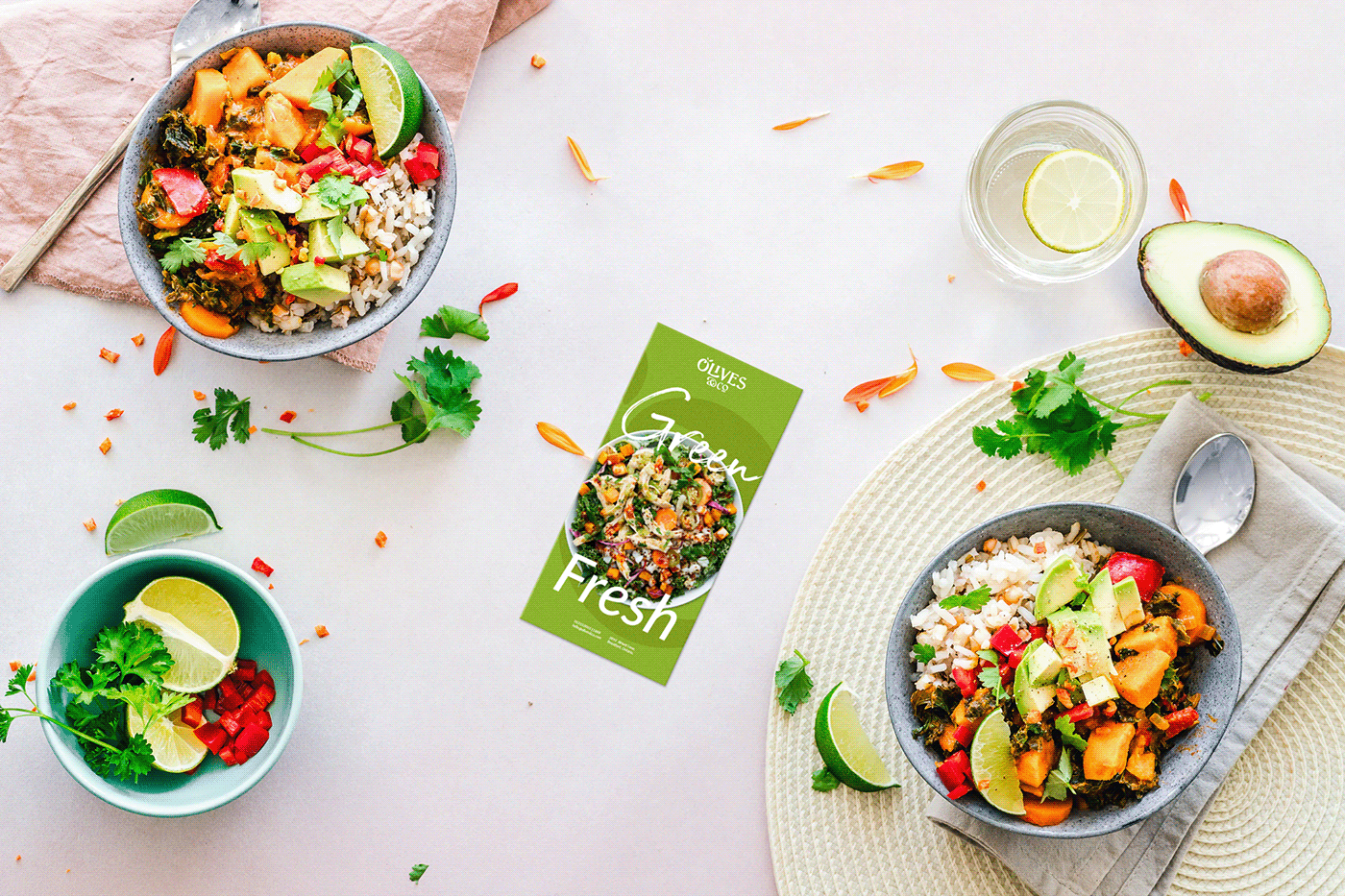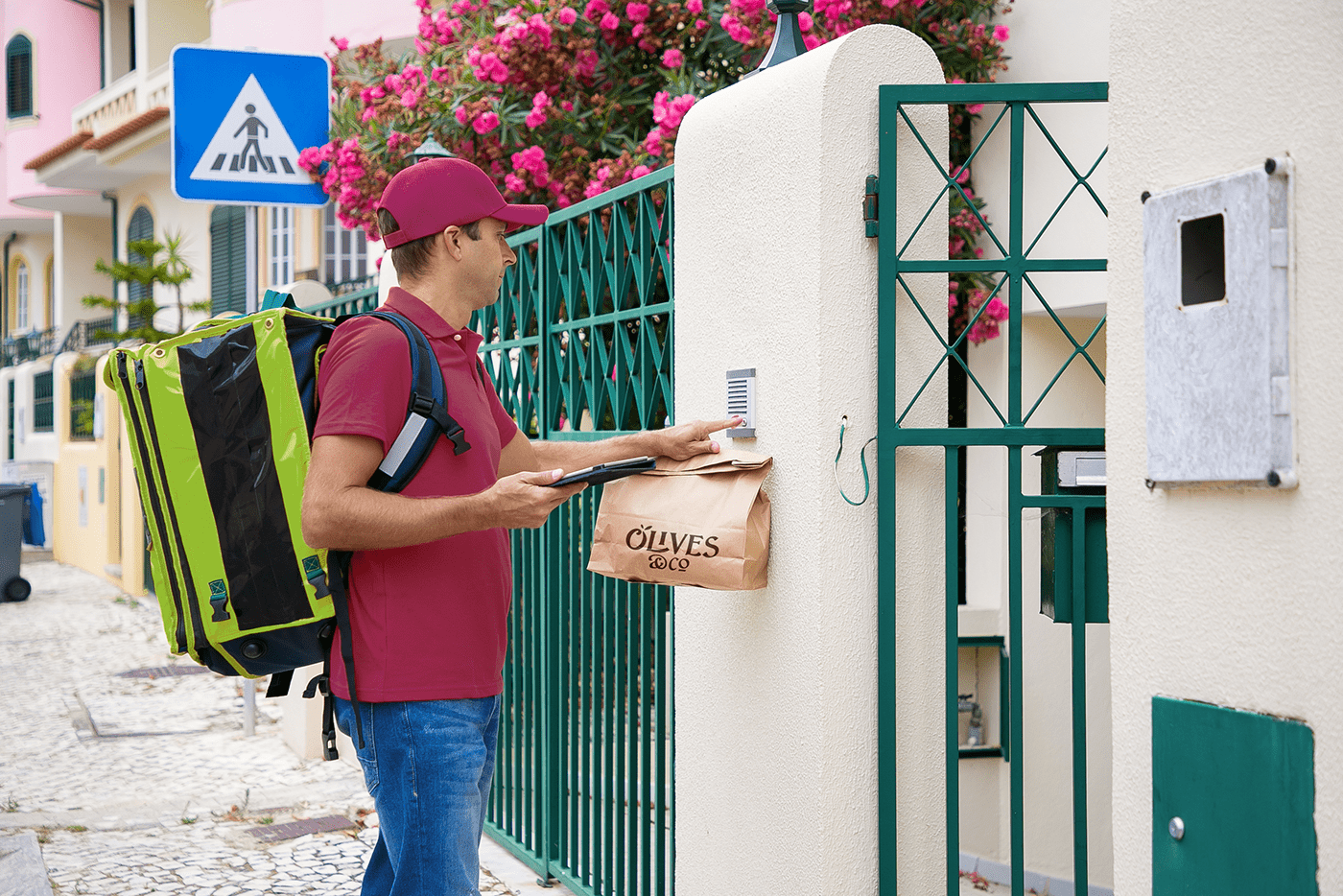


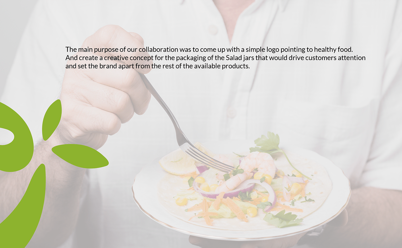
Olives and co is a new online store that provides fresh and healthy salad jars. The brand will kick off in Saudi Arabia then shall expand into the MENA region. We are looking for serving people who would love to eat outside yet still have a healthy meal.
Name rational
The name Olives and co was first coined in the ideation by the founder as “ زیتون و شركاؤه “ then was translated into its english version to be directly related with the industry since our ingredients in the salad will includes olives and other vegetables.
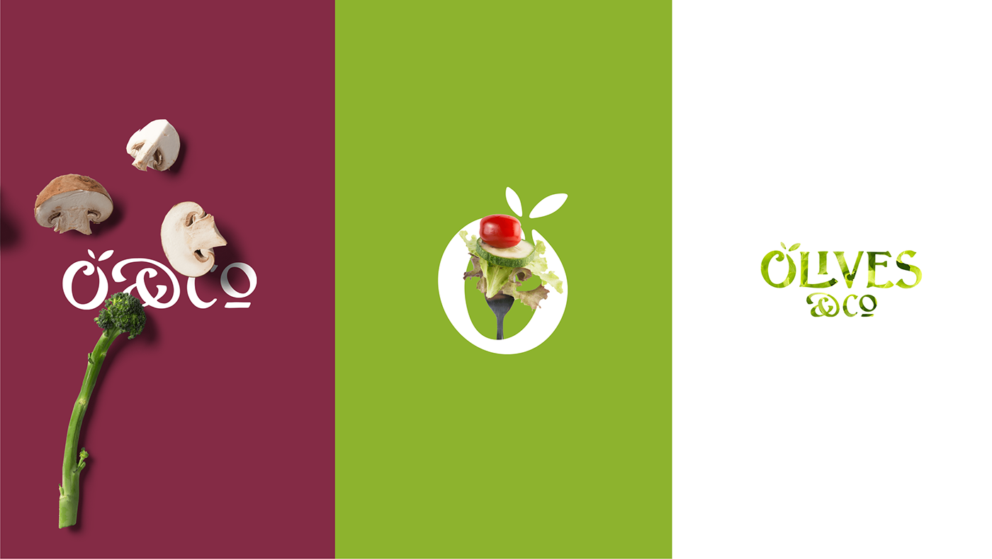
Logo concept
The logo concept was inspired by the brand name. Highlight an olive as a symbol of freshness and using a modern semi script type to communicate with the overall visual look and feel of the brand.


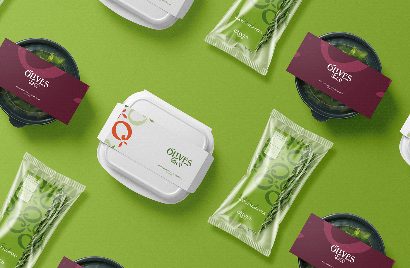
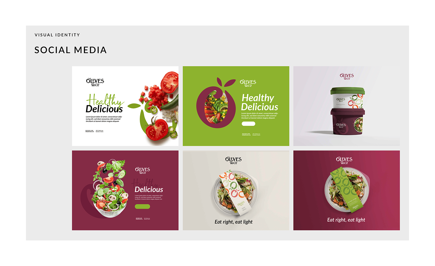
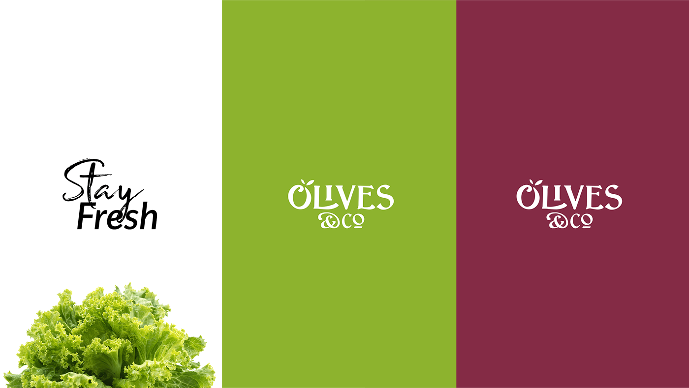
Brand color
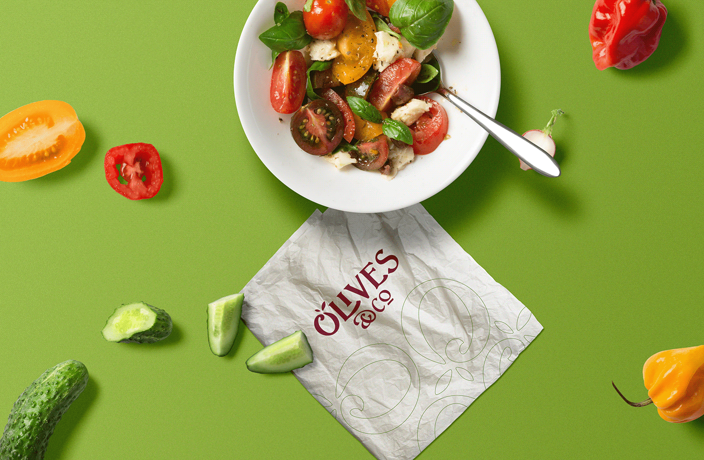
The brand has two color palettes and both are inspired from nature. However, we didn’t go for the common red of tomato, instead we selected olives and beet for the primary palette, and created a secondary one with colors that are easy to print and uncommon for the human eye as well.

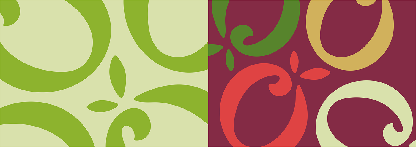
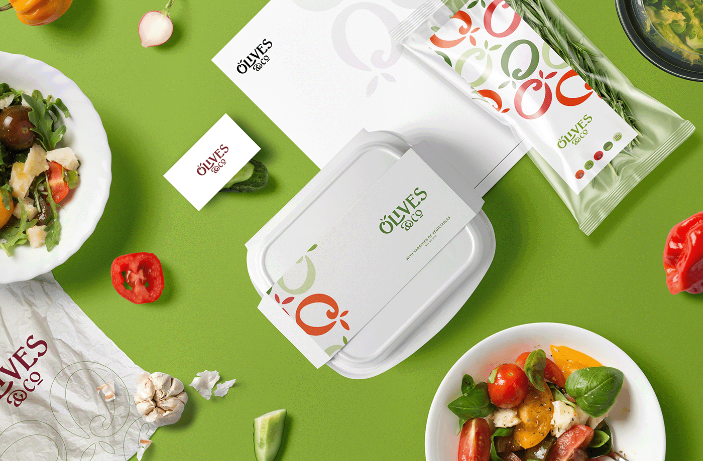
Brand pattern
Since the brand was meant to be simple and clear, we didn’t want to be excessive in details with the pattern creation. Juist having the logo initial “O” Olive was enough to set the packaging apart combined with the unique color palettes.