Moby Lines is the italian established leader in the field of maritime transport to and from the islands of the Upper Tirrenian Sea (Sardinia, Corsica, Elba), it became popular for their ships decorated with Looney Tunes themes. In 2005 Moby hired Domitilla Biondi to completely redesign the web site which earned, in the very first months, the amount of the entire previous year e-commerce bill, and bringing great faith on the online department work, lightening the overloaded help desk's job.
From the creative point of view, we decided to pursue the strategy already begun with press adv, focusing the recognizability on Warner's characters. Besides, main effort has been dedicated to design from scratch the usability and the e-commerce funnel process, which settled the basis of the average italian travel shopping experience of that period. Meanwhile, also the Agencies' Area portal had been designed, and it’s currently still in use as built in 2005.
Thanks to such good results, since then we have guided the Client on user experience for many restyling versions of its web site: in 2007 we changed the UI on a more corporate look&feel and starting also a newsletter, which begun the initial activity of the newborn web marketing department, taking care of the frequent update of offers banners and proposing parallel promo ideas such YOUMOBY, pioneering the use of viral sharing strategy.
YOUMOBY collected and promoted sharing activity among registered moby club users of their pictures and movies shot on bard, placing them into a cartoon virtual tour of the ships' interiors to self promote Moby services such as restaurants and amenities.
In 2009 we went for a brand new look to follow the technical upgrade, meanwhile web marketing activity moved to a specialized outsourced agency.
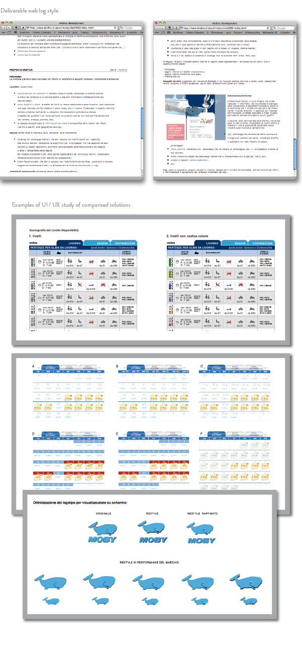
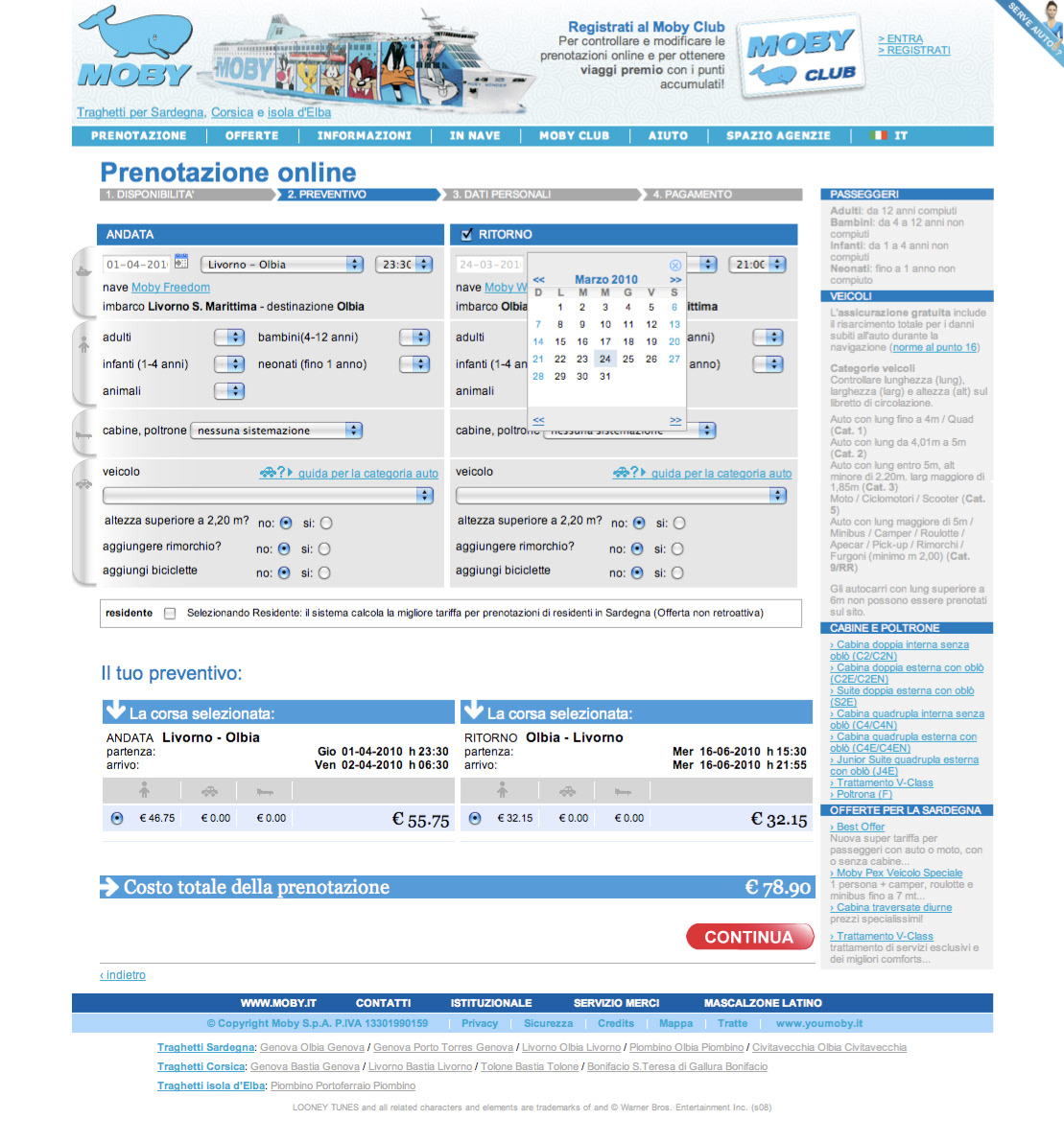
Architecture, low-fidelity wireframes, flowcharts, progress matrix

Project Analysis + Strategy / Branding thoughts
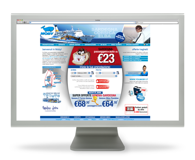
2005 | UI and Graphic design
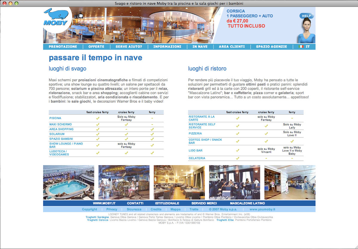
When I was asked to design the new company's web site from scratch, Moby was beginning to draw attention on itself thanks to Looney Tunes decorated sides of the ships, so it was obvious choice to use Warner's characters as main attraction on the website too, following up their popularity. The "mamozzi" — as they sympathetically call them in napolitan dialect — accompany the user through every pages, bringing color and fun: on the upper right side of the screen, for example, some mini flash animations play to amuse, entertain or even suggest the user he can change the color background of the page. This was the part that Mr Onorato, owner of the company, loved most!
With the exception of the booking pages, this website was entirely static (html 4).
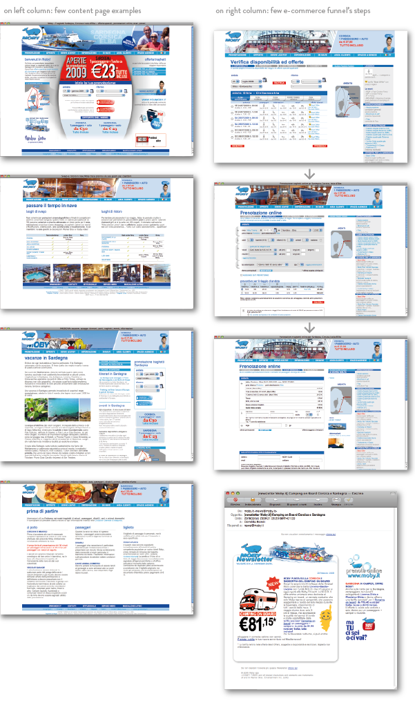
Together with Moby's development department, special attention was given to optimize and functionalize the e-commerce process, making it easy and clear. Moby has been the very first italian travel web site to invest on its website usability, and after a few months its main competitors immediately followed the same choice.
Together with Moby's development department, special attention was given to optimize and functionalize the e-commerce process, making it easy and clear. Moby has been the very first italian travel web site to invest on its website usability, and after a few months its main competitors immediately followed the same choice.
After released, the web site earned in 3 months what the previous version did in the whole past year.
Wow, I told myself.
Wow, I told myself.

2007 | UI and Graphic design


Promotion & web marketing
In 2007 Moby feels the need to push more its communication. Because in Italy the social fever was beginning, we tried the collateral project YOUMOBY Community.
I took care of web site banner campaigns, first following-up the print adv campaign (by JWT) and then becoming independent in creativity. In 2009 Moby established its own web marketing department and I started working on digital adv campaigns as well.
I took care of web site banner campaigns, first following-up the print adv campaign (by JWT) and then becoming independent in creativity. In 2009 Moby established its own web marketing department and I started working on digital adv campaigns as well.
2009 | UX / UI restyle, MobyClub enanced.
We worked on making the look&feel more clean and simple so to be loaded quicker and easier. We gave a good review to the booking process usability and user experience. Being the target of web marketing campaigns, the Moby Club gets more importance both in the User Interface and in the UX, so the section is completely restyled and perfected in its services (i.e. the possibility to modify reservations and personal details besides accumulating points to win a free trip).


Agency Area
After noticing that travel agencies begun to prefer booking from the client version web site instead of using their intranet tool, in 2006 Moby decided to create a practical one-page booking process version, adding also all the features proper to an agency’s needs. It's still in use now in 2013.


