Sierra Nevada
Package Design Rebrand
THE PROJECT
The main task of this project was to take an existing alcohol brand and redesign it while still maintaining the integrity of the original brand and their identity.
THE BRAND
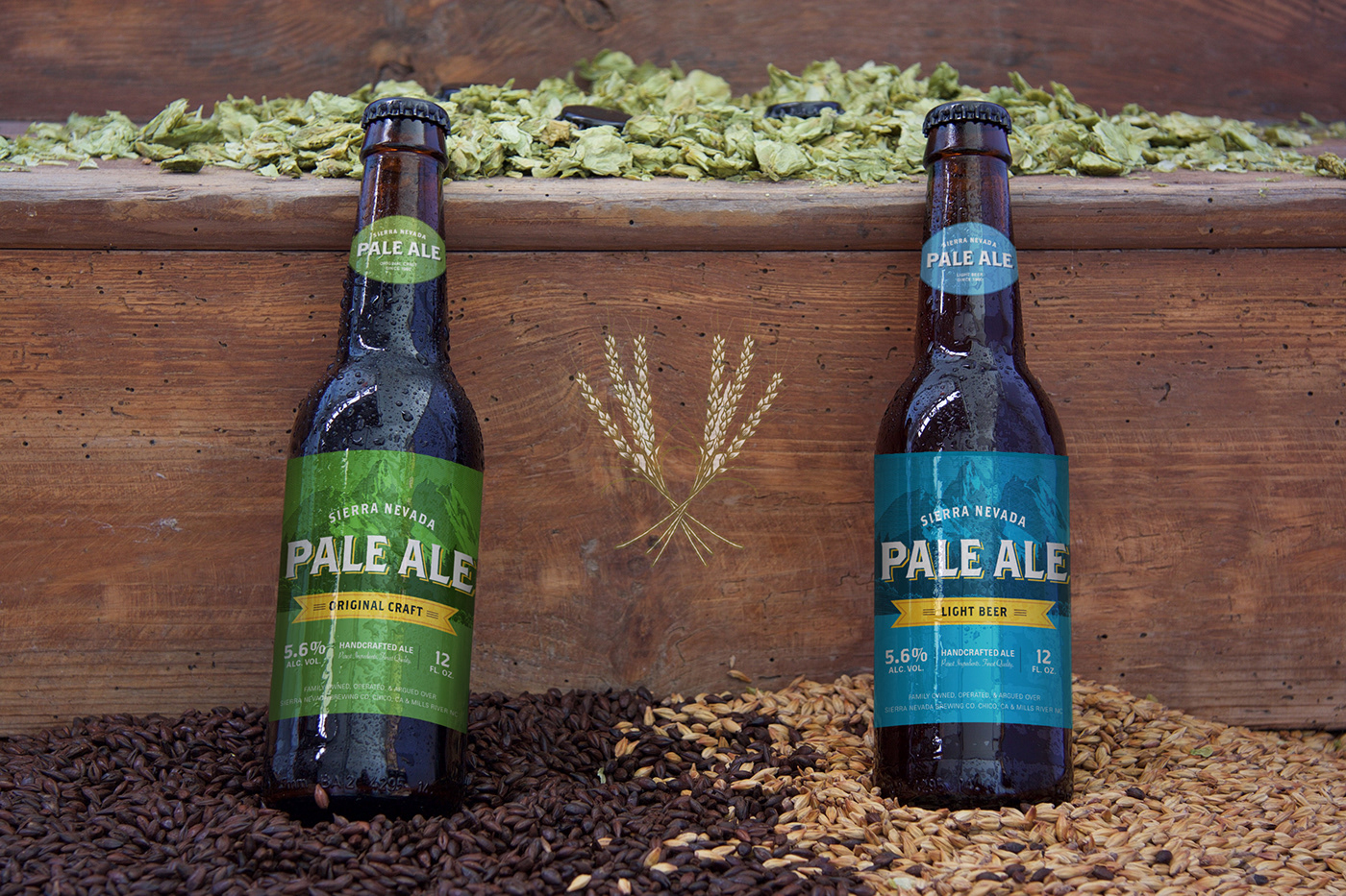
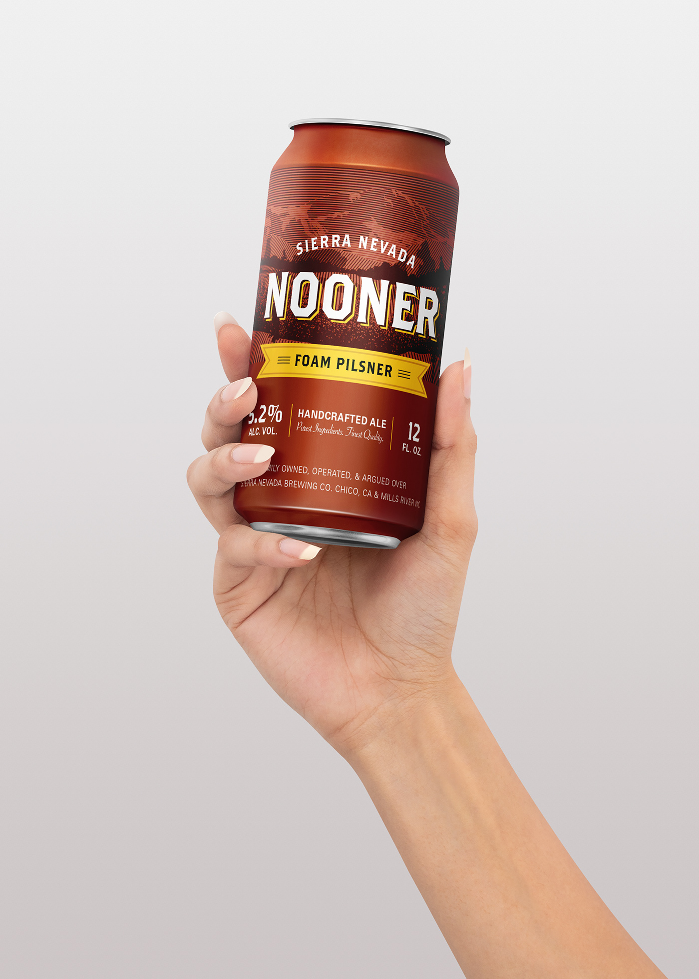
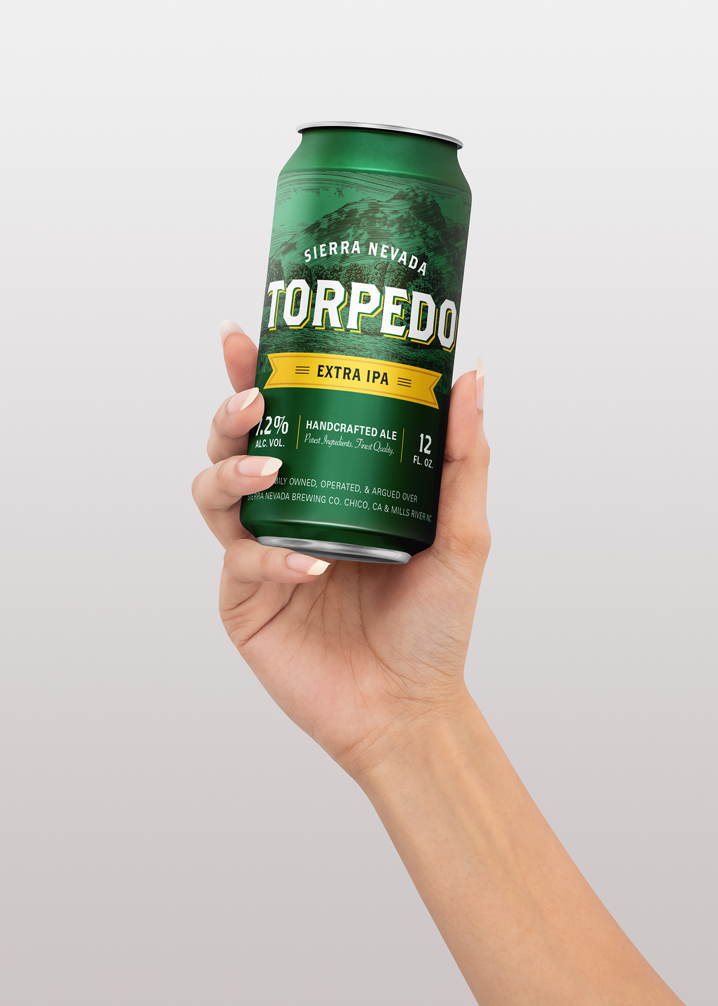
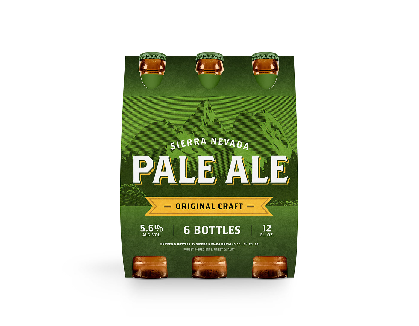
I chose to redesign Sierra Nevada because their packaging has been very consistent and specific for quite some time, so I thought it would interesting to see what I could add to their look while still honoring who they are already.
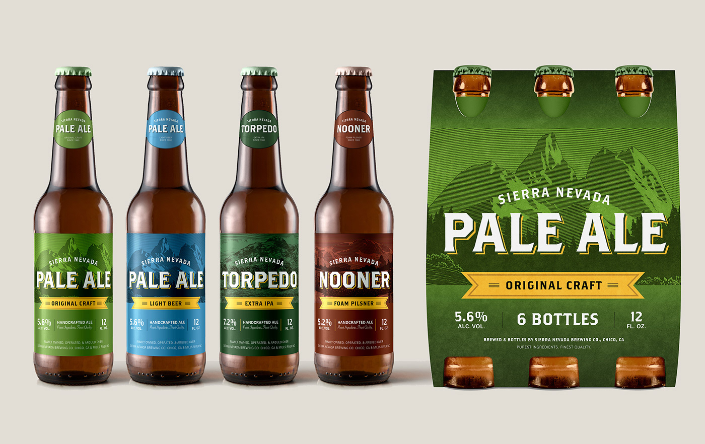
THE REDESIGN
After many ideas that went way too far from who Sierra Nevada is, I drew back in some of their main characteristics such as the color palette, woodcut illustrations, and typography, and created a package design system that is modern and clean, yet still true to the brand.