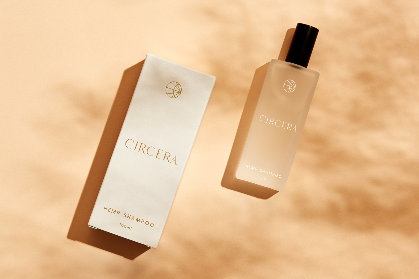
Concept
This product itself helps guide you to a state of calmness and tranquility. The hemp wellness market is oversaturated with pot leaves and tacky marketing. Circera disrupts this with elegance and confidence. The customer is meant to be proud to show it off.
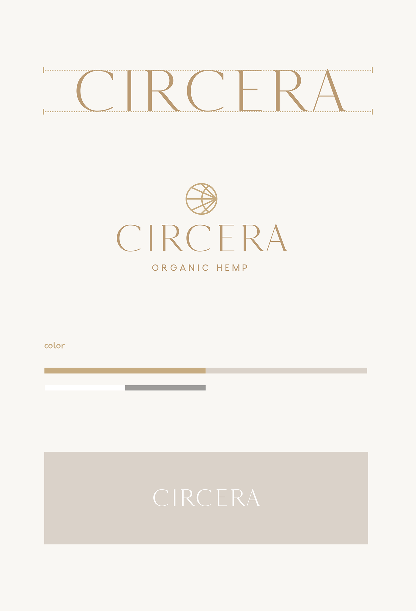

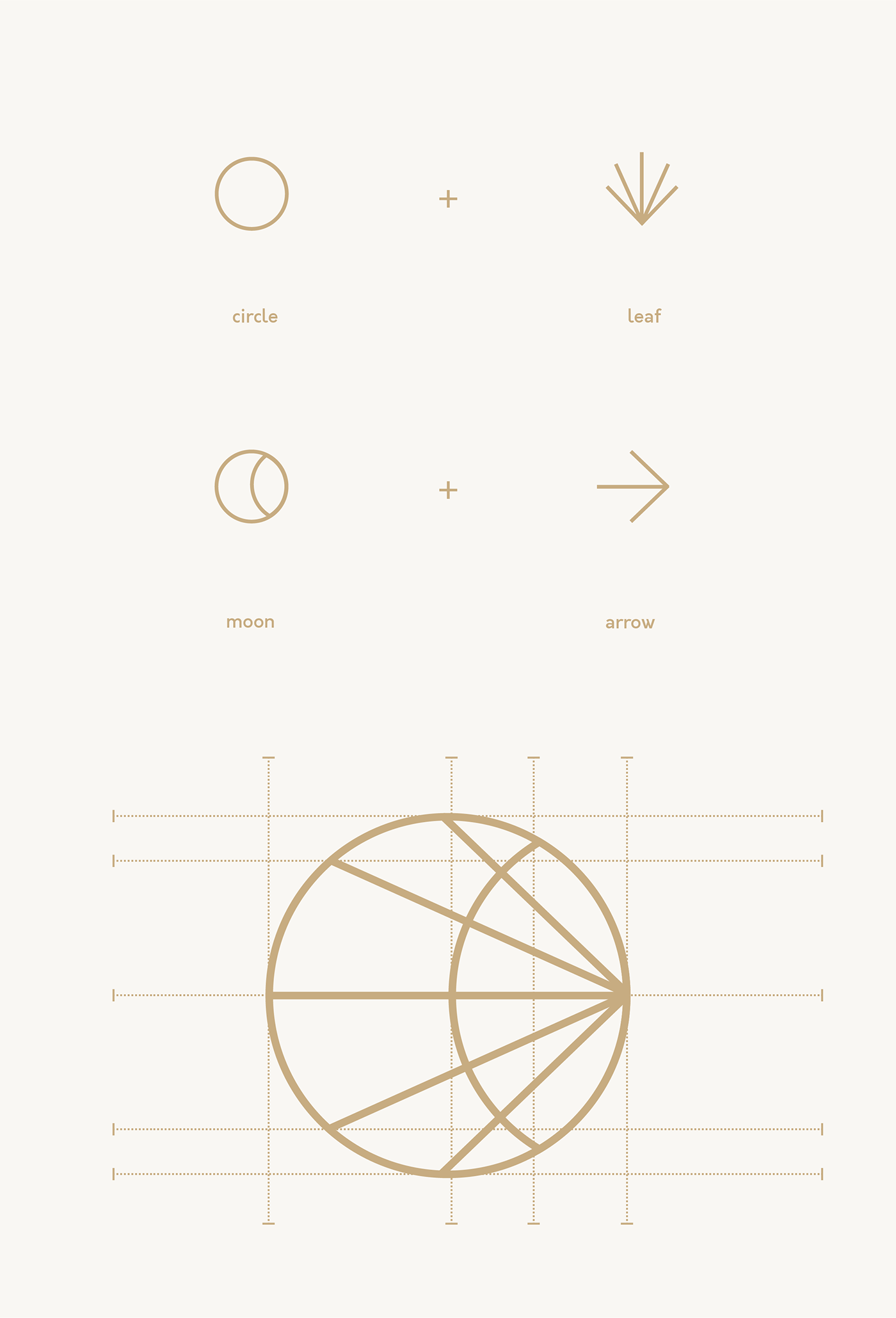
To achieve this I've created a brand identity that is clean and minimal. The mark references the hemp lead without being overpowering. The word "Circera" means circle. The idea behind the name portrays the idea that using the product gives you a sense of wholeness. You're reaching an equilibrium with your health. This was something I wanted to play off of with an astral theme of the globe or lunar cycles. The mark is turned on its side, facing forward to show the customer moving in the right direction with their health. Circera is the navigator. It's helping you stay calm and move forward.A
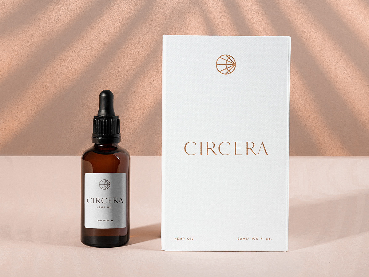
The packaging was kept minimal. I worked with the clients manufacturer on what they could do within budget. The main idea was to keep the mark the main focal point of the product with shades of earth tones in its main color scheme.


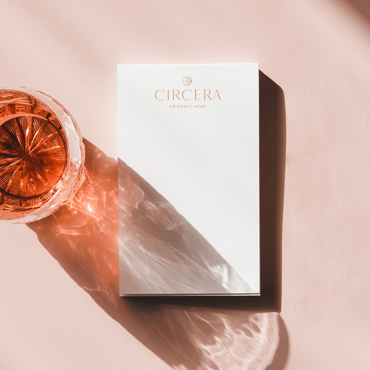
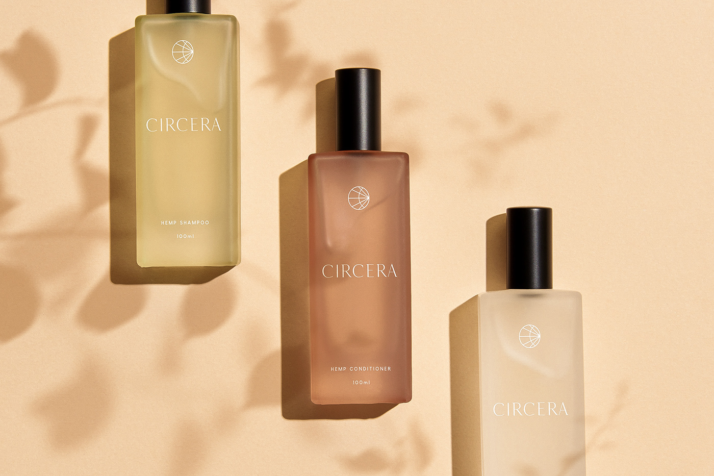
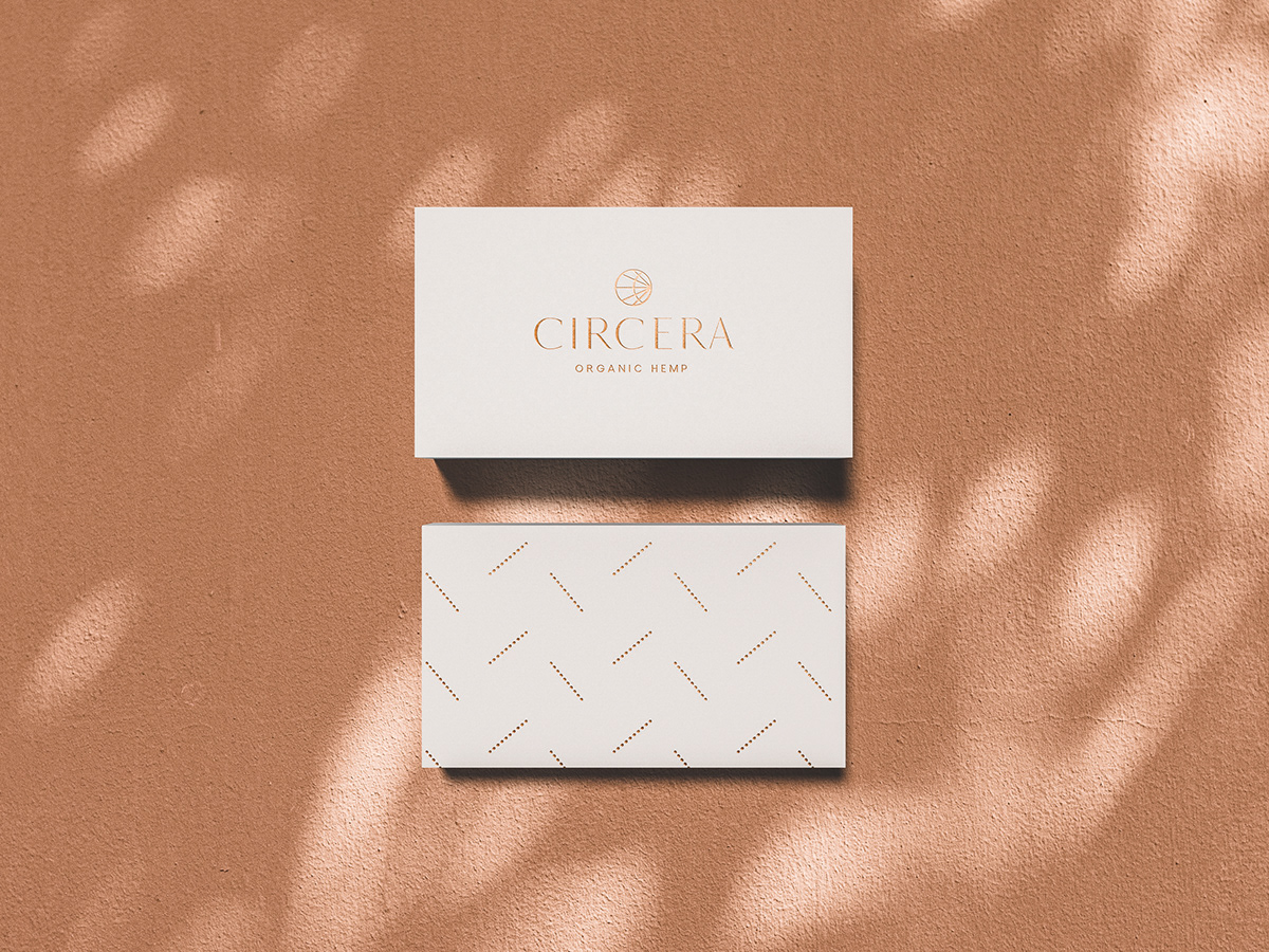
Circera Organic Hemp
Branding / Logo Design / Brand Identity / Typography / Package Design / Logo / Mark / Seal /
by freelance designer, Kevin Craft


