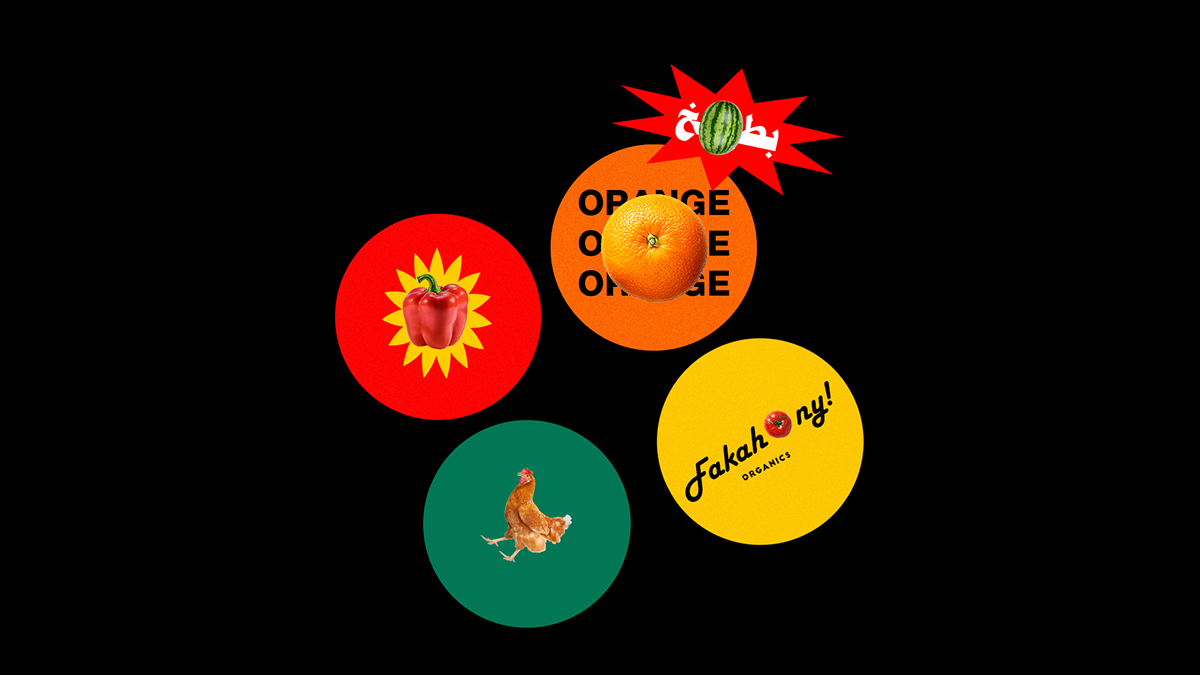
In order to show appreciation to one of the pioneering food & beverage apps in Egypt, we decieded to storytell how organic & fresh their products are through a new fashioned branding style.
The story began smoothly at first developing a typography logo that looks neat and friendly as well but it didn't end peacefully there; we steered the wheel to take a rough drift in the project art direction which is; why not to make it MORE ORGANIC, COLORFUL, BOLD & VERY BIG! Eventually, the final logo has become a hyper formula between friendly typography & user-friendly product images.
The messaging style is BOLD in this branding so it connects clearly with the audience besides using BIG product images so it will be more relatable as well.


