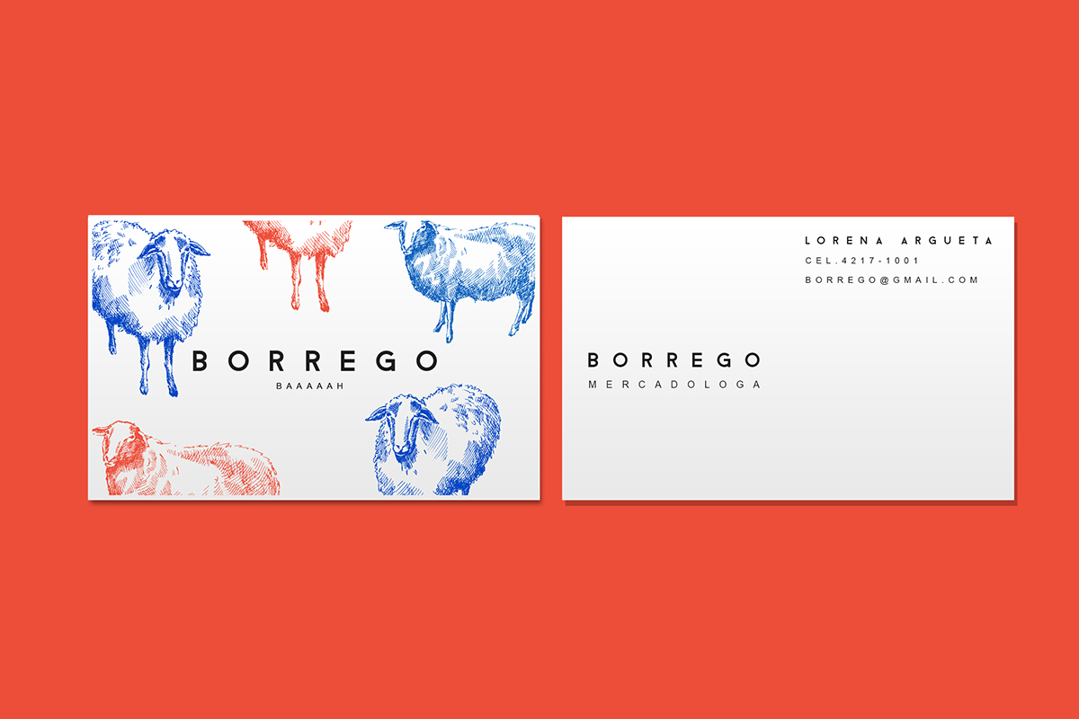
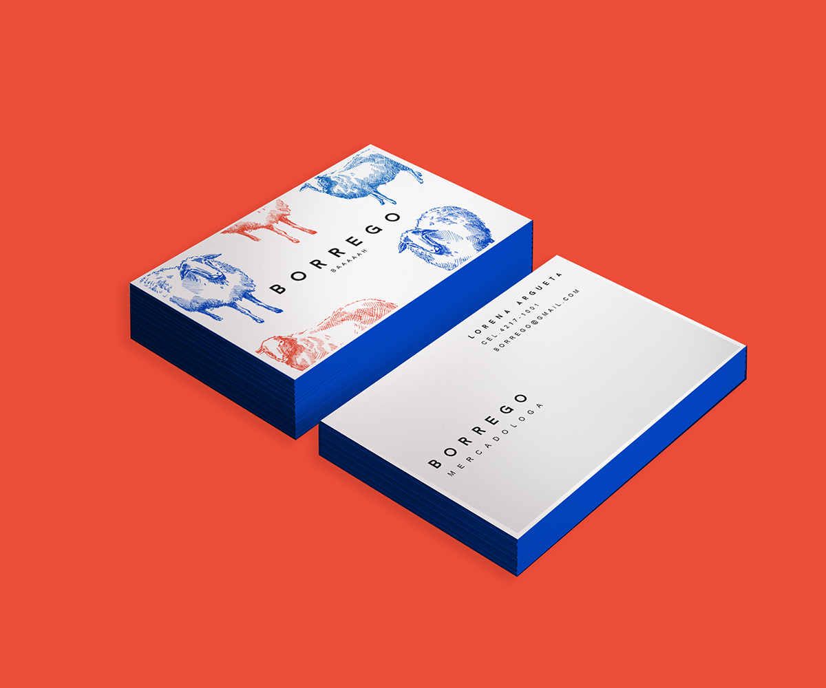
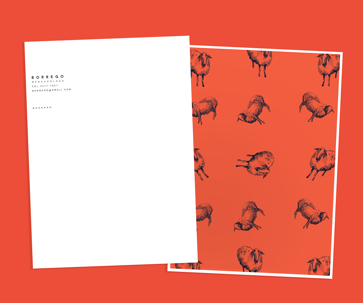
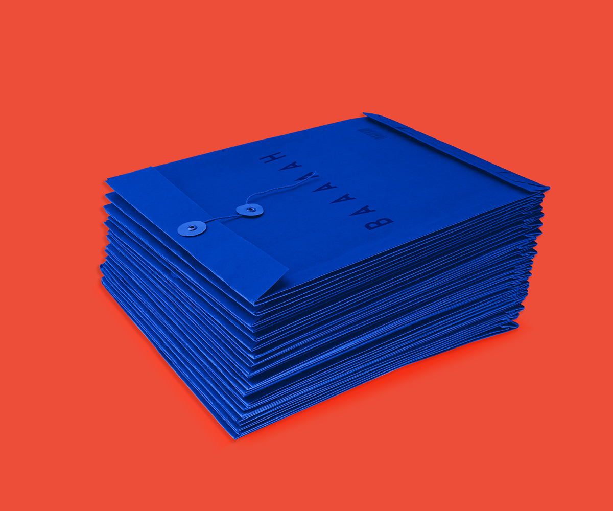
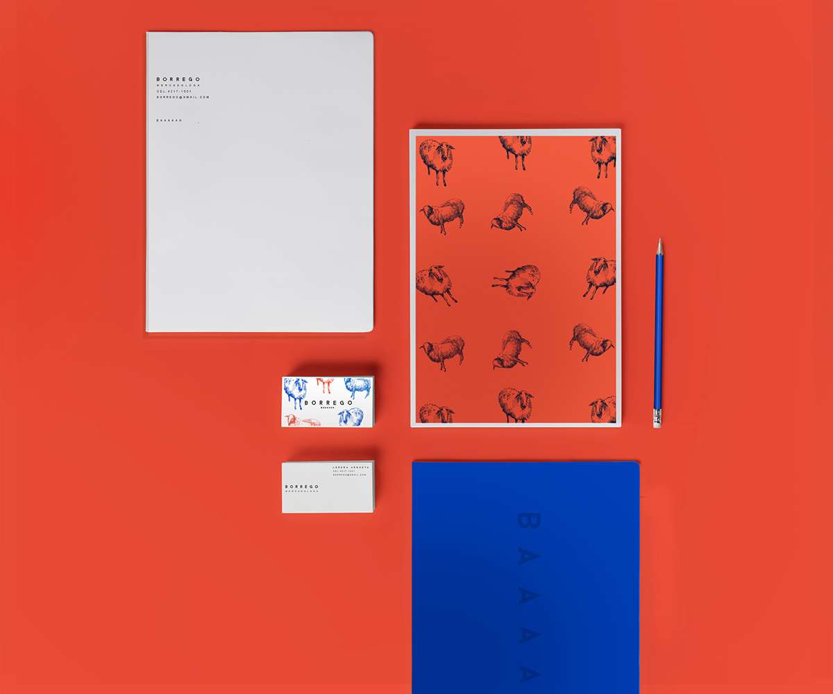
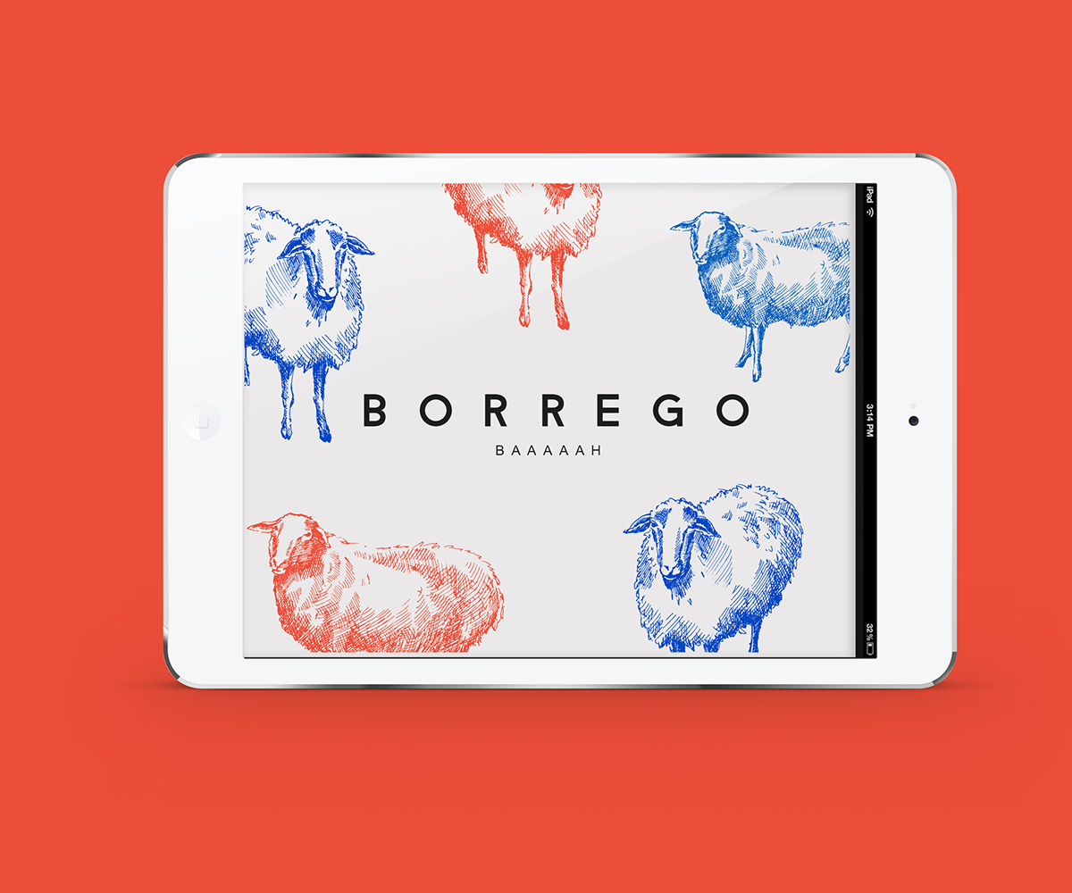
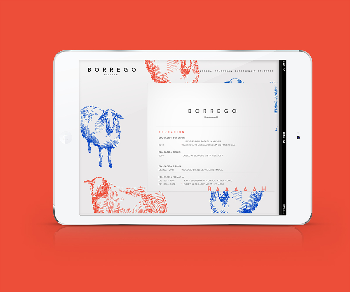
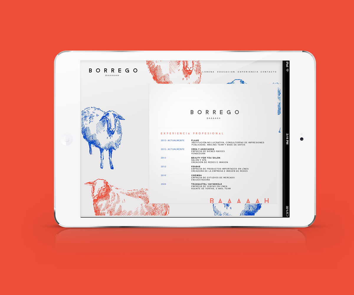
BORREGO (Lamb)
BAAAAAH
Marketing Professional
Branding & Identity Design
The purpose of this project was to capture Lorena Argueta’s wild and outgoing personality, with the use of appealing colors, a unique style of illustration and the correct distribution of the design elements.Due to the nature of her profession there also had to be a formal side to the project, which is reflected in the selection of typeface, arrangement of typographic and other pictorial elements within the layout.
Lorena Argueta’s nickname is Borrego, which stands for Lamb. Instead of using a lamb and by using a sheep for the illustrations, her growth is represented not only as an adult but also professionally.
The main purpose with the use of color in this project is to reflect the clients outgoing personality and to make sure that her clients could take interest in her work by standing out from the bunch with a bold design.
The main goal for Borrego was to deliver a functional graphic identity that is highly conceptual, modern and minimalistic.


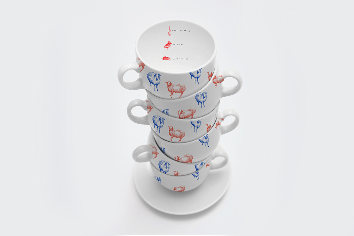


What you bring
What I do
What you get
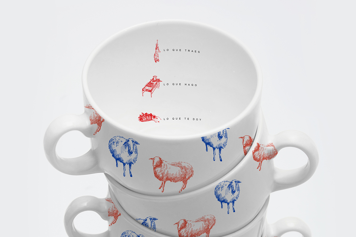
Lo que traes
Lo que hago
Lo que te doy
THANK YOU FOR WATCHING
You can follow me on
claudiaargueta.tumblr.com
claudiaargueta.tumblr.com


