


Teatro Municipal do Porto — Contest Submission
Like the title says, this was just a submission to a public contest. We ended up not participating but nevertheless, we had a blast reimagining Porto's Municipal Theatre branding and it certainly was no easy work.
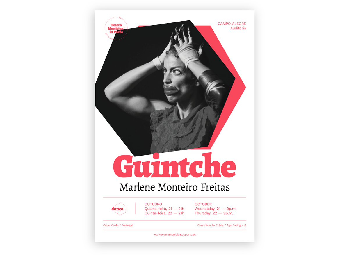
The brief required the following pieces to be made: the logo itself, a poster for an event, the cover and two spreads of the printed programme, the website and a few digital assets (event GIF, e-mail footer, facebook event cover, instagram stories and a webflyer).
For a bit of context, Porto's Municipal Theatre is actually divided into two separate theatres: Rivoli and Campo Alegre. Although a new brand wasn't required for both entities, their names had to appear on the final logo. And since we're goody-two-shoes people, we abided! In order to reinforce the idea of the Theatre's being composed by these two places we wanted the name to always be inside a geometric shape (in the vast majority of cases, the circle), with both the Rivoli and Campo Alegre name present at all times.
We used a pretty heavily grid based layout for the poster, programme, website and digital pieces in order to keep a coherent and clean look to all the little bits of information.
All and all we're super proud of this work and we're hoping it's to your refined liking as well!


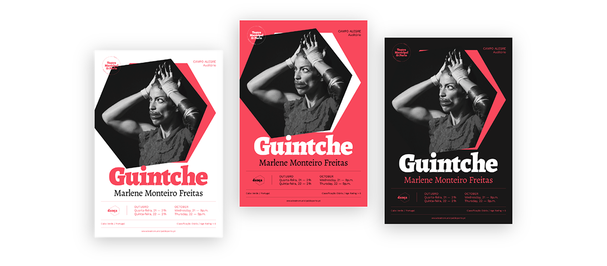
Alternative versions


Desktop version
Mobile version


Thanks! We apashiate you <3


