BRANDING OSLO APIARY
Oslo Apiary makes short travelled, locally produced, pesticide free, ecological, raw honey and beeswax through urban beekeeping.
In addition to promoting slow food and reinvigorating self-proletarianization, Oslo Apiary aims to support local artists through surplus-stipends.
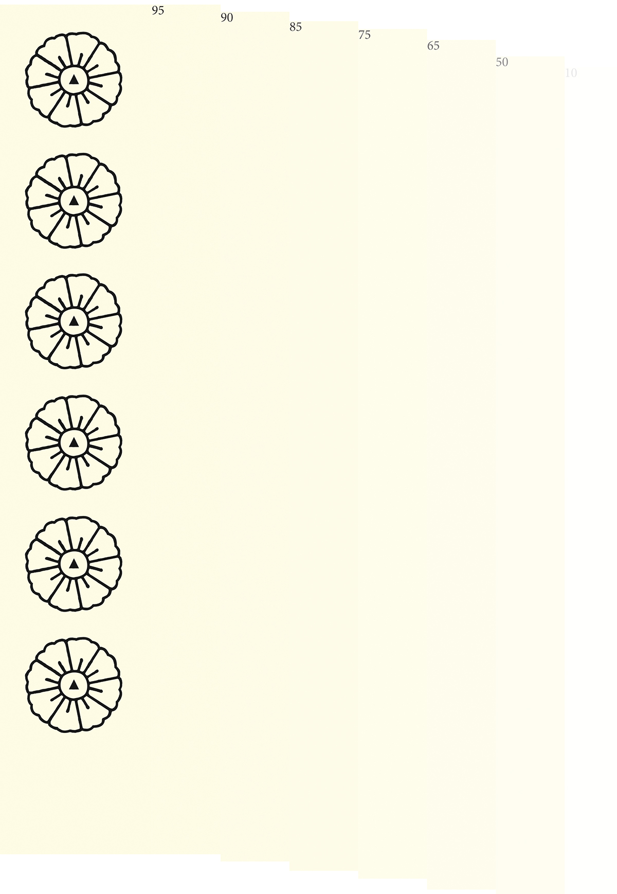
Starting out, all we had was a sake-cup with a flower pattern we wanted to incorporate into our logo design. We also had a shade of yellow in mind, that leaned slightly towards ocher, which we hoped would go well with the color of honey and beeswax without feeling cold.
References to the urban cityscape, its wear and tear, its tarmac landscape,
weeds, insects, flea markets, and lastly, Asia, were welcomed.
Asia, for conjuring up images of overpopulation in combination with blossoming cherry trees -misanthropy and fecundity - hand in hand.

The flower pattern was first reinterpreted in Indesign, then traced in Illustrator, before being printed on regular copy paper and retraced by hand, using black paint. This exercise was done the make the logo feel more organic. The original dot in the middle was replaced with a triangle, giving the logo an esoteric feel and relates it to symbols used for air, the heavens and for the spiritual realm, in f.ex. New Age mysticism and Judaism. We thought this fitting for the airborne bees.


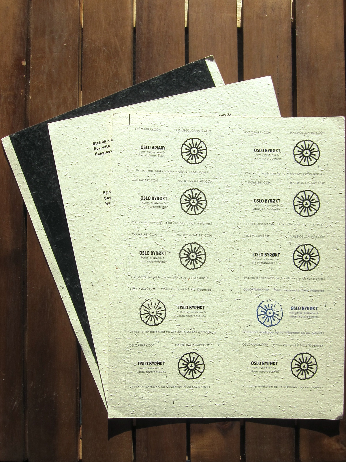
The logo was firstly used to make business cards in Norwegian and English and reads "Oslo Byrøkt - Kulturkrig, miljøvern & urban matproduksjon":
"Oslo Apiary - Culture war, environmentalism & urban foodproduction"
The business cards were printed on paper containing wildflower seeds, making them plantable. The pros and cons of making a business card made to be destroyed, came out in favor of the pros, since it would make for a conversation piece and also would be something you held on to for a while untill the city dweller acquired a pot of dirt or a vase.
We chose the font "Collegiate".
Checking coloring.
Secondly, the logo was used to make stamps, which were used to give some of the business cards an even more organic and dynamic feel. Blue and black ink was tried out for comparison. The flip side of the card sported a poem, compliments of Marius Presterud.


Using beeswax from the Apiary, we made sealing wax for formal letters.

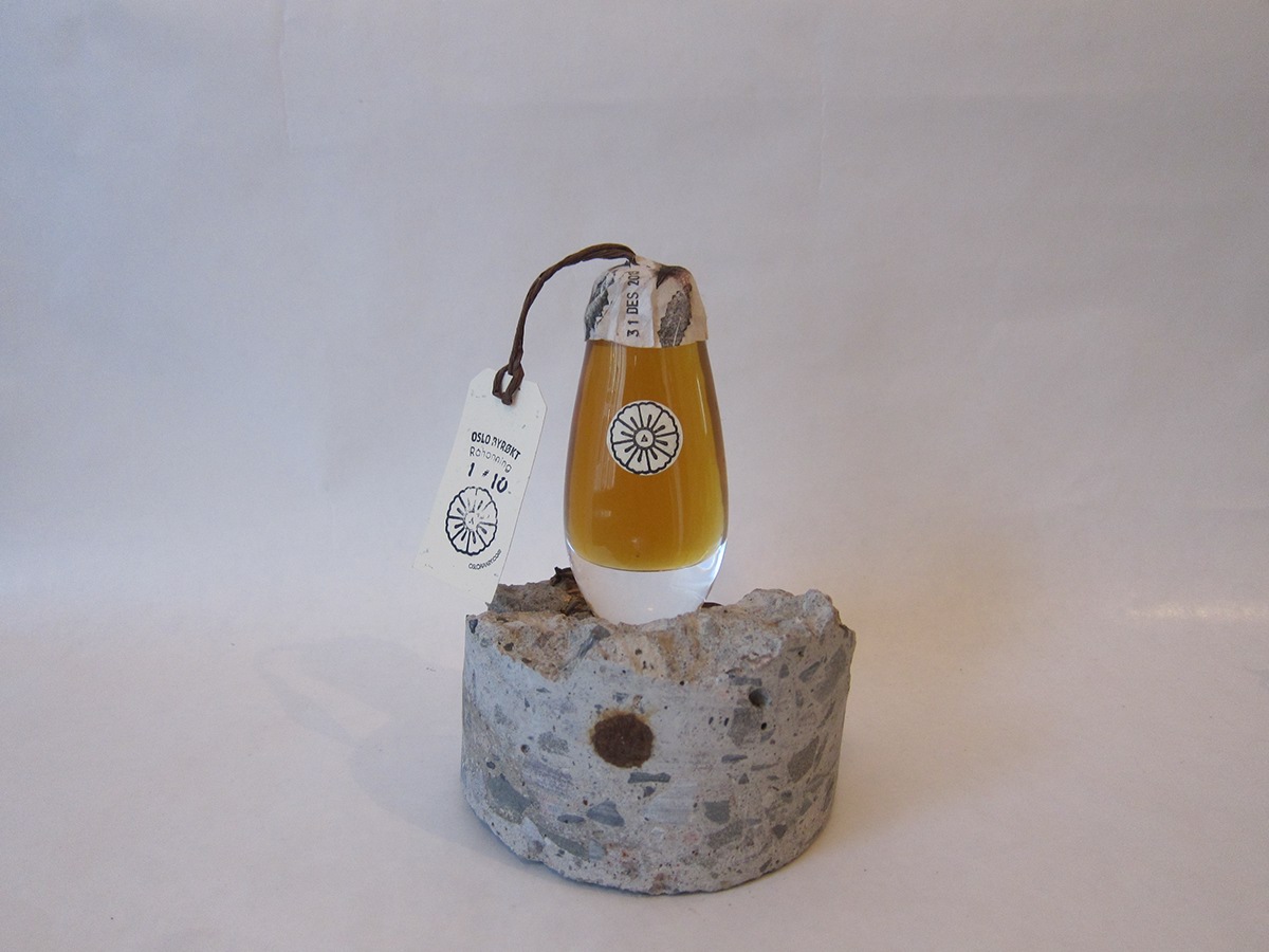
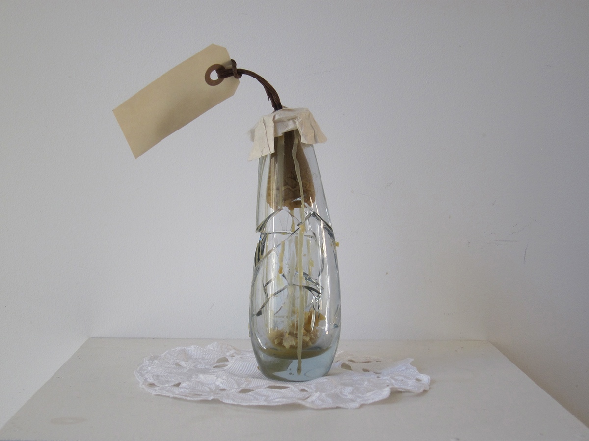
Searching through local fleamarkets, we found a set of crystal vases. They were then cooked and industrially cleaned, before being filled with raw honey and sealed using wax from the apiary. A paper string allows for
attaching labels and makes it possible to close the vase after its been opened (by pulling the wax cork back in place).


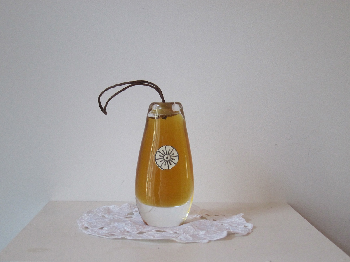
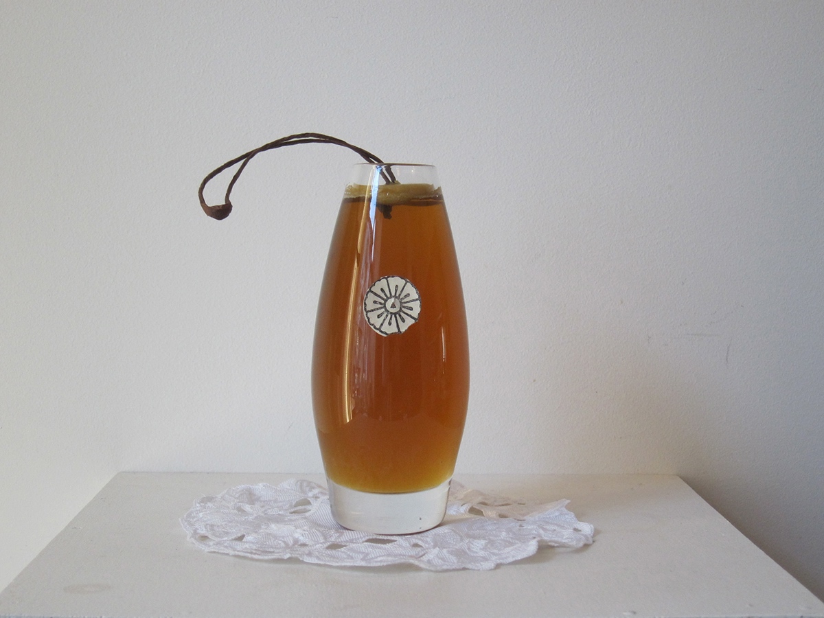
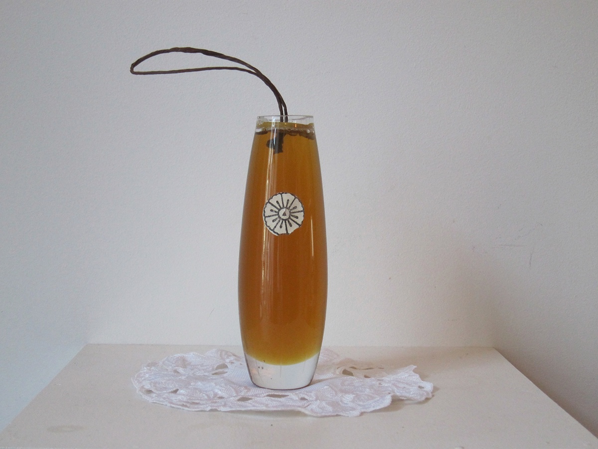
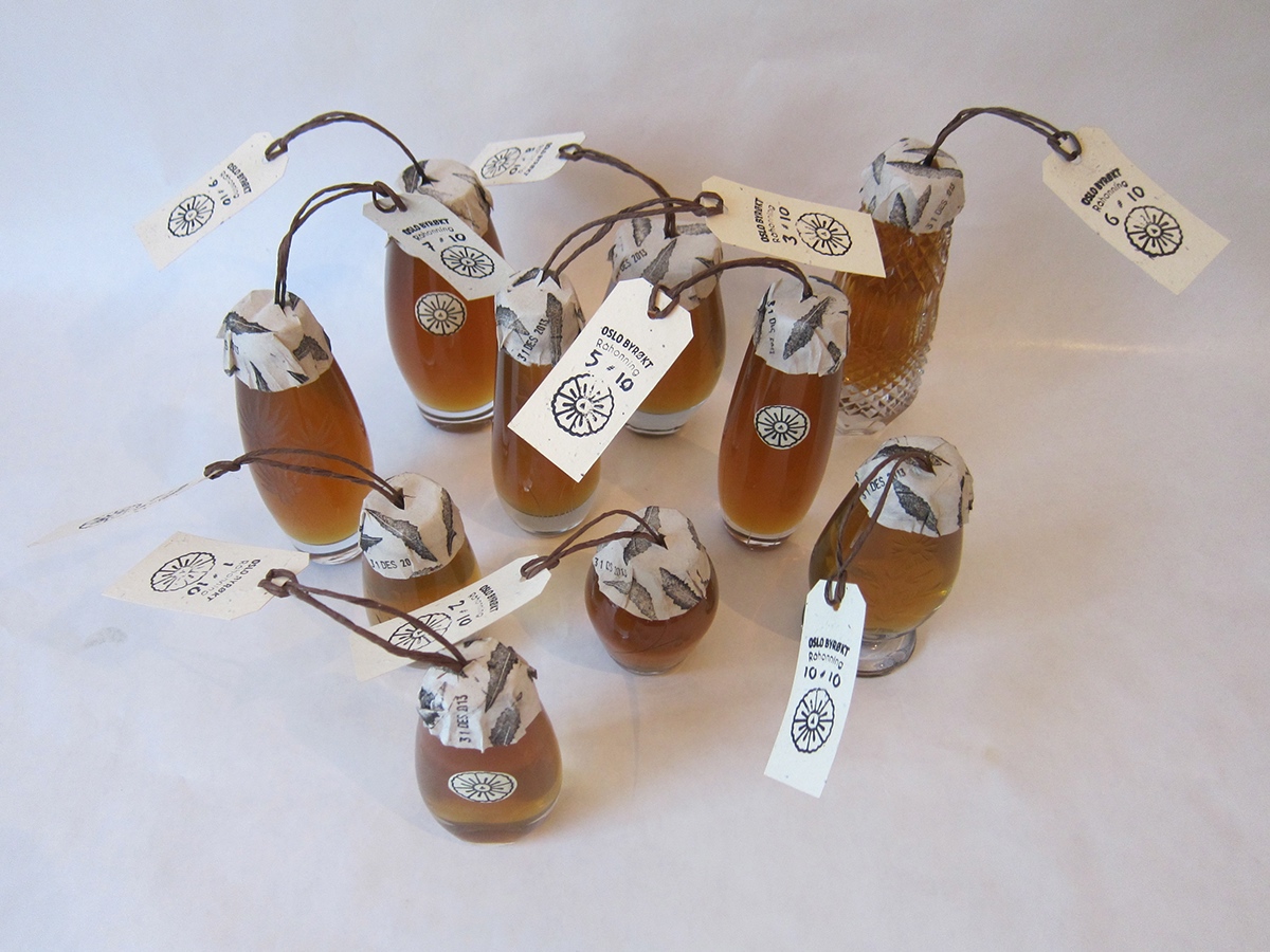
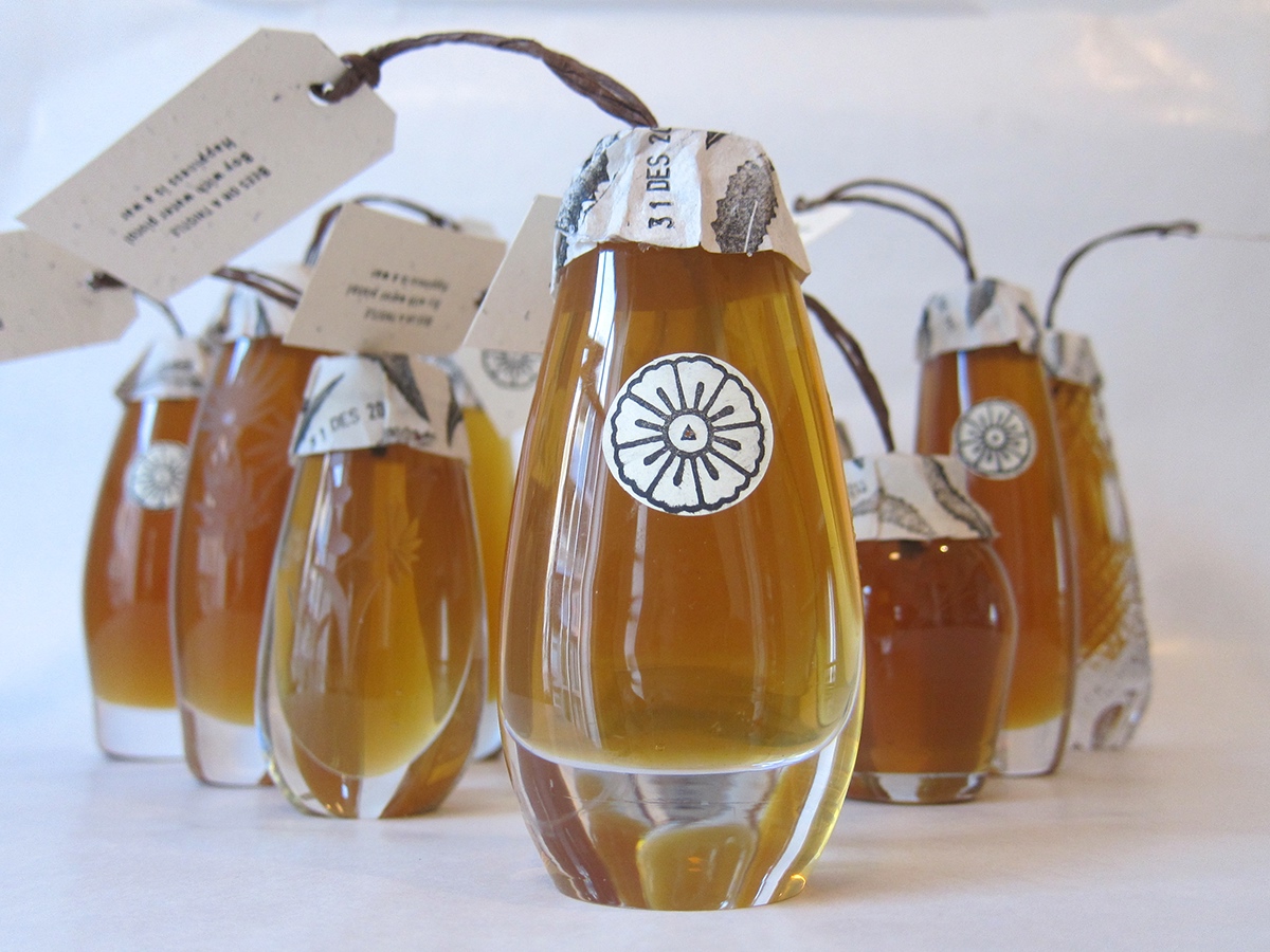
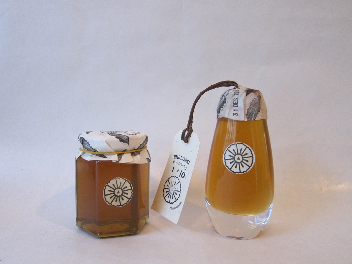
Thirdly, the logo and stamp were used for making individually numbered labels. The labels were also made from paper containing wildflower seeds. This meant that you would get raw honey, a poem, a crystal vase and a potential bouquet with a purchase.

We used a second patch of paper to protect the wax seal from getting dirty. Several paper types were tried out to match the wildflower infused label.
Rice paper, or the cheaper alternative, bamboo paper, did the trick.

Patch details. Dandelion leaf stamp, by default. Date stamp, by law.

Oh yeah, and we made the dandelion leaf stamp by scanning a piece of rucola. They are basically related.

PRODUCT 1:
Promotional, honey filled crystal vases.
Final Product, "Grøfteblomst".
Promotional, honey filled crystal vases.
Final Product, "Grøfteblomst".


Launchparty 14.11.2013


PRODUCT 2:
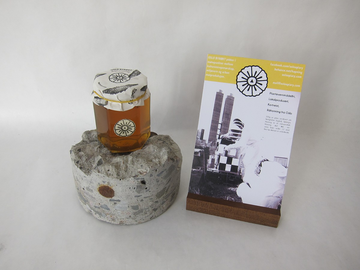
Regular jars to be sold in stores.
Regular jars to be sold in stores.
Here we are toying around with different patterns for the top patch. In the end, we decided to use the same haphazardous stamp pattern we used for the vases.

Final product, "Oslo Byrøkt Råhonning".


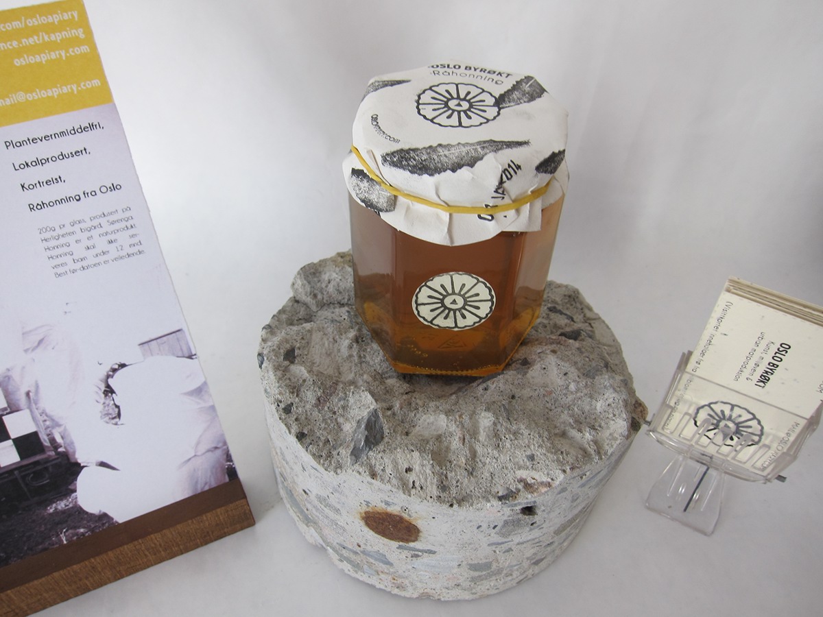
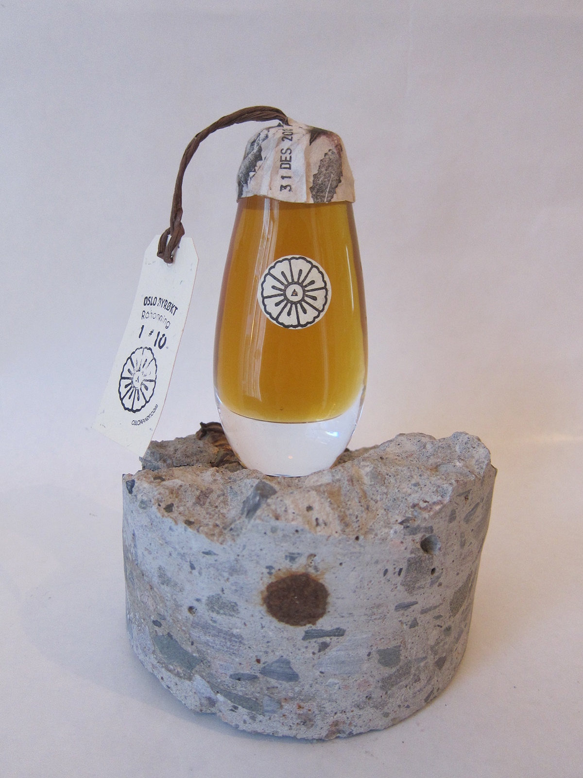
We also made a flyer for our sales stand. The foot is made from kebony, a durable and environmentally friendly wood. The concrete cylinder is from the building site right next to our apiary.

Comparative design, product 1 and product 2. Familiarity, achieved.
Products in store, at Fuglen, Oslo.


BONUS MATERIALS:
A single drop of honey sealed within glass using wax from the apiary.
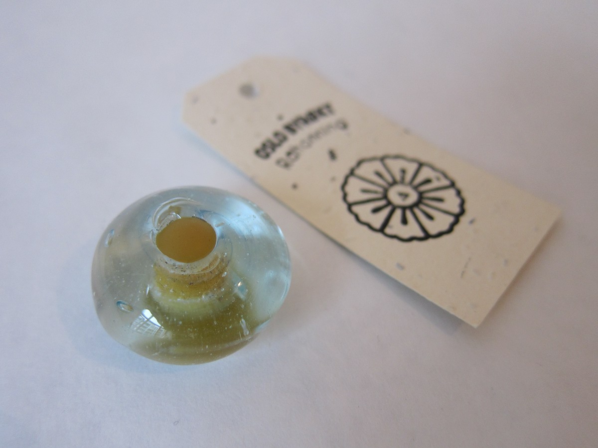
Fun fact:
Crystal vases dont like being rinsed with cold water after you cook them.
Crystal vases dont like being rinsed with cold water after you cook them.
One of our business cards, planted.

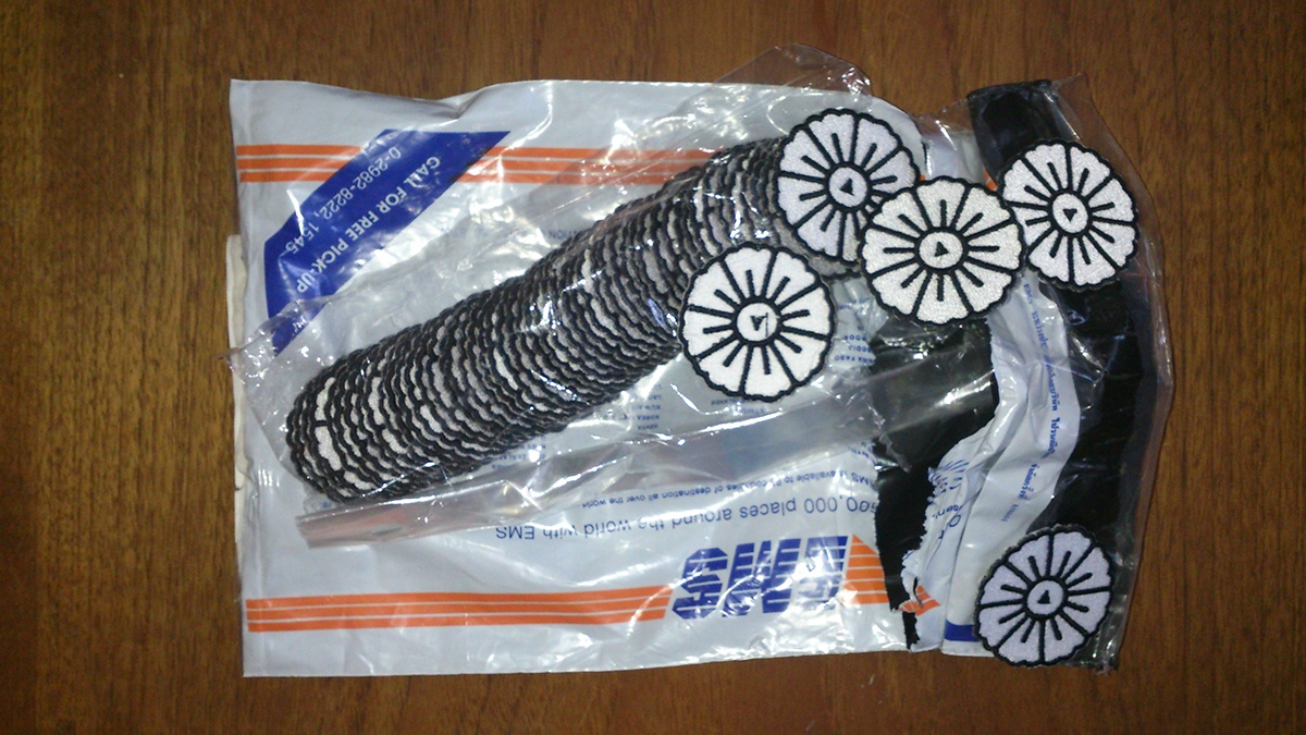
Some clothing patches we ordered.
Some honey decanters we made for the restaurant at the Artist House in Oslo.
A sign to accompany the honey decanters at the Artist House.
And a couple of stills from our crowdfunding video.


Here you can see the whole flick:
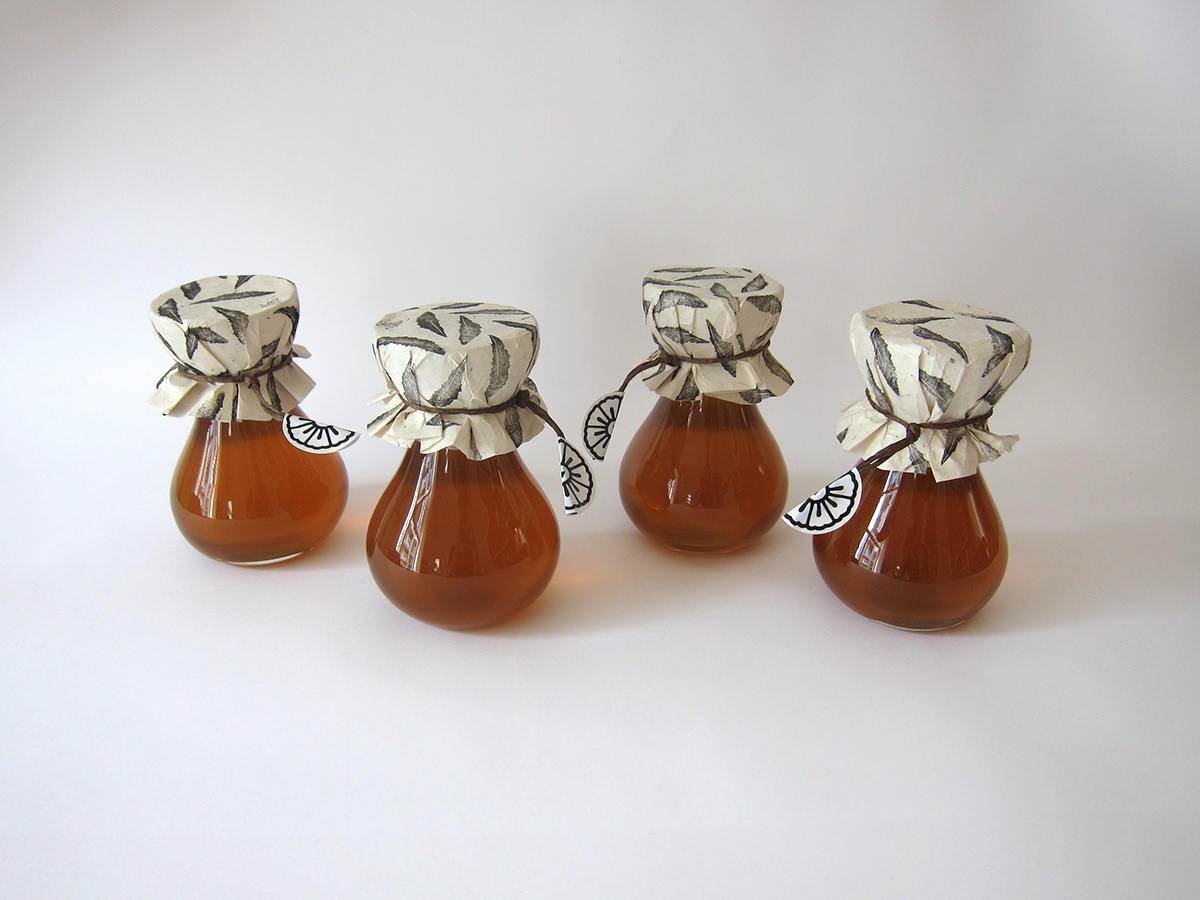
These are the honey jars we send funders.

