Léonie Paris - Storytelling, brand design & packaging
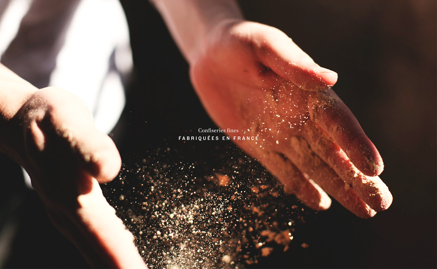
A unique culinary experience between Indian spices and the finest French ingredients.
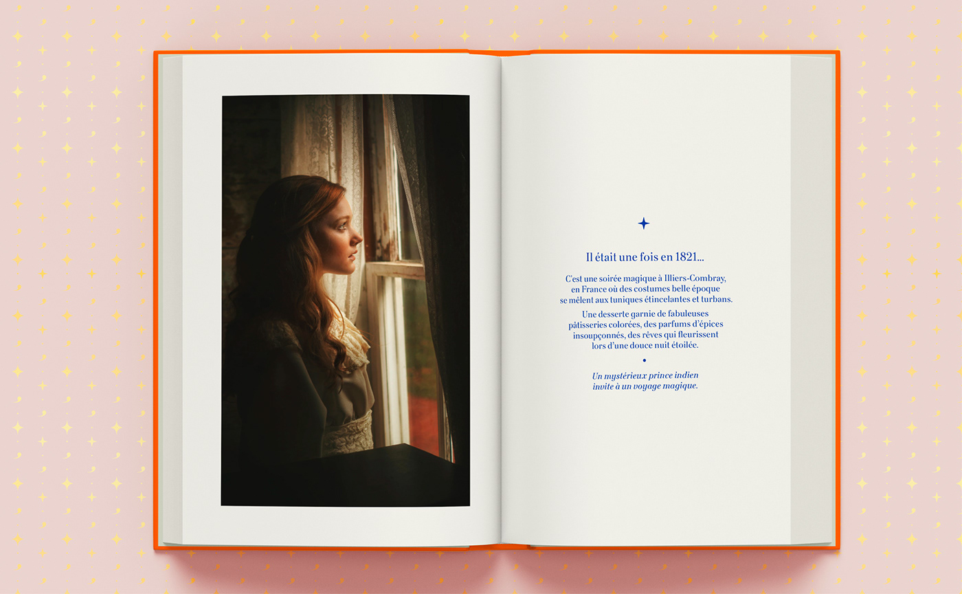
We are in 1821, in the town of Illiers-Combray, France. Léonie Proust is a young maiden, curious with a boundless imagination.
With a prologue that merges reality and fiction - in the pure Proustian tradition - LÉONIE Paris invites us to discover an episode from the youth of Aunt Léonie and her own madeleine of memories.
With a prologue that merges reality and fiction - in the pure Proustian tradition - LÉONIE Paris invites us to discover an episode from the youth of Aunt Léonie and her own madeleine of memories.
“Wrapped in the carefree warmth of a summer evening at dusk, Léonie watches the incessant ballet of carriages arriving in succession from the large open window of her bedroom.
Downstairs, her father, a highly respected businessman, is hosting a reception to celebrate the signing of a contract with a wealthy Indian ambassador.”
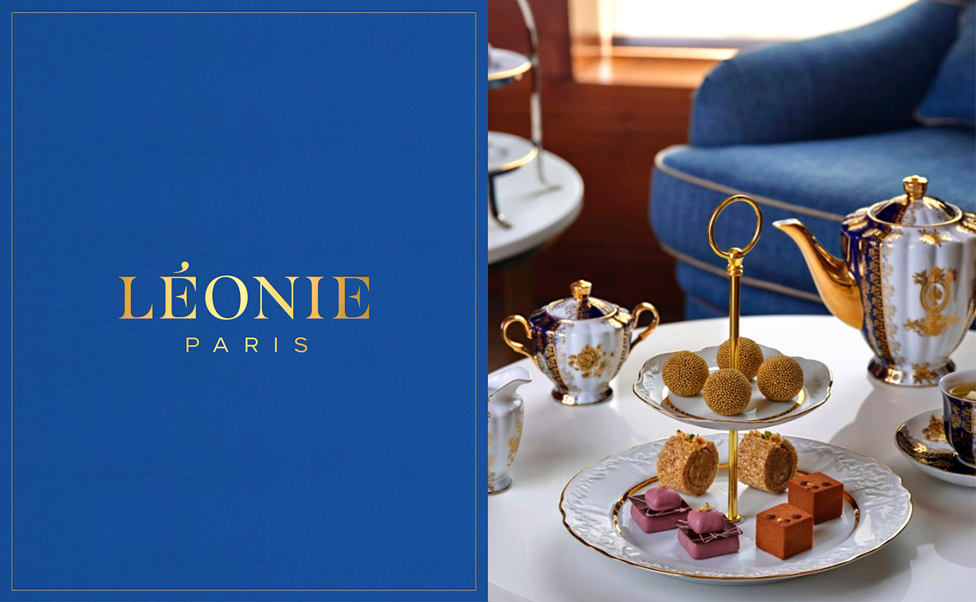
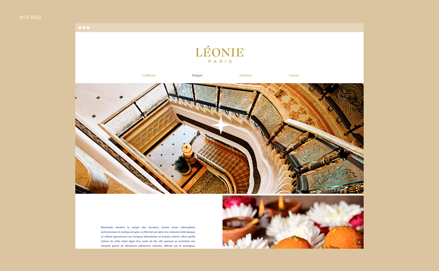
LÉONIE Paris is an astonishing journey that combines traditional Indian pastries and French know-how. Graphéine accompanied LÉONIE in the creation of the brand's stortytelling and visual identity.
“Hiding behind the bannister of the staircase, Léonie inhales the enchanting and exotic atmosphere of the party. The celebration is in full swing, Belle Époque costumes merrily mingle with sparkling tunics and Indian turbans.
As she soaks in this fairytale vision, she notices a platter filled with fabulous colourful pastries offered by their prestigious guests. Intrigued, Léonie manages to stealthily swipe one of the pastries, before tiptoeing back to her room.”


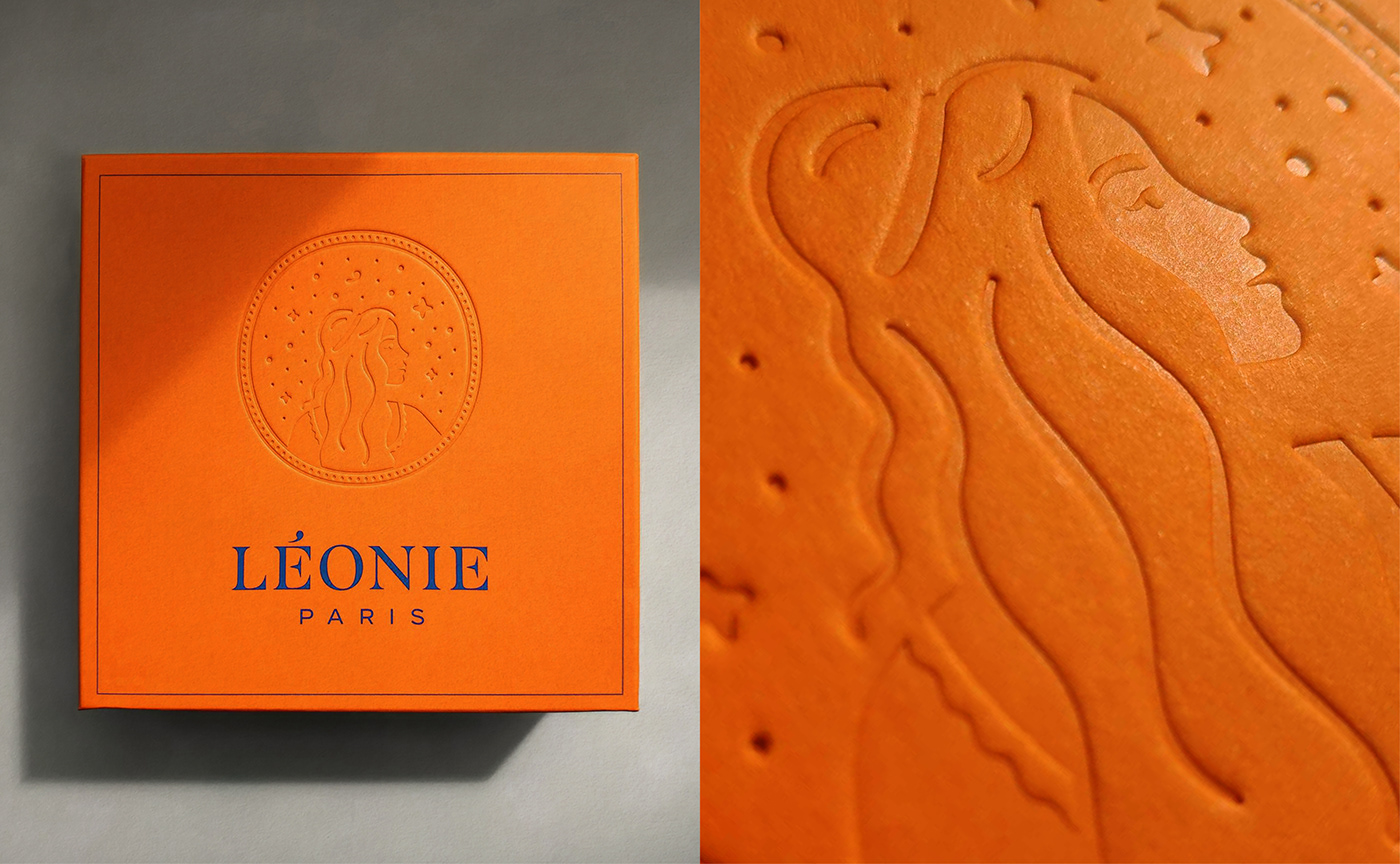
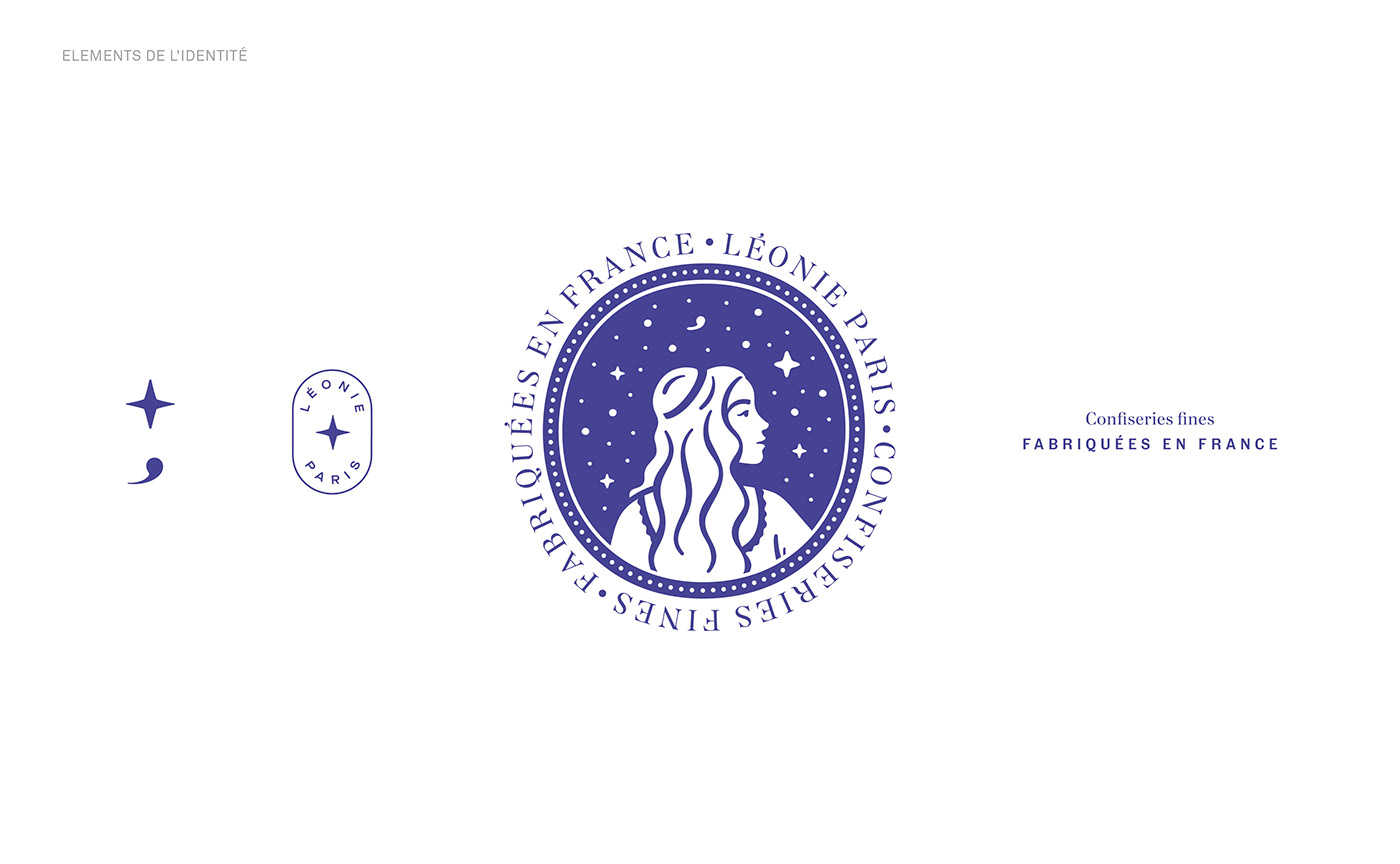
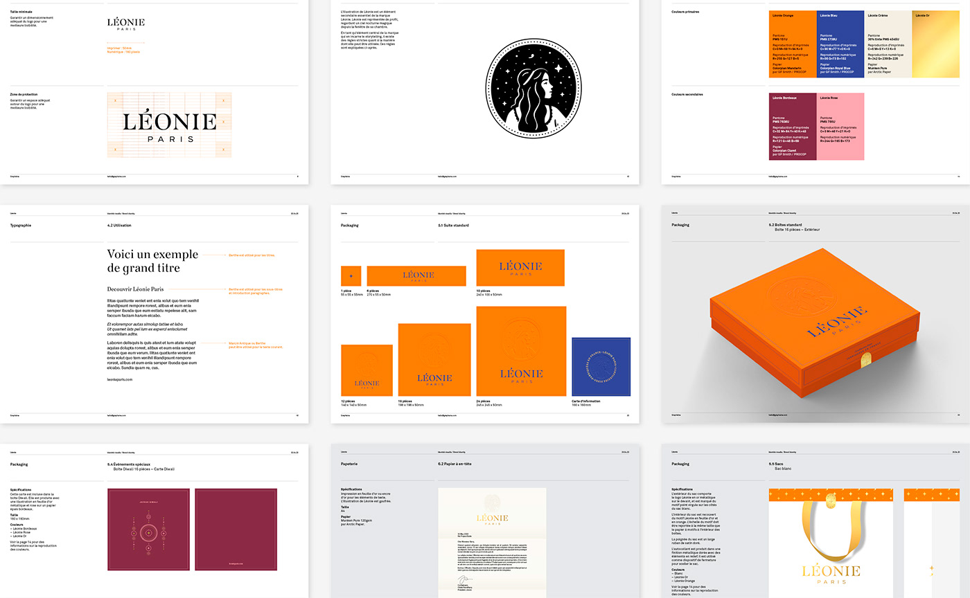
The night sky is the backdrop of Leonie's story. The stars are a strong symbolic element in the visual identity of LÉONIE Paris, and create the link between the story of this festive night and Léonie herself.
This element is depicted in both the stylized portrait of the character Léonie and her word mark. The illustration, an ingredient of the visual identity, depicts Léonie in profile under a starry sky. Its framing and oval shape directly evoke the image of the dreamy young girl standing in front of her window.
This element is depicted in both the stylized portrait of the character Léonie and her word mark. The illustration, an ingredient of the visual identity, depicts Léonie in profile under a starry sky. Its framing and oval shape directly evoke the image of the dreamy young girl standing in front of her window.
“The night has fallen and moonlight bathes Léonie’s room in a dreamy l ight. Once curled up in bed, she takes a delicate bite of the sweet.
Her mind marvels as she discovers its incredible spiced flavours, like promises of a faraway, unimagined land. As she savours her first delicious bite, she falls deeply asleep.”
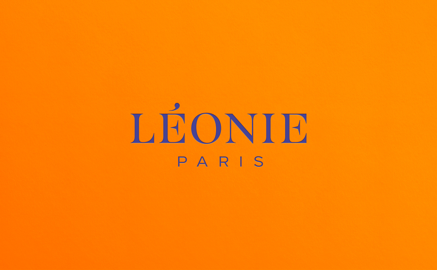
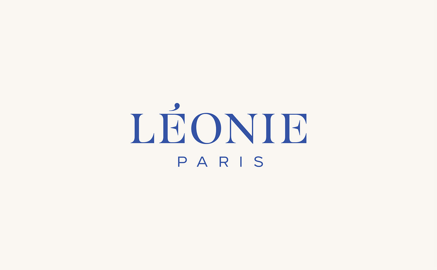
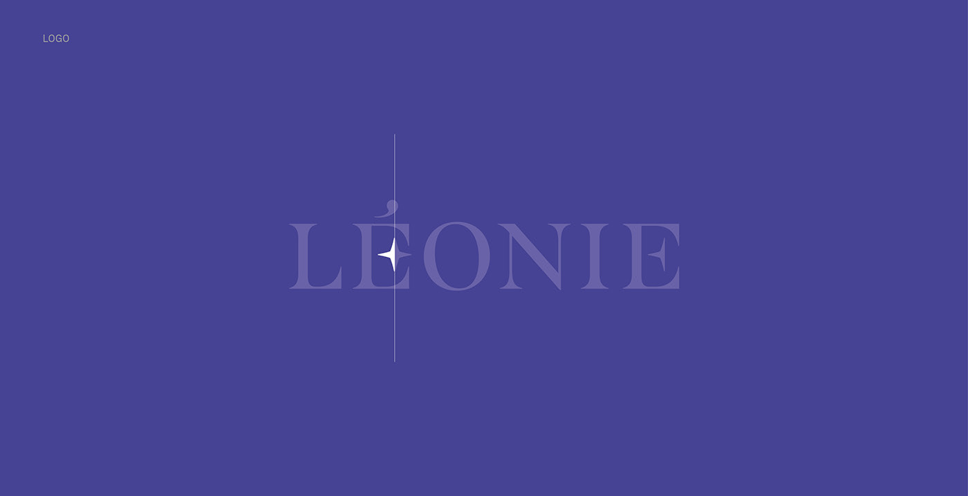
The wordmark of the LÉONIE logo is in the Didone style. This style conveys French elegance and know-how. Its proportions are enlarged to give more presence to the name.


The "É" combines a half moon in its counterform and a star in its crossbar. This trick subtly underlines the typographic finesse and brings a touch of originality. The star in the "É" has been deliberately drawn with angles and not curves so that it stands out in the logo and creates 2 types of stars that punctuate the brand pattern.
The accompanying typeface is Berthe. It is a revival of the "Série n°16 des caractères ordinaires" produced and distributed in 1887 by the Deberny & Cie type foundry. Although it is based on the Didone style, its serifs are even finer and its junctions with the stems are softer for a premium look. As an accompaniment, the Marcin Antique typeface has more character than typical Neo-Grotesques, which makes it an ideal match. Grotesques essentially being Didone typefaces whose contrast has been removed, these two typefaces share the same skeleton while having different contrasts.
“Léonie is suddenly awakened by the melodic sound of bells carried by the night breeze. Before her eyes is the silhouette of a mysterious Indian prince resting against the windowsill. He leans down, smiling at her and reaches out his hand.
His sparkling, musical cape envelops her and it is only then that she realises that this handsome Indian prince is inviting her on the magical journey she has always dreamed of.”
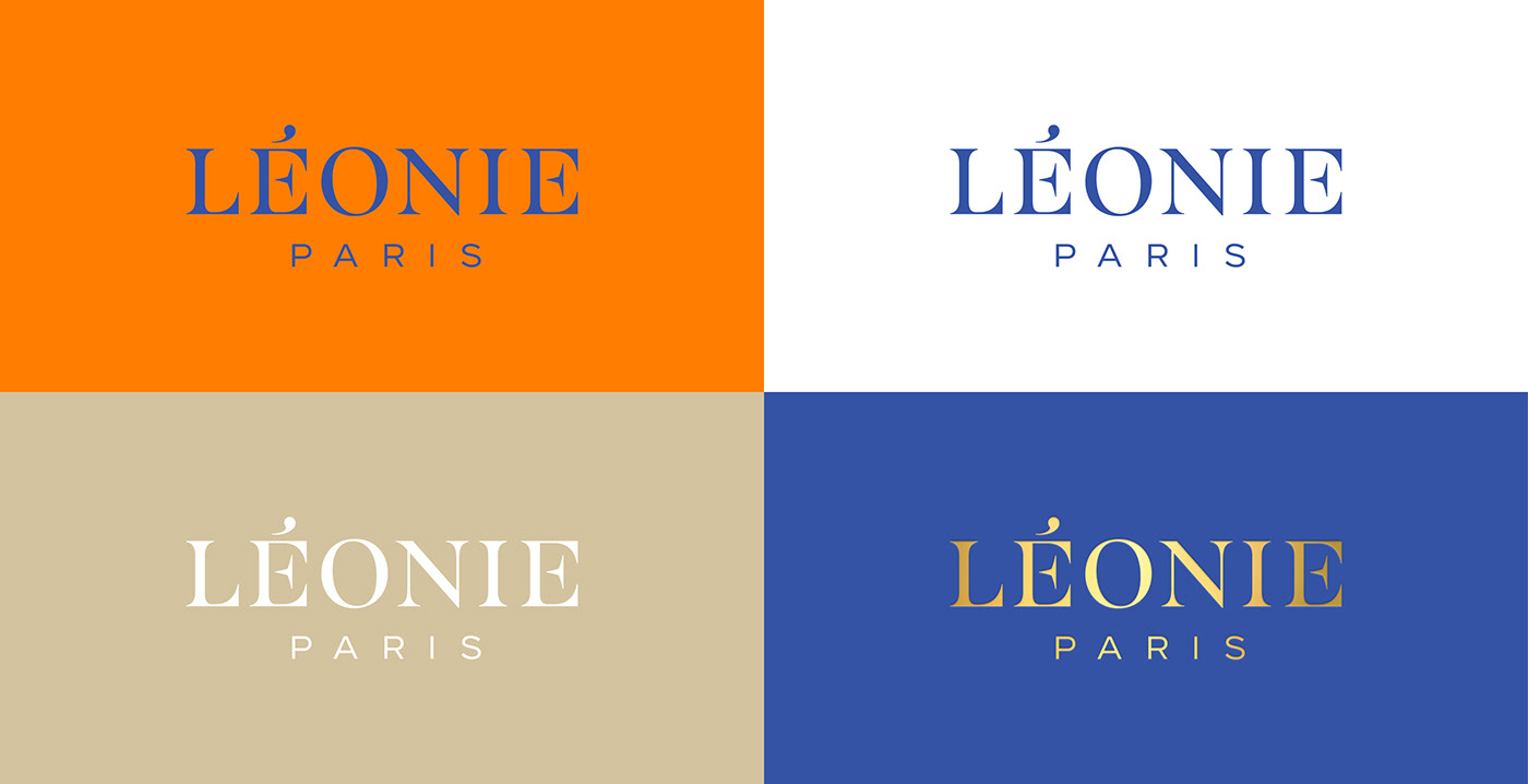
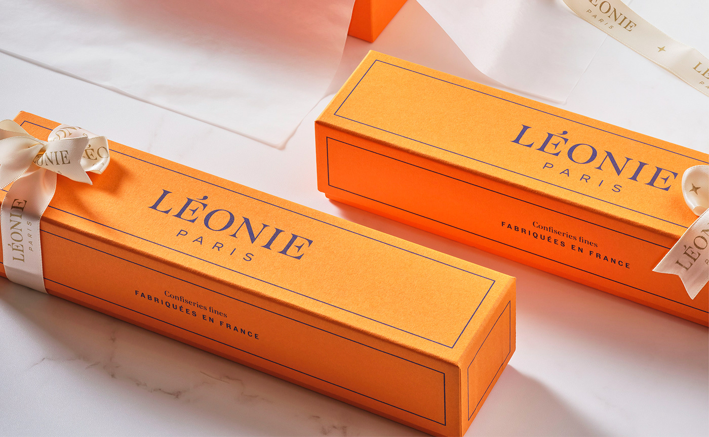
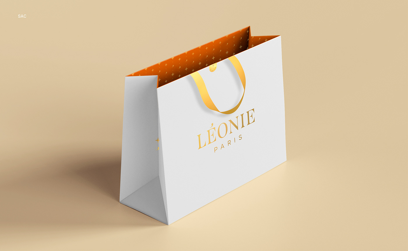
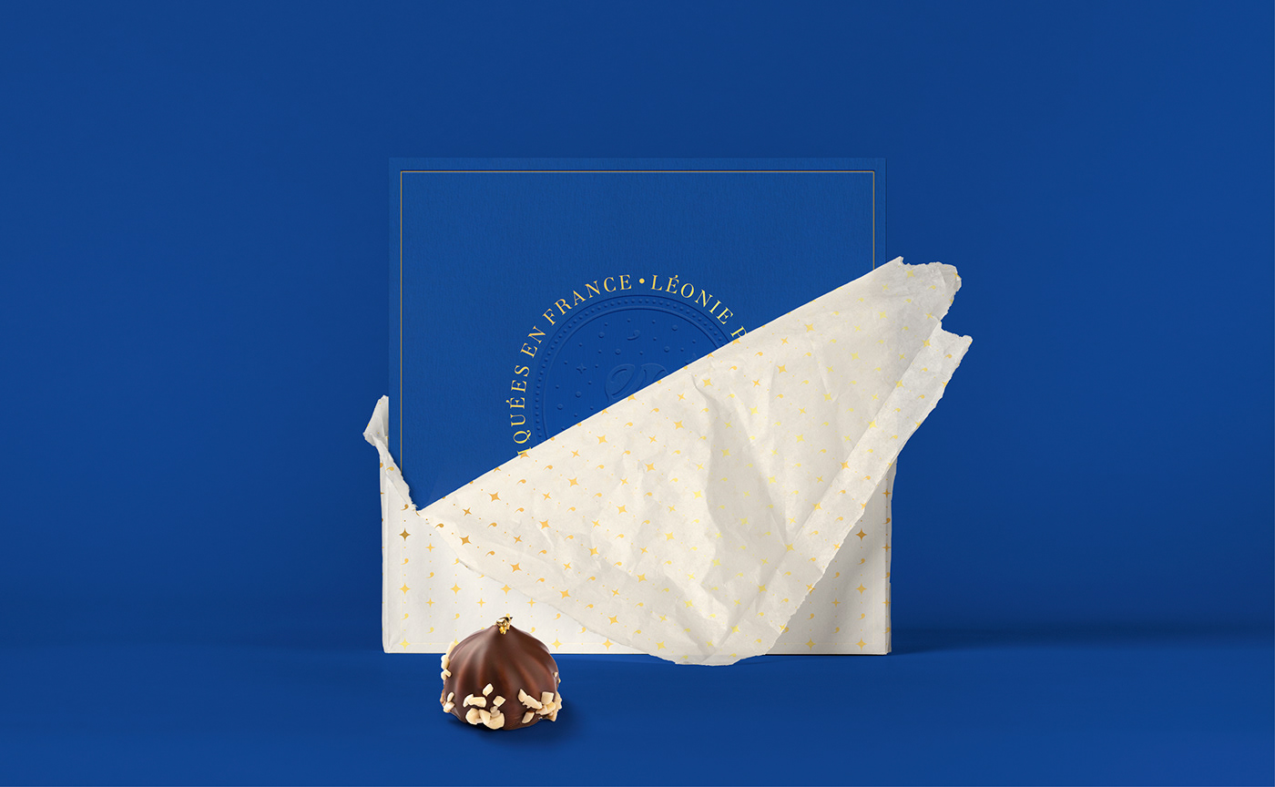
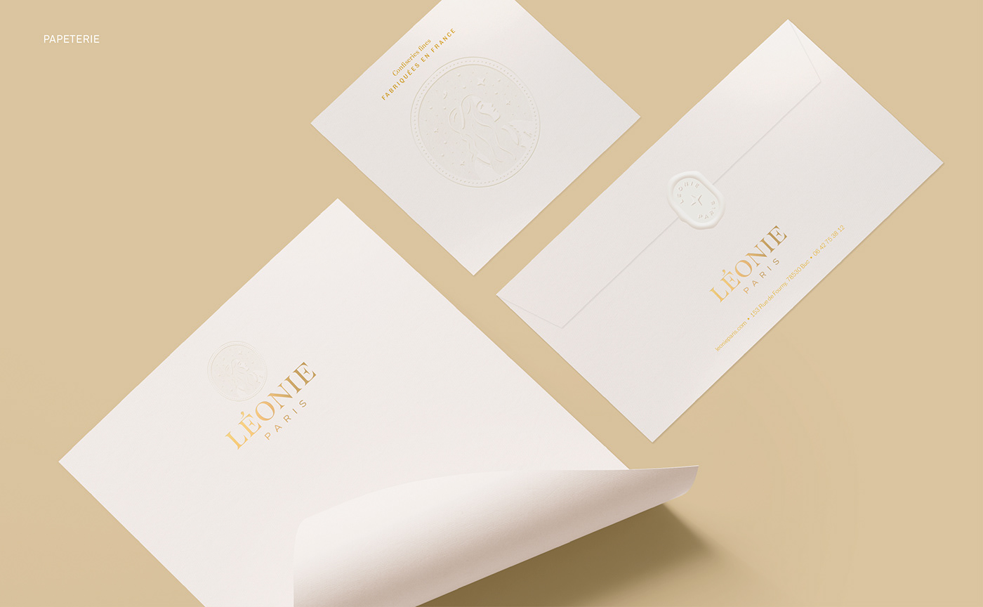
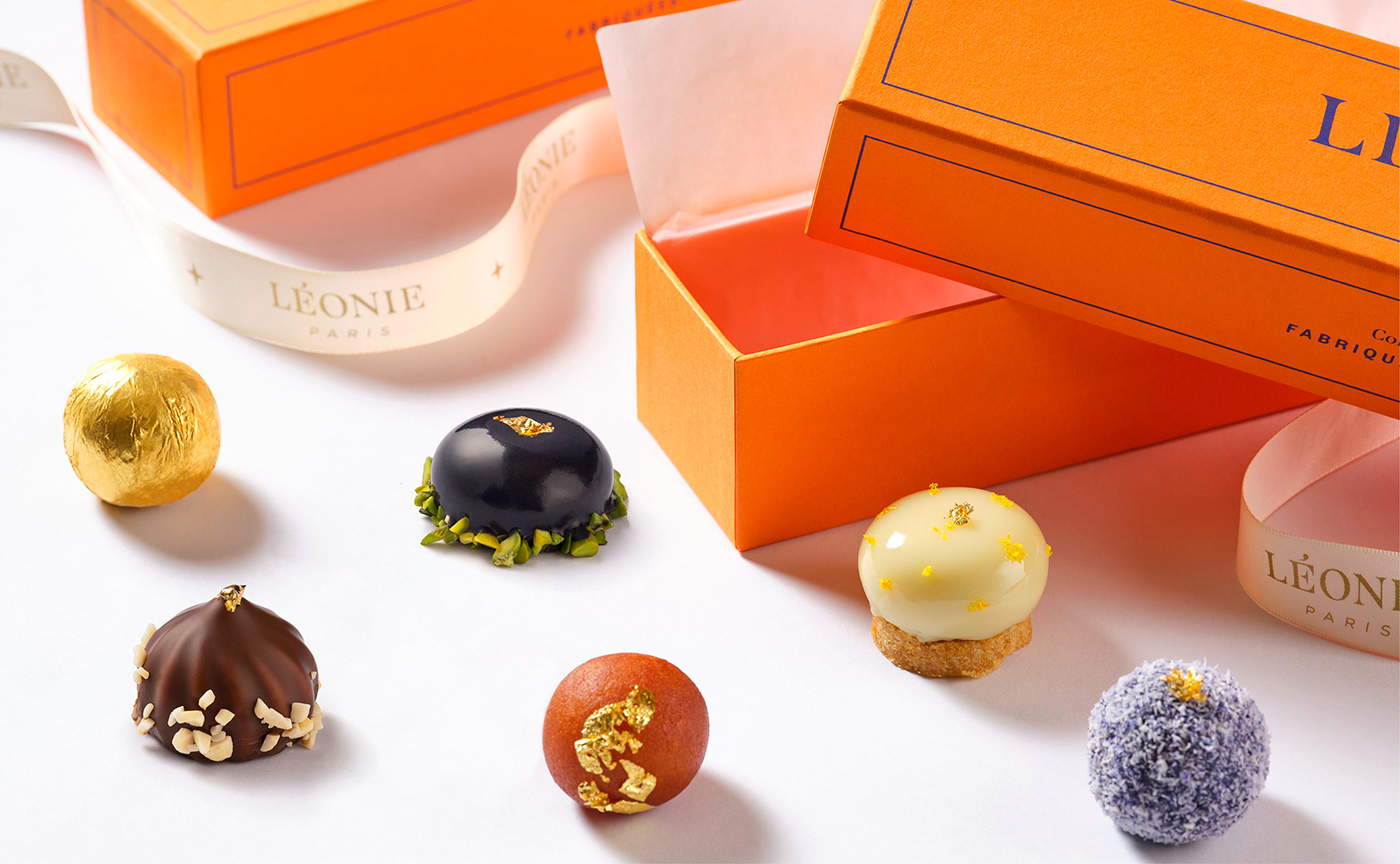
Graphéine also assisted Léonie with the creation of its packaging. The chosen colour palette is energizing and contrasted. The dark blue embodies the starry sky of a warm summer night and the bright, energizing orange symbolises the spicy flavors of India.
The packaging design integrates the different ingredients of the Léonie brand (illustration, wordmark, pattern). It adapts to the different box formats. A meticulous attention to the manufacturing details was ensured throughout the production process. The embossing adds a richness of texture and a subtle vintage touch. Dyed colour papers evoke the clothes of the guests and the night. The hot press foiling recalls the glitter of stars and jewelry. The embossing conjures up the evanescence of dreams. Finally, a satin ribbon closes the box and wraps the pastries like a precious gift.
The packaging design integrates the different ingredients of the Léonie brand (illustration, wordmark, pattern). It adapts to the different box formats. A meticulous attention to the manufacturing details was ensured throughout the production process. The embossing adds a richness of texture and a subtle vintage touch. Dyed colour papers evoke the clothes of the guests and the night. The hot press foiling recalls the glitter of stars and jewelry. The embossing conjures up the evanescence of dreams. Finally, a satin ribbon closes the box and wraps the pastries like a precious gift.


Aknowledgements:
Thanks to Cheke Randharry, CEO of Triomphe and Léonie Paris, Lena Baux, Executive Officer and Communications Officer of Triomphe and Léonie Paris, for their trust and involvement throughout the project. We would also like to thank Céline Schaeffer, Business Development Manager of CNC Packaging, as well as the entire production team for their advice and the remarkable work done on all the packaging elements.


