


Yang
Yang is Ukrainian healthy plant-based foods manufacturer of affordable and healthy snacks for those who value their time and health. My aim was to develop the packaging that will be aligned with the product. They produce snacks and organic food every day. Their tone of voice is equal communication but with respect, they are savage, emotional, modern, honest, they speak in simple and understandable words, they are brave and know how to joke.
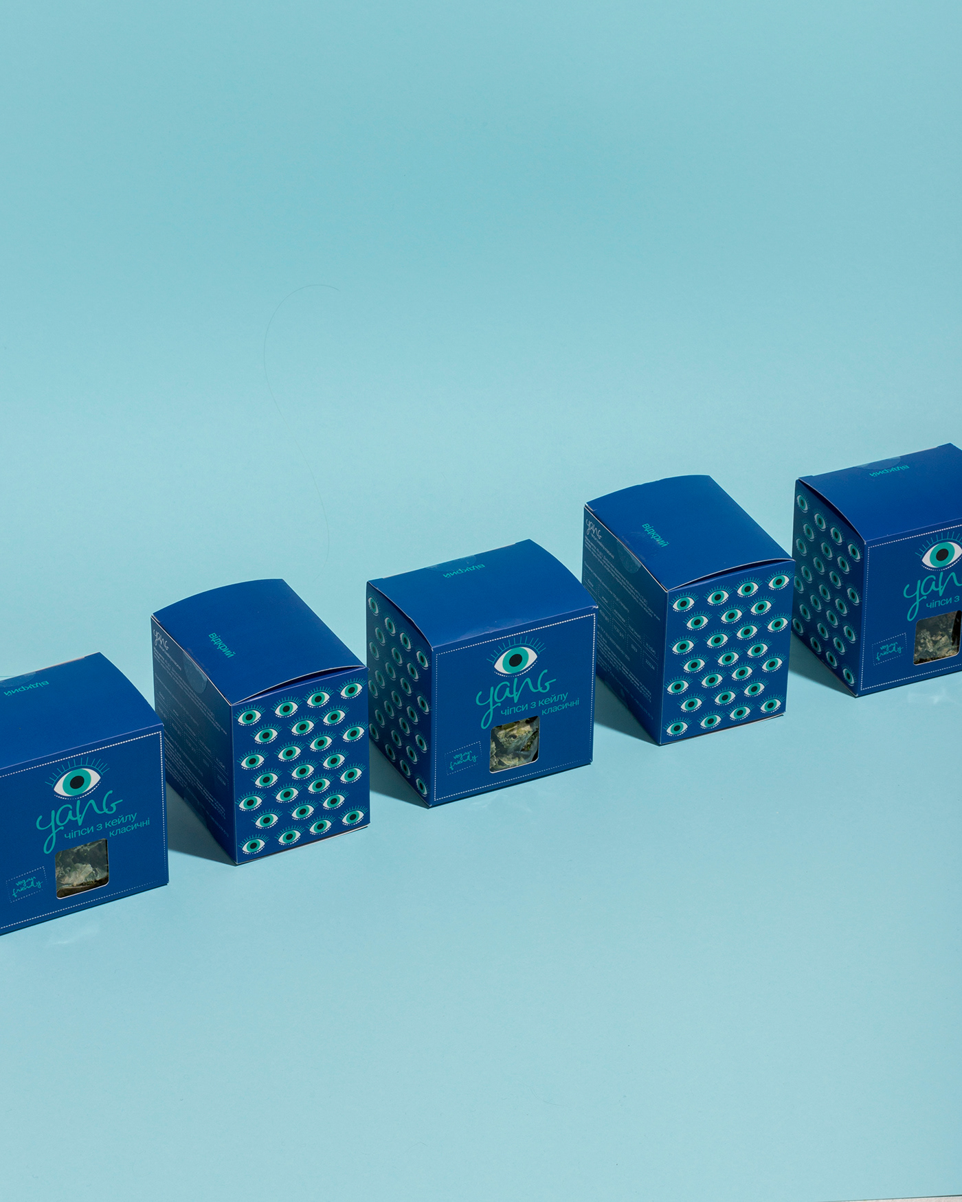
My task was to create a new packaging for completely new brand in Ukraine.
YANG - yin and yang (ONE YANG) - is a symbol of the creative unity of opposites in the Universe.
The logo is the word "YANG" + an additional abstract "eye" logo:
• simple, clear, friendly, youthful
• the eye draws extra attention to itself
• embodies the idea of the importance of communication, eye contact and close contact of the brand with the consumer.
That was going to be modern, simple and timeless. I chose to go for simple design with paper box and propylene bag with food inside. Where snacks itself helps to bring out the colors and some excitement to the design.


Thank you for taking the time
to view my project!
Your appreciation makes me very happy!
______


