
MOBILE APPLICATION
ROLE: UX Researcher & UI Designer
TOOLS: Sketch, InVision, Optimal Sort, UXTweak, User testing
GOAL:
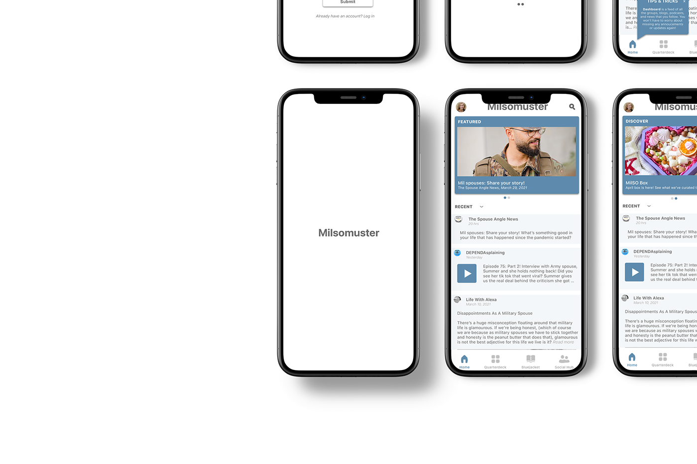
Milsomuster is a social app that targets military family members in creating a safe and supportive community. They have many features like socializing, podcasts, blogs, columns, resources centered around healthcare, base directories, and even MilSO-owned small businesses. The goal is to make informed UI design recommendations that will enhance the user’s experience as they discover resources, content, and interact with other users. The main problem with the existing UI was the lack of engagement and content discovery.
Role:
I worked collaboratively with two other colleagues for five weeks. My role in this project was to research and design wireframes, prototypes, and a UI style guide.
“When your soldier is gone and you’re by yourself, you kind of have to manage things by yourself.. And just having that feedback from other people who are going through the same thing and see what is working for them, really helps.”
Problem Space:
Military spouses (MilSO) are frustrated at juggling multiple outlets for resources and information on their soldier and military life. They rely on social media to connect with the military community and also rely on emails and websites for military base information. They find themselves engulfed in research trying to find information that is relevant to their situation, e.g. permanent change of station (PCS) which is the relocation of the soldier and their family.
User pain points:
1. Overload of information
2. Loneliness and disconnect from soldier and military community
Approach:
We approached this project with an agile methodology, constant collaboration with stakeholders, and improvement each week that we met.
TIMELINE:
Week 1 - Kick-off meeting, business goal briefing, and problem space
Week 2 - User research, UI design audit, competitor analysis, persona, user interviews
Week 3 - Ideation, wireframes, usability testing, 1st card sorting (original IA with military terminology)
Week 4 - Iterations, style guide, user research, 2nd card sorting (civilian terminology)
Week 5 - Handoff of a style guide, test results, and resources.
At our kick-off meeting with the stakeholders, we took the time to understand the business goals and target audience. My team and I began our research into the problem space: looking at potential competitors, design audits of the current user flow, and surveyed existing users about their experience.
Research:
We began with a design audit of the current UI to analyze where there would be frustrations in the user’s journey. I used Heuristic analysis to understand what design elements can cause these pain points during the onboarding flow.

Onboarding flow
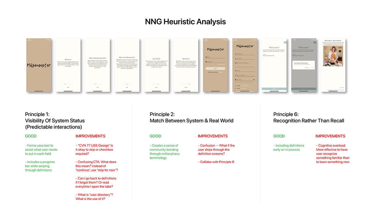
NNG Heuristic Analysis on Milsomuster Onboarding flow
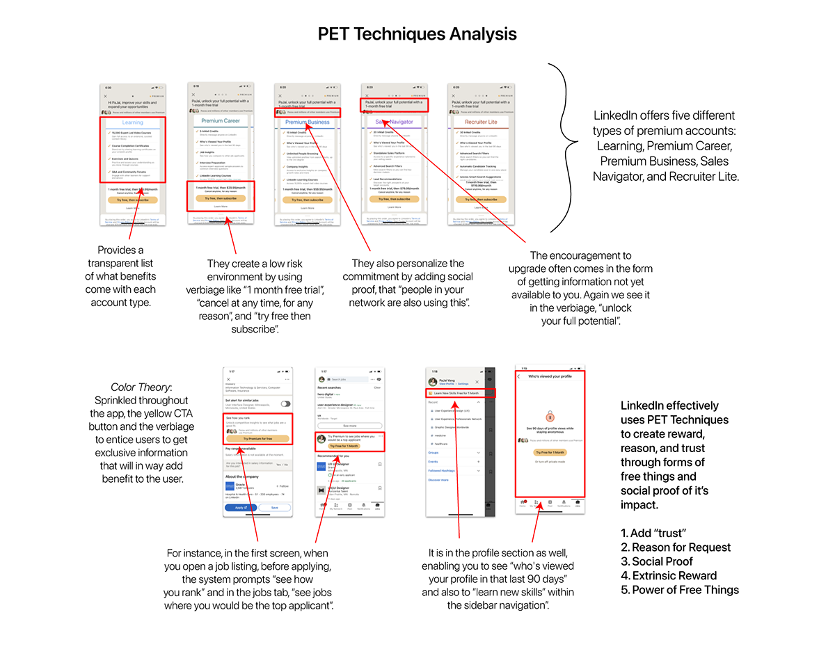
Competitor Analysis
In looking at competitors, our objective was to understand what types of layout and information architecture industry leaders were using. We felt it was important to look at various platforms because of the variety of resources that Milsomuster currently offers. E.g. podcasts, blogs, group chats, PDF links, columns, website links, and maps.

Behance watch tab and Facebook groups
Our hypothesis was “users don’t see enough information to decide to discover the app”. The competitor that I analyzed was LinkedIn. I looked at the PET Techniques they currently use for their mobile app.
Testing Round 1:
User Survey
We conducted surveys and interviews as user research, to get insight from new and existing users. The objective was to understand what information they find valuable and what they hope to get from using the app.


User survey #1 results
Persona
Through user research, we found the top priority was to connect with other people to share experiences. The second priority was utilizing resources. With this information in mind, we created the following persona:

Persona
Card Sort Test
We ran a card sort test to learn how existing users are understanding how information is organized. We used cards from the original navigation to see if users understood what “Dashboard”, “Quarterdeck”, “Bluejacket”, and “Social Hub” contained. Our research found that most of the participants placed the cards mostly in “Dashboard” and “Social Hub”. There was about 55% accuracy, our hypothesis was new and existing users are unfamiliar with terminology -- expressing cognitive overload.

Design:
During ideation, we developed solution ideas that could positively enhance the user’s experience as they discover content and engage with other users. We looked at layout ideas that followed the F-scanning pattern. We also looked at ways to elevate CTA buttons to get users to listen to podcasts, read blogs, chat with other people, etc.
Our card sort test showed people did not know how to get to certain pages so we wanted to test out a sub-navigation bar that introduces a clearer hierarchy in information.


We synthesized the feedback from the card sort test, competitor analysis, and user research to create the following wireframes to do usability testing. I was in charge of the onboarding flow and “Dashboard”.
For the onboarding flow, our research indicated that users value personalizing content fit to their needs and want, so we introduced a new task that asks a user to input what they are interested in. I also expressed to stakeholders the purpose of onboarding is to get users to sign up and into the app. With the current numbers screens they need to go through, I hypothesized that users can become uninterested by the time they reach the dashboard. To expedite the user to see content, we decided to test “tooltips” to see if users can get through tasks faster and increase information retention. Going into usability testing, we hypothesized users would be inclined to explore more because there is more content to see.


Testing Round 2:
Usability Testing
With our first set of wireframes, we reached out to people who fit our persona to do usability testing. We had a total of 5 participants, ages 23 to 50 years old. Each participant was either a military spouse, family member, veteran, and/or active duty member.
Usability Findings with Onboarding and Dashboard:
1. All participants liked the color blue.
2. A few participants offered using army green.
3. Most participants worried about disclosing too much information with the form, they hesitated with questions relating to location and biography.
4. All participants were interested in communicating with their soldiers and connecting with those who share the same experiences.
5. A few participants found the text was too small.
6. Tooltips were not seen immediately.
7. Most participants clicked through the tips and did not read them.
8. Participants wanted to scroll and click around immediately.
9. We found that users didn’t care much about personalizing their newsfeed to these topics: lifestyle, cooking, saving money, etc. They cared more about personalizing their experience to fit the military branch/unit they were affiliated with, e.g. Army, National Guard, Marines, Navy, Air Force, etc.
Card Sort Test
We presented our findings and were informed that our client had switched developers and are beginning to implement the research recommendations and designs of our first set of wireframes.
We decided it would be a good idea to conduct a second card sort to see how the new IA compared to the first card sort. We hypothesized that there would be an improvement in categorizing the cards. The results came back to 72% accuracy, increasing from the first card sort test. This was because we omitted terms like “Bluejacket” and “Quarter Deck” that were too exclusive to the target audience.

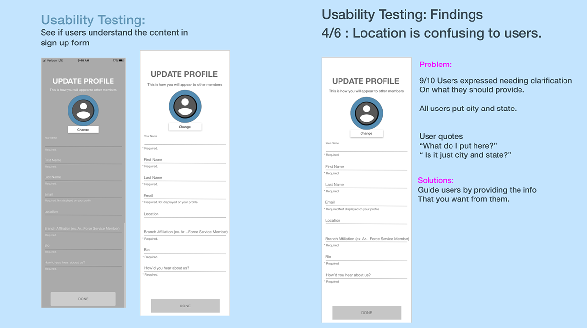
User Survey
We also conducted a second round of user surveys to understand how other people felt about the form questions, specifically when asked about location. This was especially important to stakeholders as it allows users to connect locally and enhance the connection to a real community. Location is also a touchy subject when it comes to the military as it can breach operational security (OPSEC) policies.
Our survey results proved participants experienced decision paralysis because the question is very open-ended. The main confusion was about the formatting of your location, e.g. state and country vs. city and state. When presented back to stakeholders, we suggest having location as an optional field versus required, to accommodate users who do not trust the app yet. Introducing the location field again later in the journey will allow users to trust the app more and comply easier.
Solution:
Military families experience information paralysis with the current military community. Milsomuster aims to be a “one-stop” resource for everything from socializing, how to handle deployment, healthcare, relocation, to even base directories. Within the app, the problem was poor visual design and disorganized information architecture (IA) which lead to overall low engagement.
To solve this, we developed a new IA system that adapts functional labels where users can recognize where content is housed. Our design decisions were centered around creating a social platform since "community" is the top priority. We wanted to highlight a newsfeed feature and civilian terminology to enhance socializing and sharing of information.
Our final deliverable was a UI style guide. It contained updated iterations of our wireframes as well as principles and suggestions to consider within the mobile space like layout and eye-tracking patterns.


Learning:
Learning needs and wants of the target audience.
It was interesting to see how our hypotheses evolved. There were some moments of enlightenment when the data came back to show there was a slight variation, e.g. thinking users wanted to personalize content with topics like cooking, lifestyle, and crafts, it was more of wanting to personalize with their specific military branch/unit.
Client working with a third-party developer.
Because our client was working with a third-party developer, they had templates and styles to adhere to, so we had to understand our contributions were not going to be seen end-to-end.
Constant goal changing - being flexible - revising timeline and deliverables.
During our kick-off meeting, our client expressed the need to improve the conversion rate from free membership users to premium users. After listening to their concerns, our plan of execution was to first understand the target audience, the current flow of the app, and see what other subscription service providers are doing. Our research showed that most users did not know how content and incentive is different with a free membership vs. premium membership.
At our next meeting, we found that our client had done their own research with investors and had already dropped the goal of converting users to premium. They proposed a shift in the business goal and this affected our timeline and deliverable but overall the goal was still to increase the user’s engagement and improve the information architecture.
The design thinking process was not linear.
There were moments where we had to adapt and find what part of the UX process was more appropriate. For instance, towards the end of our timeline, instead of doing a second usability test, we chose to do a card sort and user survey. We did not have a lot of time left for the project and recreating a prototype from their developer would have been too time-consuming. Instead, we felt it was more important to validate their new labels and architecture to see if there was evidence of incremental improvement. Moving forward if we had more time, I would love to do another usability test to understand what other improvements we can make to the UI.


