


COFFEEPRO
One of the Poland's first speciality coffee roastery got a little bit rusty. It's time for a new chapter.
*
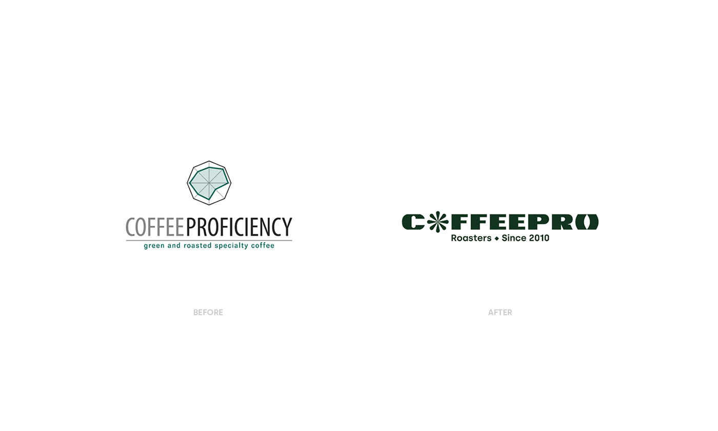
In late 2020 we partnered with Coffee Proficiency to work on the new visual identity for the brand. One of the oldest roastery in the Poland's market needed a fresh, new look - one that will emphasise innovation and uniqueness that were always in the core of the brand but now got a bit dusty.
*
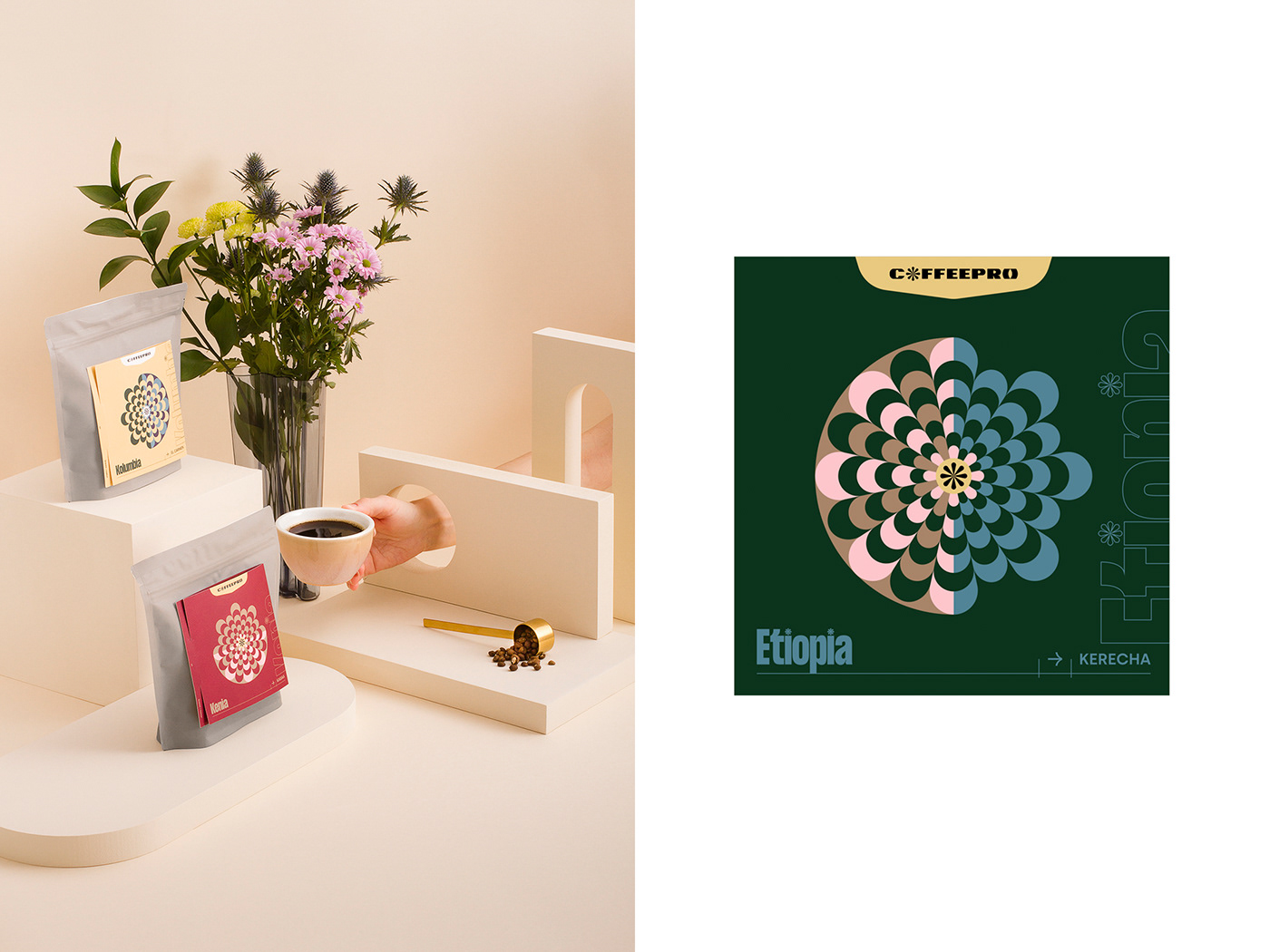
We created a completely new, colorful and bold visual language based on the Polish design tradition with references to coffee origins and sharing knowledge of the craft.
The first task we were about to face-off was naming and the logo. Obsolete typography and mark had to go and make place for a concept that will serve for years. Coffee Proficiency became COFFEEPRO.
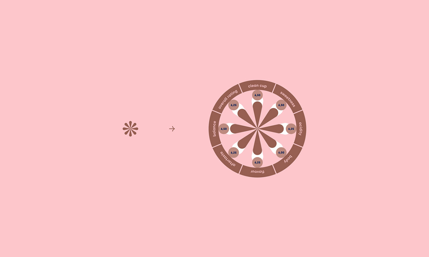
The mark was inspired by coffee plant, the sun and asterisk symbol that stands for passing knowledge.
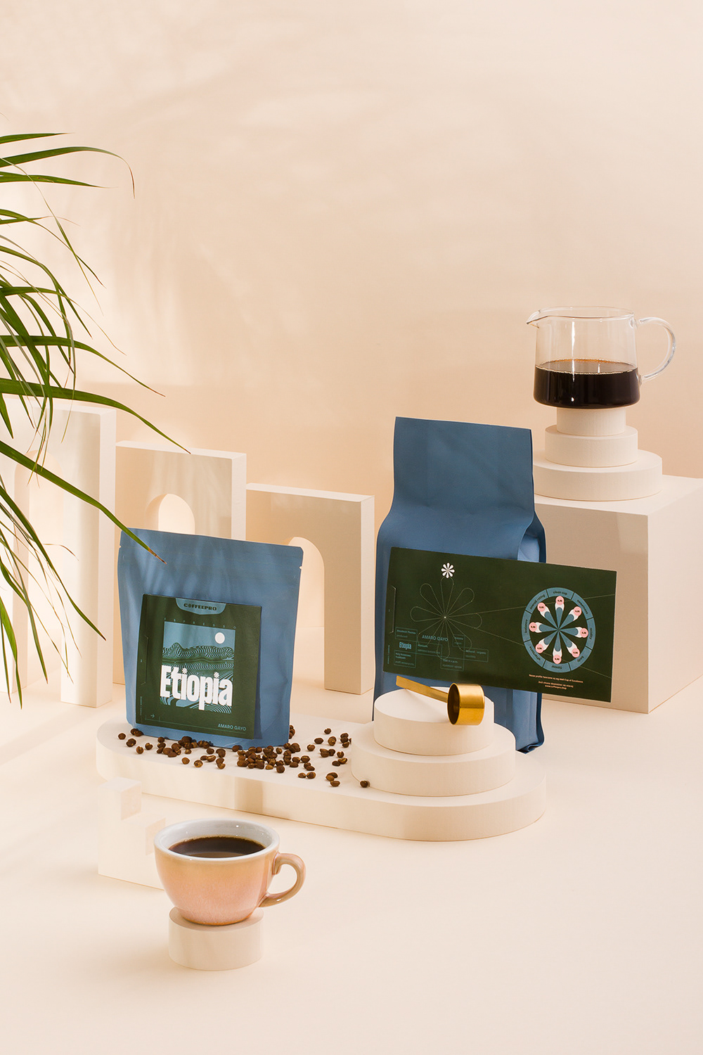
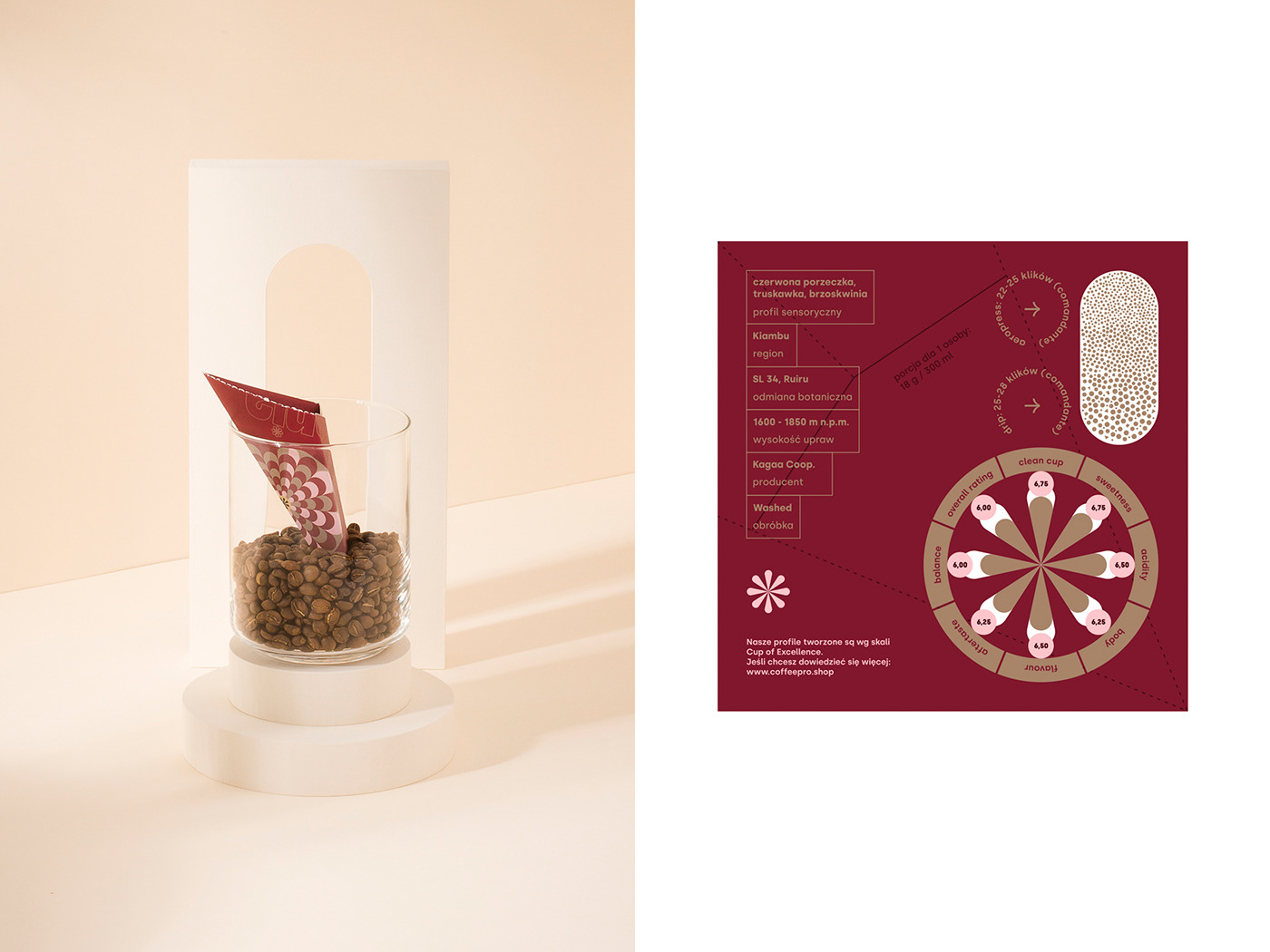
The characteristic graph was strongly identified with Coffee Proficiency before. It appears on judging cards during the cupping proccess and helps define the best coffee among all others. We wanted to keep it but on our own terms.


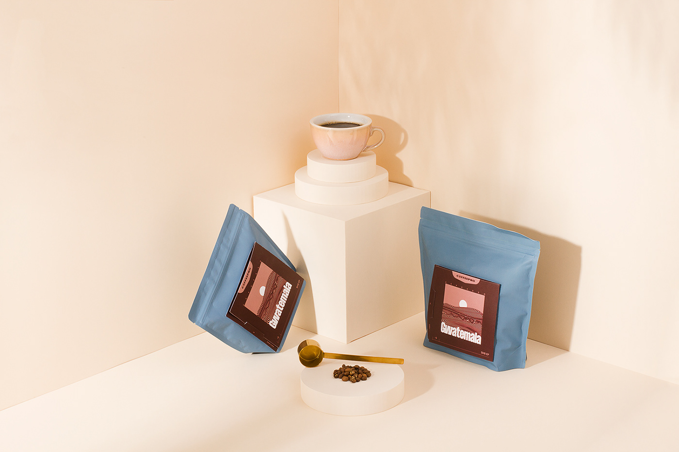
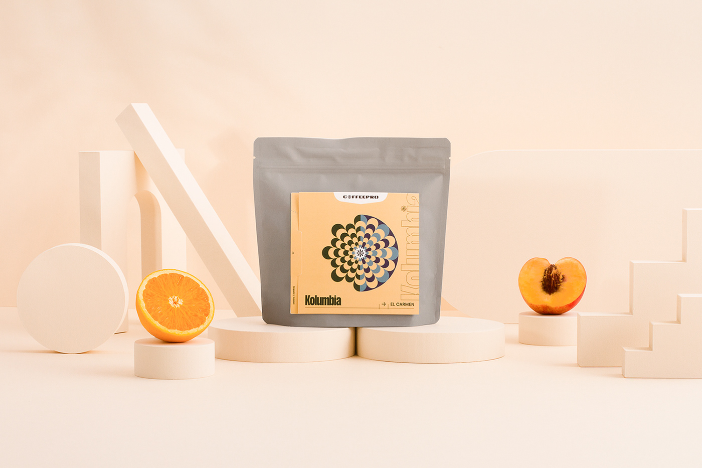
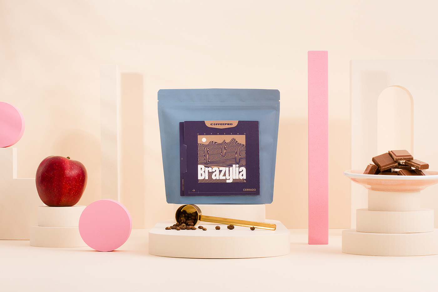
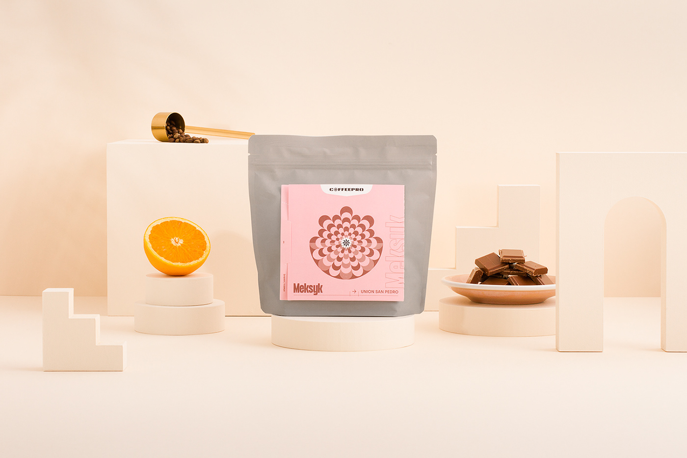
The mark was also the foundation for the filter coffee label design.
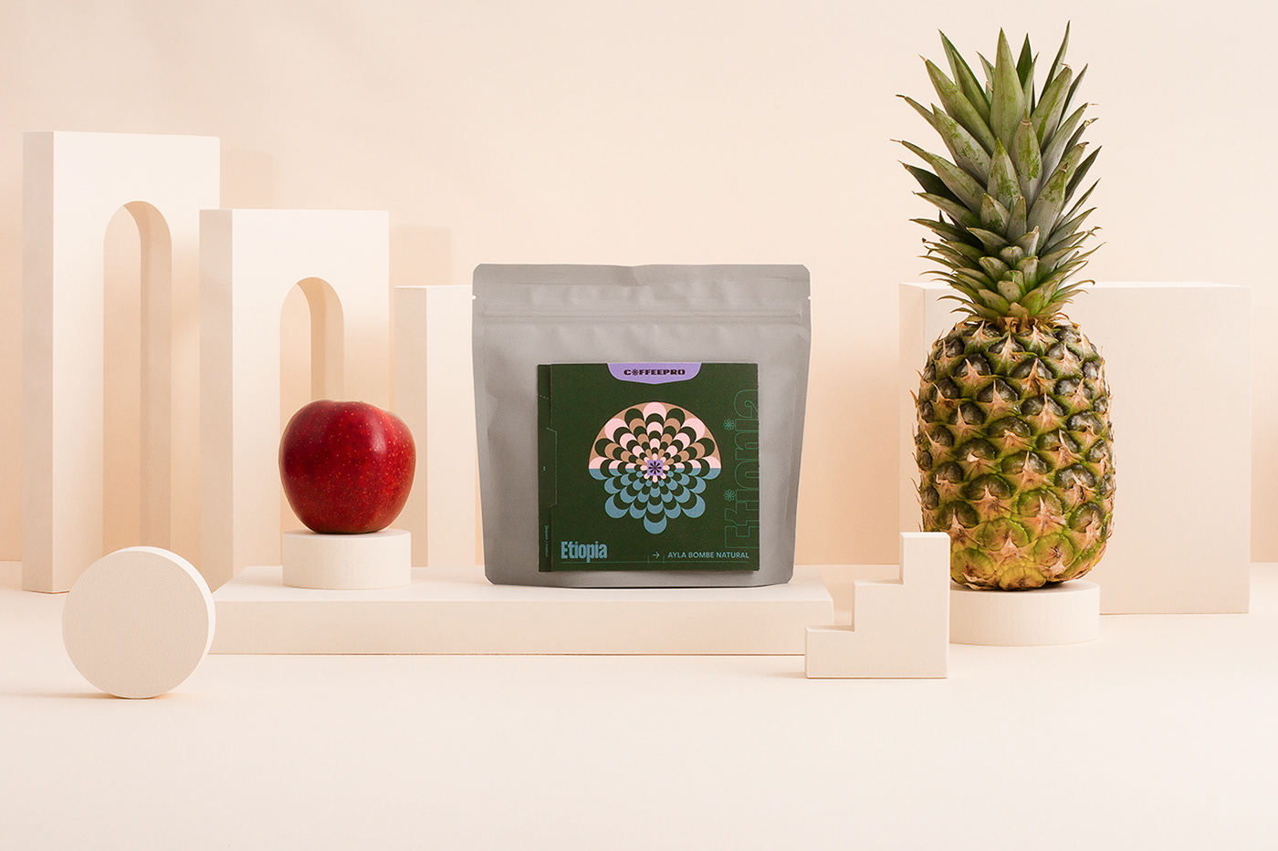

To distinguish espresso labels from the filter we decided to go with minimalistic plantation landscape illustrations and blue packaging.


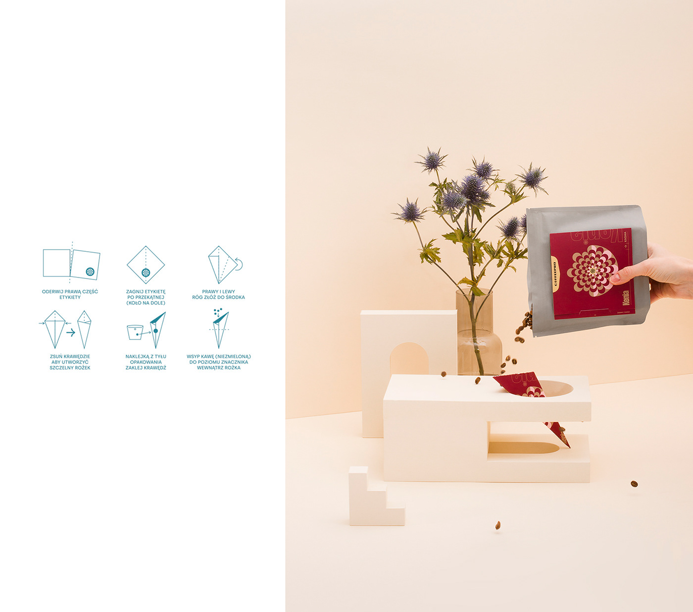
Less waste and eco-friendly policies are very important to COFFEEPRO. That's why we use zero emission packaging and special paper with potato starch. But can we do more?
We figured out the alternative use for the label. Now it can become a tool for all the beginners to help them measure exactly the right amount of coffee and also guide them for the perfect grind. You don't have to throw it out.


Thank you for watching!

For more projects visit instagram.com/ill.cat


