Client
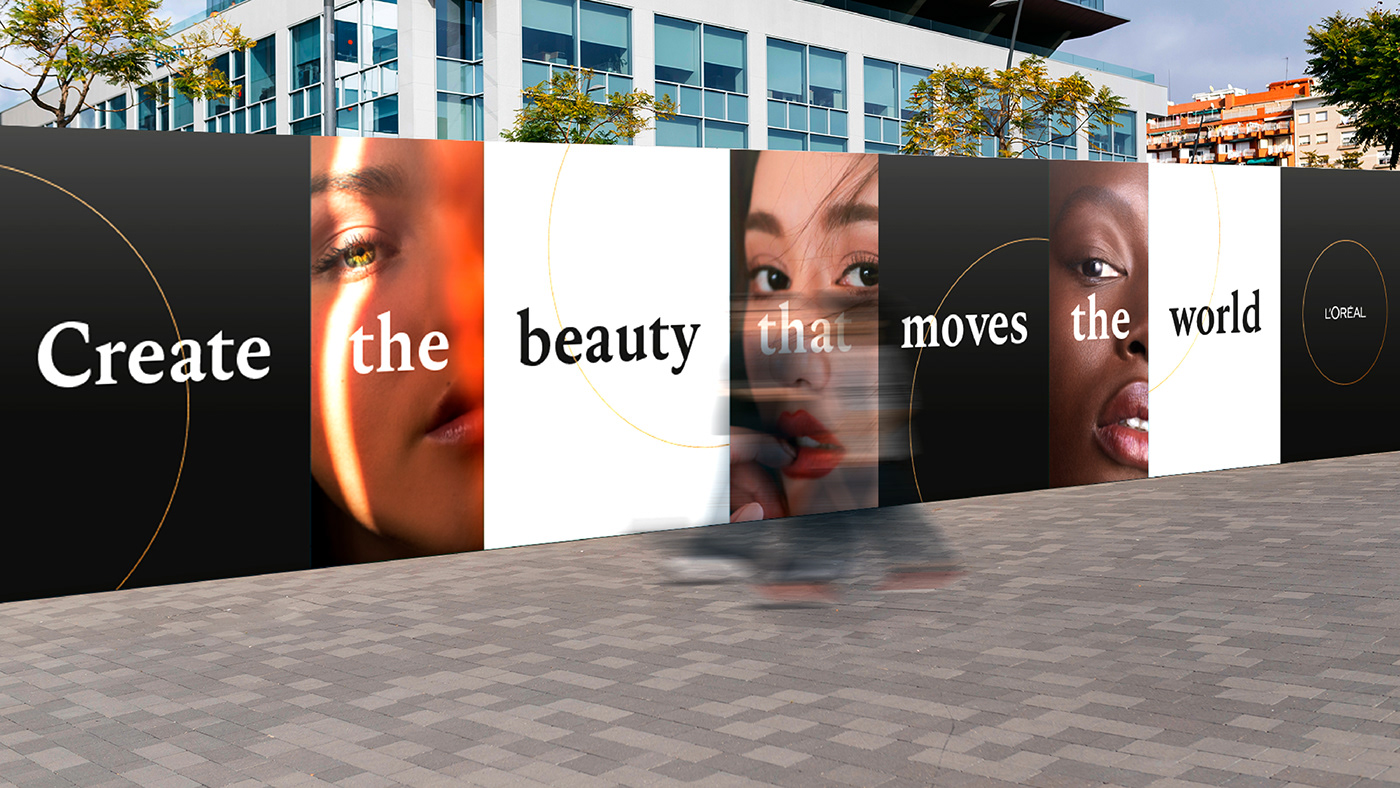
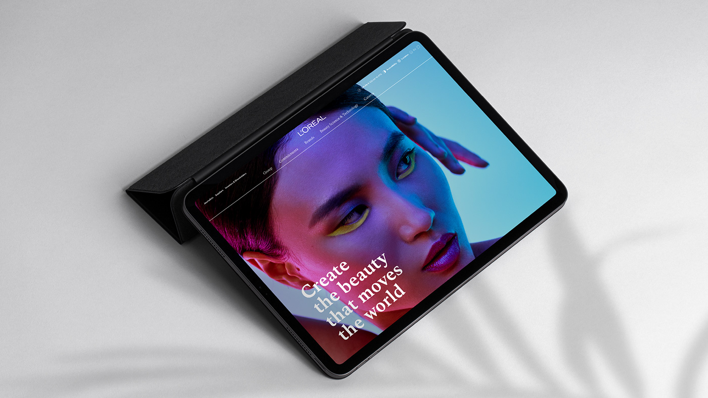
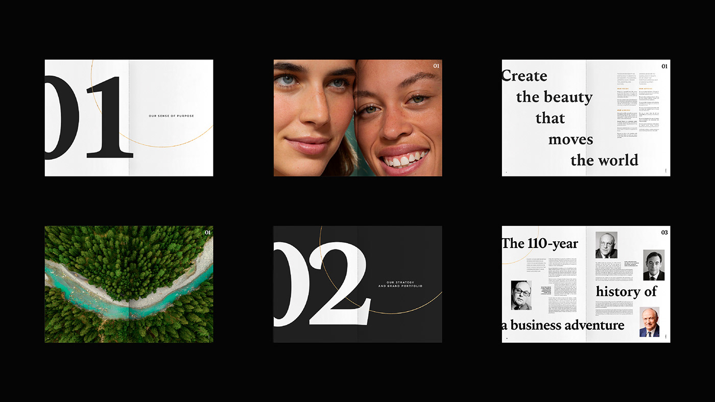
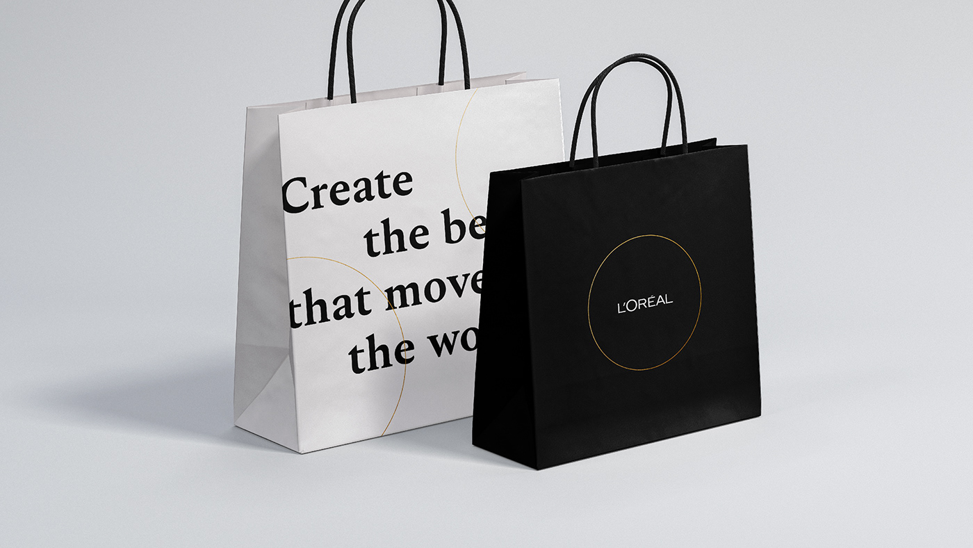
Create the beauty that moves the world. A newly crafted purpose, yet one that rings true for the 110 years L’Oréal has been championing beauty. With a portfolio of iconic brands, one of the world’s most powerful R&D and a presence across the globe, L’Oréal is the most diversified, transformative and diverse beauty company.
Challenge
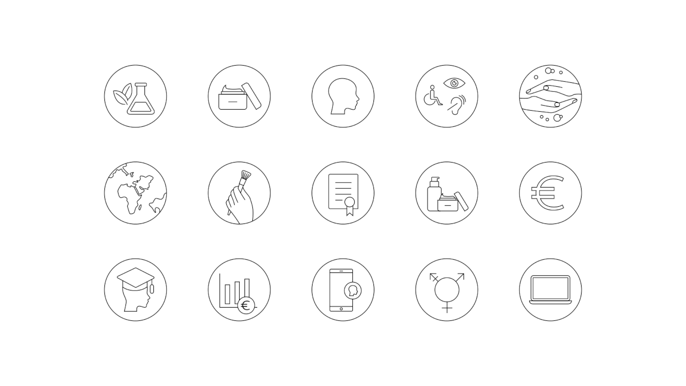
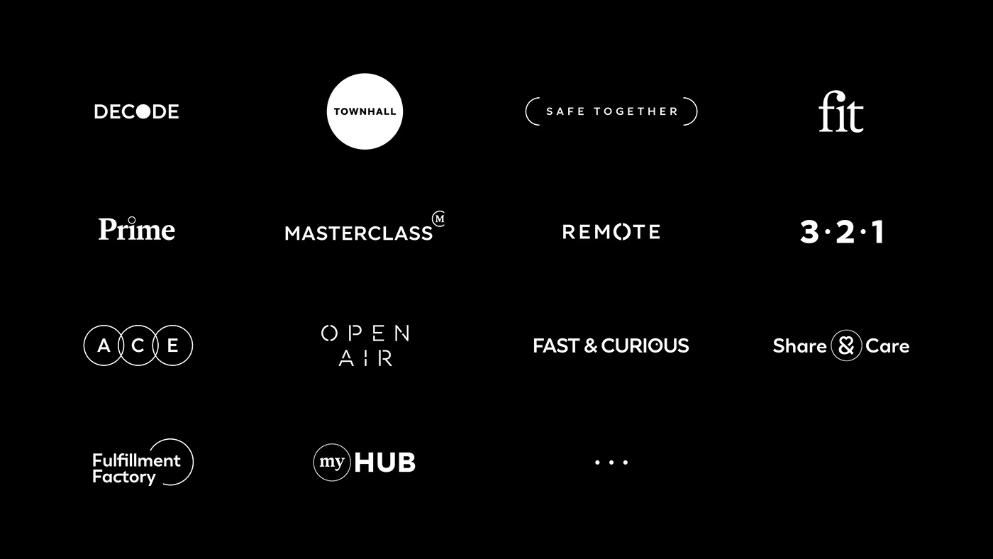
L’Oréal takes pride in recruiting strong creative and entrepreneurial minds to drive the business successfully. This also resulted in a myriad of heterogeneous identities throughout the different entities. Our challenge was to unify the teams’ visions and deliver an impactful, easily activable corporate brand while leaving room for every team to express themselves. We needed to safeguard the diversity of the people while encapsulating the power and the complexity of the purpose that unites them.
Solution
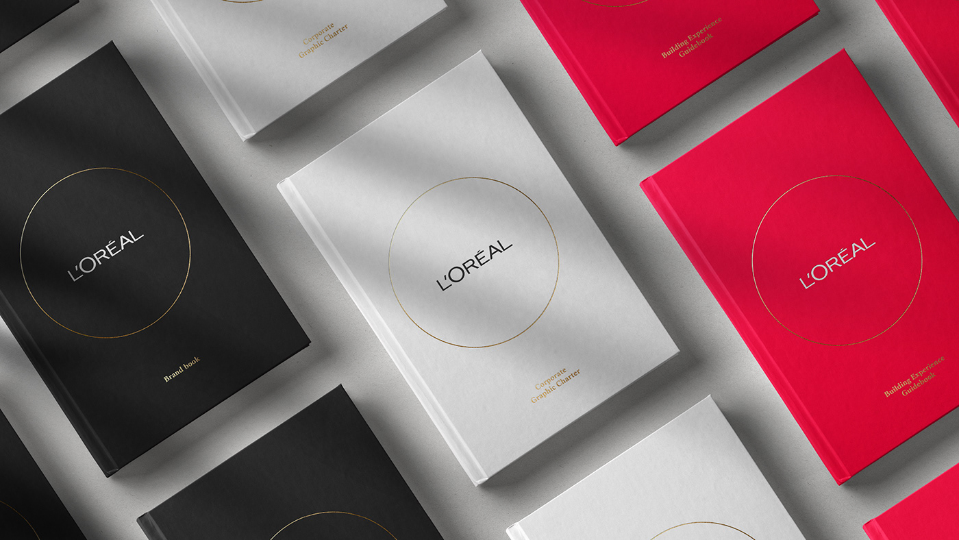
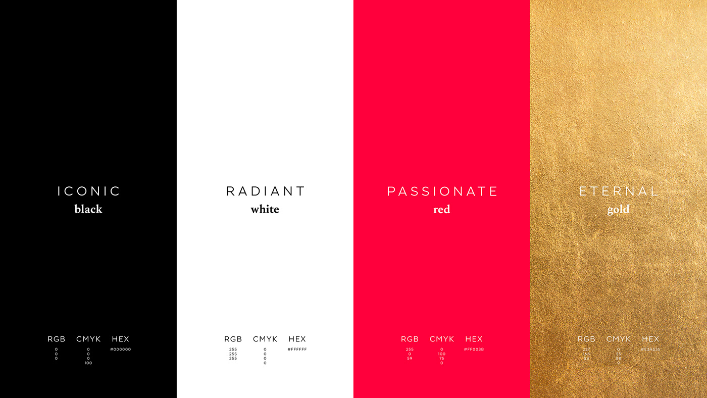
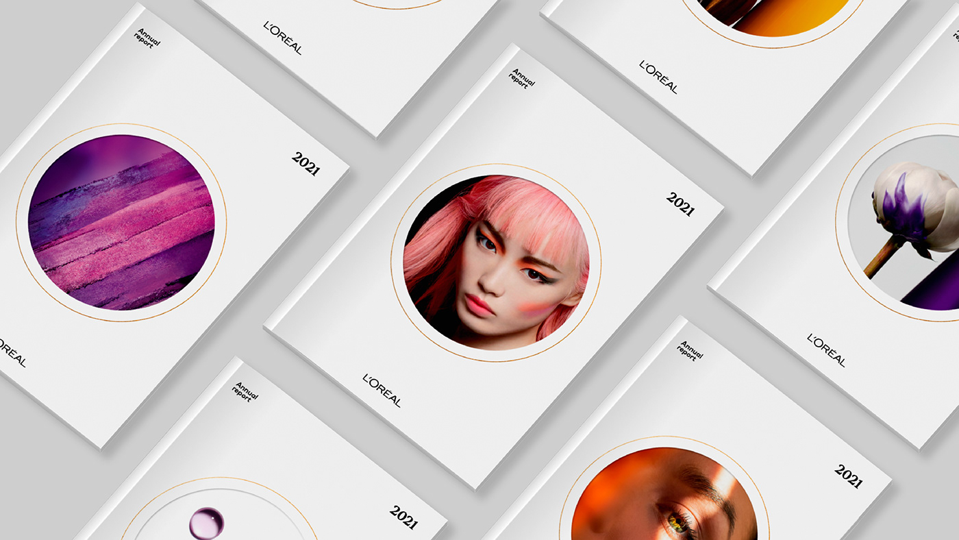
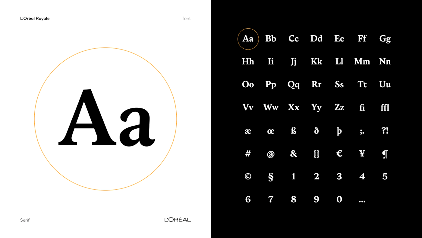
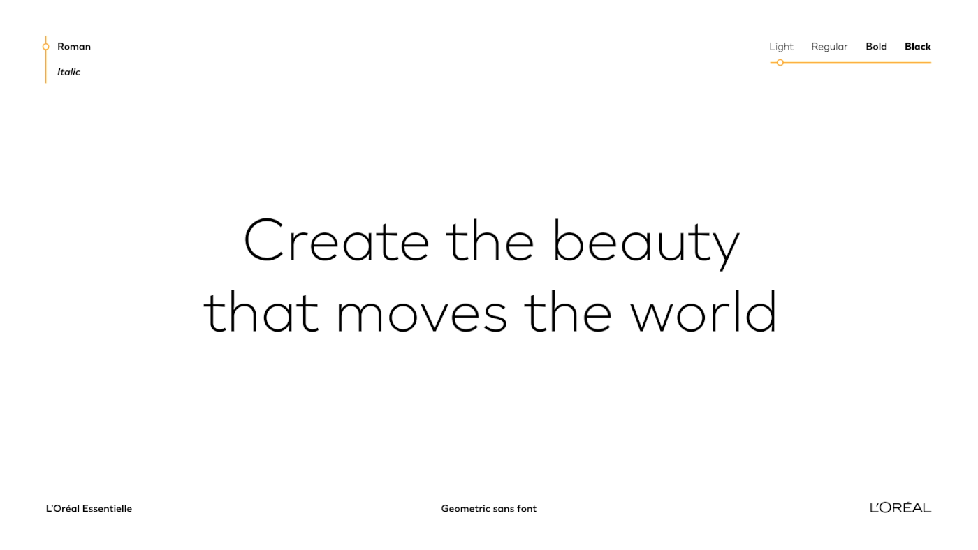
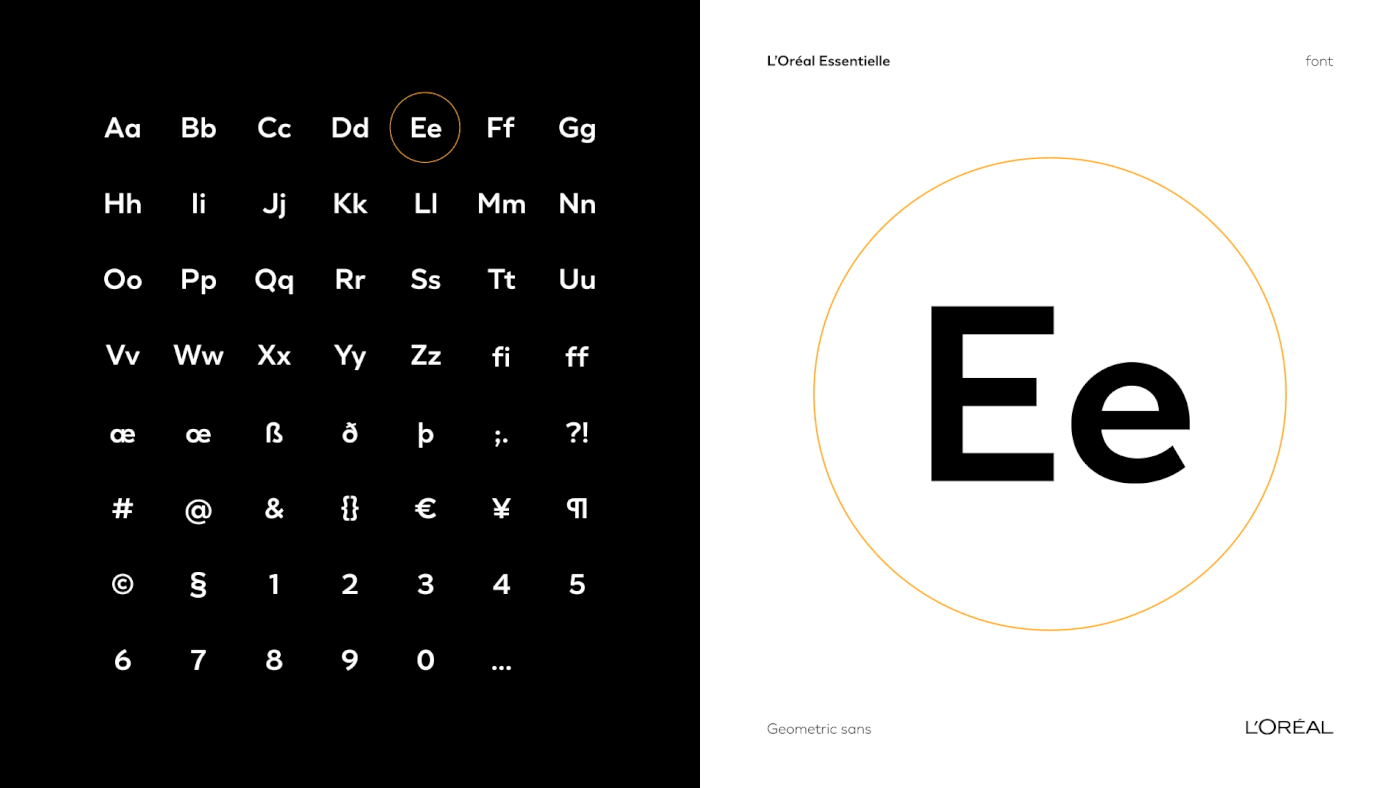
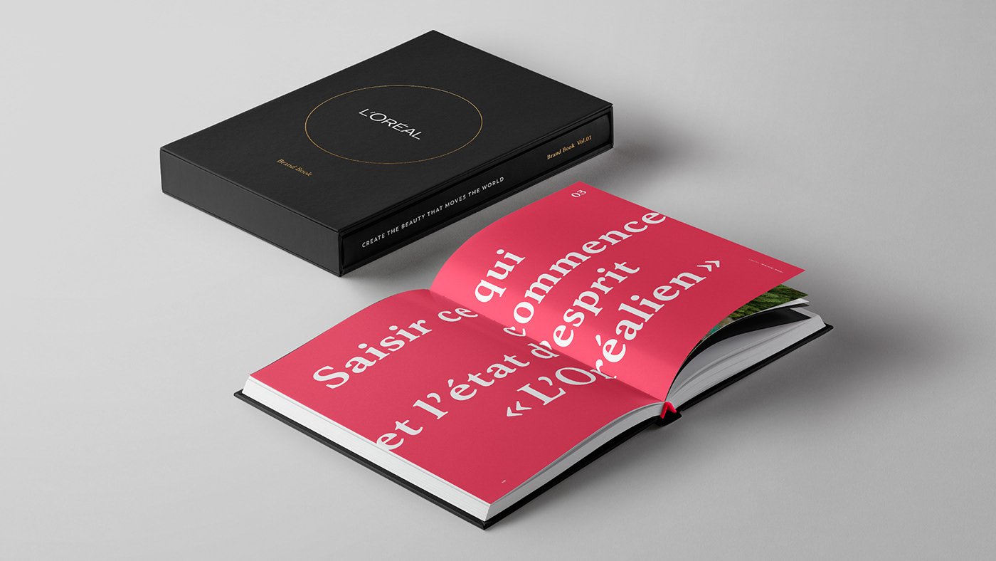
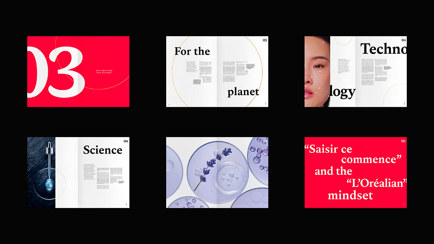
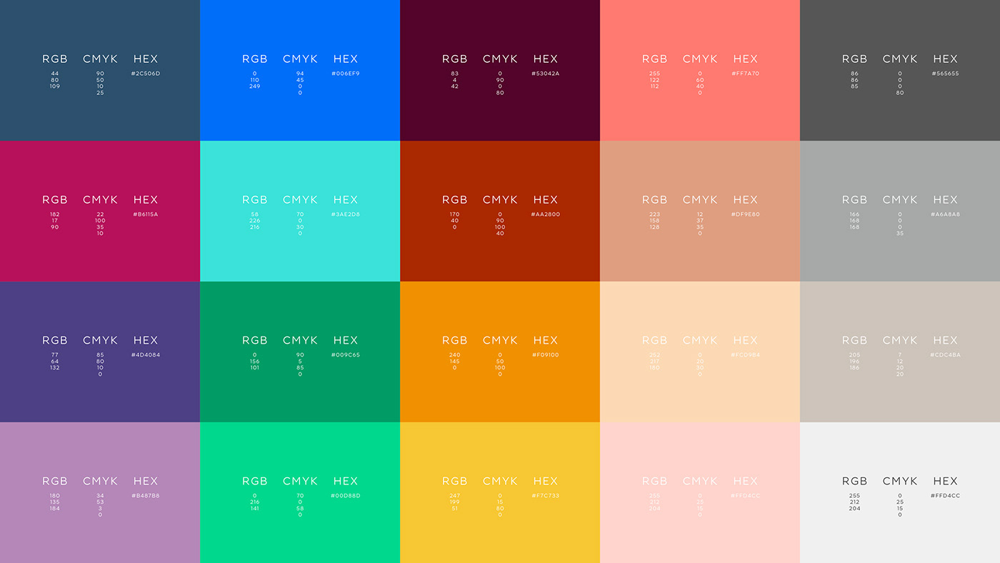
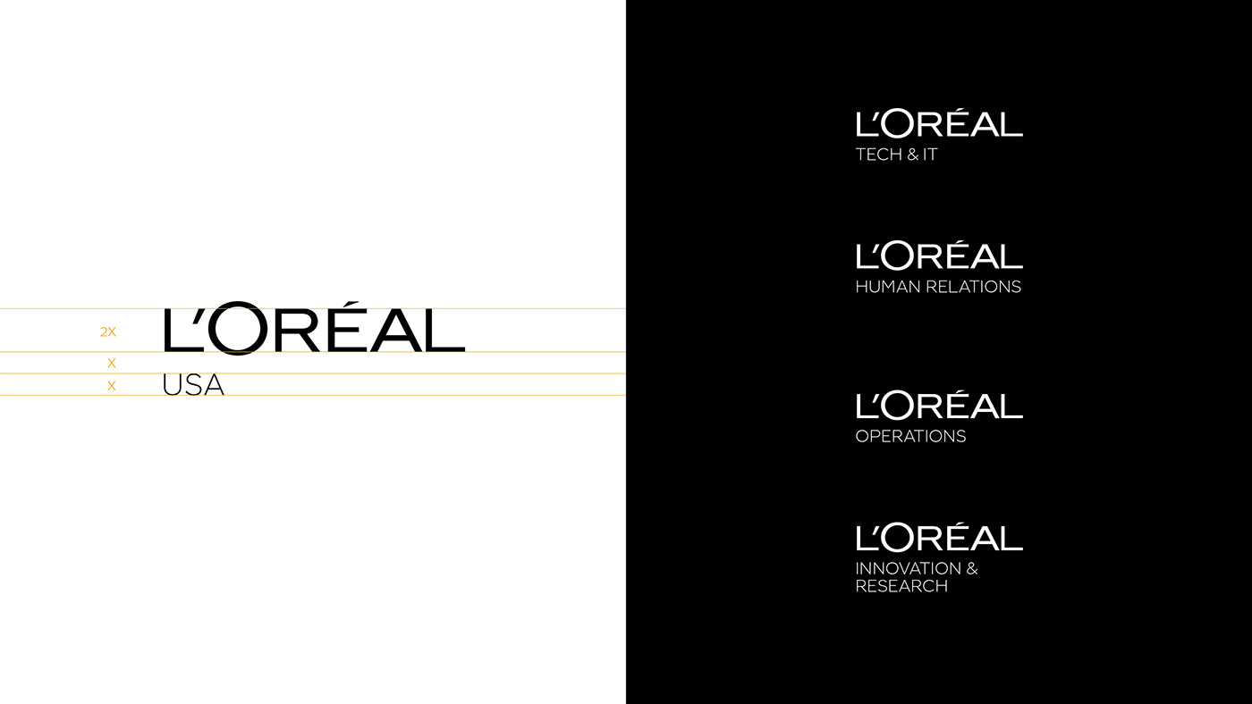
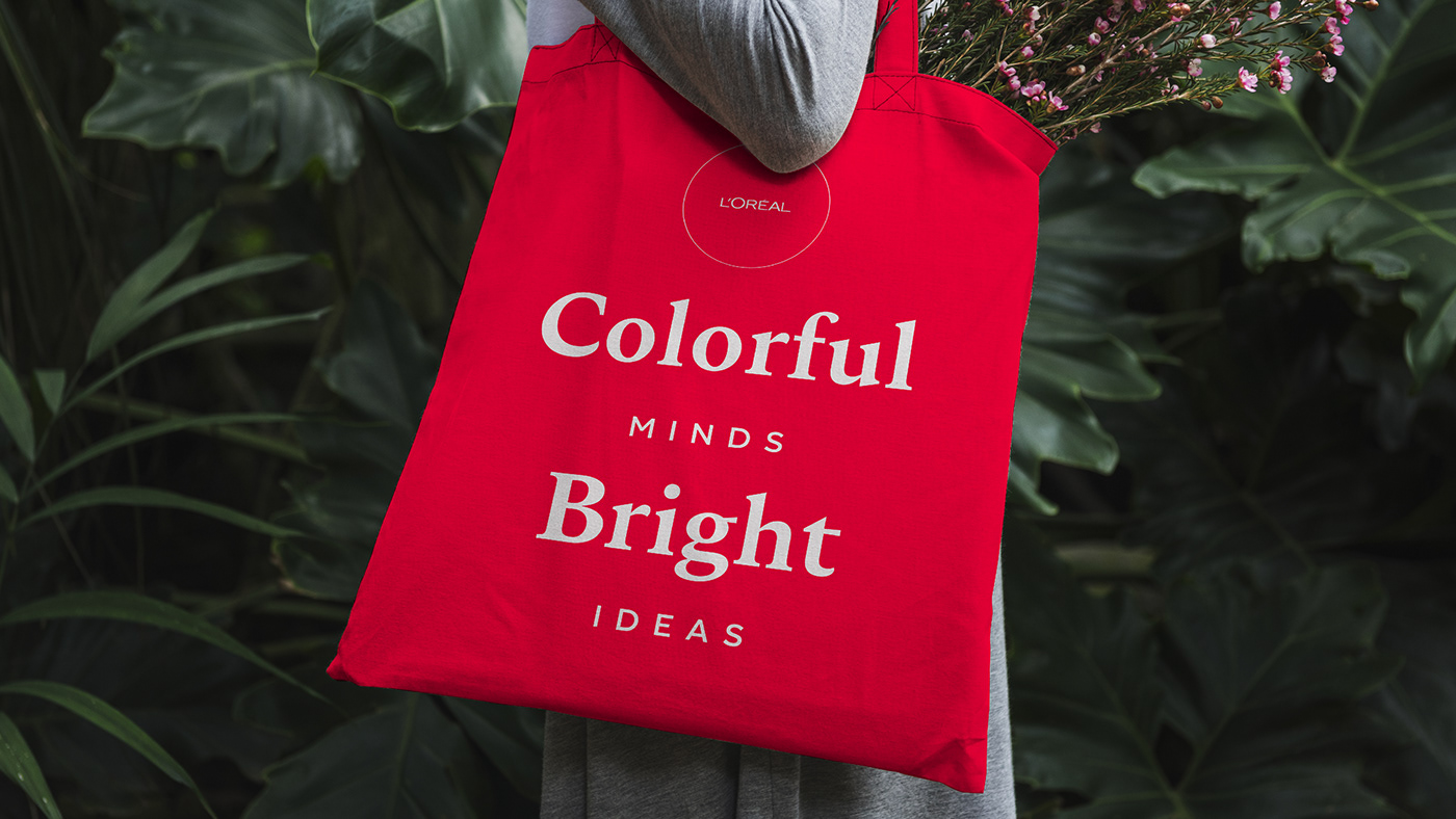
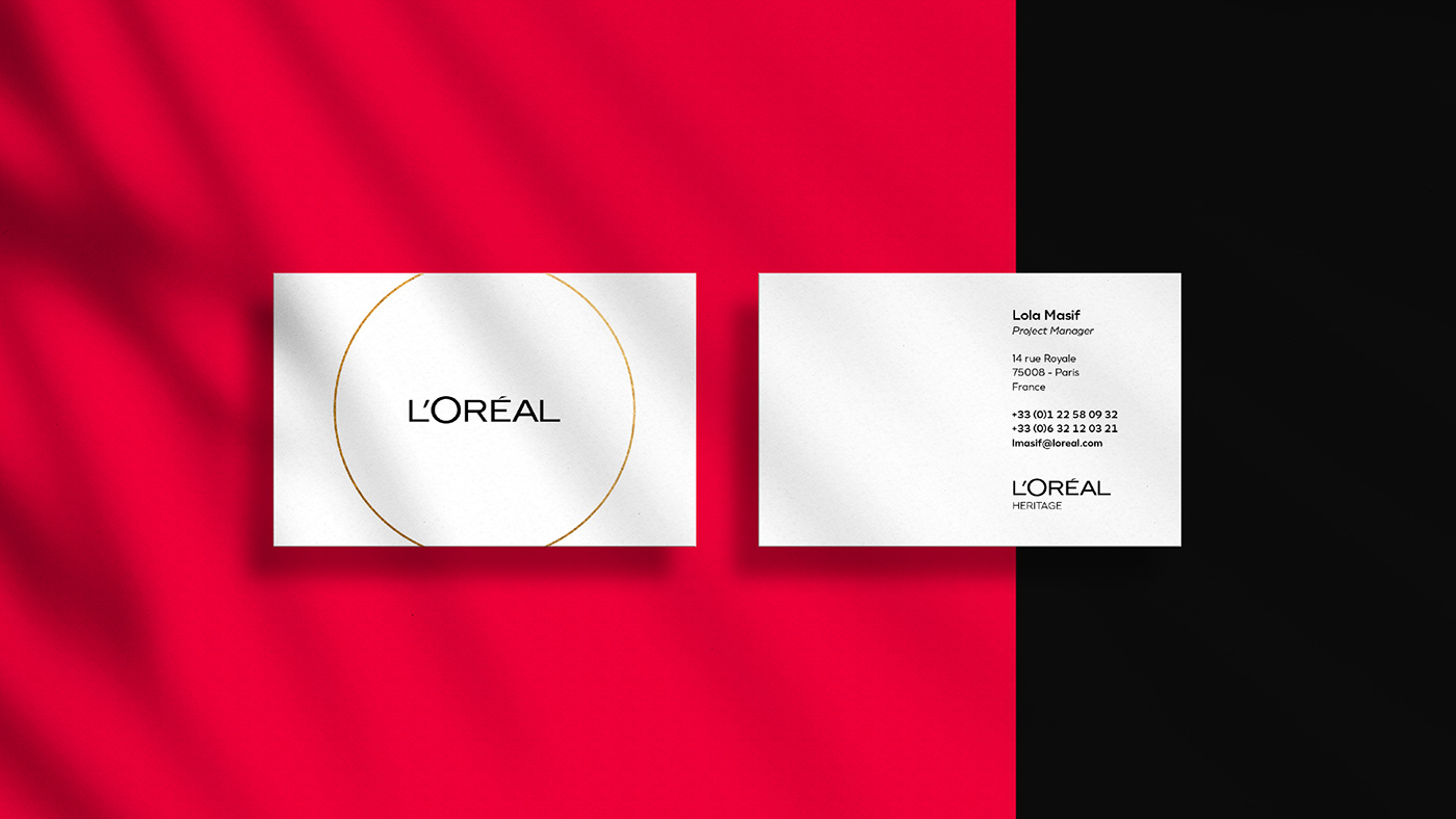
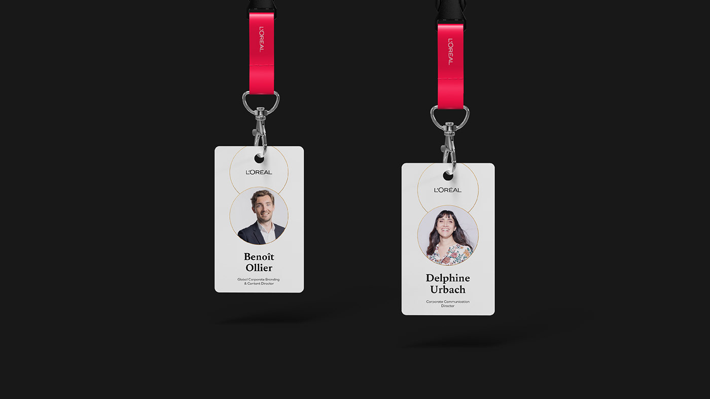
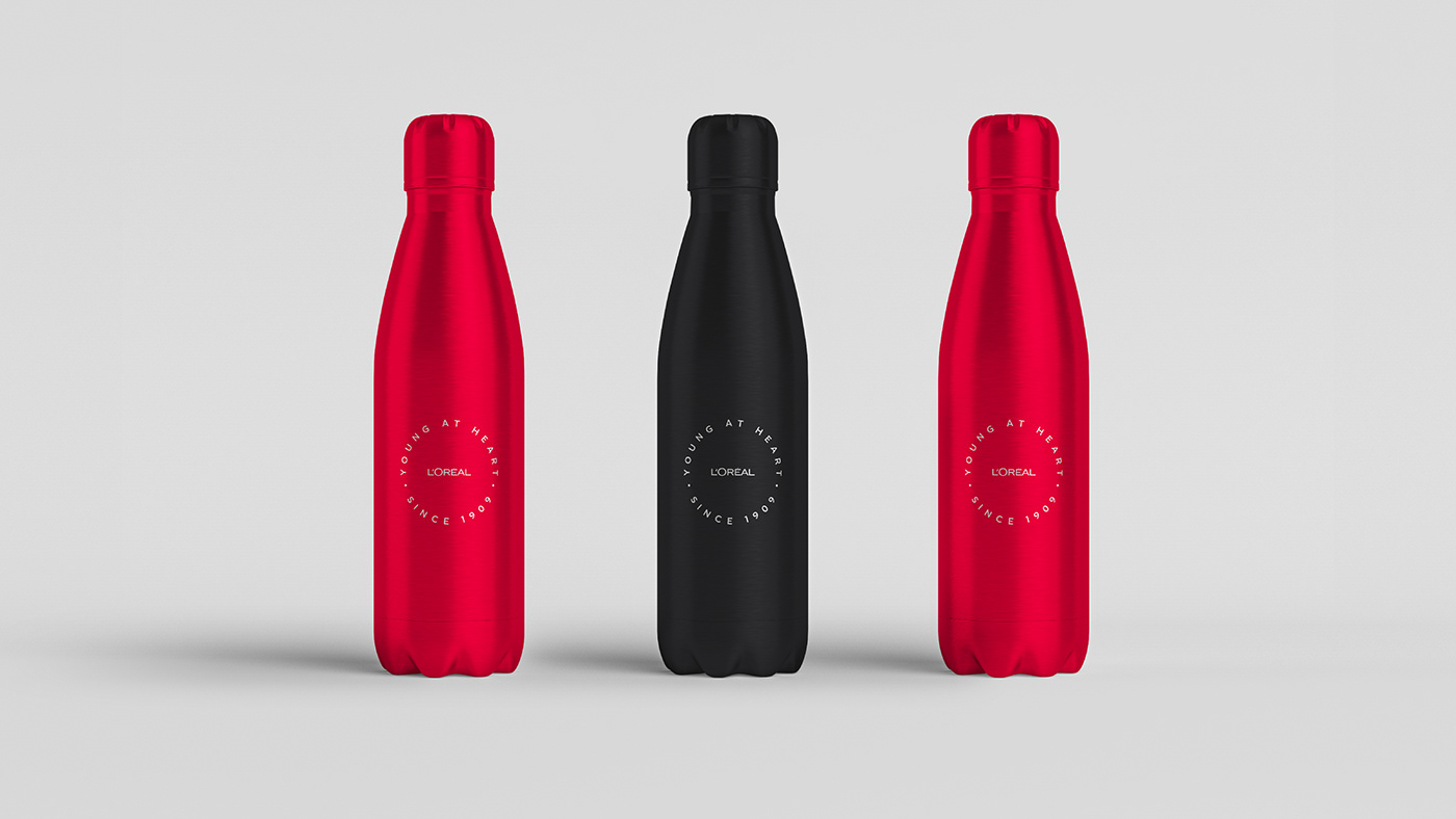
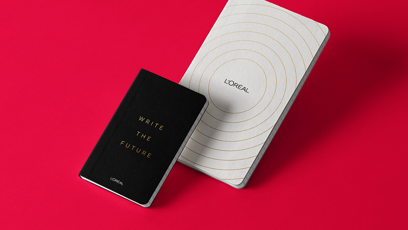
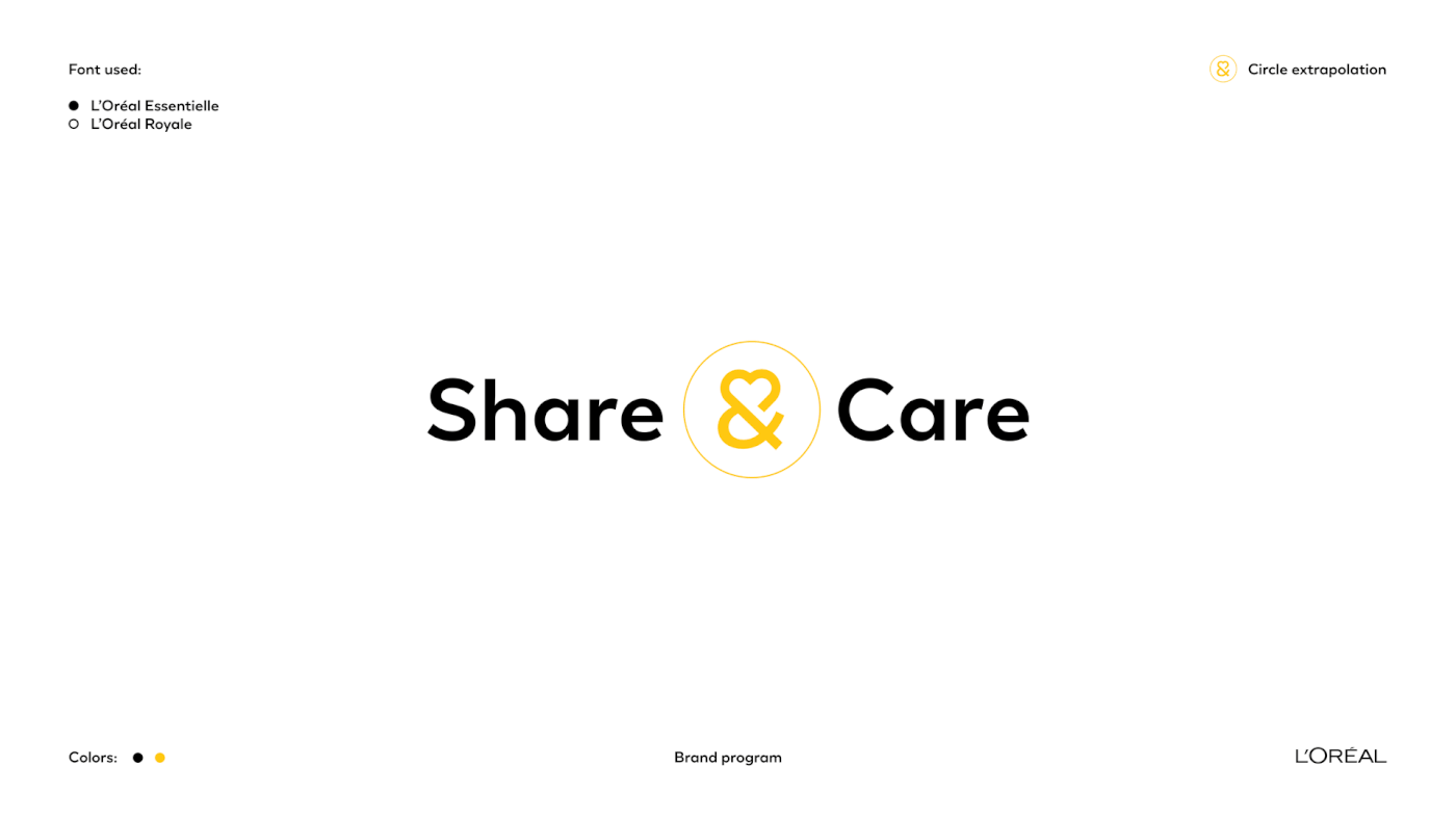
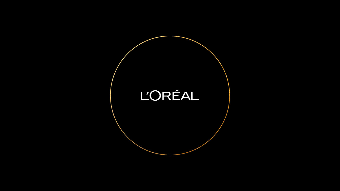
A vision of modern beauty transpired from the 30 interviews we conducted, always more inclusive and diverse. We found the symbol of this inclusivity in the L’Oréal archives. The circle, the “O” from L’Oréal and the shape of the very first ad for the product that gave the company its name: L’Or de L’Oréal, released in 1908. The strong personality was reflected in the primary colours. Bespoke fonts were developed to capture the L’Oréal voices. On top of the traditional serif and sans serif typographic expressions, we created a distinctive script font based on the founder Eugène Schueller’s own handwriting. A more contemporary look was strengthened through more authenticity in the imagery.