KPB
— the perfect partner
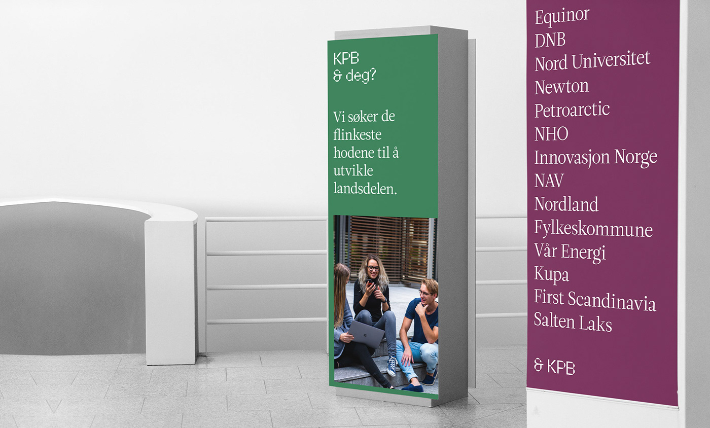
KPB is a consulting firm with a diverse team of specialist in the fields of business development, innovation and analytics. They work with a broad range of clients from start-ups to Norway’s largest companies.
By North was commissioned to design a new identity for KPB that could reflect their competence and position as a market leader in their field.
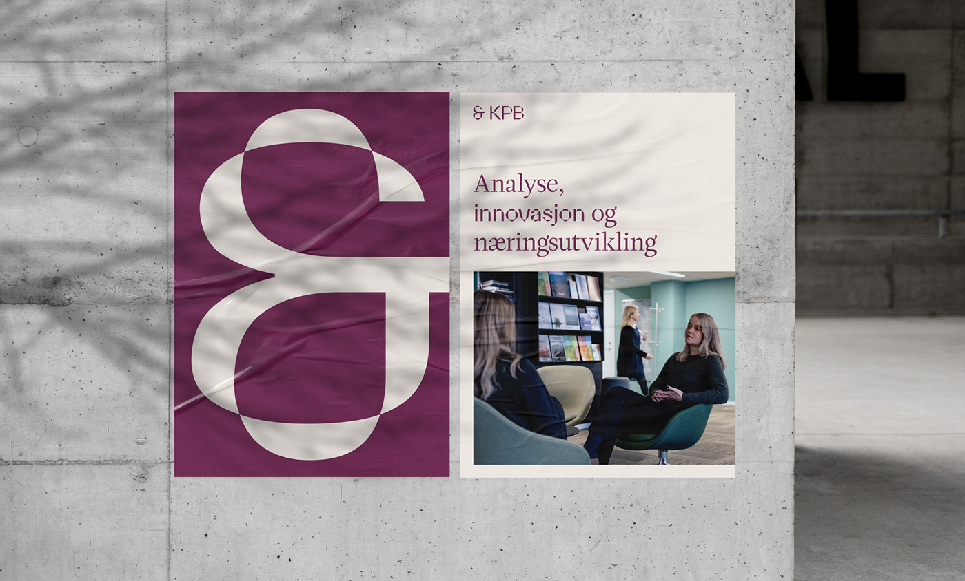
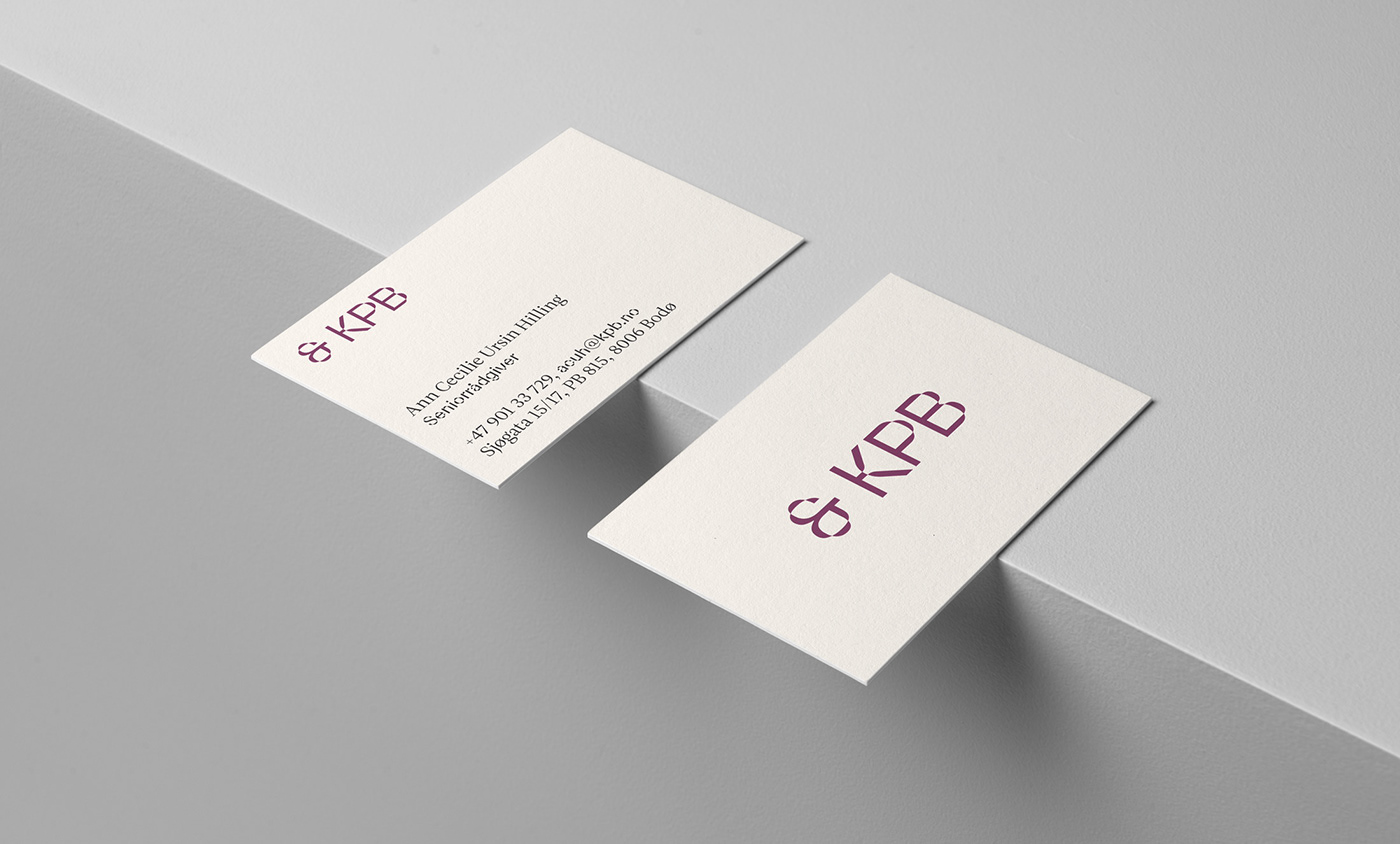
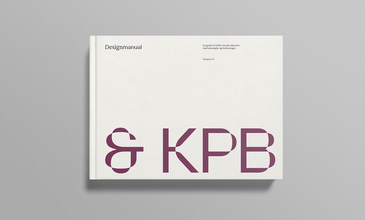
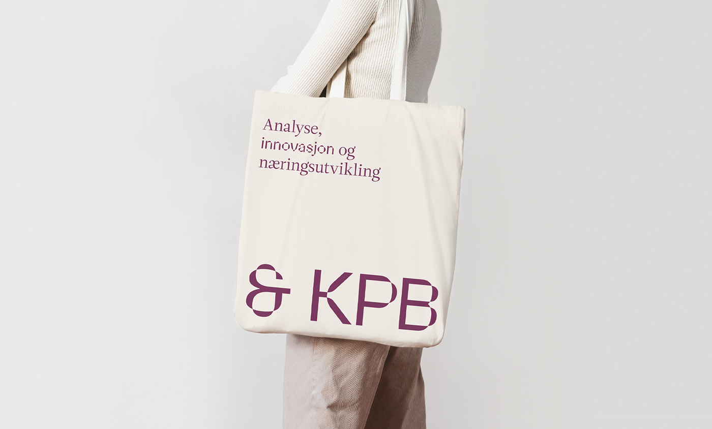
We built the identity around the concept of partnership, reflected in the ampersand used in the logotype. As well as being the building-block for the logotype, the font Parabole is used in headlines to emphasize keywords. Combined with Leitura it creates a playful and modern language without compromising legibility and content. The color palette is sparse, but warm and inviting and underscores KPBs desire to work together with their clients and form lasting partnerships.
Photography: Dan Mariner
Typeface: Parabole by Dávid Molnár
— the perfect partner
KPB is a consulting firm with a diverse team of specialist in the fields of business development, innovation and analytics. They work with a broad range of clients from start-ups to Norway’s largest companies.
By North was commissioned to design a new identity for KPB that could reflect their competence and position as a market leader in their field.
We built the identity around the concept of partnership, reflected in the ampersand used in the logotype. As well as being the building-block for the logotype, the font Parabole is used in headlines to emphasize keywords. Combined with Leitura it creates a playful and modern language without compromising legibility and content. The color palette is sparse, but warm and inviting and underscores KPBs desire to work together with their clients and form lasting partnerships.
Photography: Dan Mariner
Typeface: Parabole by Dávid Molnár