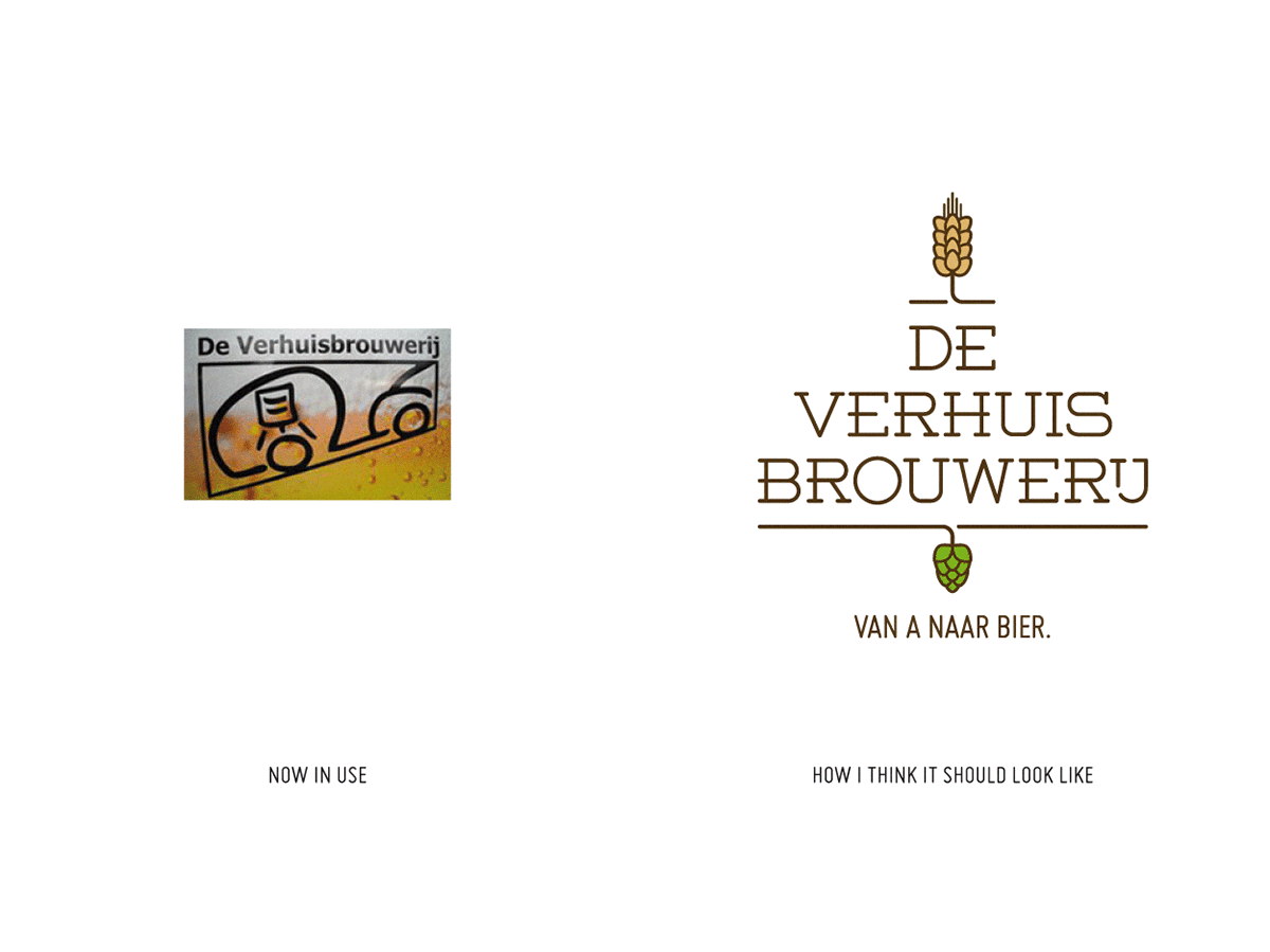
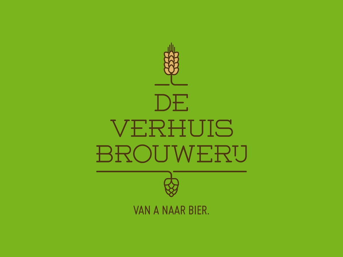
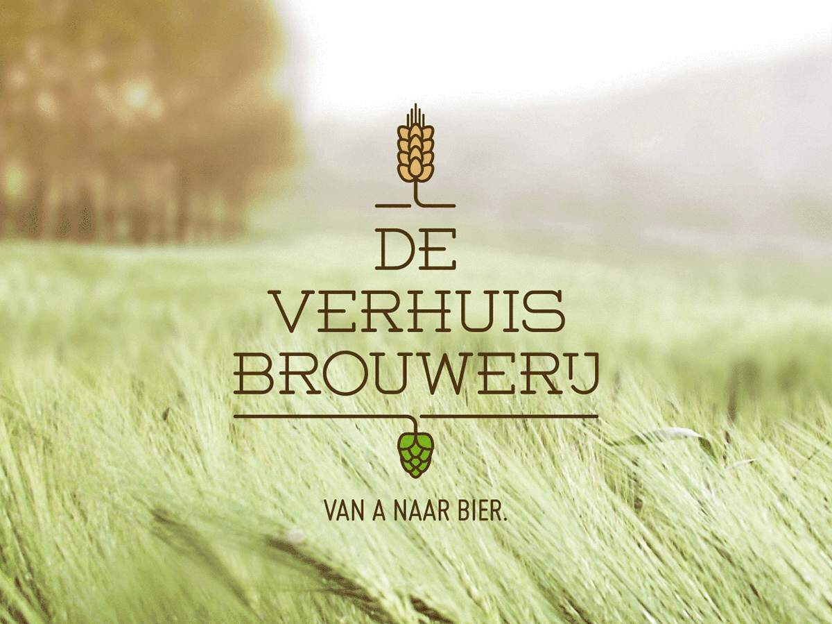
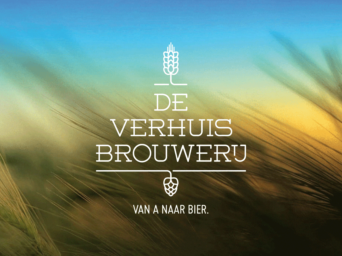
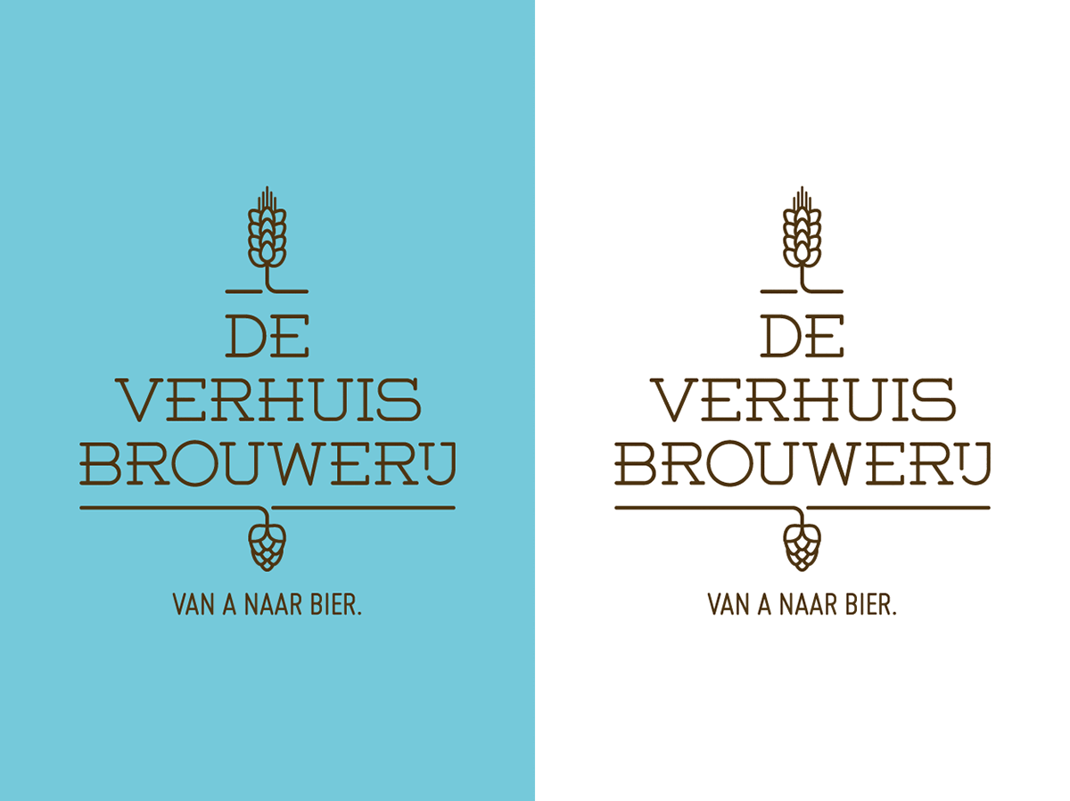
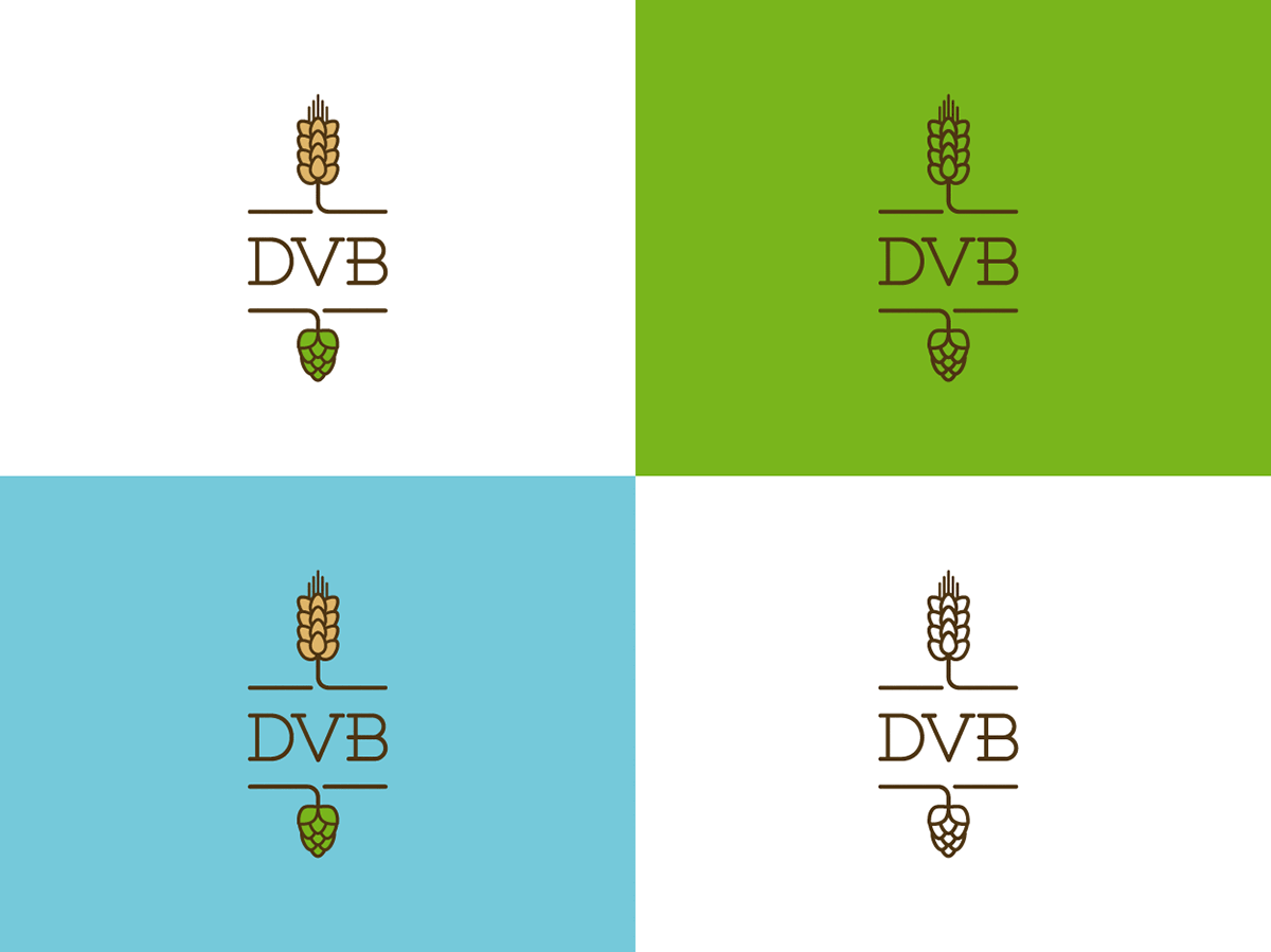
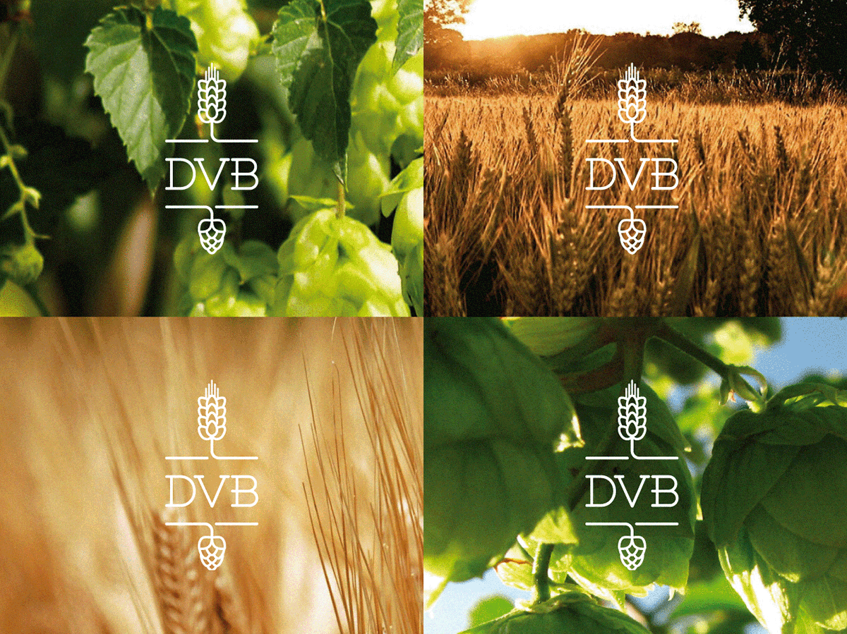
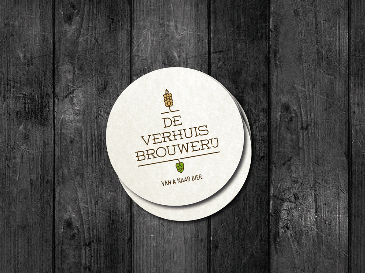
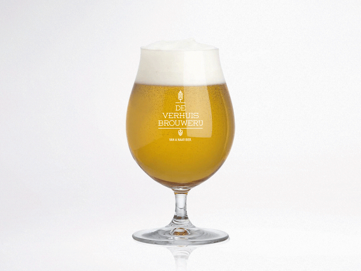
De Verhuisbrouwerij (The Moving Brewery) is a micro mobile brewery. 7 beer enthousiasts travel across Belgium to make beer at any possible location. Being a beer lover myself I worship these guys. As a graphic designer though, I thought their logo could do with a total redesign. Here's my interpretation and how I think it should look like. The design concentrates on the premium flavour ingredients of beer: hop and malt. Natural colours strengthen the image of the craft of brewing using pure ingredients. The main type used is a slightly altered font called Weston, available as freeware from Fontfabric. Check out their website for loads of great typedesigns. The baseline is set in Miso by Marten Nettelbladt.
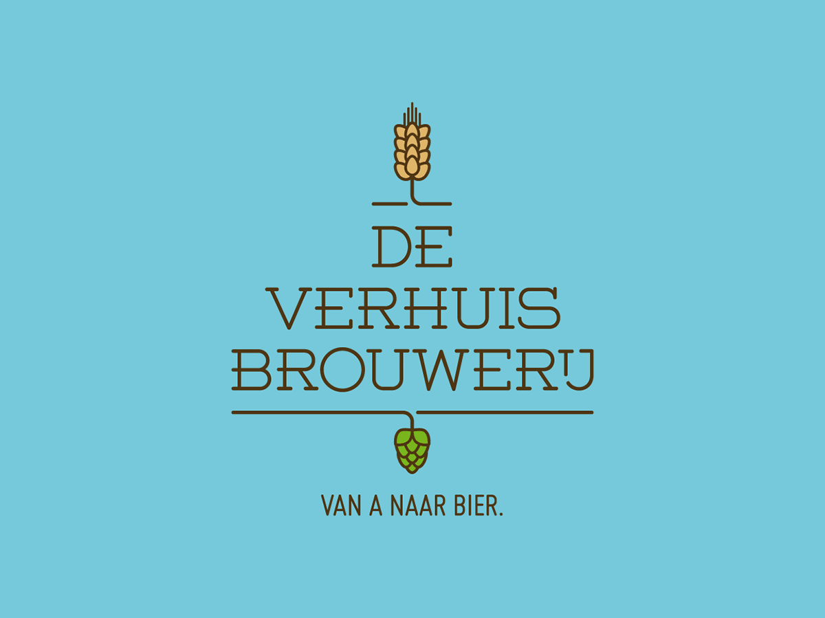
In addition to the design I came up with the baseline ‘Van A naar Bier’. The baseline captures the essence of what De Verhuisbrouwerij stands for: driving from A to B to brew great beer.
In addition to the design I came up with the baseline ‘Van A naar Bier’. The baseline captures the essence of what De Verhuisbrouwerij stands for: driving from A to B to brew great beer.
Sadly though, they were determined not to change a thing. Too bad. I had a great time creating this design.