


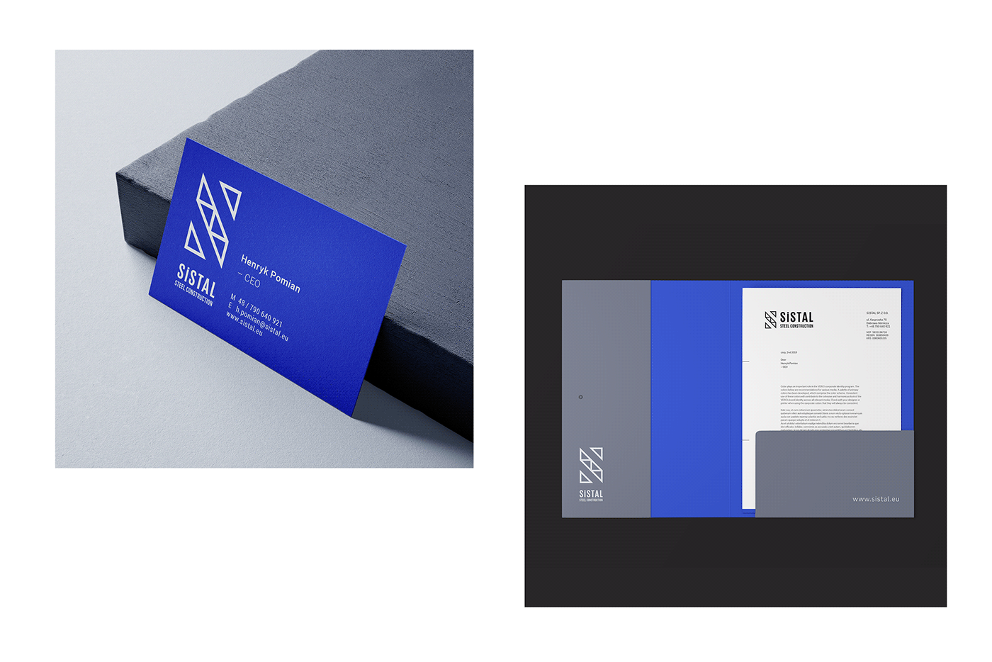
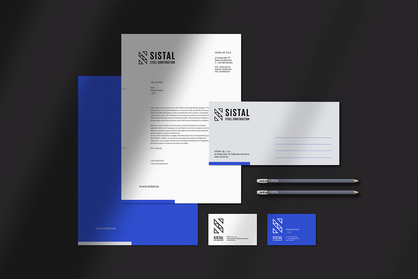
SiSTAL Steel Construction Ltd.
#logo #logodesign #visualidentity #branding #graphicdesign #printdesign #webdesign
SiSTAL is the steel construction company based in Poland. Delivering innovative and responsibly sourced construction products to craft inspiring energy-efficient buildings.
The identity concept started with the very foundation of the brand – measurements, sketches and prefabricates. The SiSTAL Masterbrand or Corporate Logo comprises two elements, the logo symbol and logo-type. The Logo Symbol is a powerful image monogram evolved from the abstract initial letter, combine with the most common structural feature (Warren truss). The logo symbol consists of a powerful element evoking expectations for safety, strength and certainty.
The Logo Type has been carefully chosen for its modern and yet refined, highly legible style, which has been further enhanced by the use of upper case letters. The typeface of SiSTAL is Bebas Neue and has also been chosen to compliment and balance perfectly with the logo symbol.
Design & photos: Ewa Mocha
Web development: Robert Ziemniak
www.sistal.eu


Thank you for your time!
made.by.ewamocha
www.ewamocha.com


