


Fideltronik is a Polish engineering company operating in automotive, industrial, lighting, telecom and consumer sectors. For over 30 years, it has specialized mainly in the design and production of electronics and the development of Industry 4.0 software and solutions. Fideltronik is one of the main players on the European market.
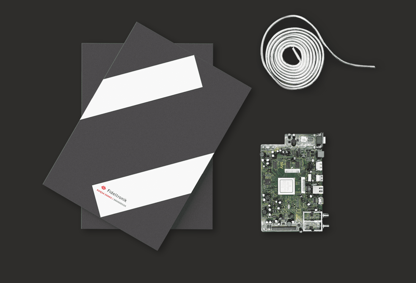
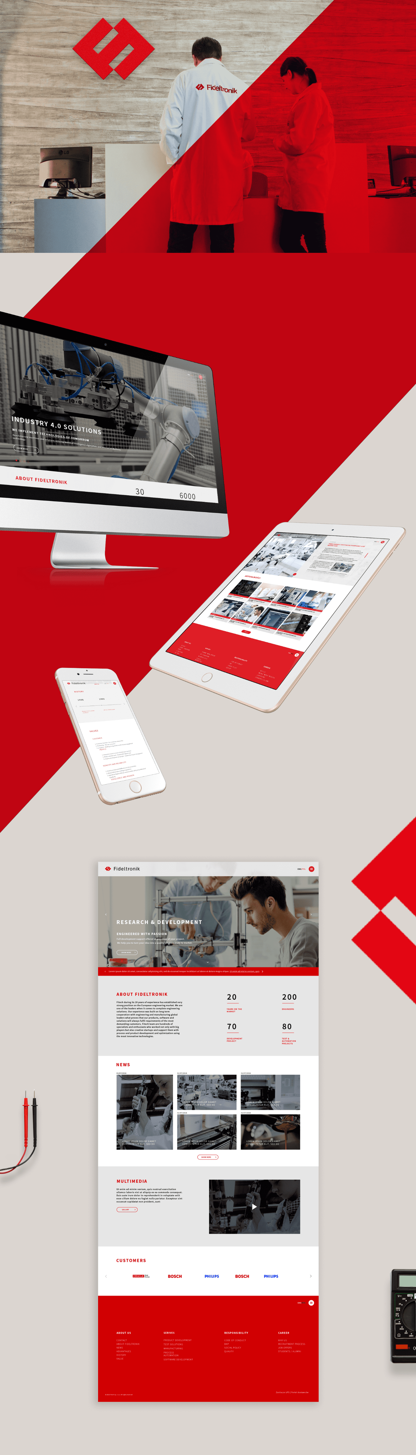
The customer wanted rebranding because the functioning brand began to depart from the modern character of the company and the dynamically developing sectors in which it operates. A new brand book, visual identification, and website were created. Leaflets and roll-ups were created in the BTL area.
The old logotype, which was not adjusted to Fideltronik’s new image, had to be refreshed. After the preparation of many interesting concepts, an emphasis was laid on simplicity and functionality. Red colors and gray scales emphasize the electronic origin and professionalism of the company.
Scope of work:
Key Visual, Rebranding – Logo & Corporate idenity, Display, Website – Concept, UX, UI, Interaction Design, Dev, Sales print materials, BTL materials


Client: Fideltronik
Creative Director: Anna Misiuda
Project Management:
Designer: do uzupełnienia


