A friendly and honest real estate company. Also fictional. Another school assignment.
The real estate business deals with the biggest investment most people make in their lives, because of this, trust is a crucial issue. The financial crisis has given them a bad reputation, possibly a reputation many businesses deserve.
My idea about Rede, is that they could be a company that’s aimed at young first- and second time home buyers. A business that’s honest and safe, and that’s dedicated to help you make your decisions honestly and safely.
To communicate this, I took the profile in the direction of Twitter and Vimeo, websites that provide services to millions of people, but manage to keep their relationship with their users intimate and informal. From there, I took the profile in a more conservative direction. This logo was the end result:

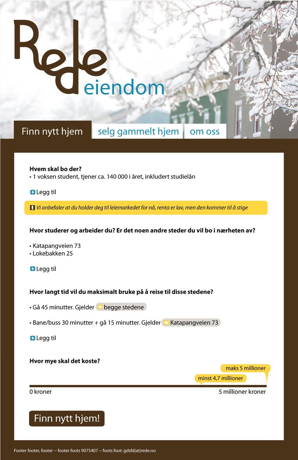
A mix between playful handwriting and a serious humanistic sans-serif, in a conservative dark brown color — accompanied by a business-like blue and some times, a warm yellow. This sketch for a website is in Norwegian, but I think you can get a feel for it, even if you don’t know the language:
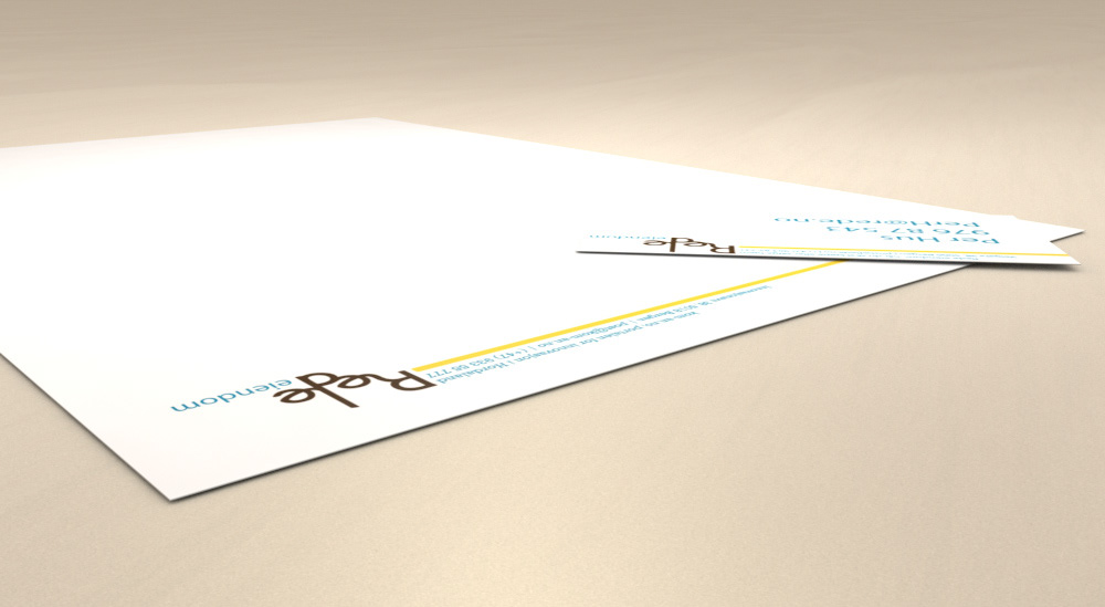
Business card and letterhead: