SusiRed: A bold brand identity for a new vision in online shopping.
Project summary: Brand Strategy, Identity, Guidelines, Implementation, Print, Digital
A dynamic and ambitious new UK business, SusiRed wanted to create a distinctive brand that differentiated them from the competition in order to penetrate a highly competitive, ever-expanding hair and beauty market. The brief was to create a bold and memorable brand identity that would make them stand out, and not be just another generic online retailer.
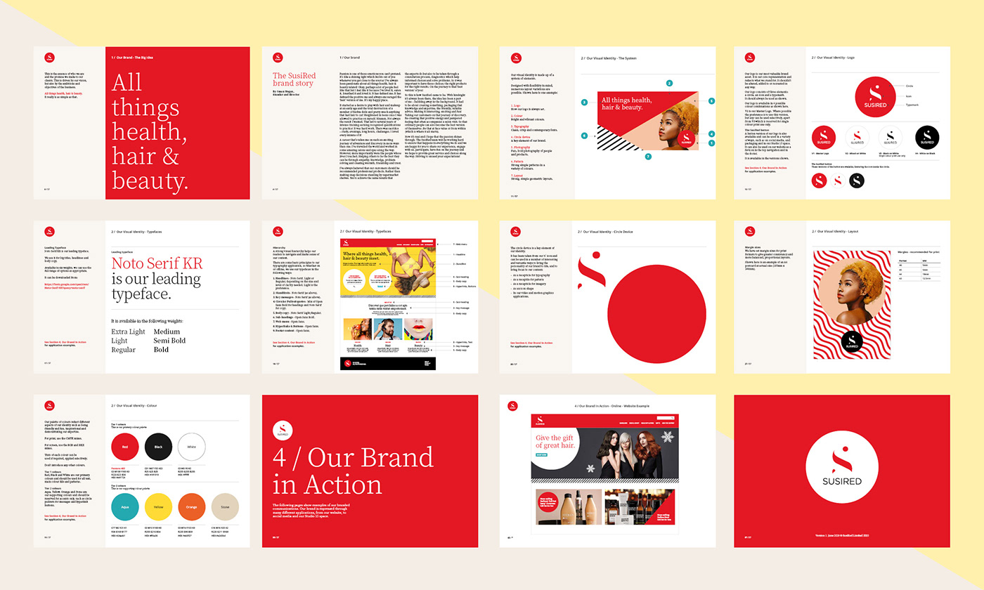
To begin with the brand strategy was firmed up, allowing a strapline to be created, along with a clear definition of the brand’s personality and how it should translate visually.
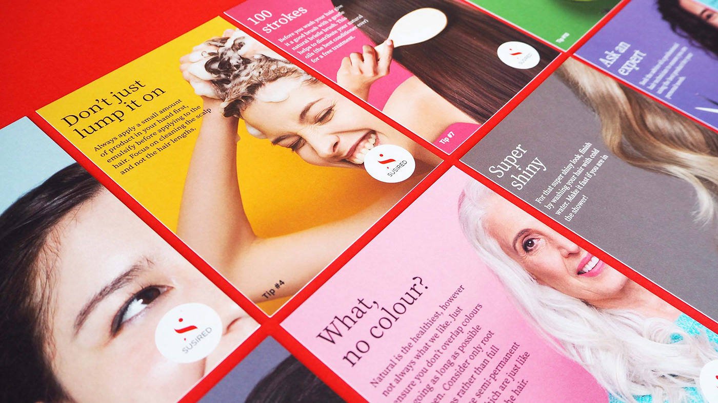
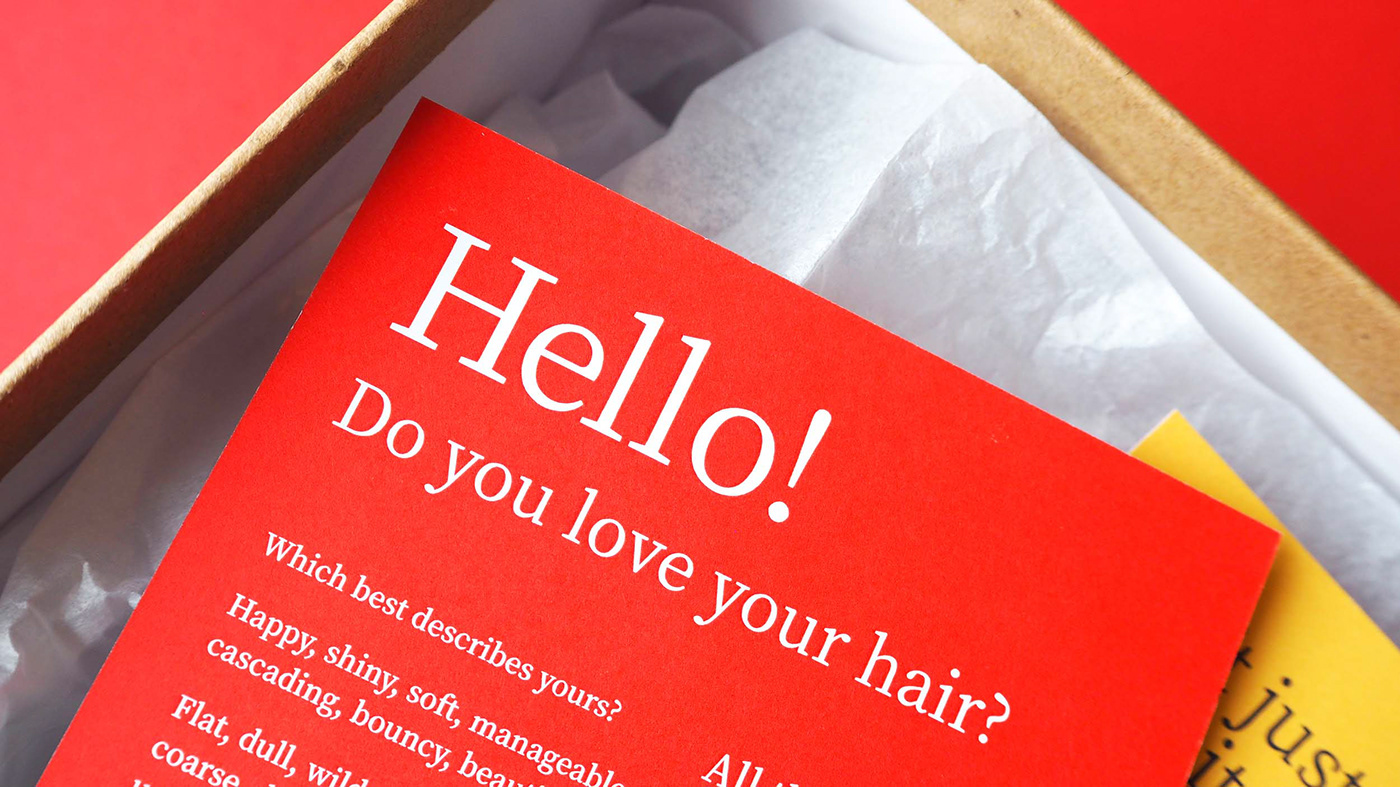
Our approach was to create an identity that is different from the conventional hair and beauty landscape. Fun, bold photography takes centre stage, combined with a suite of patterns that can be used in a variety of fun and interesting ways.
A monogram logo was designed with an elegant S at the centre, the circle used throughout as a key device, bringing focus to the logo and key messages. Shape plays a key role with strong, simple, geometric layouts being used on promotional content. Fonts are a clean and crisp contemporary mix.
Intended to provide maximum stand-out, colour had to be bold with red taking the lead, complemented by a suite of vibrant supporting colours.
A set of extensive brand guidelines were then created, designed to offer maximum flexibility for brand application across all channels.
© SusiRed