The Challenge
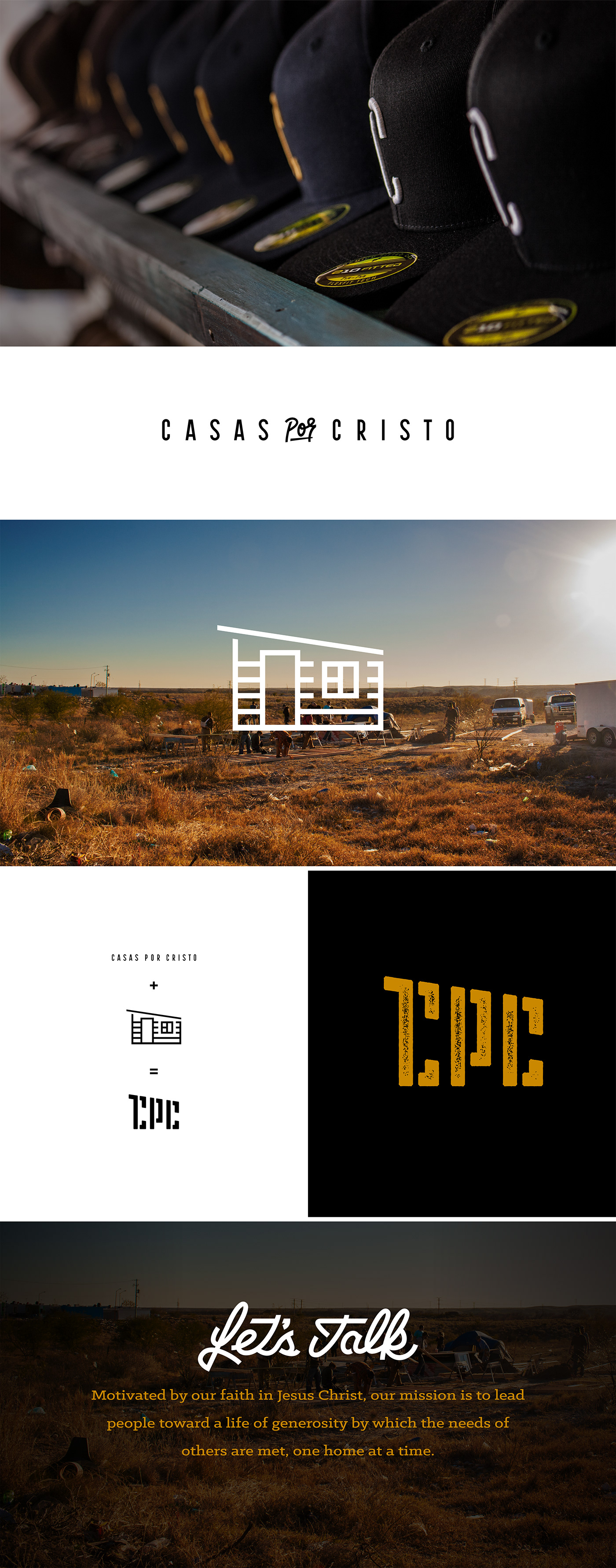
Casas por Cristo is a nonprofit organization that leads volunteers to build homes for families living in poverty in Latin America. They have met and overcome many challenges over the years, but a constant challenge has been communicating clearly with their target audience who does not speak Spanish. The name of the organization means, homes for Christ.
Services: Brand Identity, Logo Design, Apparel, Print Collateral, Lettering

The Visual Identity
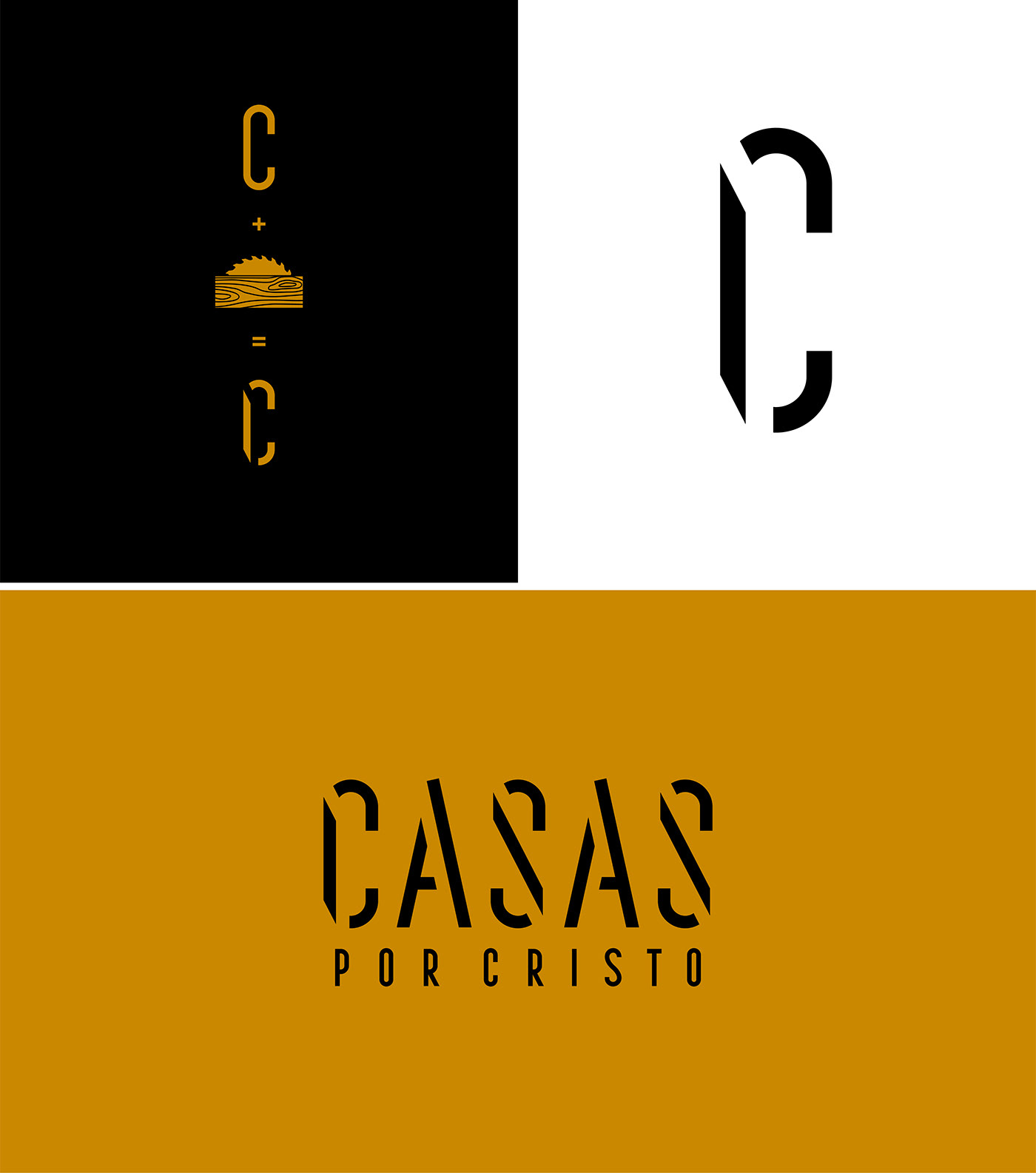
My goal was to create a logo that would communicate the overall nature of what the organization does despite the target audience not knowing what the name of the organization means. I designed the logotype in such a way as to resemble cut lumber as well as to represent individual pieces/volunteers coming together to build something bigger than themselves, Casas.
The Color
I wanted to use a bold color that would reference the color of lumber as well as to take the mind to other companies whose target audience is interested in tools and construction such as DeWalt, CAT and Carhartt.
The Brand Messaging
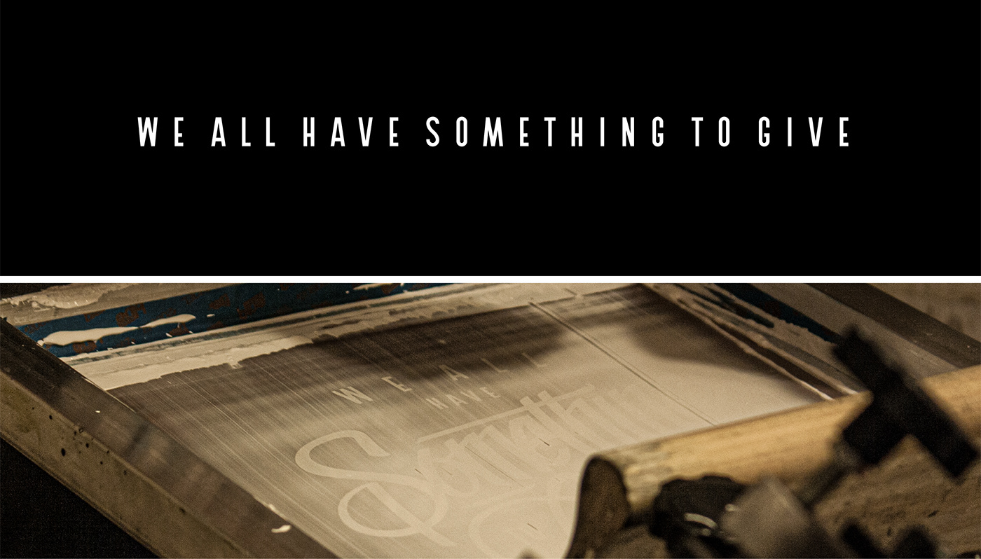
I wanted the messaging to be inclusive and to let the volunteers know that they are just as important as the leaders in the overall mission of the organization. Eventually, I realized that the main thing that was constantly communicated to the volunteers was a simple truth, that we all have something to give.
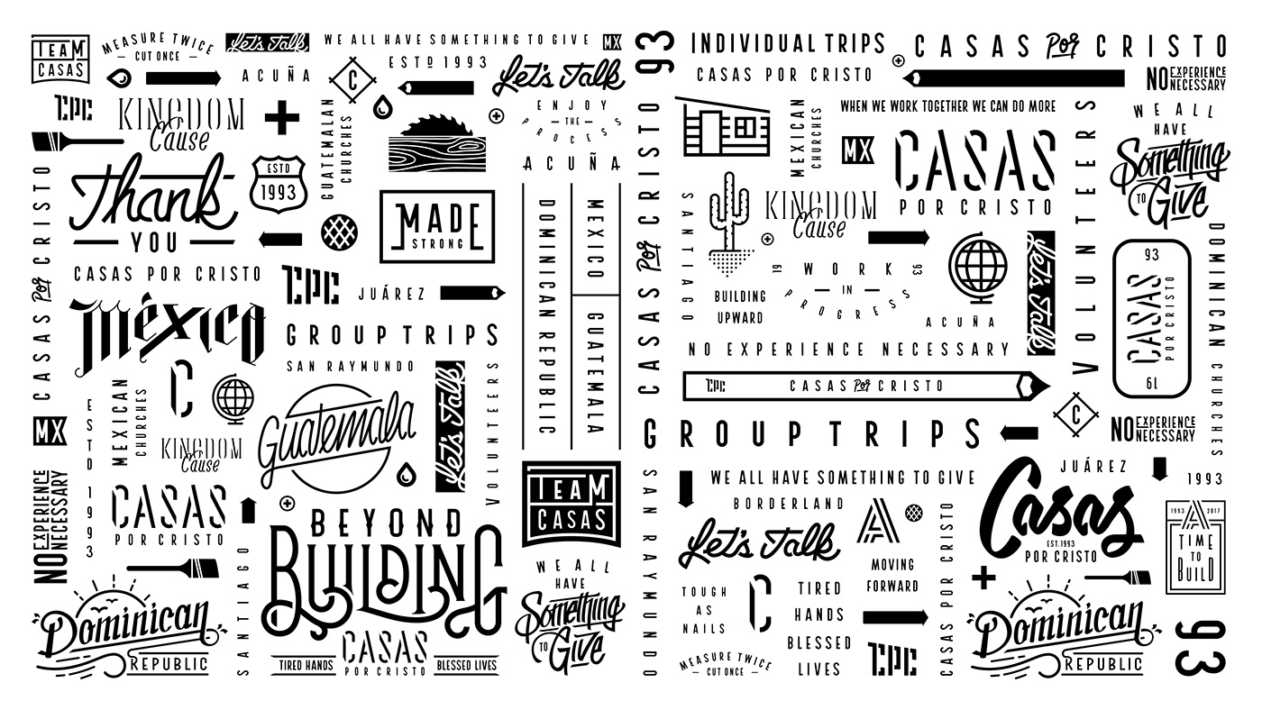
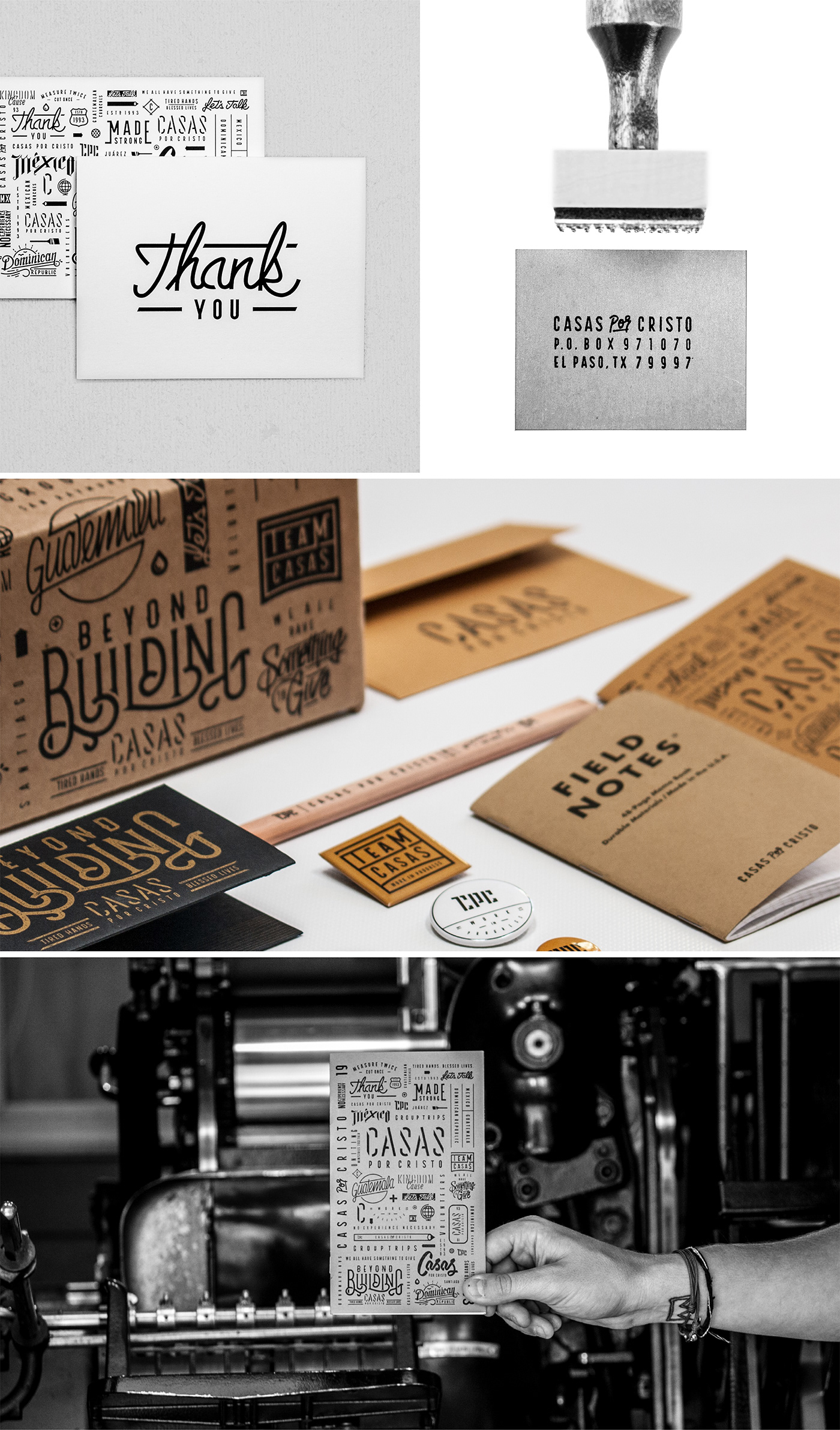
The Goods
I did lettering and illustration work for new merch which was then printed in-house to celebrate the launch of the rebrand. I also created an archive of illustrations, icons and type to use on booklets, Z-folds and other print collateral.