


CREATIVE BRIEF
Liberty STEAM Charter is a charter school in Sumter, SC offering kindergarten through 12th-grade STEAM-focused, project-based, and personalized learning model that is innovative and unlike any other school in South Carolina.
The goal of the project was to create a new visual brand that would convey a sense of innovation & traditional. The main challenge was differentiating the brand among surrounding schools in the area.
Along with a branding strategy the project included designing school uniforms, IDs, mascot, stationary, brand guides, web elements, social media templates and a social media strategy.


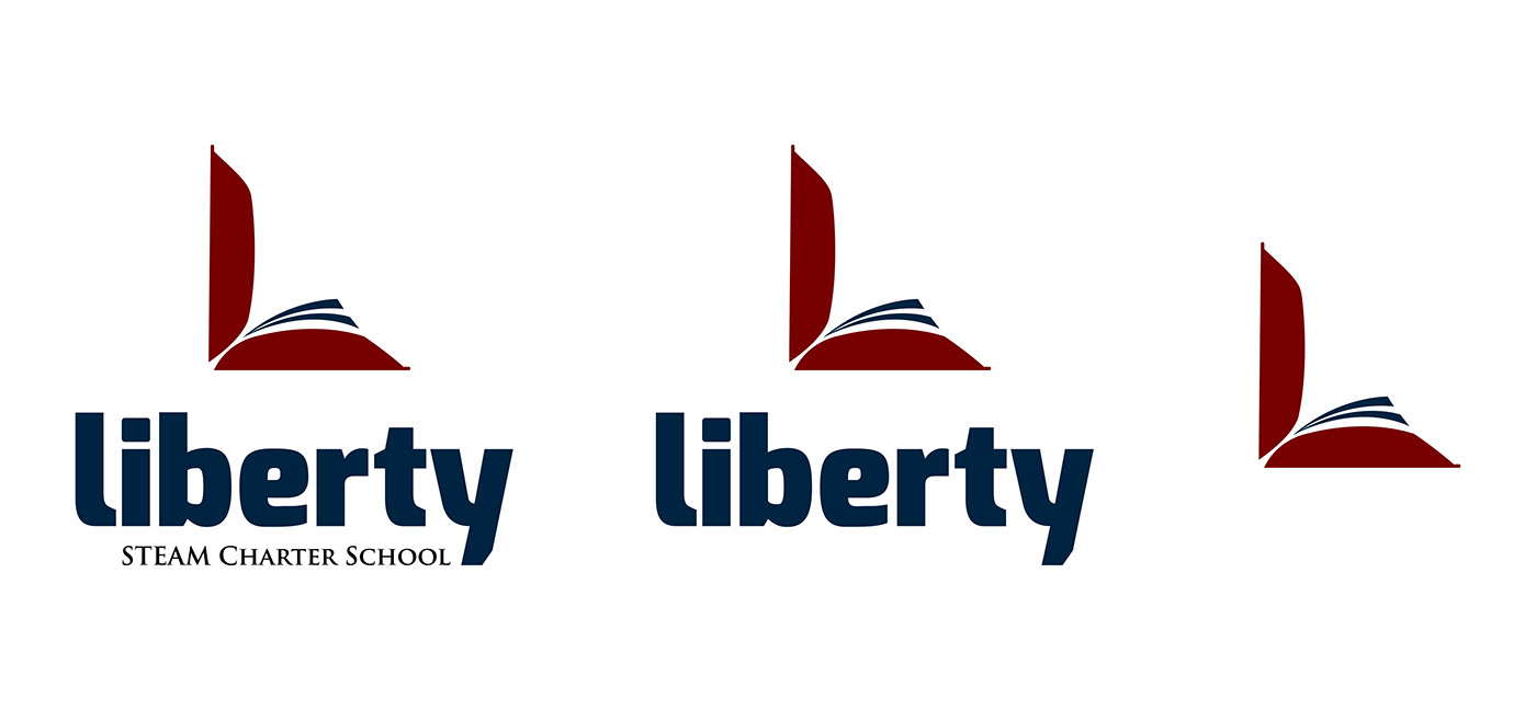
This icon combines a book and the letter “L”
In this day of age the book conveys a traditional and timeless feel as ebooks are becoming more common but the likelihood of books becoming obsolete is very low. Therefore this icon will age well in the coming years and always be tied to one root of education, the book. Liberty’s site states:
“We believe that it’s important for prospective parents to become informed about the uniqueness behind LSC’s educational model before making a decision. The only way to make an informed choice for your child/children is to get accurate information.
We have designed Family Preview Sessions as a way for prospective parents to learn more about LSC’s mission, scholar expectations, core values & beliefs, being a part of the family, options for your child, project-based & personalized learning academic model, enrollment & lottery procedures, and much more will all be presented.”
This icon lets parents know Liberty is an open book regarding the parents being informed along with expanding the minds of their children. This logo give that mission a face. A fun fact that can be explained at orientation enticing parents to chose your school for their young ones.
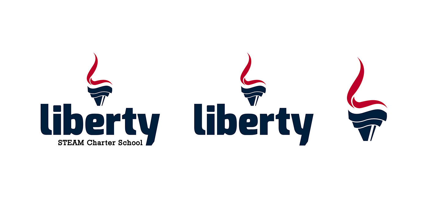
More traditional than the previous concept focusing on the word “Liberty”
Here the letter “L” is combined with a torch and the “L” represents the flame. The traditional feel comes from the statue of Liberty, when one hears the word “liberty” most likely the first thing to come to mind is the statue of liberty and that sense of history follows.
The red in this palette was increase slightly so the “L” sticks out better.
Typography
Considering how Liberty’s goal was to be a brand that would convey a sense of innovation and traditional values...
Futura was chosen for the header as it is bold, serious, modern and forward. Its Bauhaus history pairs well the geometric iconography chosen for the school’s visual branding. Garamond’s traditional feel balance’s Future’s modernism with its serifs and maintains readability at small points.

Mascots
After creating the logo, handbook, mock ups, social media templates and other brand materials the next step was to create a mascot illustration for the school.
I started this process by exploring various art directions & style by sketching out rough drawings and refining the sketches until satisfied before moving onto the computer. I created over 10 different mascots and the two presented below stuck out to me the most.


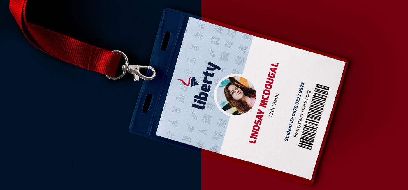


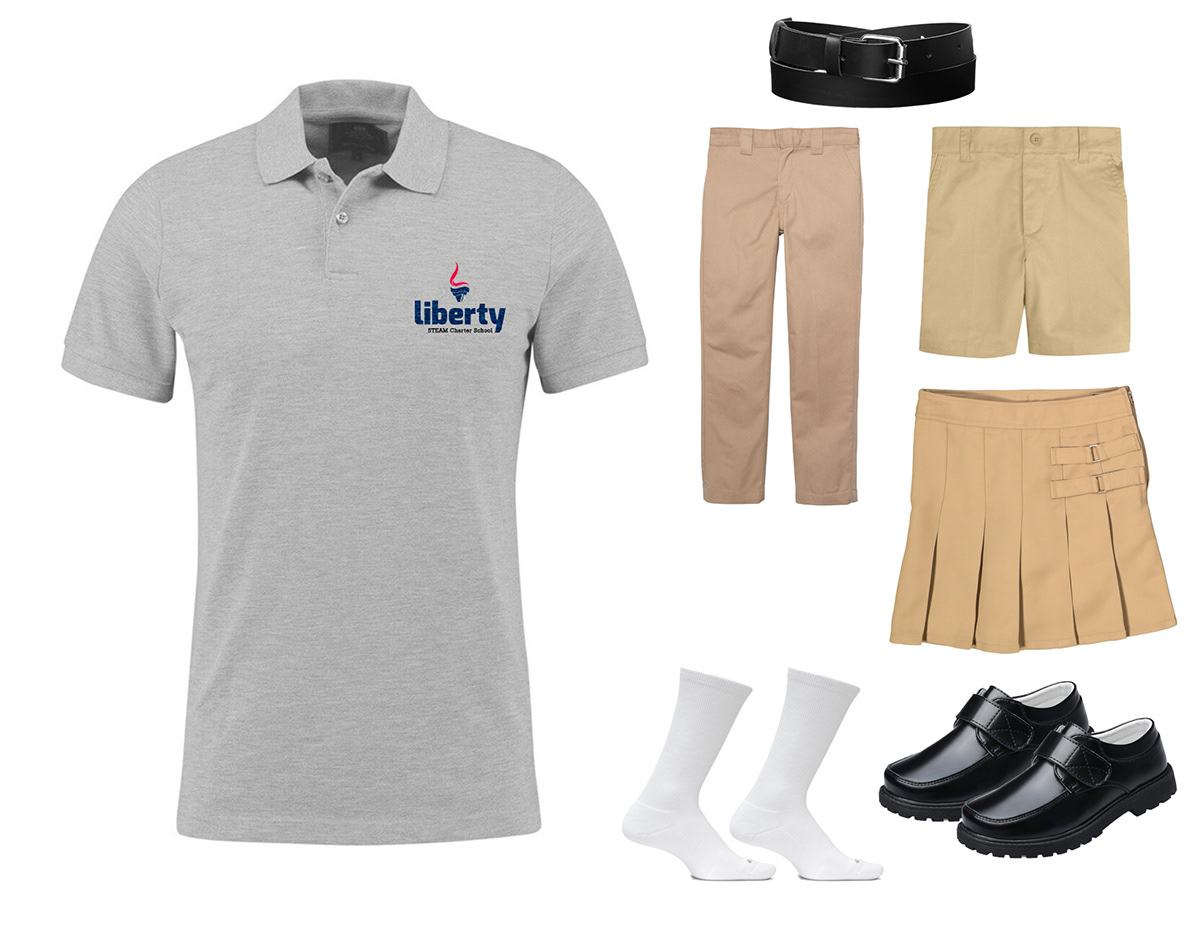

Photo above credit // B Marketing (Project Partner)
Photos below credit // @libertysteamcharter Instagram


