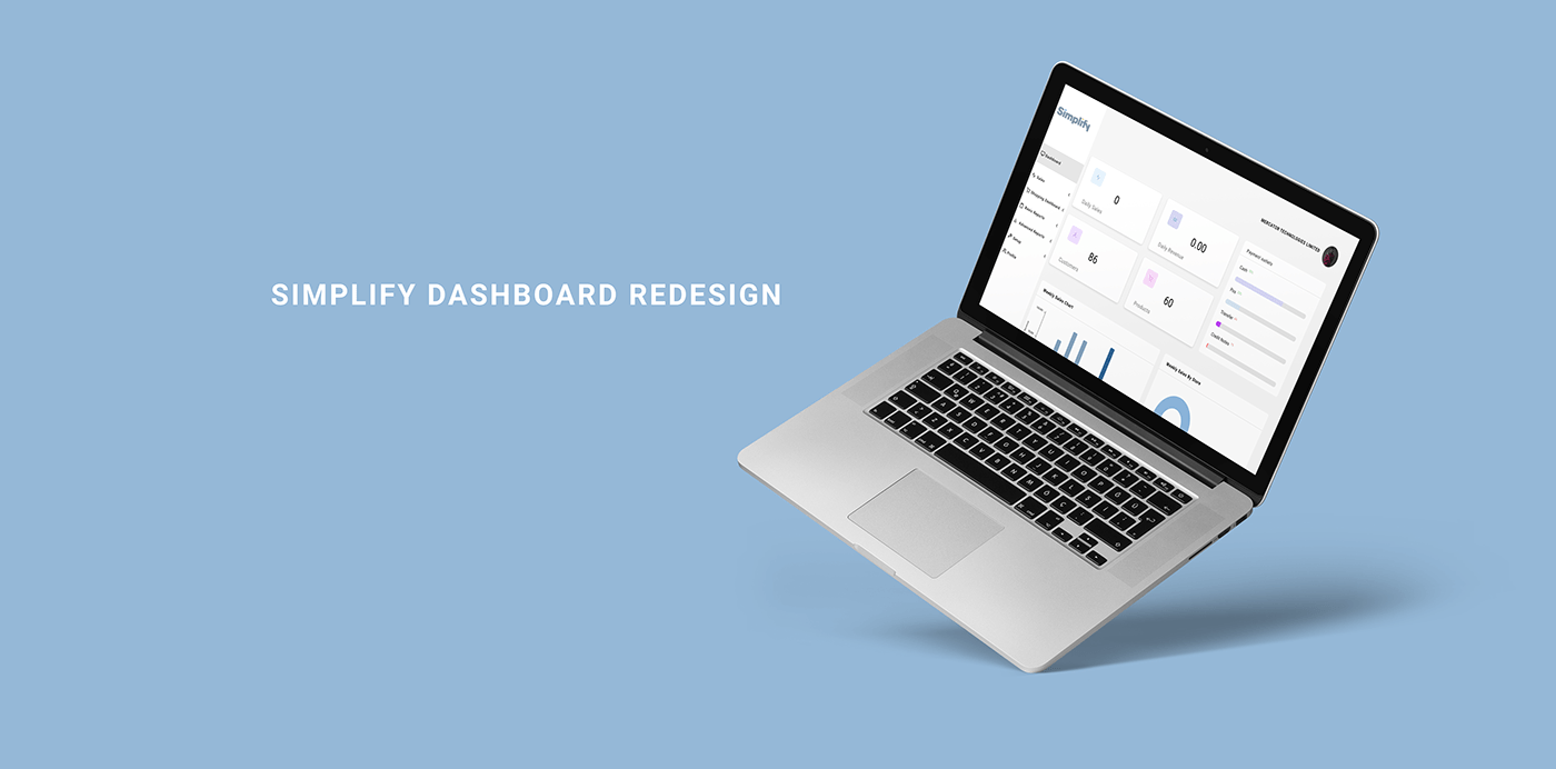
Simplify Dashboard Redesign
I receive a task to propose a redesign for one of simplify’s dashboard, POS page, or log-in page. After going through them I decided to redesign the dashboard.
During this process, I employed the standard principles of design (Define, empathize, ideate and design), combining them to ask 3 questions;
WHAT? WHO? HOW?
What? - During this stage, I looked to know what I’m designing, by answering this question I can know what and what not to incorporate in my design.
So, What is Simplify? To answer this, I visited the simplify homepage, simplify is an omnichannel enterprise, it looks to provide retail payment and record-keeping solutions to businesses.
With this, I can proceed to ask the next question.
Who? - During this stage, I looked to have an understanding of who uses the product. I did a walk through the entire simplify system as well as their homepage and from this, I deduced that the users are retail businesses who need a service that can help them manage their stocks and track their business processes as well as a way to easily accept payments.
CURRENT DASHBOARD DESIGN


How? - So how did I go about the redesign, for this, I looked to improve the aesthetic feel of the dashboard while keeping functionality in mind.
By using the developer console on chrome, I was able to get the font and colors used on the initial dashboard. Though I revamped the look and feel, I didn’t look to deviate from the original style of the dashboard.
Some of the problems I sort to improve are:
Alignment and Grouping: majority of the sections were misaligned and scattered on the dashboard, to improve this, I employed the laws of proximity and common region, I grouped items that are similar or related together, that way a user knows exactly where to find information when they need it.
Color representation: Many of the sections had similar colors that were not distinguishable, I developed a color shades and tints palette from the existing colors to solve this problem.
Use of white spacing: I added more spacing to improve identification and general aesthetic feel
Proper distinguishable icons: Many items, especially the menu items had the same icons therefore, there was no proper communication on what each item represented, I proceeded to looking for Icons that fit into the scope of what simplify was and what I felt they were trying to pass across.
NEW DASHBOARD DESIGN
Low Fidelity Design


High Fidelity Design


