

Problem
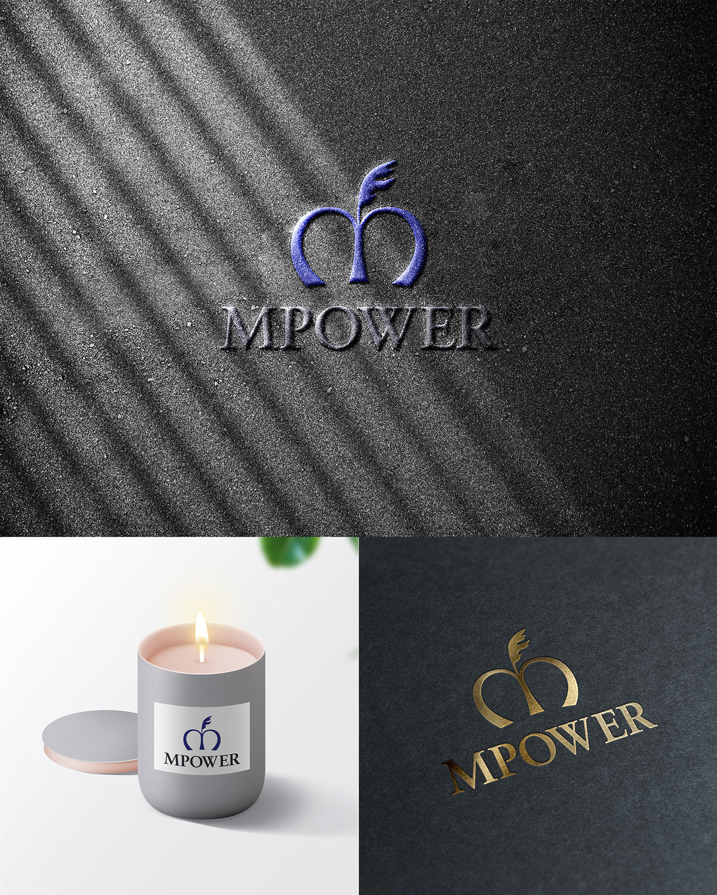
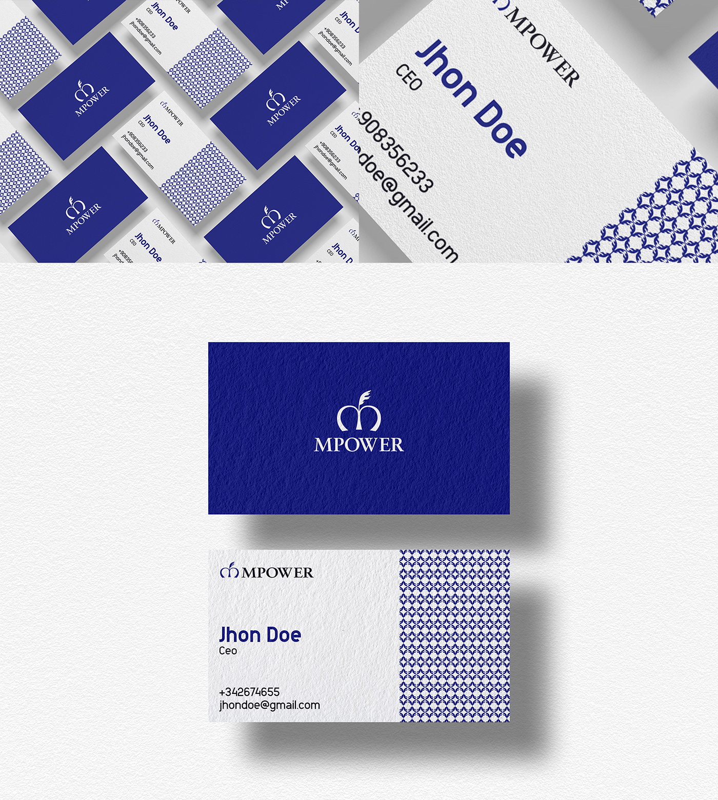
MPOWER is a consulting brand focuses on all kind of businesses who wants to take their business in the next label. They usually discuss everything with business owners, workers, consumers, etc to understand whats going on their business. Then they give them a specific solution for the business. Client wanted to express their royalty, strength, exclusiveness & timelessness through their brand. So I have built a logo and brand for their business.
Solution
I have to deep dive into their brand to find what was really going on. I deeply researched how to express these characteristic on their logo. I found crown is the best element to express royalty and oak leaf is the symbol of strength. So I merged a crown, oak leaf and "M" letter on the logo. I used the oak leaf so wisely that it almost looks like feather which usually uses on a crown. And serif typeface shows timelessness easily.


Thank you


