The Task
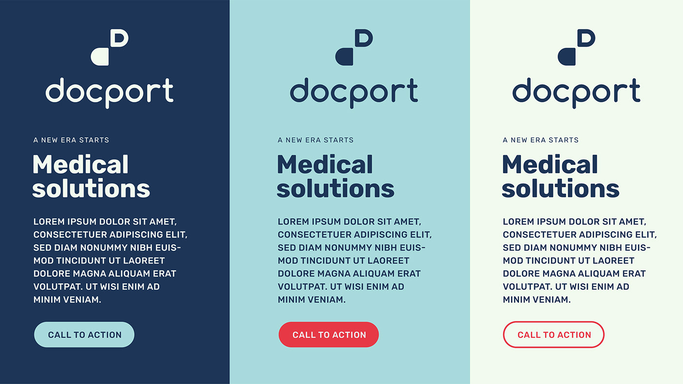
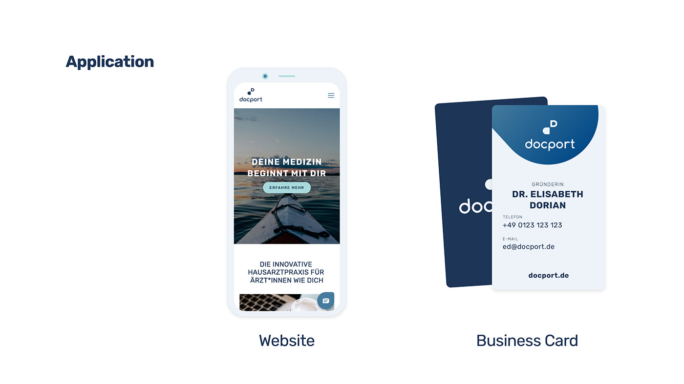
The startup "docport" wanted an easily recognizable logo and mark as well as a small guideline for their branding like colors, fonts.
The startup founded in Düsseldorf by 3 ambitious founders wants to revolutionize the general practitioners market with easy implementation of state-of-the-art tech for doctors’ offices.
The Solution
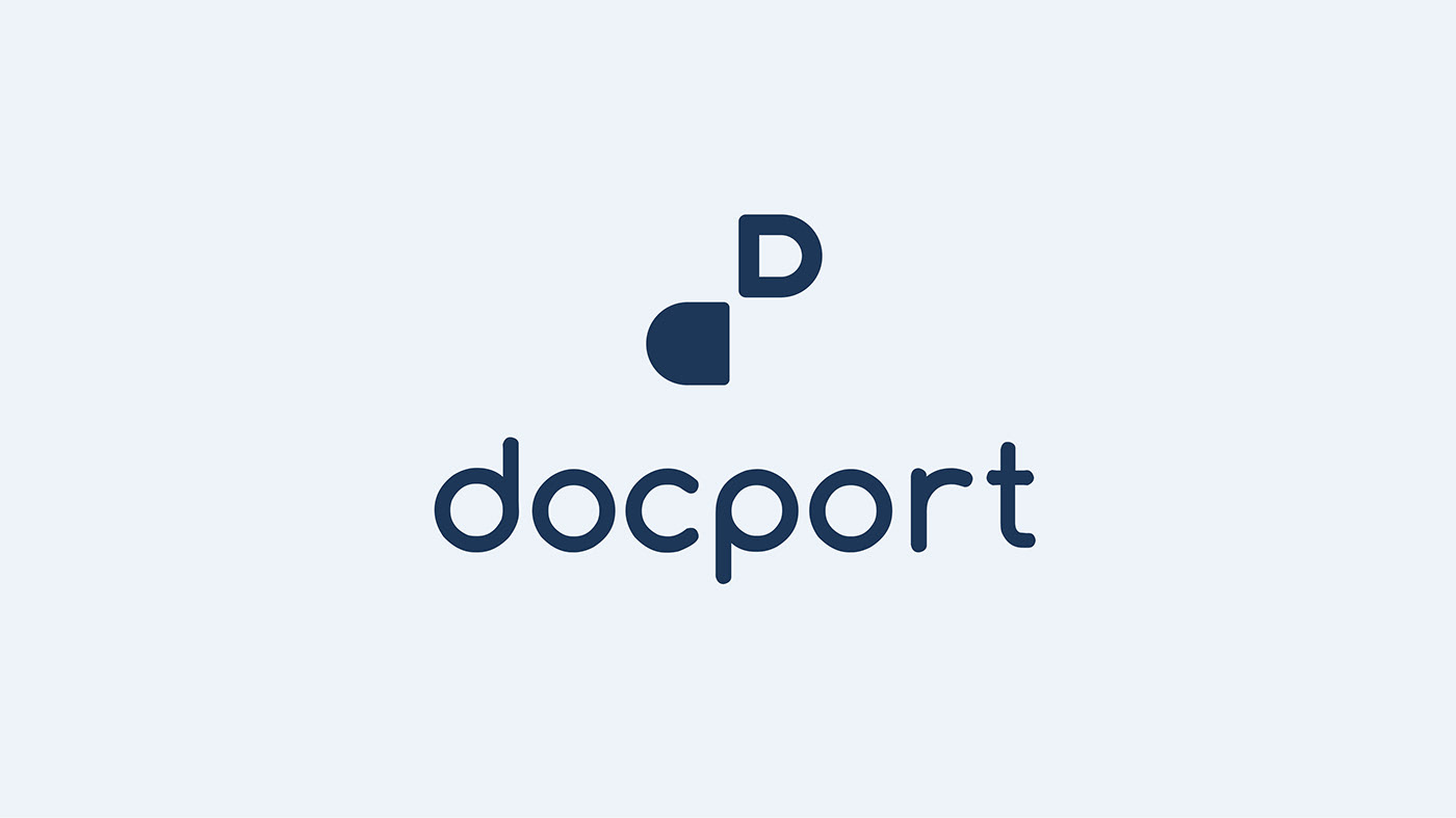
The logo is a simplified letter of the brand name that symbolizes a broken-up pill. A metaphor for the disruptive nature of the startup as well as an eye-catching and minimalist icon that is easily recognizable as well as usable for every medium like smartphones, tablets, and even physical products.