100 Best Posters 11
The appearance and the exhibition design for the competition 100 best
posters 11 were created as part of an interdisciplinary study project.
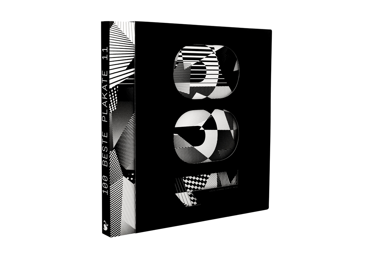
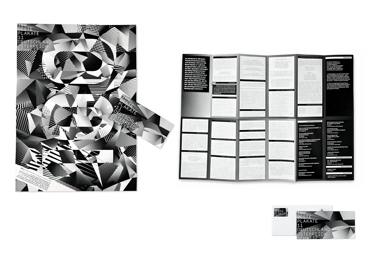
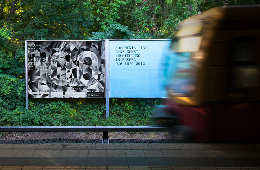
The printing screen as the smallest element of any printed object and thus every
poster, is the focus of the design. Only dot and line screens are used, which represent the printed image and the written word. To give the posters the greatest possible attention, the design is limited to a minimum: any colour is waived.
Black and white as a maximum of contrast.
To create a distinctive appearance out of these elements, the main subject is in
motion. The attentive viewer discovers the 100 in the midst of an explosion of dots and lines. It seems to be merely a snapshot in the transition to something new.
Also the construction of the exhibition system was kept as simple and
essential as possible: black-and-white bars and cross connectors – like the graphic
elements of the line and dot – form the system components.
When assembled, they become a varying spatial shape.
TEAM:
Marina Gärtner
Lena Haase
Laura Hillebrandt
Marita Schwenkedel
Isabel Thoma
The yearbook is published at
Hermann Schmidt Mainz