Mesquita, also affectionately called "Princesinha do Vale", is a Brazilian municipality in the interior of the state of Minas Gerais, in the southeastern region of the country. It is located in the Vale do Rio Doce and belongs to the metropolitan necklace of Vale do Aço. Its estimated population in 2018 was 5,666 inhabitants.
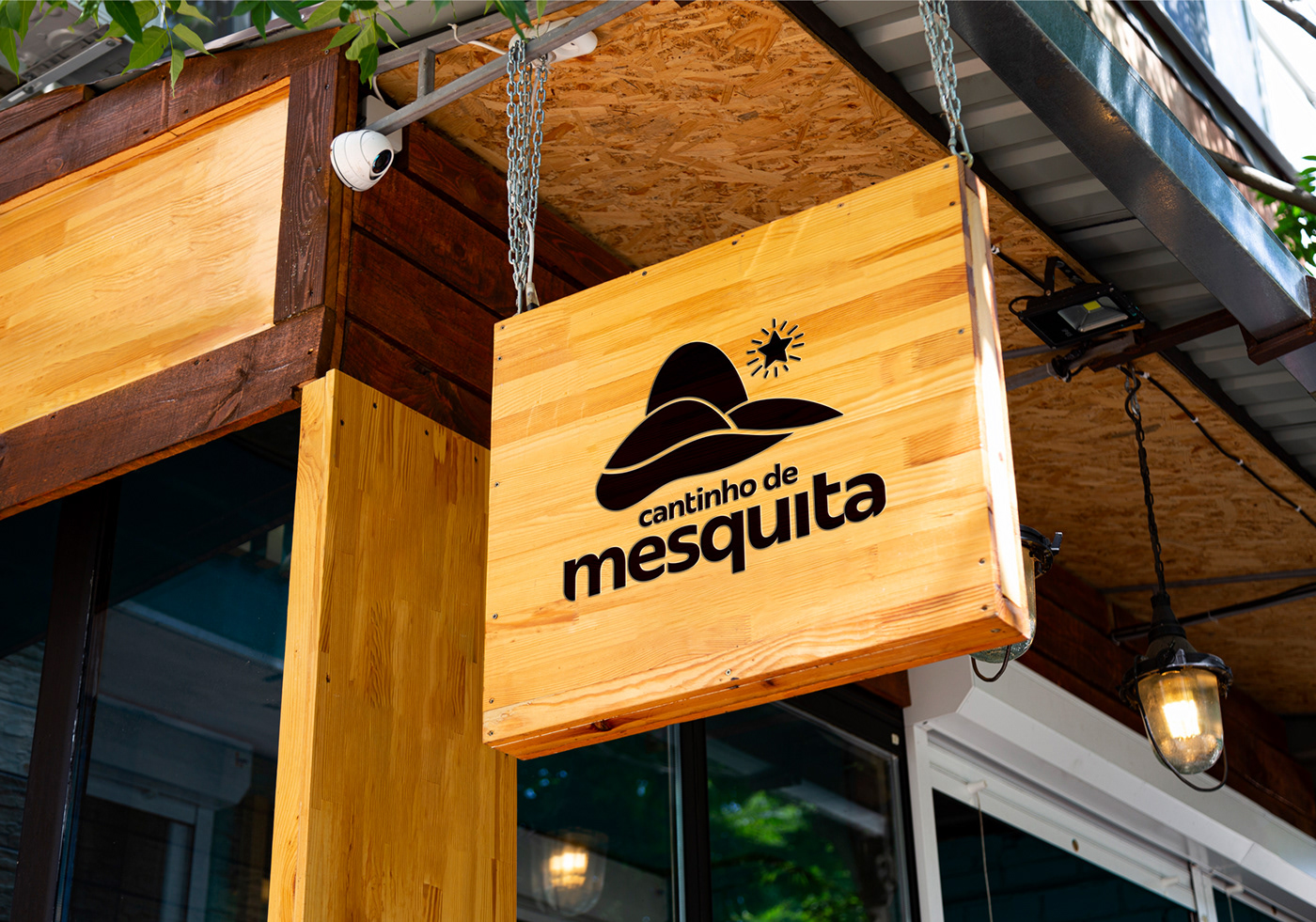
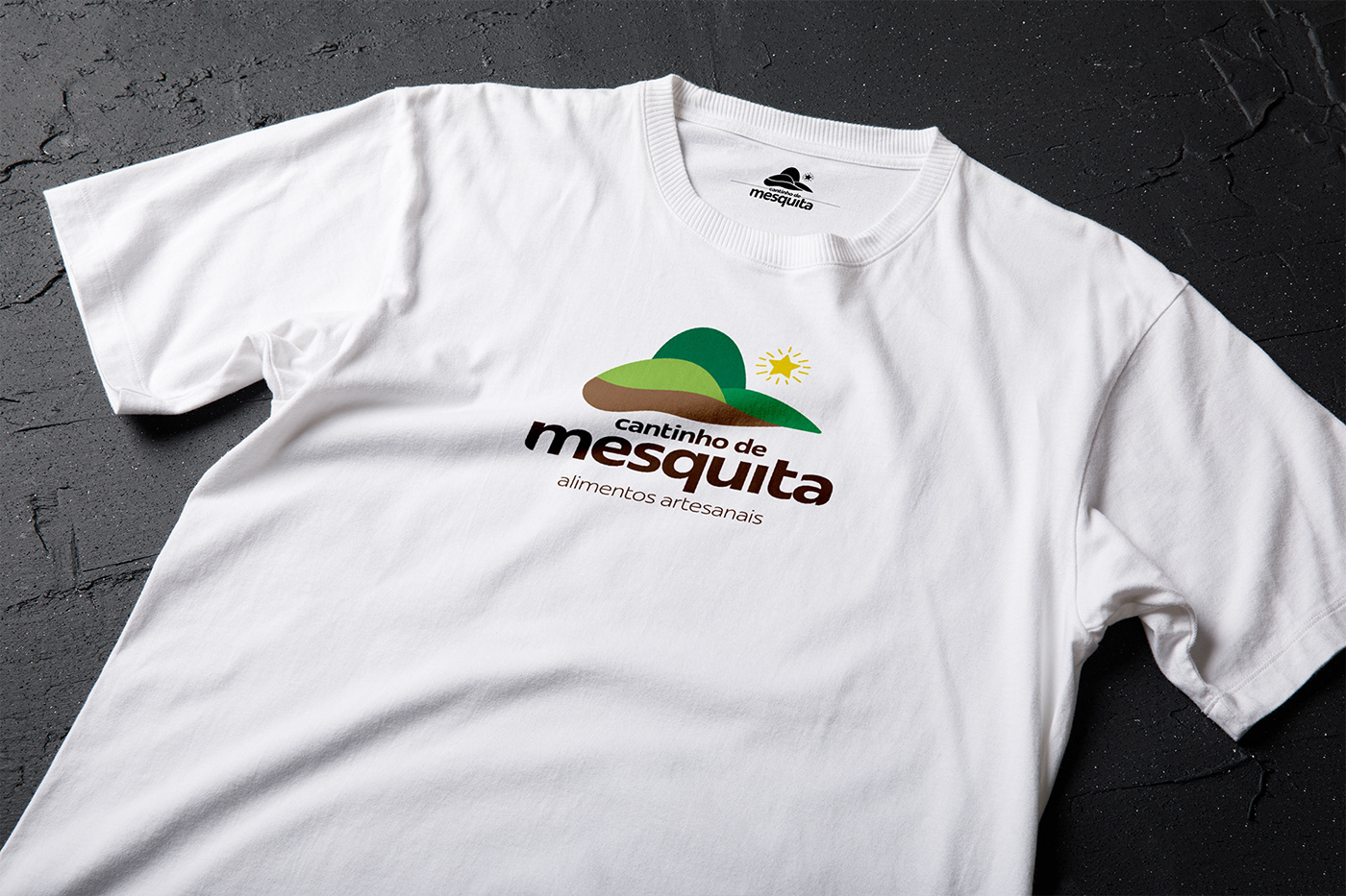
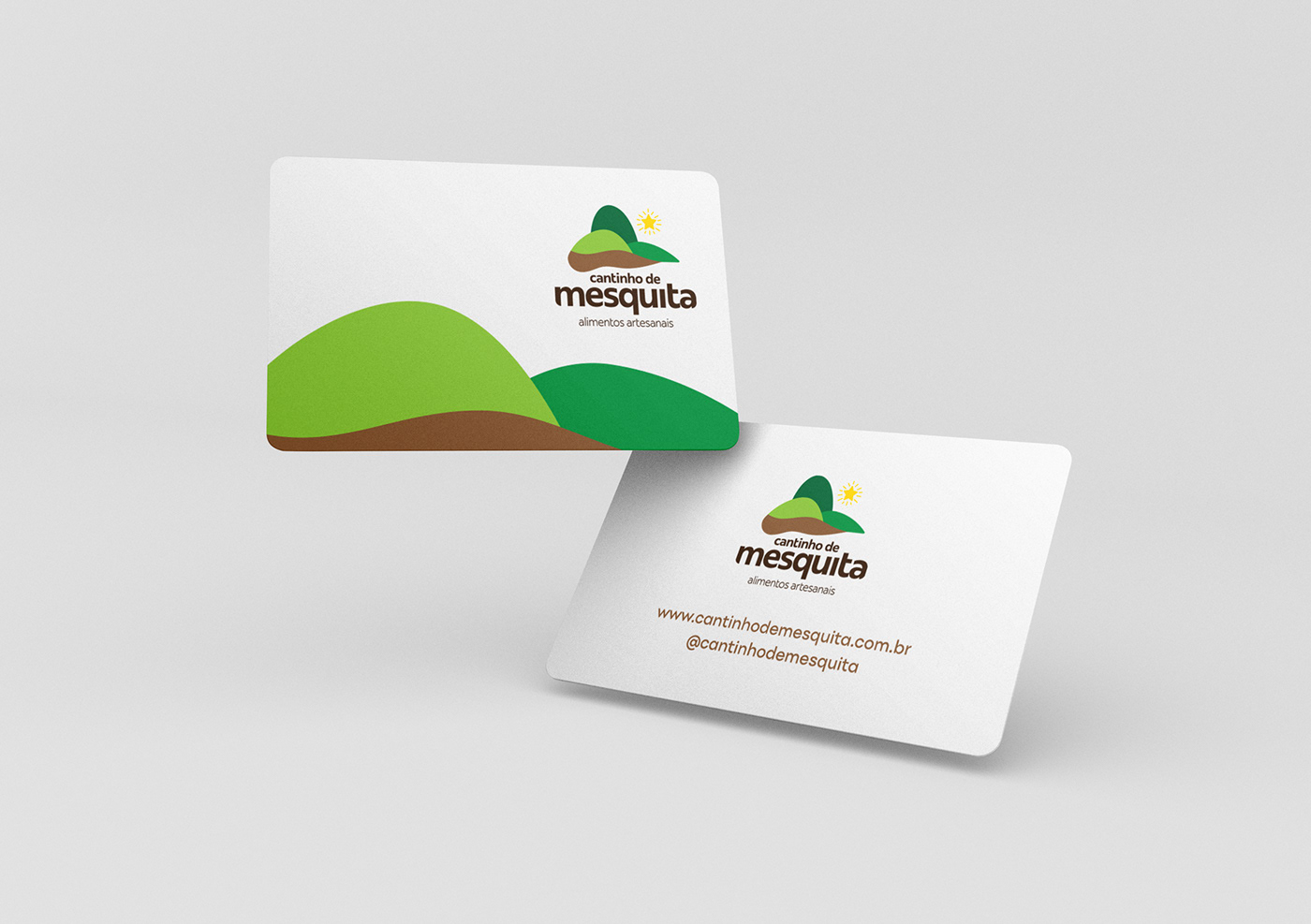
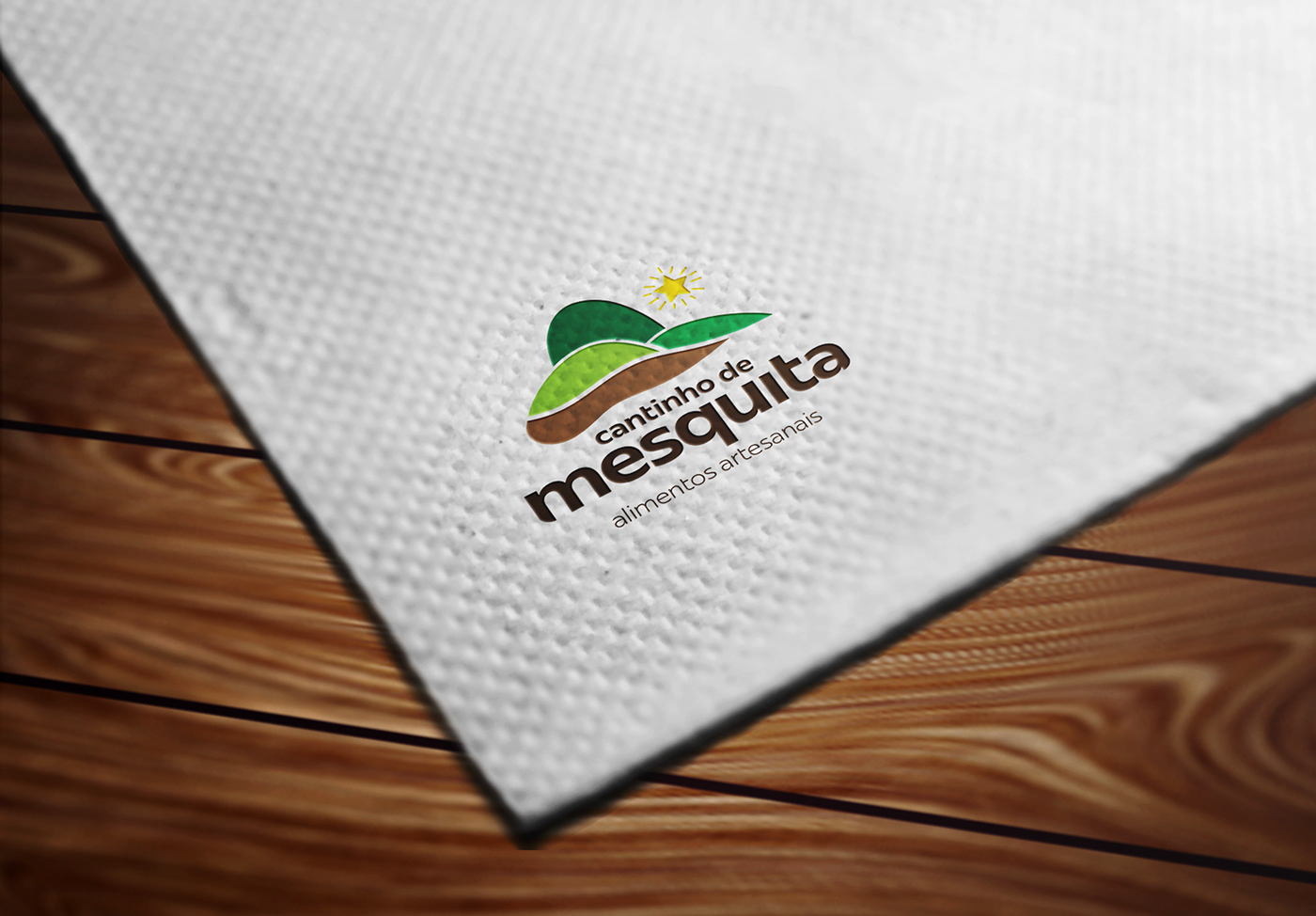
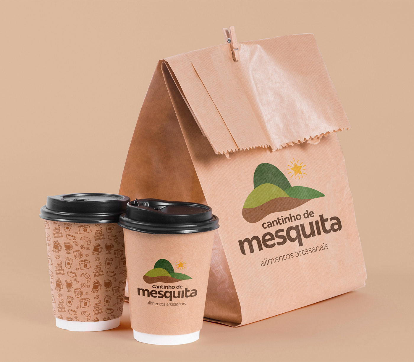
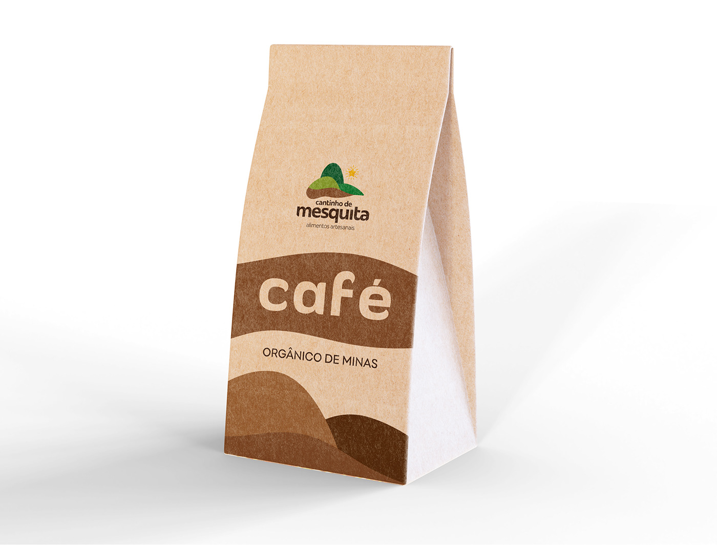
Cantinho de Mesquita is a store that sells organic products produced in the region.The company's objective is to take to the consumer diversified products from the country, manufactured in a handmade way, with a lot of love and affection.
The challenge of this brand was to bring a happy image and, at the same time, harmony, and that above all spoke of the place.
The line of creation and concept I will present below:
-----
Mesquita, também chamada carinhosamente de "Princesinha do Vale", é um município brasileiro no interior do estado de Minas Gerais, Região Sudeste do país. Localiza-se no Vale do Rio Doce e pertence ao colar metropolitano do Vale do Aço. Sua população estimada em 2018 era de 5.666 habitantes.
A Cantinho de Mesquita é uma loja que se destina a vender produtos orgânicos produzidos na região.
O objetivo da empresa é levar ao consumidor produtos diversificados vindos da roça, fabricados de forma artesanal, com muito amor e carinho.
O desafio dessa marca era trazer uma imagem alegre e, ao mesmo tempo, harmonioza, e que sobretudo falasse do local.
A linha da criação e conceito vou apresentar abaixo:

My Sketchbook
-----
Meu caderno de rascunho

Analysis of the elements that make up the Coat of Arms of the city of Mesquita.
The idea of the brand comes from the extraction of some very representative elements found in this ancient coat of arms of the city.
-----
Análise dos elementos que compõem o Brasão de Armas da cidade de Mesquita.
A ideia da marca parte da extração de alguns elementos bem representativos encontrados neste brasão antigo da cidade.

Stylized forms, extracted from the Coat of Arms, which will result in the composition of the brand.
-----
Formas estilizadas, extraídas do Brasão de Armas, que vai resultar na composição da marca.

The typography chosen for this work was the very Brazilian Redonda, a Plau Design font, bringing even more Brazilianism to the brand.
The typography was rounded on the corners to create a central closure at the same time, making it converse even more with the brand's rounded lines.
-----
A tipografia escolhida para esse trabalho foi a brasileiríssima Redonda, uma fonte da Plau Design, trazendo ainda mais o brasileirismo para a marca.
A tipografia foi arredondada nas esquinas para criar um fechamento central ao mesmo tempo, fazendo com que converse ainda mais com as linhas arredondadas da marca.
A tipografia foi arredondada nas esquinas para criar um fechamento central ao mesmo tempo, fazendo com que converse ainda mais com as linhas arredondadas da marca.

Final tag with tagline.
-----
Marca final com tagline.
Next you will follow the step by step of creating the concept and the brand. From the initial sketchbook (above) to the realization of this brand.
-----
A seguir vocês vão acompanhar o passo a passo da criação do conceito e da marca. Do caderno de esboços iniciais (acima) à concretização de fato dessa marca.

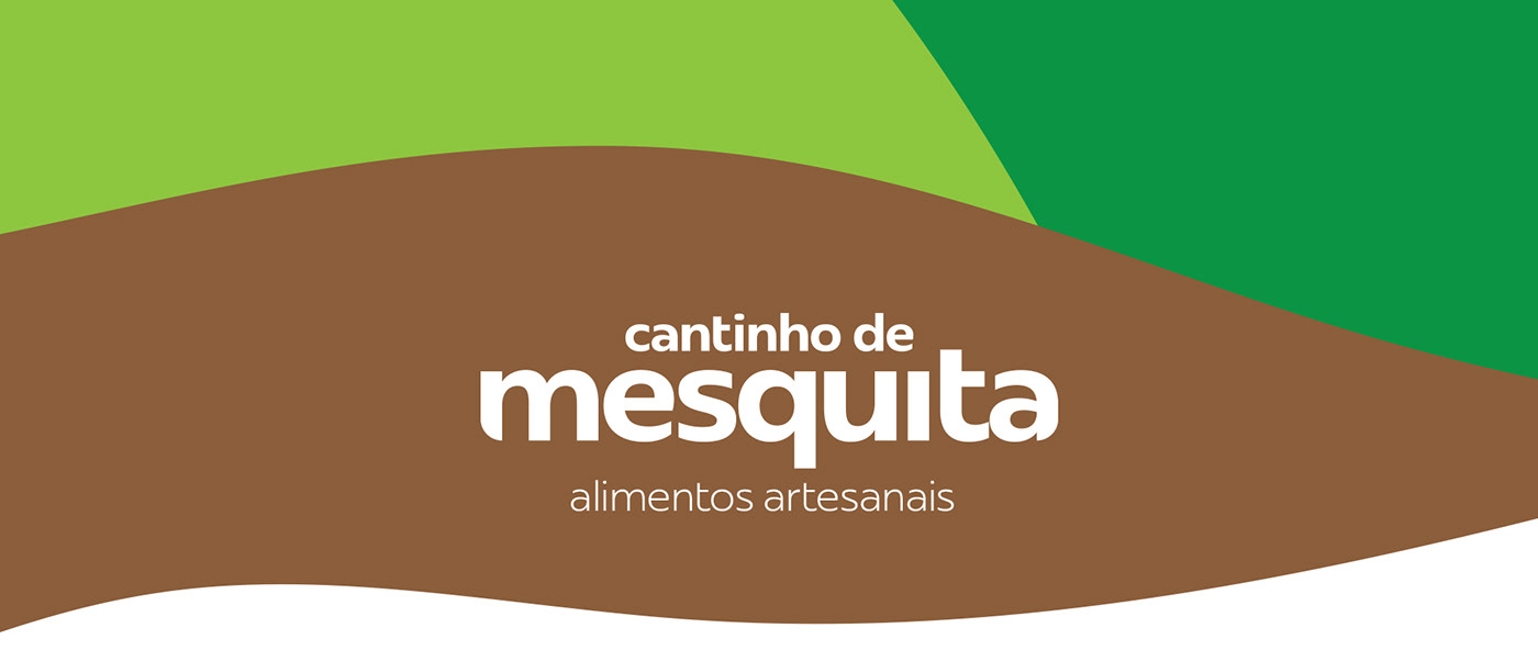
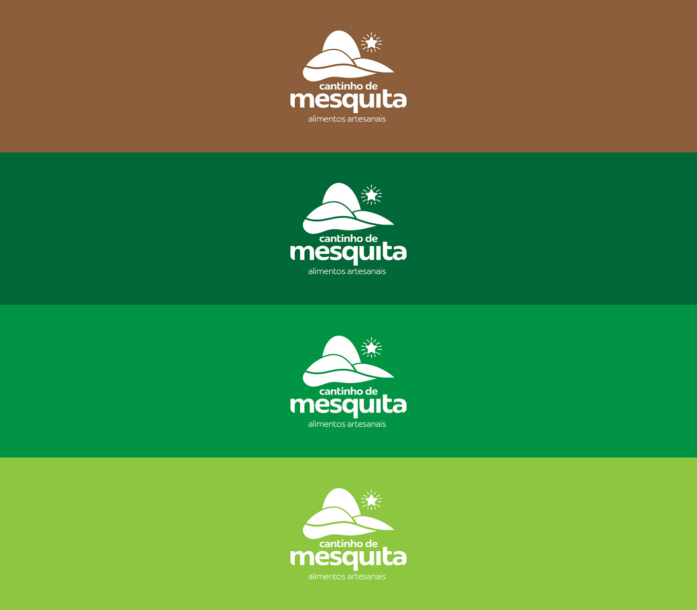
Color palette.
-----
Paleta de cores.