


Who am I?
I’m a 21 year old graphic designer based in Wales. I speak two languages –
Welsh and English – fluently and I’m very proud of my Welsh background and identity.
In terms of my personality, I have confidence in saying that I’m an introvert, but that doesn’t define me entirely. Although I’m not the loudest, my ideas are. If I’m not bouncing around the room, my creativity is.
I’m an INFJ. I’m dedicated, a hard grafter, and empathetic. I want to strive for greatness, whilst also maintaining and making relationships, meaning connections and rapport are important to me.

Philosophy.
I believe in good design. That’s the general idea. I feel that a design is only good if it fits its function.
“Form follows function.” That saying resonates with me as the foundation of my practice. I’m attracted to the idea that good design has a good basis, a good framework, a blueprint if you will. I feel like the fundamentals need to be hit, before the aesthetics are worked on. I think that design with a purpose is the best kind of design, or maybe better put, is the only way to ‘design’.

Audience.
As a 21 year old, I'm needing to appeal to the youth, particularly those in the realm of esports and its surrounding design community, and also catering to the taste of future employers and their clients.


Inspiration.
As mentioned in my biography above, communication and problem solving are aspects of design that I believe separate design and art. These are fundamentals that I want to represent and hold closely to my design morals. With that being said, I think that International Typographic Style (Swiss Style) does exactly that, so I’m very inspired by that movement.
With communication being at the forefront of my ideology, Morse Code, used in the most widely used form of telegraphy, is something that I feel represents me and my values well.


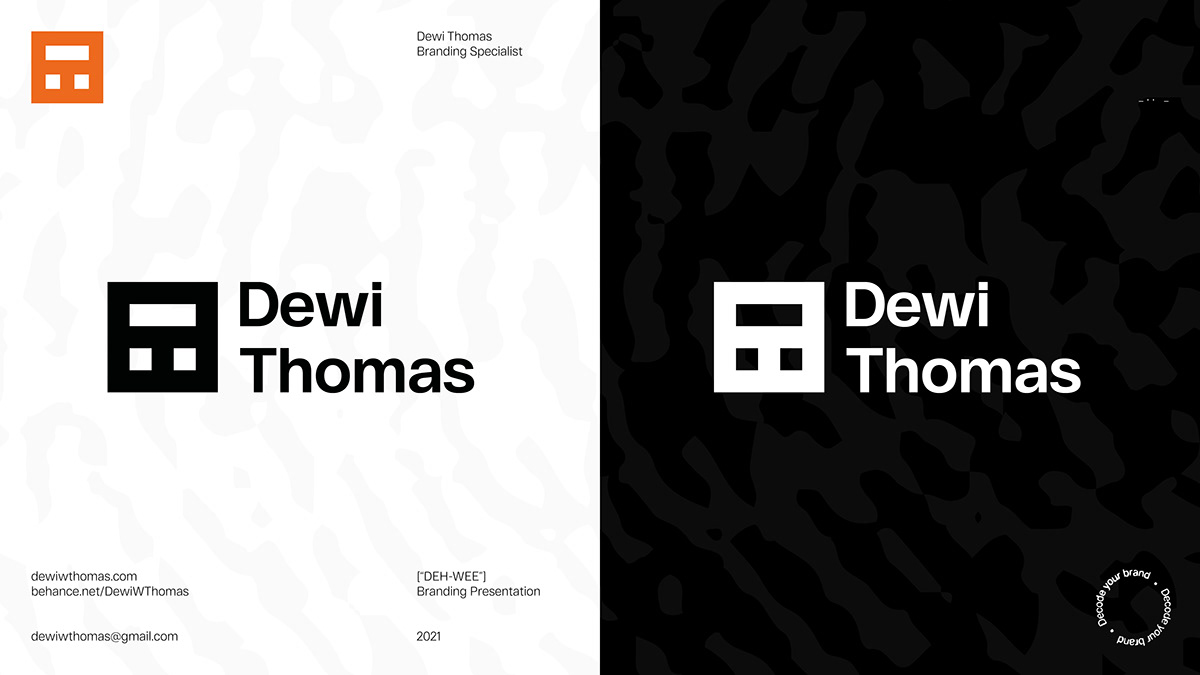
Logo Design.
The logo is built from my initials. The "D" in Morse Code, stacked in a 3x3 grid with the "T" being found in the negative space. This icon is then inverted onto 5x5 grid to have clear edges for the purpose of anchoring and assisting with the Swiss Style layout.


Typography.
The typeface RF Dewi is the only typeface used throughout my branding. Where contrast is needed, the 'Bold' and 'Light' weights should be used, otherwise 'Regular' is preferred.
The typeface is edited/customised for the use in the logo lockup to align the ascender height with the cap height for visual consistency.


Tagline.
The tagline shows what my job is in a concise and clever manner. My job as a branding specialist is to provide a clear brand breakdown and structure when creating an identity. It is also a play on the theme of Morse Code.
The tagline is displayed as circular 'stamp'. This is infer the idea of a 'stamp of approval', affirming that the work I create is always aiming to be of the best standard. Also, with the rest of the brand using clear squared grids and assets, the circular shape provides a break for the eye thus helping with the hierarchy.


Pattern.
Authenticity is important to me. I want my brand to feel personal, and I couldn't think of a better way than incorporating my thumbprint to serve as a pattern/asset.


Website.
I wanted a central landing page for all of my social media yet included a clear primary action for the user - to 'View Portfolio'.
I designed the website using Adobe XD. All credit goes to Ben Grey (Paper Crowns) for developing the website and all its features.
Click the URL to visit my website: dewiwthomas.com

Analogue assets.
"I use this stuff... That's the main thing. Does it help me along my day? That's why I made the stuff in the first place, to serve what I need." - Aaron Draplin (DDC)
This quote provides a basis for my analogue assets. I want to make things useful to help with day-to-day tasks as a designer or creative. With analogue assets, I also aim to create a lasting impression. The way I do this is to appeal to the senses, implementing touch as well as the visual.
Good examples of this would be the business cards. They incorporate an enamel pin as the logo because it encourages interaction (and I love pins). The business cards would also be made using recycled material. Another example would be the bookmarks. As a creative I'm always sketching and reading, so having space on the bookmark to doodle, write notes, and scribble ideas would be perfect for me.


