New Packaging of Palmolive Sets: Up-to-date Solutions
and Fresh Attitude towards Development
Palmolive, the brand owned by Colgate-Palmolive, has recently updated its guidebook and logo to get an updated look.
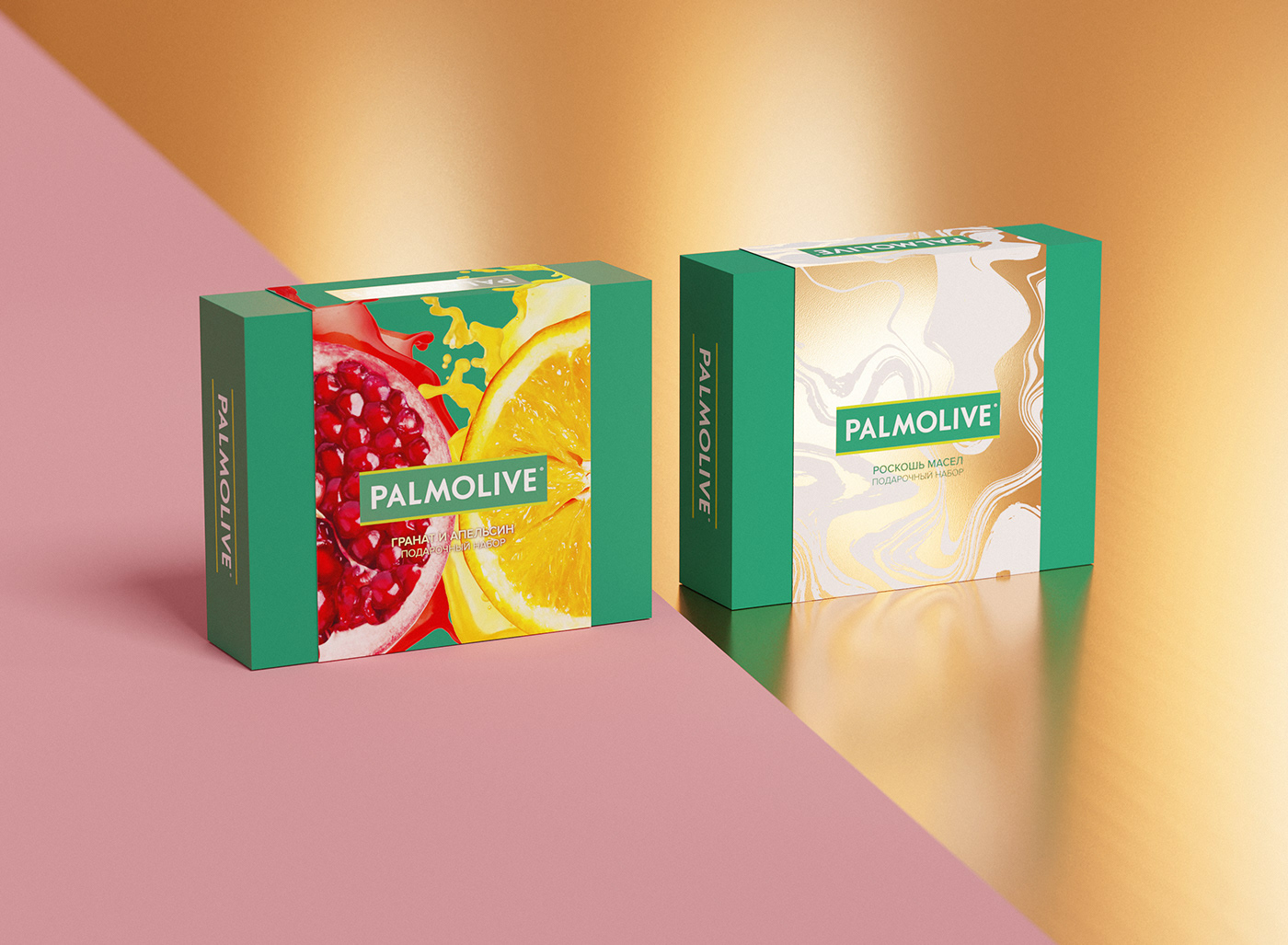
Yasno. branding agency has developed the packaging design of Palmolive Naturel and Luxury Oils gift sets for the brand's new online sales format.
The new kits belong to the premium price segment in the category. Thanks to the new design, Yasno agency emphasized the high quality and uniqueness of the product, made it more friendly and familiar to the consumer in the selected sales channel. The design of the box is based on the brand's guide book; at the same time, the packaging for online sales has its unique personality.
We chose the most relevant style today: a limited number of colors in the packaging design, an emphasis on large images of the ingredients, moderate use of textures – and clear fonts.
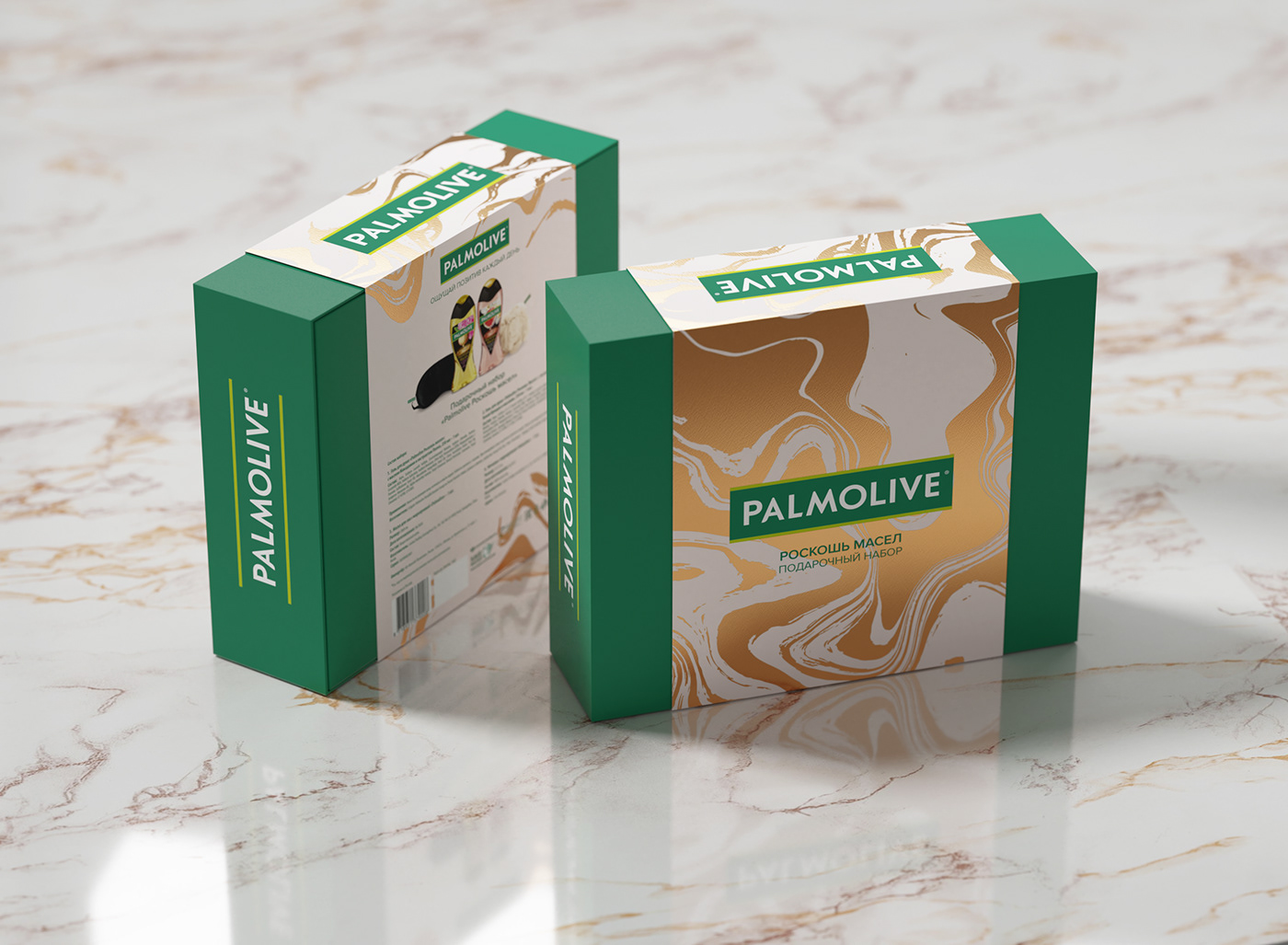
The gift set is packed in a simple box with a separate lid, which is fastened to the box with a wide shell. For the shell, the agency has created its own concept.

The first package of Palmolive Luxury Oils, features the poured golden oil. It seems that it slowly fills the entire area, like volcanic lava. The metallic texture and golden sheen create a truly premium product feel.
The peculiarity of packaging gift sets for e-commerce is that it is not necessary to make a cutting, a transparent window or visualize the contents of the set. The buyer can see what is inside by scrolling through the slide show on the product page. Textures, finishes, and special effects on packaging work well in offline retail. The consumer can take the package in hand, watch its design elements, feel the weight of the package. You can't do this using online catalogs.
But this does not mean that the packaging design is not important. Yasno, thanks to its well-thought-out design, has given the product its definite competitive advantage in online retail.

On the back side of Palmolive gift packages, their contents are shown in large detail for the consumers’ convenience. Orange and burgundy splashes of paint slightly dilute the calm design of the reverse side, bringing a touch of audacity.

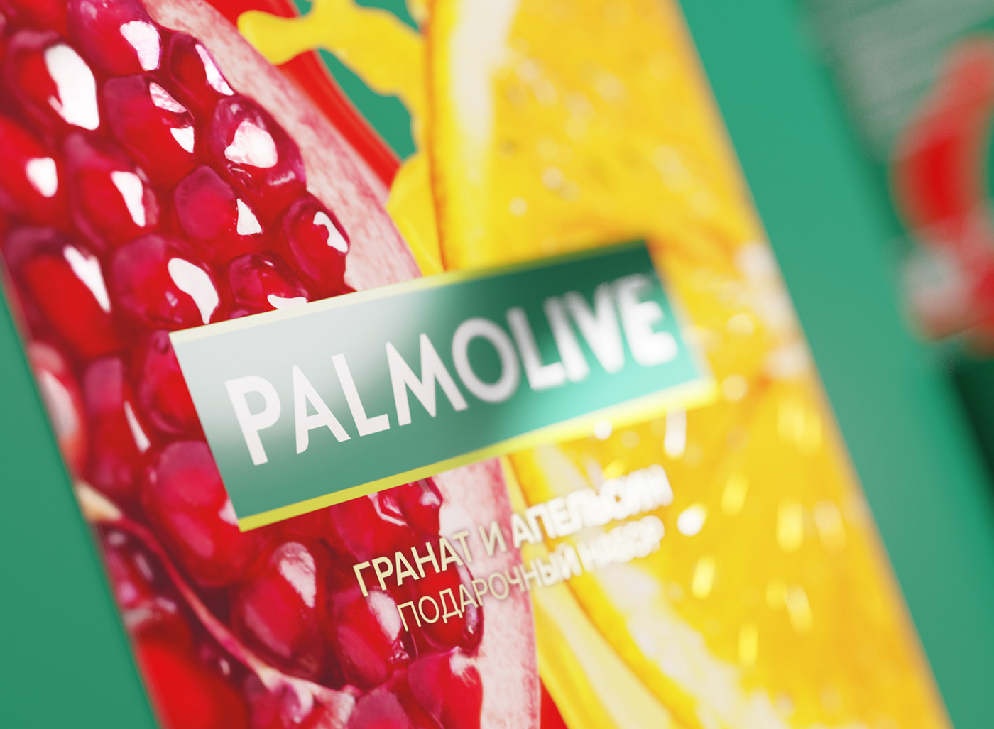
On the second package of Palmolive Naturel, delicious ingredients are visualized. Juicy pomegranate and orange occupy the entire area of the front part of the design, which makes the box noticeable and appealing. The juicy orange and burgundy colors of the fruits contrast with the turquoise hue of the packaging itself.
This is a rather practical trick. In the online stores’ catalogs, the images are quite small, and this technique will allow the design to look more impressive among competitors.