

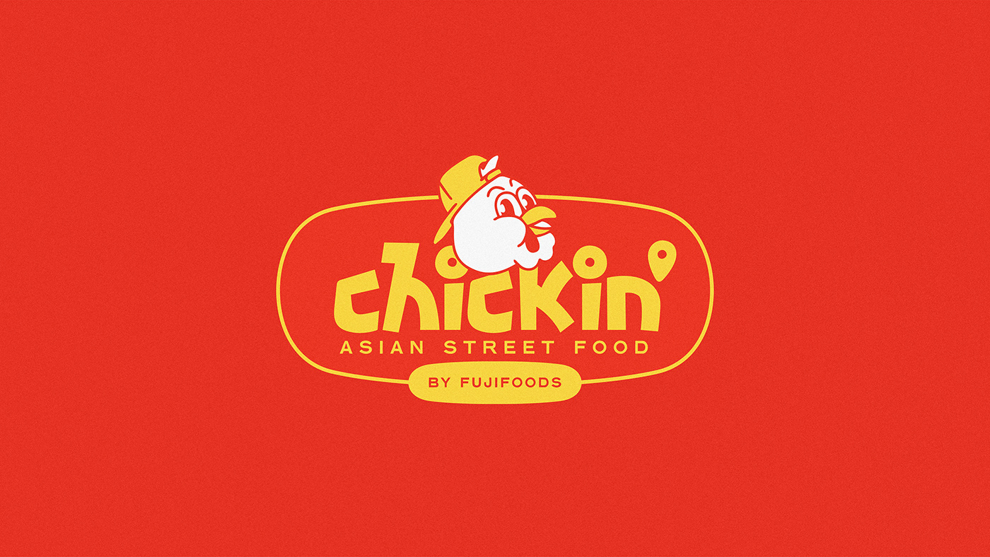
Chickin’ is one of the very first fast food in Vietnam whose main products are chicken directly sold from trucks. Based on convenient mobile concept & eye-catching visuals, Chickin’ no-doubt does not only play it cool the role of life-savers for those growling bellies in emergency but also deliver “fresh – dynamic – funky” traits in eyes (while delivering chickens in hands). Only “debuted” as the new comer in this market, in the context of this bustling urban lifestyle of Hanoi, Chickin’ has won over kids & teenagers’ hearts & collected a group of fans due to its “fast- come – fast – serve”, tidiness & presence of threading over any corners in Hanoi thanks to its transportable mobility.
This upcoming re-branding project is set up for both better communication with customer in distance when grabbing their attention from faraway and the bold emphasis onto the spirit of Chickin’ which is also in Vietnamese youngster’s blood – the main target customers. Besides, the Korean soul is also added as the perfect differentiated trait keeping Chickin’ outstandingly “badass” among casual truck food brands in local.
CONCEPT
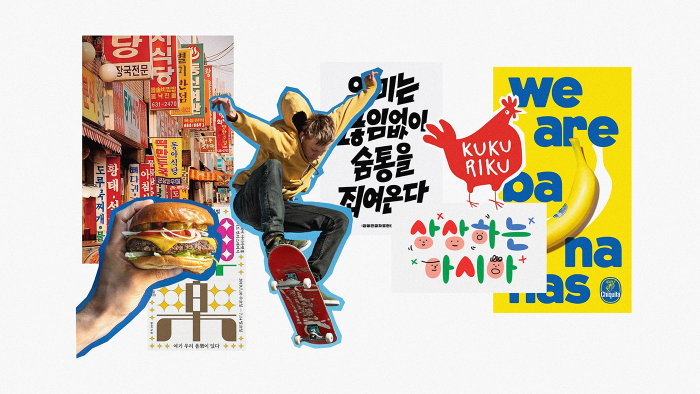
Together with chicken-marinating recipes inspired by Korean street food, we are approaching this concept through can’t-be-closer images from Korean Street Food that everybody might have seen once on K-pop MVs or K-drama or simply a trip to Korea which are easily reminded even with a glance of eye. The core visual of Chickin’ is nothing else but Korea food stalls & restaurant’s glowing banners that are playful & attention-grabbing as the way Chickin’ is aiming at.
COLOR
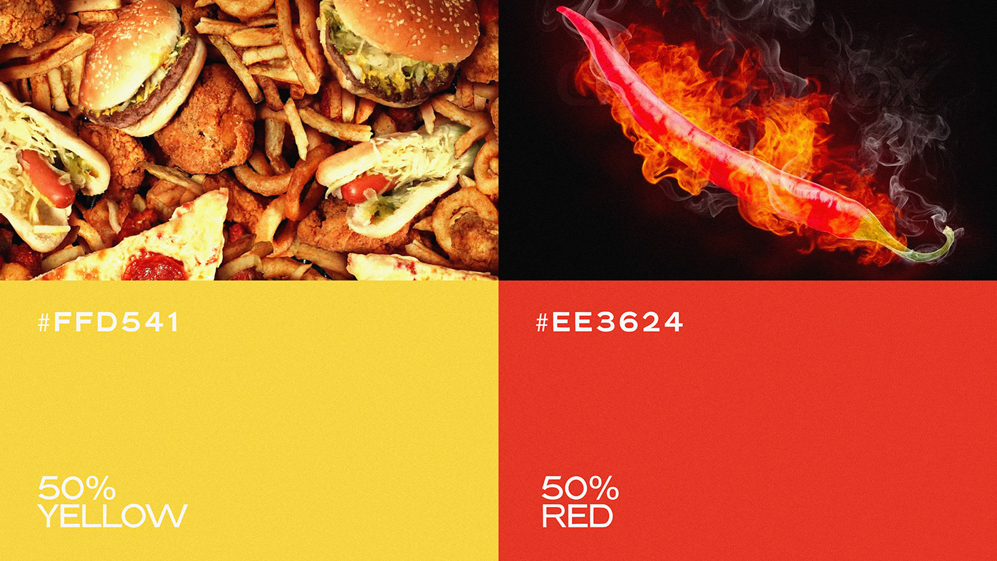
Color palette of Chickin’ is a good team in harmony of colors when Red gives Yellow a helping hand. While Yellow “dominates” & somehow is simply “detected” in most of dishes of Fast Food culture from the West, Red completes its mission when portraiting the main color of Korean cuisine in which chilli peppers are the indispensible ingredient. The couple of colors seem mainstream yet tempting to your mind whilst savory unconsiously is running through your throats.
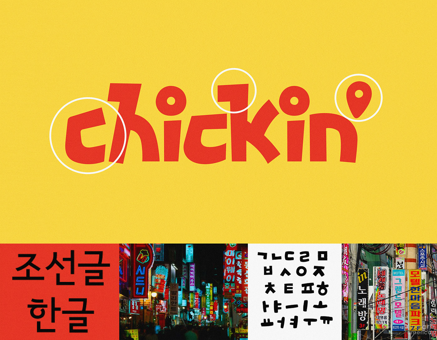
TYPEFACE
In the sense of paying homage & appreciation towards the Korean authentic recipes as the source of creativity, our typeface gets influenced mainly by Korean’s common fonts effortlessly found on Korean’s Street Food banners – “ ROUGH in curves, BOLD in shapes, INTO-YOUR-FACE in mission”. Also, it would be a missing piece if we overlook the “Funky” sense that is “secretly” illustrated through the “flexible” postures of alphabet – where the mobility is shown, also. Or you might imagine the crunchiness & crispiness of chicken when it comes to the first bite in front of Chickin’ truck via its typography.

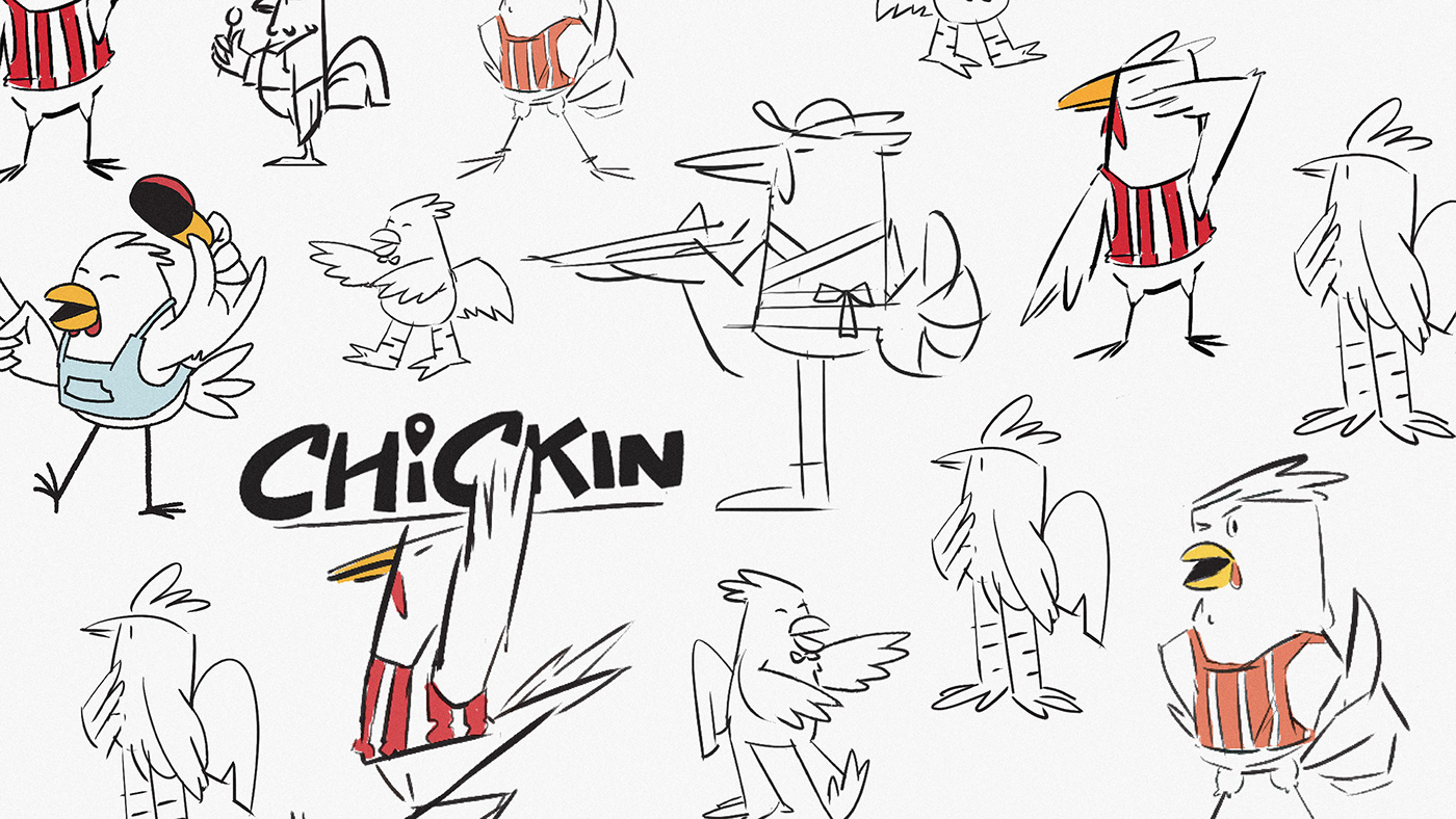
MASCOT
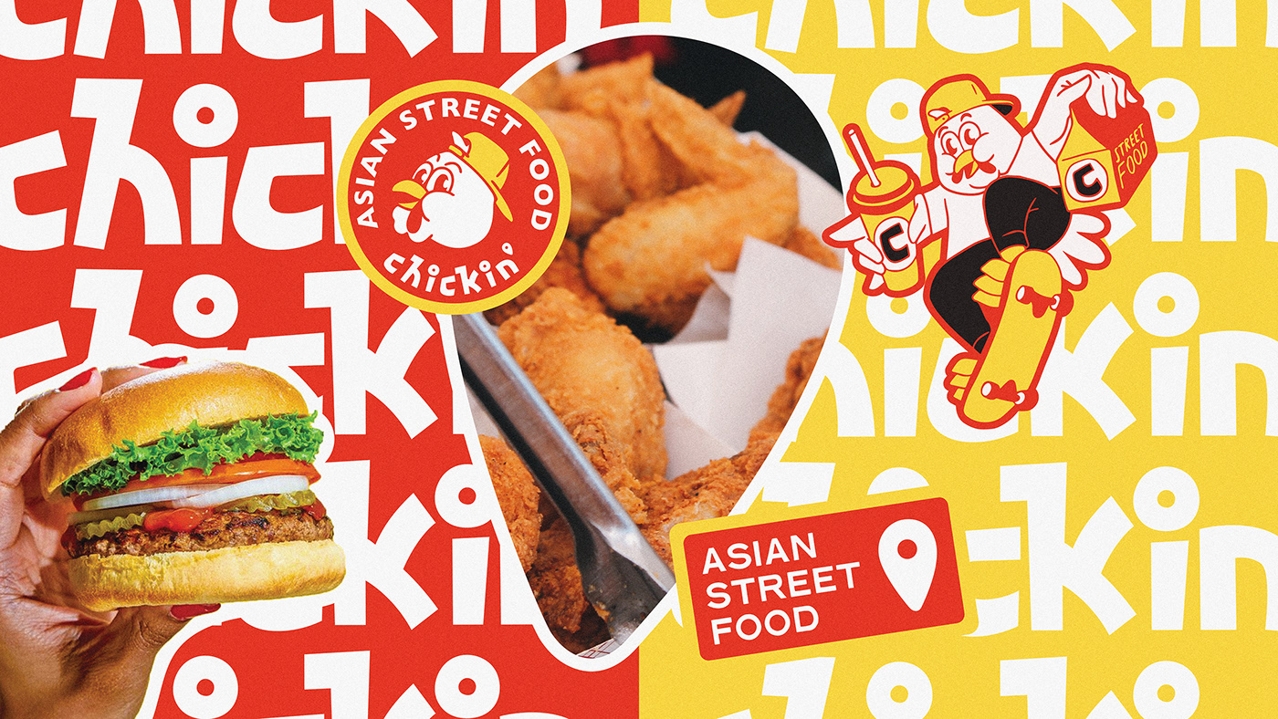
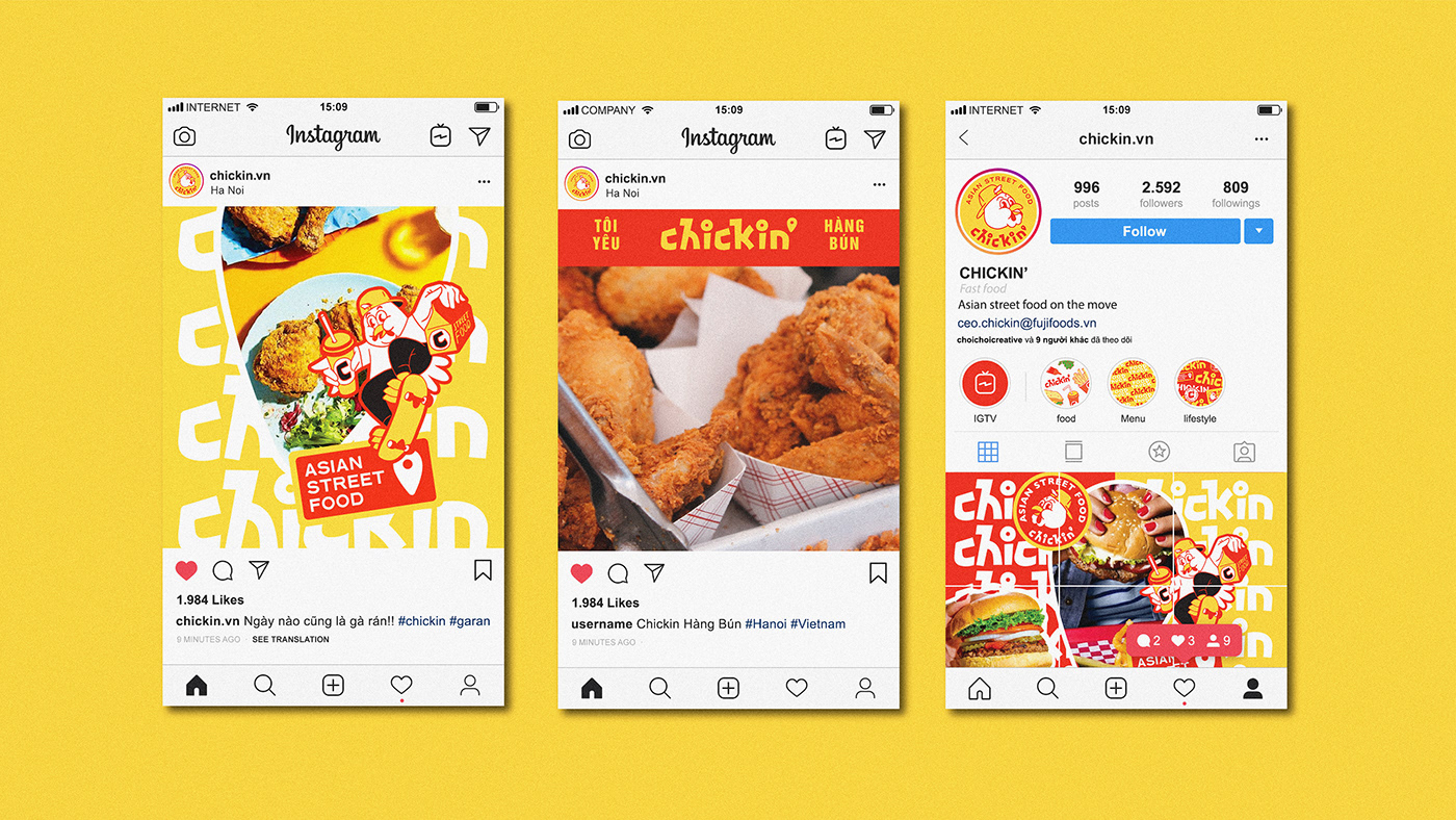
The appealing look of “Chicken” character who is also the main products of Chickin’ while its body & shapes arouse the Hiphop spirit within underlines the “energetic” feature - the common persona of the young generation in Vietnam.
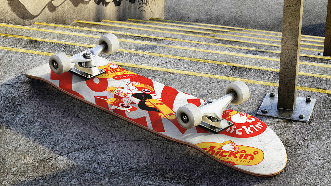
Once again, the “fresh –dynamic – funky” premise in root of Chickin’ is desmonstrated visually by a “BOOM” of Logo’s variants of shapes, positions, structures & mascot-involment. Consequently, the adaptability comes smoothly to be used from massive pieces like banners, posters,truck pattern,... to detailed pieces such as packaging items, skateboards or even stickers.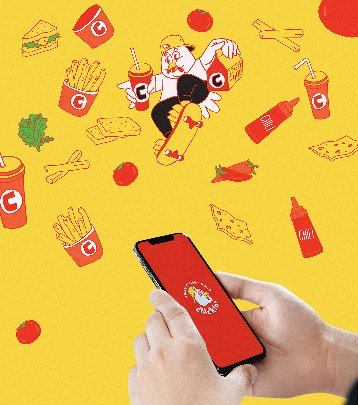


Client / Chickin' Vietnam
Art Direction / Laint - Hieule
Designer / Hann - Khang - Tram Anh
Animation / Hann - Khang
Location / Ha Noi - Viet Nam
Thanks for watching


