Analysis on the packaging of TIC TAC mint
About Packaging:
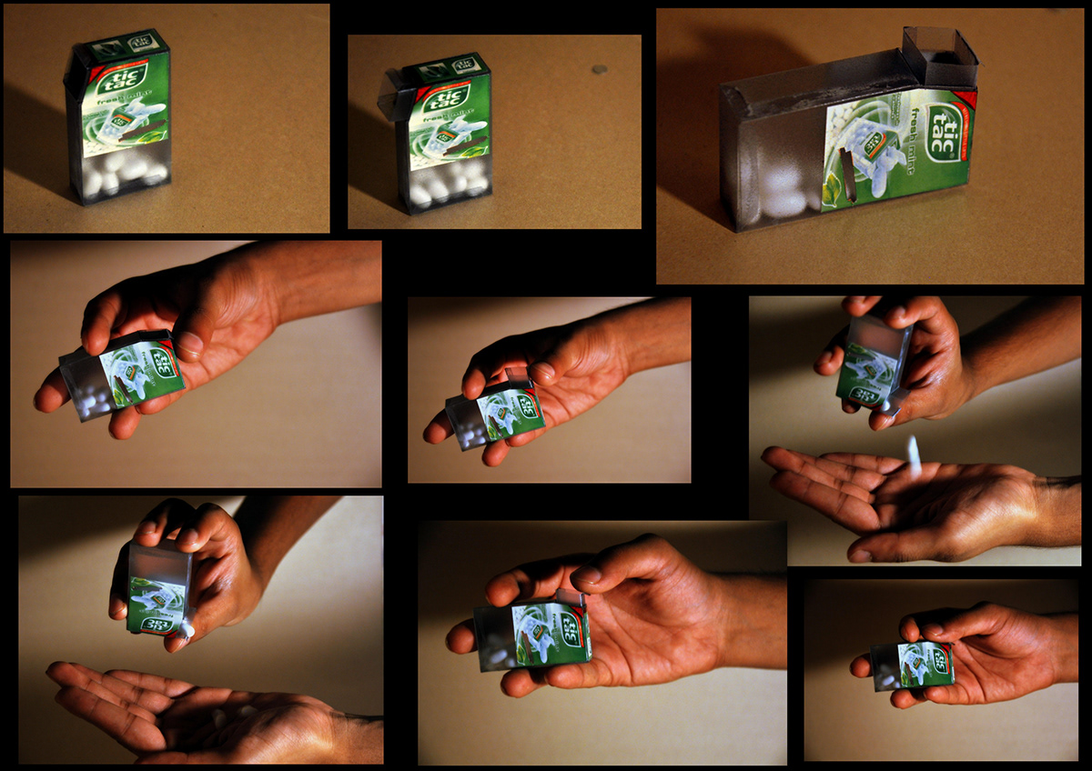
The oval shaped mint logens comes in a rectangular transparent box that has a white cap with a small oval shaped opening that allows the mint to come out when shaked after the cap is popd up. Over the cap is a green color sticker that communicates the details of the product and the manufacturer.
Brand Vision:
To establish as one of the most selling brands in the field of mint mouth freshners, and its attractive pop up packaging serves a lot.
To establish as one of the most selling brands in the field of mint mouth freshners, and its attractive pop up packaging serves a lot.
Packaging functionality:
To shake up your tastebuds with the unique refreshing experience of tic tac mints.
Aesthetics:
Its oval shape is playful and obviously the packaging is exciting.
Packaging working mechanism / How to use it

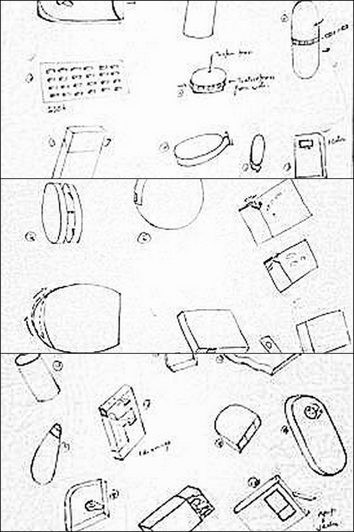
Existing packaging sketches

Concept brainstorming
After analyzing the problems in the existing packaging and keeping in mind the brand vision as mentioned earlier I came up with various concepts.