CF Napa Establishes Tiered Design for Hillside Winery
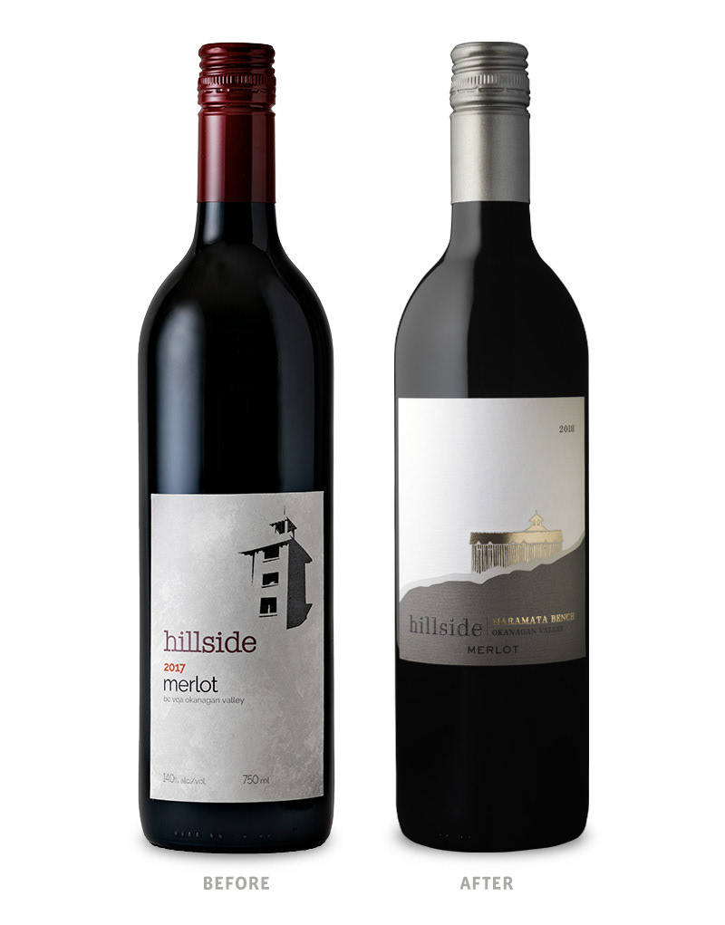
Hillside Winery, located in Penticton, B.C., came to CF Napa to both premiumize their packaging to reflect the quality of their wines and to create greater differentiation between their multiple tiers. Despite the varying price points, most of their wines shared the same packaging design; leaving their higher end wines devoid of the opportunity to assert their single vineyard status and exceptional Naramata Bench pedigree.

CF Napa collaborated with the Hillside Winery team to define tiers within their expansive portfolio of wines. Once these were established, CF Napa developed a design system with a cohesive family look that still allowed for “laddering up” to more premium looks for each of the higher tiers. A silhouette of the winery along its iconic namesake hillside became the unifying symbol of the brand.
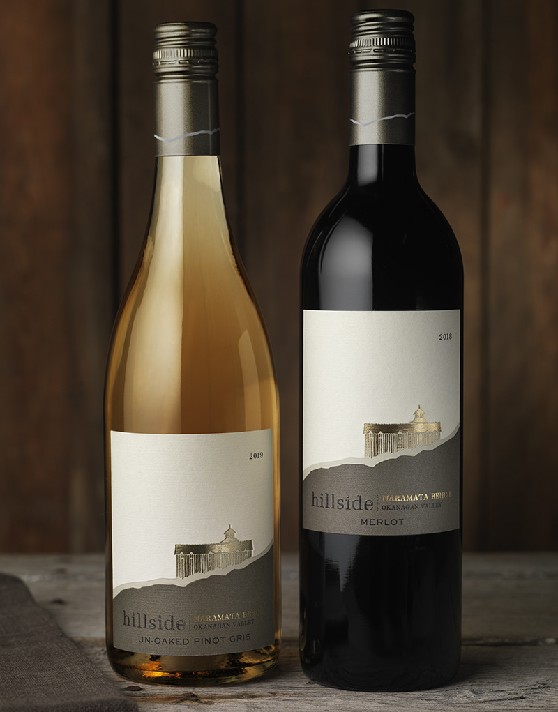
The entry tier gilds the silhouette in gold foil on a two-color label.

As the design ladders up to the Heritage Series Tier, the silhouette becomes a die cut, showing off the wine in the bottle.
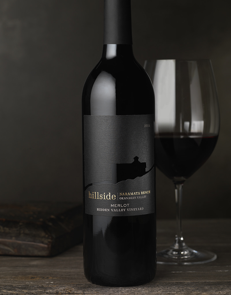
For the Single Vineyard Tier, the label color changes from gray and cream tones to a luxurious and understated black.
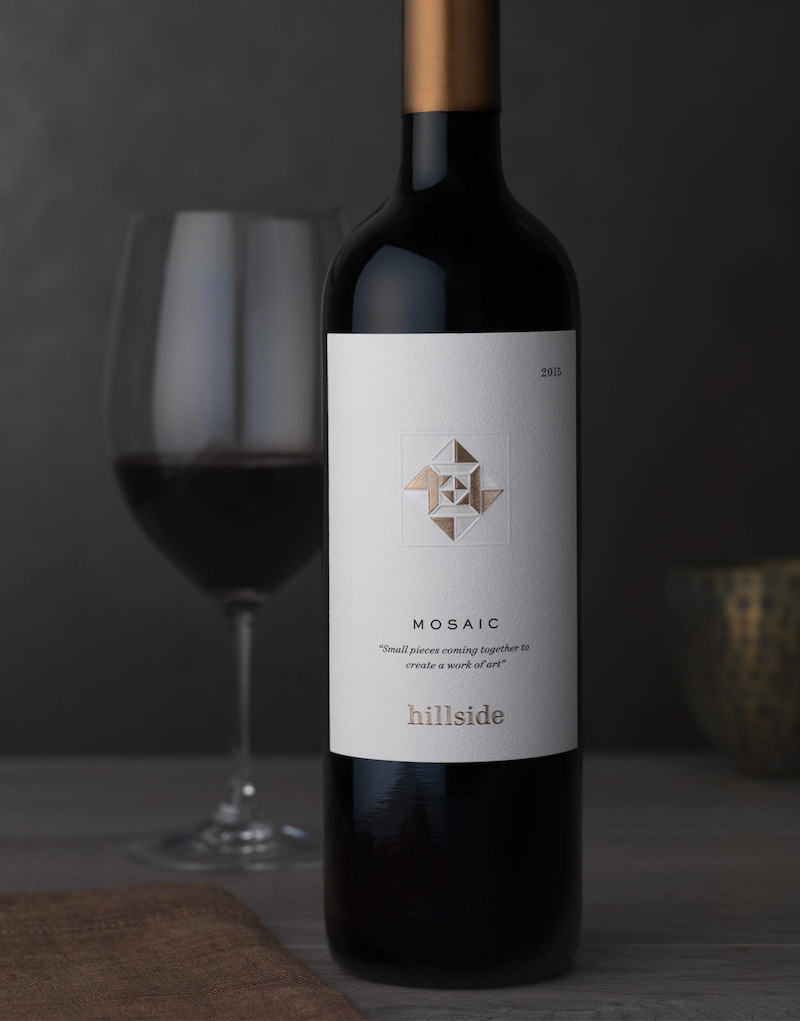
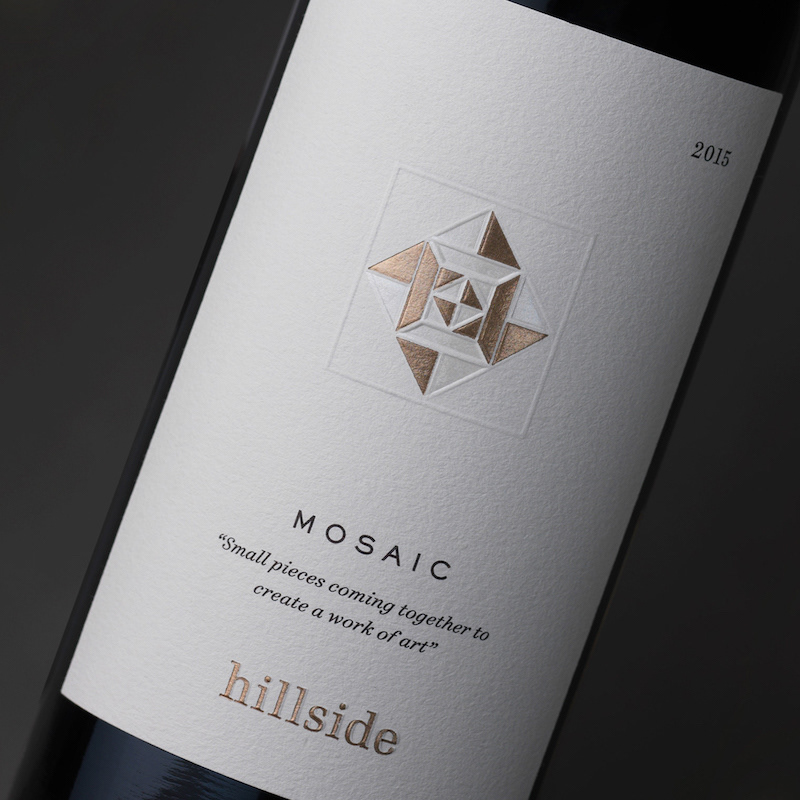
Their soon-to-be-released proprietary wine will take an abstract look at the winery – incorporating layers of foil and embossing for a three-dimensional twist.


Drink With Your Eyes®


