Adore is an experienced self-assembly furniture manufacturer and seller. With their brand-new store opened for their 30th year in the industry, they wanted a fresh, energizing and fun look inside their store.
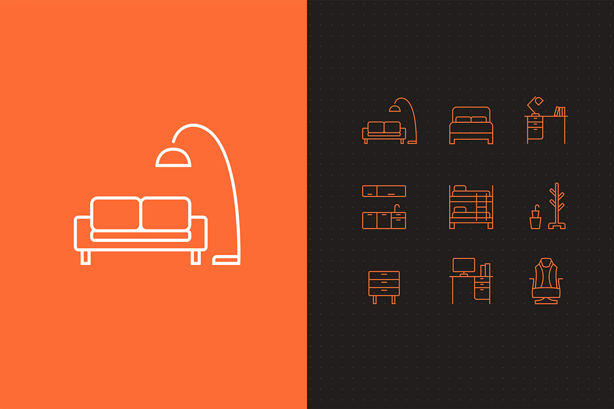
To achieve consistency, a grid system was introduced -which is inspired by the circles in the logomark- for the new icon set. Both the product category icons and the service icons were re-designed as well as other necessary visual elements needed inside the store for wayfinding like navigation arrows, help desk icons etc.
Bright Orange and Shadow Grey were chosen as primary colors for the project in order to be in coherency with the color scheme of the brand identity. Shades of both primary colors as well as White were also used as complementary colors.