Phase 2 focuses on developing three visual identity directions for the Portland Bombers. Each direction aims to visually communicate the identity attributes of vintage, bold, and tough to the target audience.
Take a look at some process here.
Objective statement

The first direction focuses on the vintage and bold attributes. The brandmark represents the historic B17 bomber very clearly and in a literal way.
This direction focuses on the idea of the bomber being an American classic, hence the red white and blue color scheme.
It’s a way to represent the bomber through American pride. A secondary logo was made that represents the propellers of the plane.
The typeface has strength and pride within it and the B17 name is being shown and honored here as well.

This next direction focuses on the bold and tough attributes.
This direction looks back at the pilots who flew the bomber planes and adds a bit of toughness through a character much like a football player.
Its dark green color hints at the military and war times.
The tough and gritty pilot hints at both bomber pilots as well as classic hard-nosed football players.
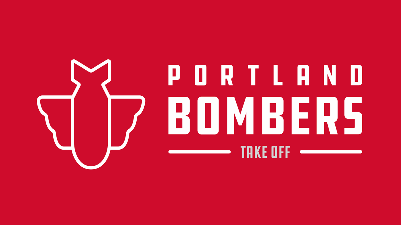
This final direction is a very simple and classic take on the Bomber and its signage. It focuses on the vintage and bold attributes. Its color scheme is taken from the old Bomber sign and the silver plane. The typeface, DDC Hardware, is reminiscent of the old sign and feels vintage and even a bit tough in its sort of industrial “no BS” design. The brand mark is straight to the point, focusing on the bomb of the bomber planes as well as the classic wings from the sign, forming one logo that is very straight-forward, bold, and recognizable.

The Portland Bombers logo fits in with some of the more simple logos in the NFL. What stands out is its boldness and its unique shape.
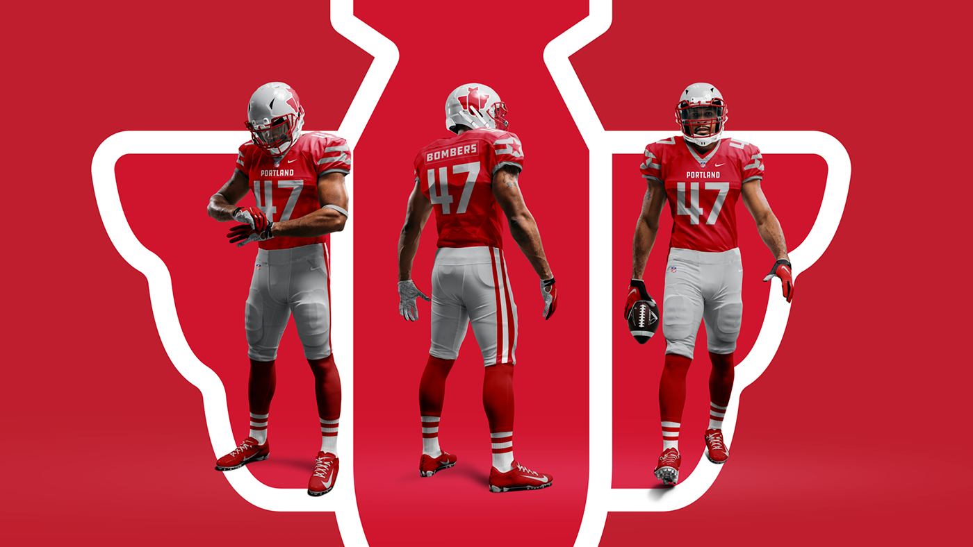
What’s a football team without jerseys?
The Bombers jerseys honor the classic Texaco gas station sign as well as the bomber itself by use of the stripes and star on the sleeves.

A simple T-shirt for the Bombers fans.
