TYPE DESIGN
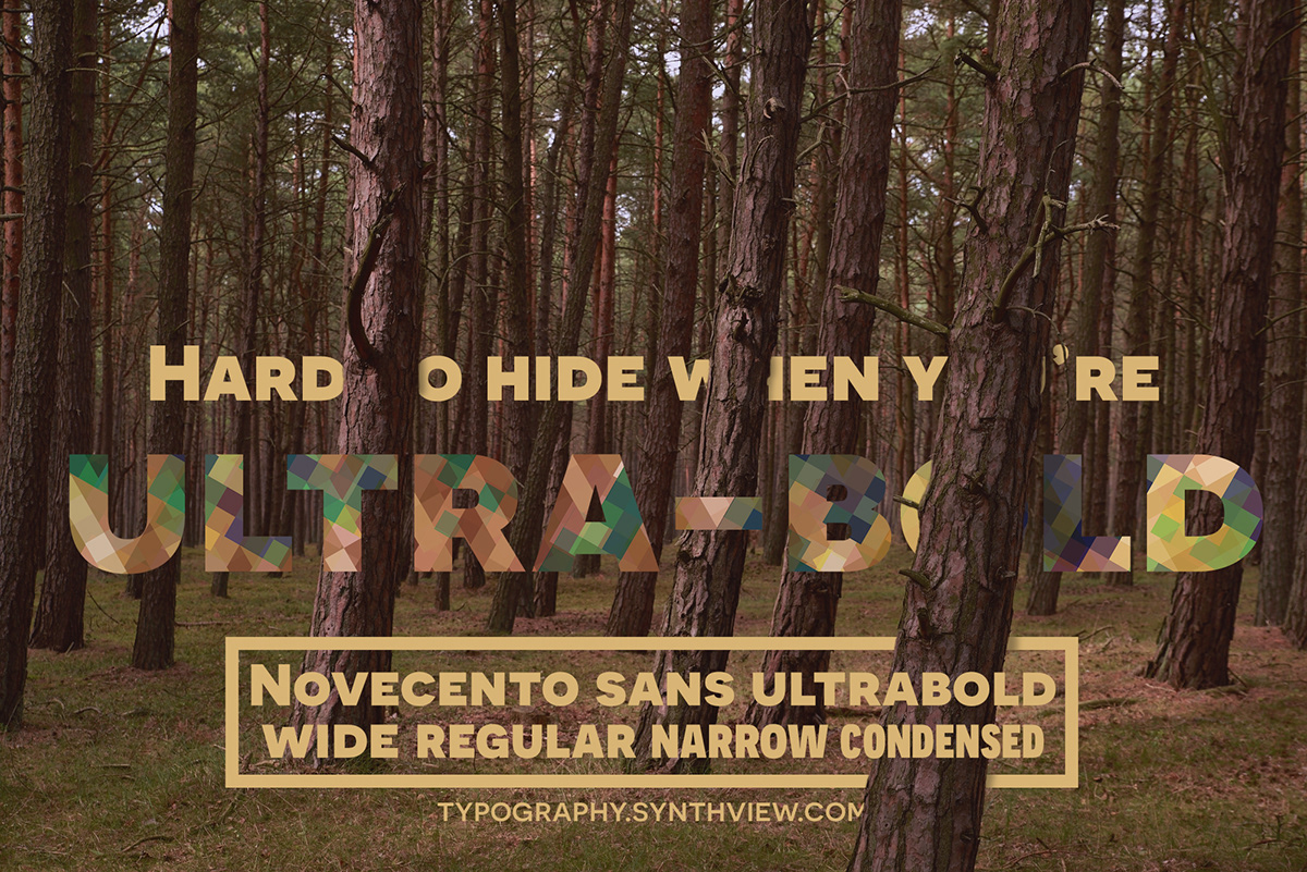
Novecento Sans font family
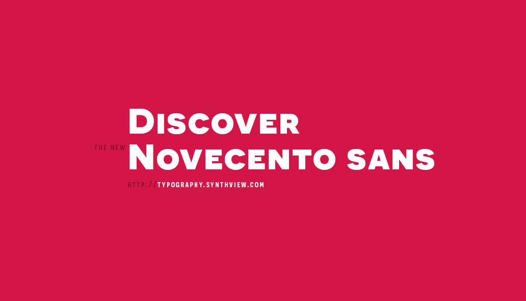
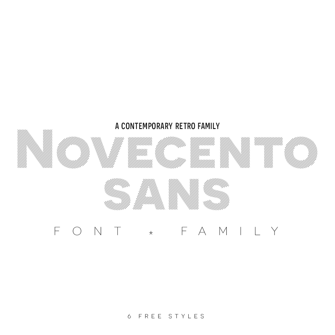
Novecento Sans is font family inspired on European typographic tendencies between the second half of 19th century and first half of the 20th.
It looks rational and geometric. However, it is optically corrected and balanced.
It looks rational and geometric. However, it is optically corrected and balanced.
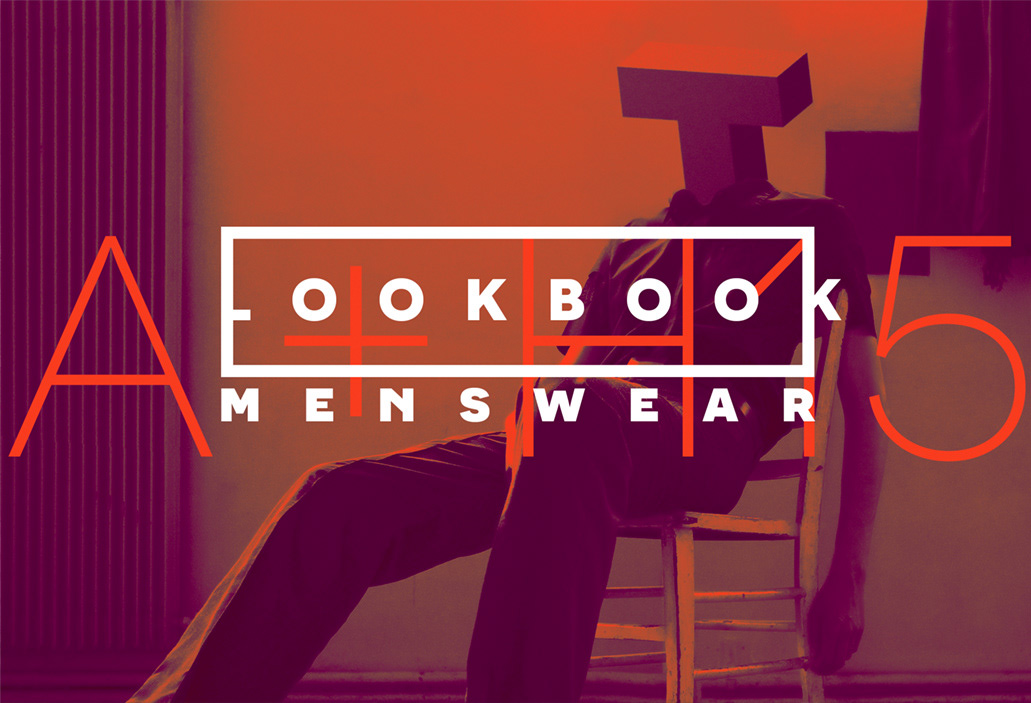
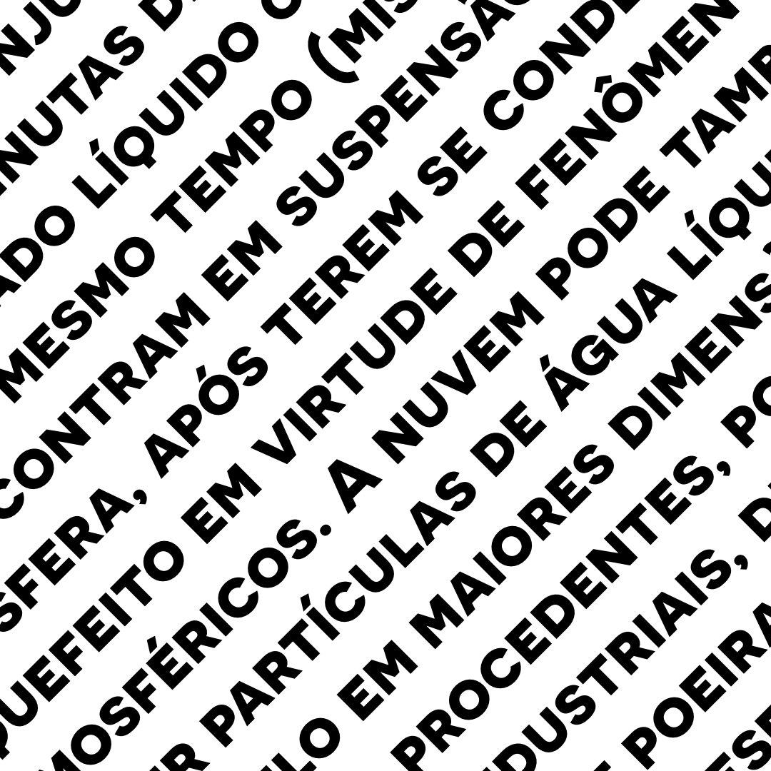
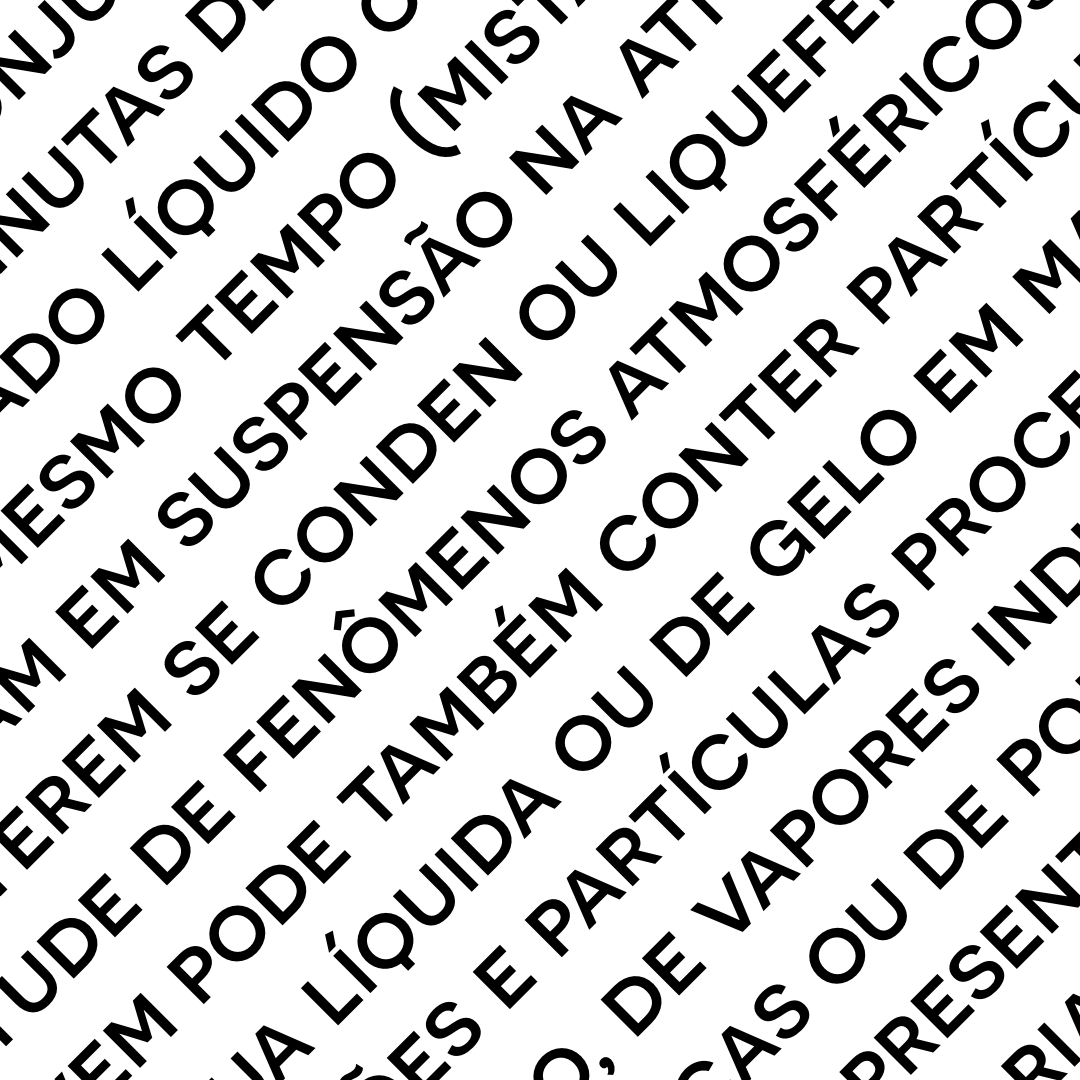
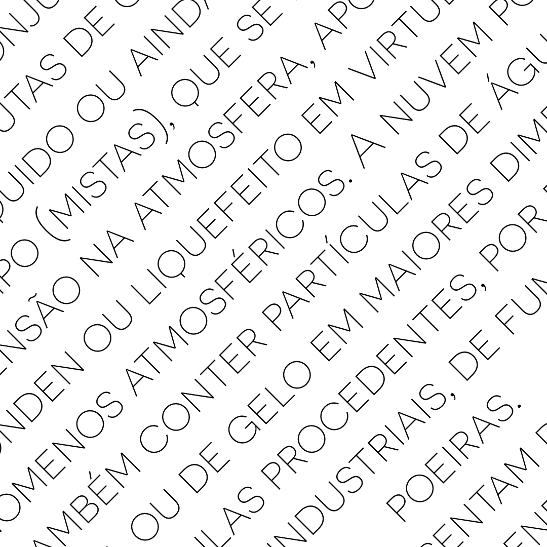
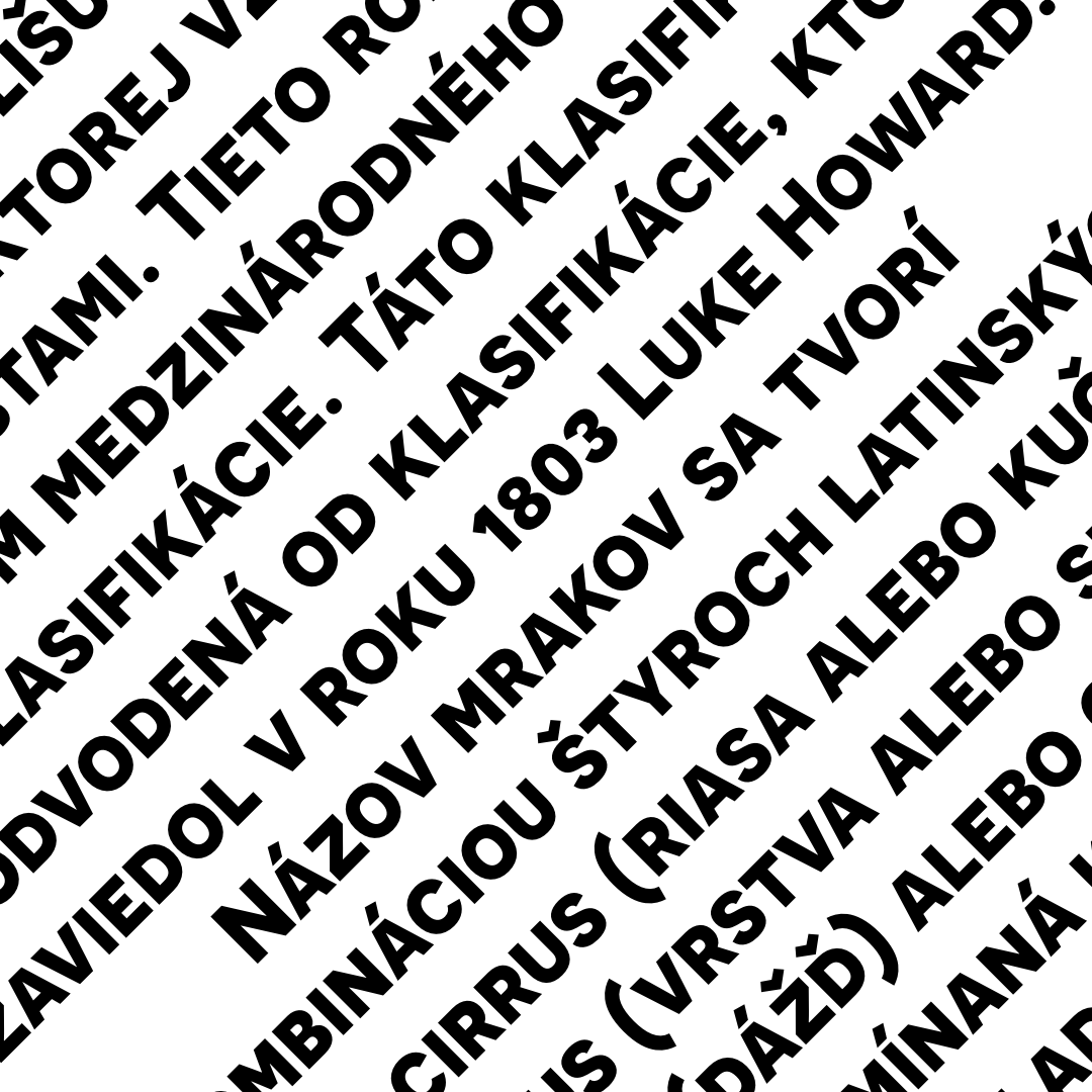
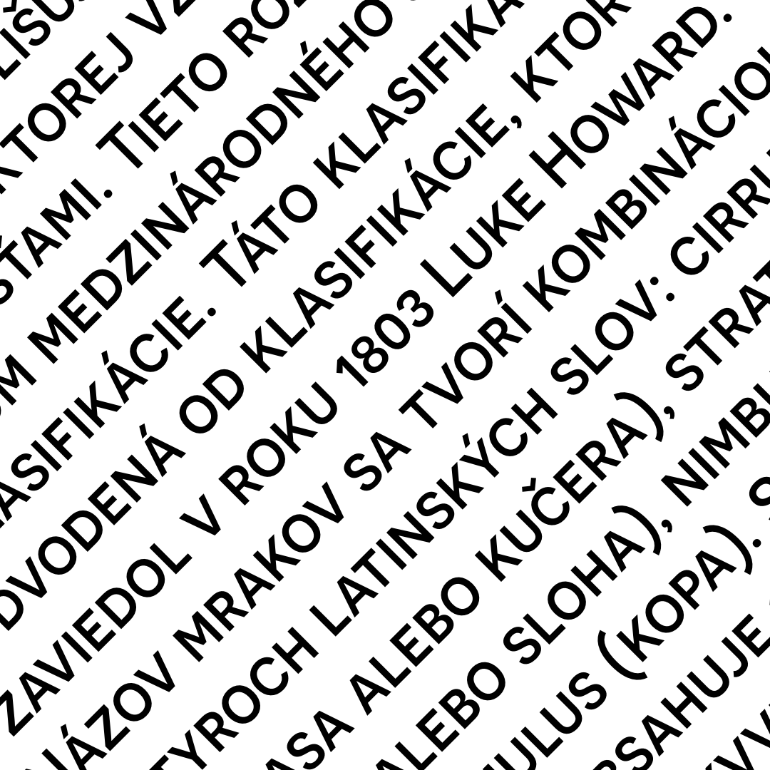
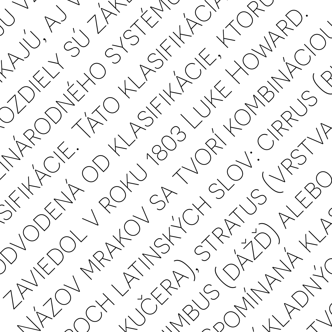
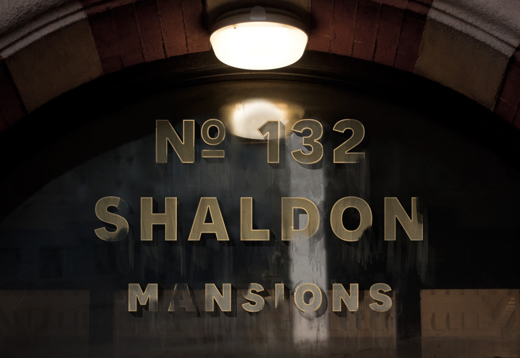
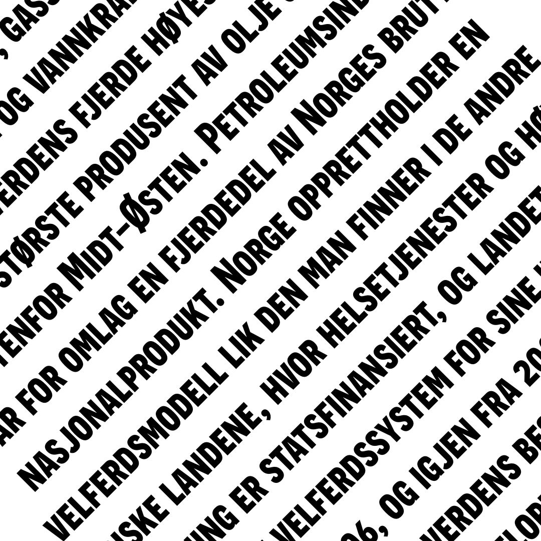
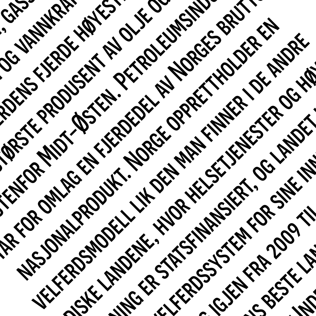
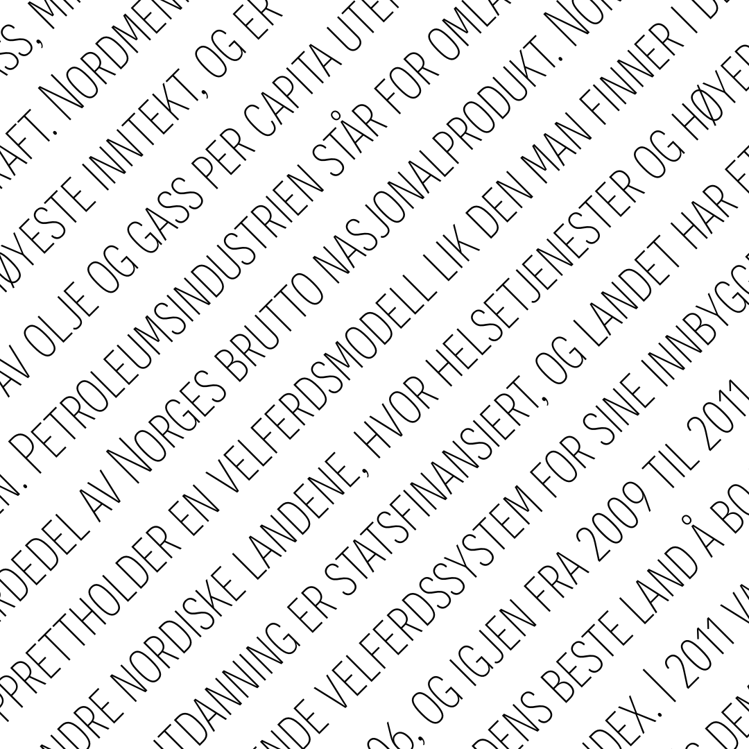
This font face is designed to be used mostly for headlines, visual identities or short sentences, both in big and small sizes. Novecento sans is very versatile: lighter faces provide a more contemporary and design look&feel, while the bolder ones definitely look retro.
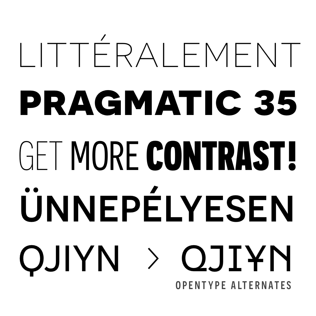
This font family is made of 32 styles (8 weights × 4 widths) and 16 stylistic features to finely adapt to the graphic designer’s needs and to perfectly fit into a layout.
For more informations and how to buy please visit:
