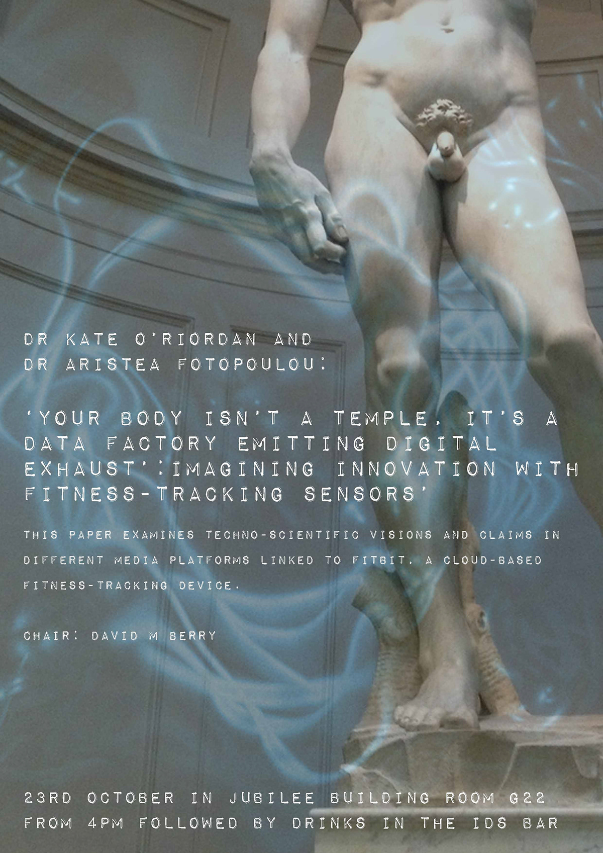
I chose the image of Michelangelo's David here as the seminar is about,' your body is not a temple..' To signify the digital exhaust I used a random image in pale blue. I cropped David to create an interesting image.

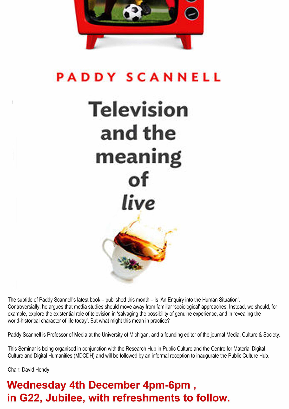
A fabulous 50s vibe.

This design is for a company called Juncaholic who arrange indoor markets. The font is edgy and haphazard reflecting the type of market that is being held one where everyone can sell anything. It looks like a chalkboard.

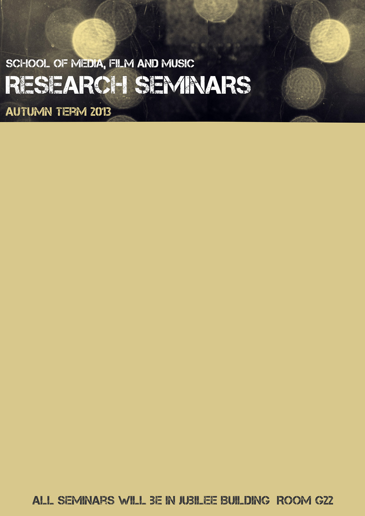
This design is for a series of research seminars by PhD students. They are called work 'in progress' seminars. I focussed on the 'in progress' bit and use a picture of a train tracks reaching into the distance. I used an image of motorway lights also along the same 'in progress' lines. The colours of the lights are Autumnal and this is an Autumn term series of events.
Created in the idraw app on ipad. Brilliant app. The image to the left was created by add loads rectangle outline to create a 'media' kind of look.

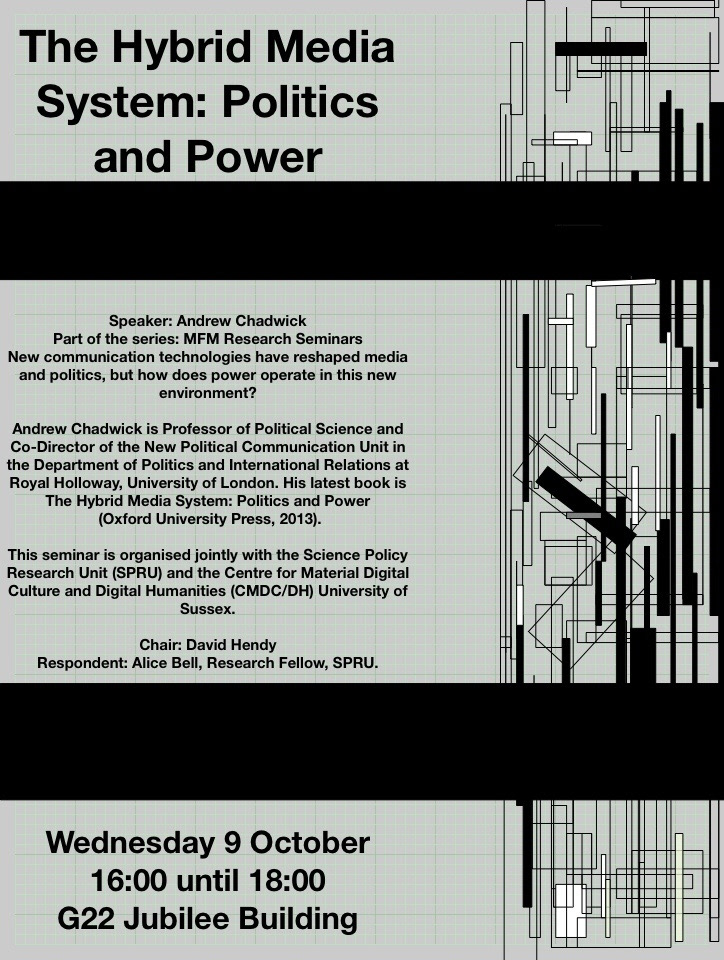
A simple but effect poster for an event created for a very short deadline.
My initial design for the research seminar series. The client wanted to include a photograph of artwork by Rod Dickenson so it ended up as below.