


EN_
SEUL Hair Treatment was born to meet the needs of patients of a dermatologist and trichologist. She noted that, for the effective treatment of capillary pathologies, it was essential, in addition to monitoring with a specialist, the use of appropriate products.
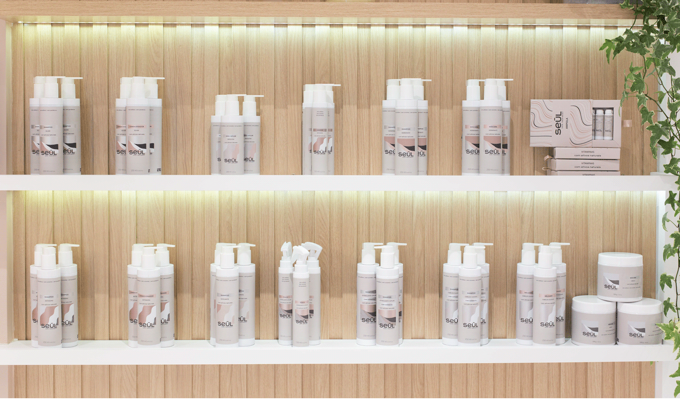
The products are for all hair types, with natural, high-quality, refined formulas, free of preservatives and heavy metals - avoiding anything that are not good for the scalp.
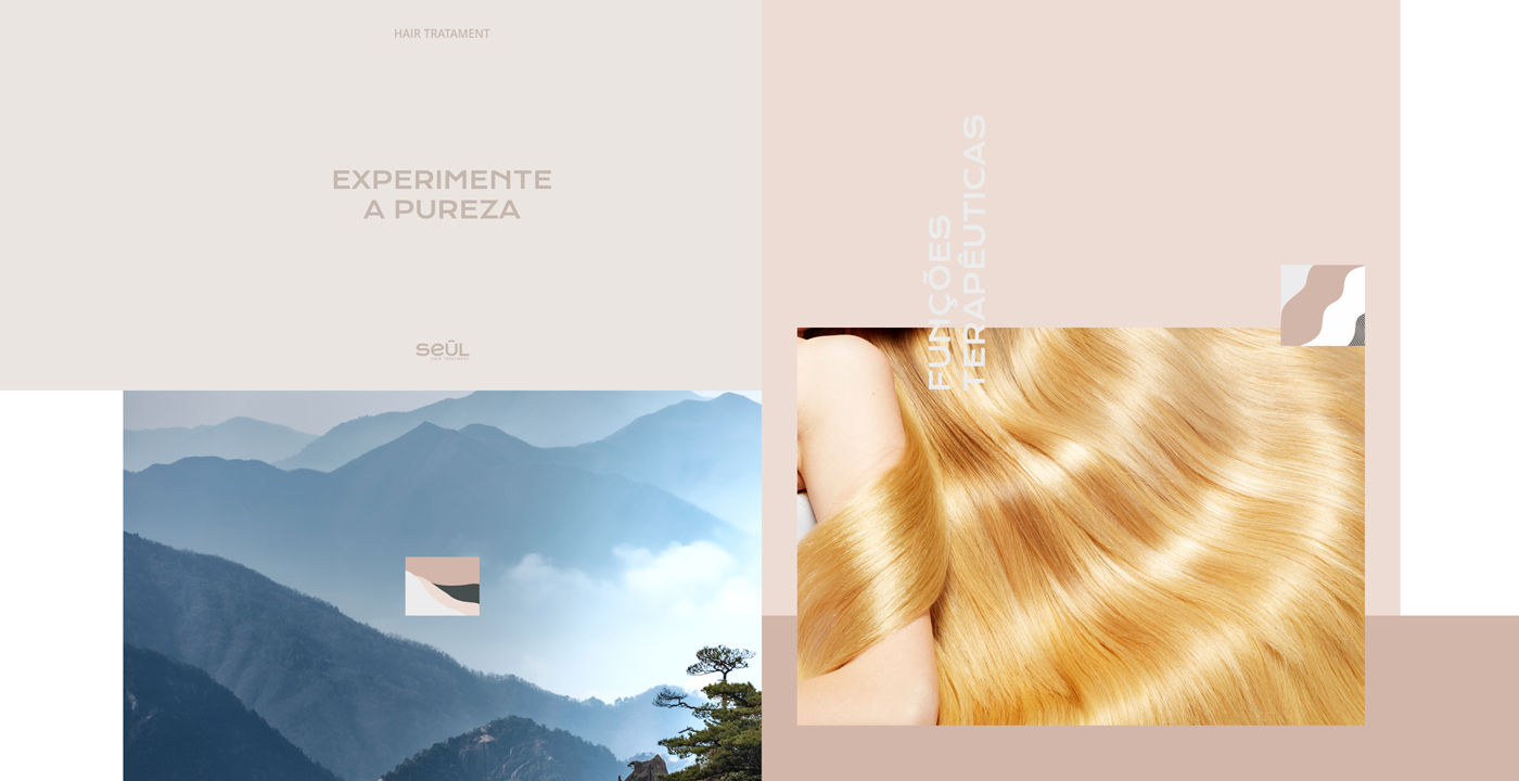
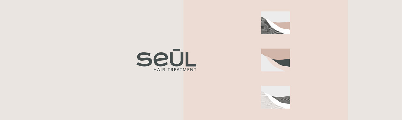
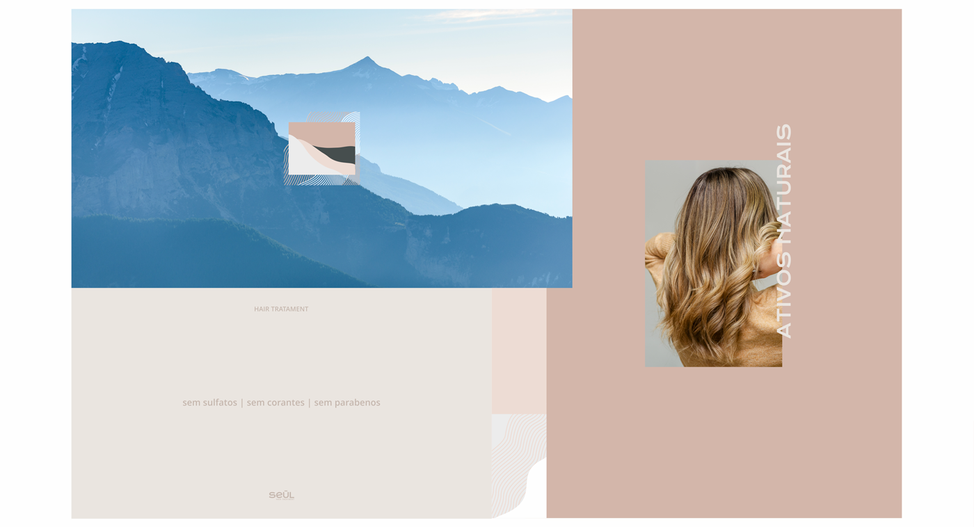
The logo and packaging symbols were strongly inspired by nature. Mountains, hills, clean air, stillness and fluidity. The goal was to create an organic, delicate, natural, medicinal, modern and feminine visual identity, referring to nature and its therapeutic functions, also represented by the color palette.
The brand should convey exclusivity, high level and that was developed by medical specialists. Thinking to the utmost in health and effectiveness, the ingredients are natural, without preservatives, parabens, sulfates or dyes.
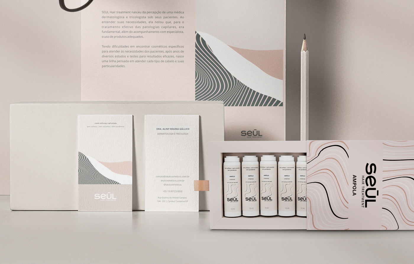
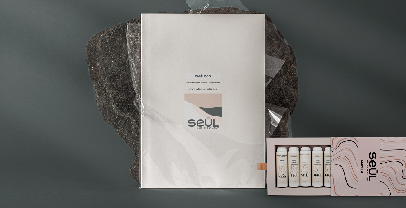
Seul launches a line of 10 products, with shampoos, conditioners, masks, balms, replenishers, in addition to a charming box with ampoules.
The packages have versions of 15g, 120g, 250g, 1L, among others. The finishing of the prints was in velvety soft touch, with metallized areas, in white couché.
PT_
SEUL Hair Treatment nasceu para atender as necessidades de pacientes de uma médica dermatologista e tricologista. Ela notou que, para o tratamento efetivo das patologias capilares era fundamental, além do acompanhamento com especialista, o uso de produtos adequados.
Os produtos são para todos os tipos de cabelo, com ativos naturais, de alta qualidade, refinados, livre de conservantes e metais pesados. A cosmética, as fragrâncias e os conservantes não fazem bem ao couro cabeludo, e por isso não agrada a empresa.
Os símbolos do logotipo e das embalagens foram fortemente inspirados na natureza crua. Montanhas, colinas, ar puro, quietude e fios de cabelo. O objetivo era criar uma identidade visual orgânica, delicada, natural, medicinal, moderna e feminina, que remetesse à natureza e suas funções terapêuticas, representadas também pela paleta de cores.
A marca deveria transmitir exclusividade, alto nível e que foi desenvolvida por médicos especialistas. Pensando ao máximo na saúde e efetividade, os ativos são naturais, sem conservantes, sem parabenos, sem sulfatos e sem corantes.
A Seul lançou uma linha de 10 produtos, com shampoos, condicionadores, máscaras, bálsamos, repositores, além de uma charmosa caixinha com ampolas.
As embalagens possuem versões de 15g, 120g, 250g, 1L, dentre outros. O acabamento das impressões foi em soft touch aveludado, com áreas metalizadas, em couché branco.
EN_
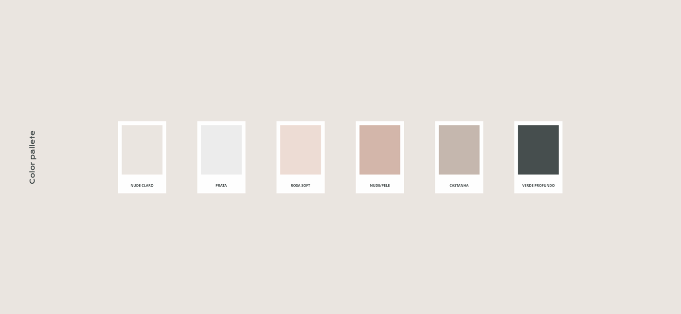
Pink has a positive connotation. It is soothing, cozy and creative. It transmits signals that the person using it is a kind and affectionate person. Soft, tactile, intimate, comforting.
Dark green is natural, reliable, refreshing, icy, imposing, foresty, peaceful. The Chestnut is classic, neutral, of quality, organic, eternal. Silver is classy, stylish, modern.
PT_
O rosa tem conotação positiva. É calmante, aconchegante e criativo. Transmite sinais de que quem o usa é uma pessoa gentil e afetuosa. Macio, tátil, íntimo, confortante.
Verde escuro é natural, confiável, refrescante, gelado, imponente, floresta, sossegado. O Castanha é clássico, neutro, de qualidade, orgânico, eterno. O Prata é com classe, com estilo, moderno.


Studio: @ferragutdesign
Visit website: www.ferragutdesign.com


