


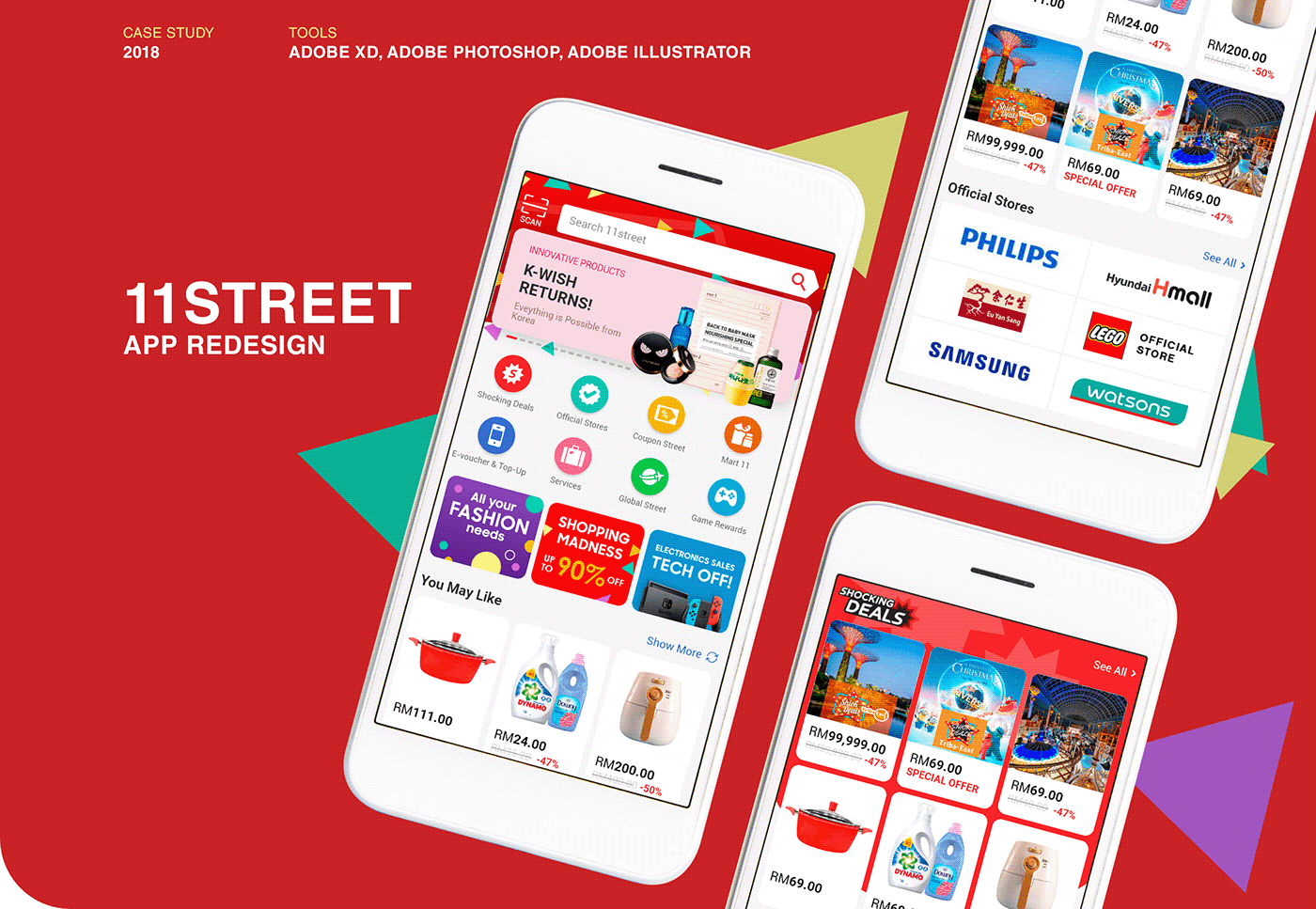
About
11street is Malaysia's top 3 most popular e-commerce platform, bringing the shopping experience from the normal brick and mortar, online.
Project Goal
To refresh & redesign the customer experience on the app. Allowing an improved, seamless shopping experience that can only be created through the app while increasing the number of app downloads.
Current UI

Understanding The User
3 design concepts were created based 3 different kinds of Personas.

The Essential Design Concept
This design is targeted at users who do not have much time. We have removed many distracting elements and colours to only focus on important things like: product image, product price. We have also reduced the height of some elements so that more sections can be seen in the first fold.
The target audience for this concept are those who want to get what they want fast. They open up our app, and at a glance, they can see all the necessary information and buy what they want.
Prototype:

The Emotional Design Concept
This design aims to increase user time on app. We want them to spend more time looking at our products and have fun while doing so. So once you open up our app, we have a big area to promote our campaigns. We can put our seasonal campaigns there as well with some minimal animations (Example: during Christmas, we can have snowfall). We also have rounded edges for our product listings to achieve a more friendly feel and we use a lot of happy faces in our banners to make user connect more emotionally with our products.
In doing so, we hope that it will increase their time spent on app. We also used vibrant and friendly colours to highlight areas we want user to focus on.
Prototype:
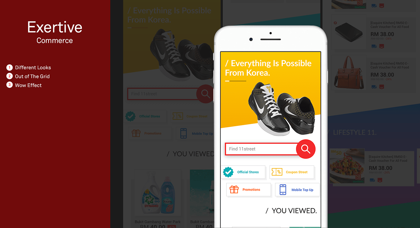
The Exertive Design Concept
This design focuses on our need to be different. The e-commerce layout and style of competitors we found are quite similar to each other. With this concept, we plan to break out of the box and try something new. This concept does not follow any old styles. It is more trendy, more active and more eye-catching. We want users who look at this concept to recognise that this is 11street when they open our app and have the Wow effect.
We aim to appeal to the young, daring and energetic audience.
Prototype:
The Verdict
After all 3 concepts were presented and discussed with various stakeholders, the concept that was chosen was the Emotional Design Concept. This is because it fits all aspects of what we are looking for to renew the app home screen. This new design will allow the marketing department to better present their campaigns, appeal to audiences who are looking for great deals, increase time spent on app which leads to better conversions and increase app downloads.
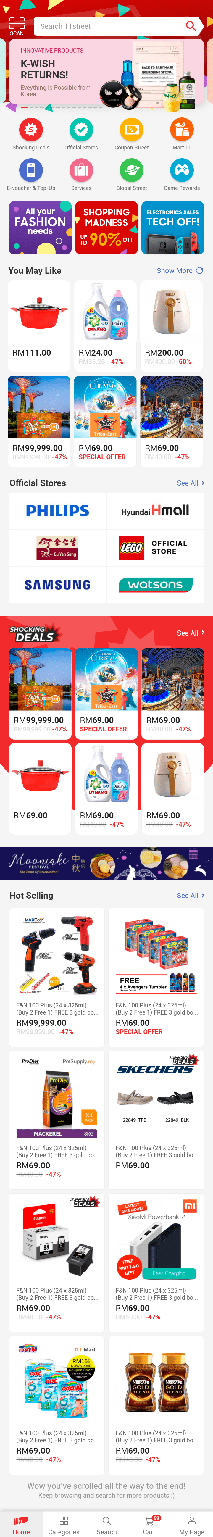
What to Show? How to Show It?
Must Haves
- QR Scanner
- Search Bar
- Carousel Banner
- Shocking Deals
- Official Stores
Good To Haves
- Quick Links
- Ad Banners
- Recommended Products
- Key Issue Banner
- Hot Selling Products
Now Back To The Drawing Board!
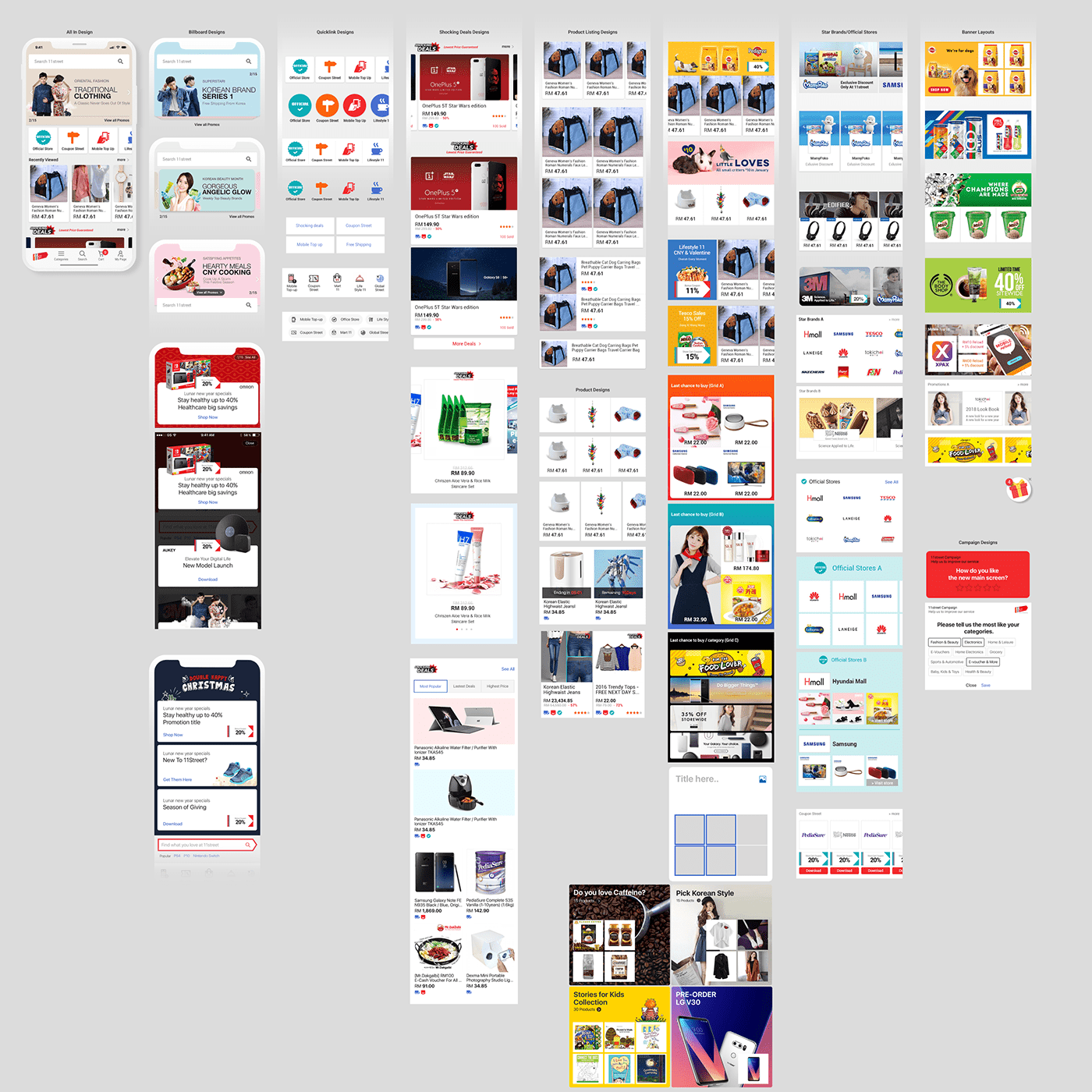
The Final Masterpiece
After much iteration, discussions and pitching, here we present to you, the final mock. Sizes of banner, buttons and images are optimised to bring more content onto the first fold so users are able to see more without scrolling. The background of the app and Shocking Deals section can be changed according to festivals, campaigns or seasons.
Handoff Documentations for Developers


