


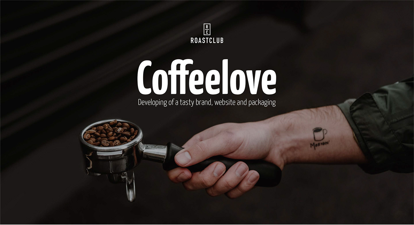
Roastclub
The german start up company „Roastclub“ (Member of the „Krüger Group“) supports over 800 craft roasting houses by bringing them together with coffee lovers and people who are searching their personal coffee taste. People receive a monthly box via post with coffee packages that fit their personal taste, way of preparation and consumption.
The passionate coffee experts asked me to develop a logo as well as a corporate design, website and packaging. I was very blessed to have such a wonderful client which make work fun. Especially if I like to drink a good cup of coffee by myself.
Agency: Freelance
Client: Roastclub (Member of the Krüger Group)
Client: Roastclub (Member of the Krüger Group)
My role: Creative Direction, Art Direction, User Interface Design, Conception and Illustration
Management: Roastclub (Lennart Altscher and Nicola Weiden)
Developer: DIGINOVUM (Frank Schmitz and Jonas Nieland)
01
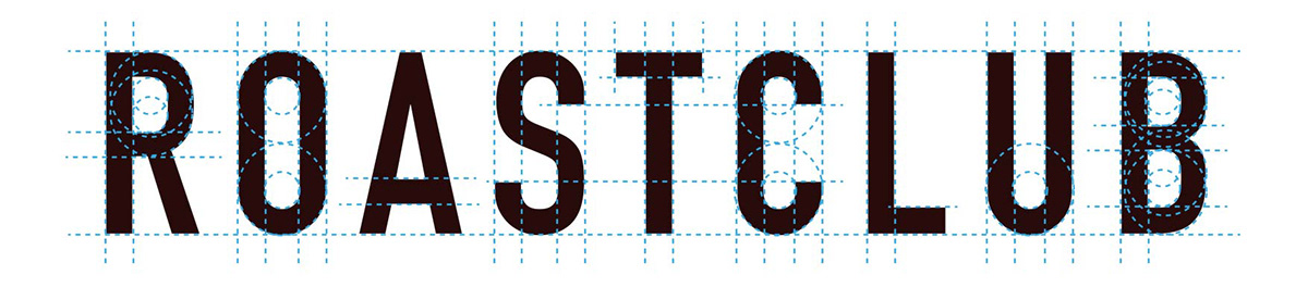
Logo Development
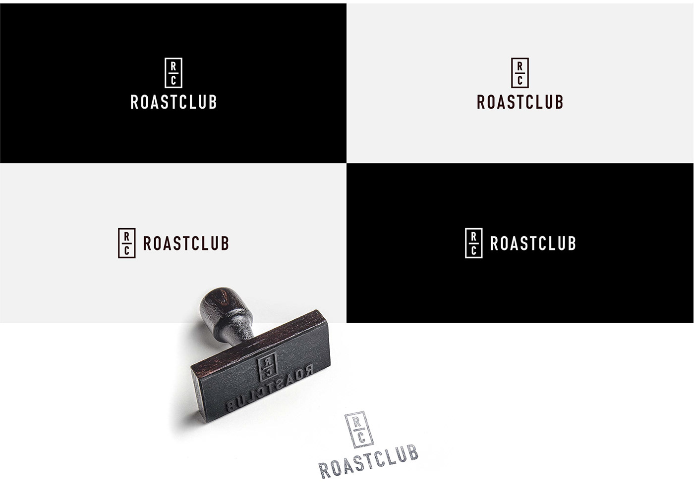
Creating a logo by nailing down the essence of a brand, the zeitgeist and personal taste of all those involved is never an easy thing to do. Also it looks simple and minimalistic at the end.
The Roastclub logo consists of a word mark and image mark that work separately from one another according to their field of usage. The hand-made typeface creates the feeling of elitist, style and modernism. The minimalistic signé supports the idea of a club, appears serious and reduced by still being catchy.
02
Corporate Design
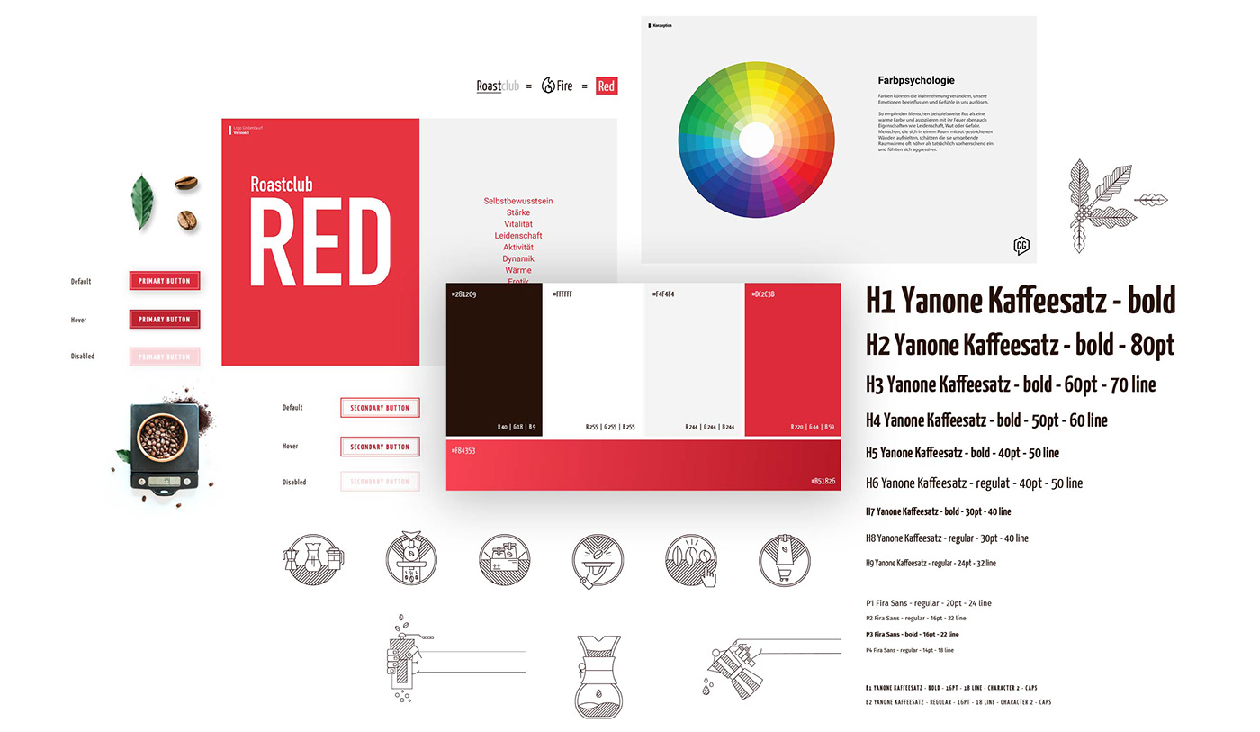
Making the invisible becoming visible is my job and I love to do exactly that. Creating a visual language for people so they can get an impression of the product, services offered and brand spirit is a very interesting thing to do.
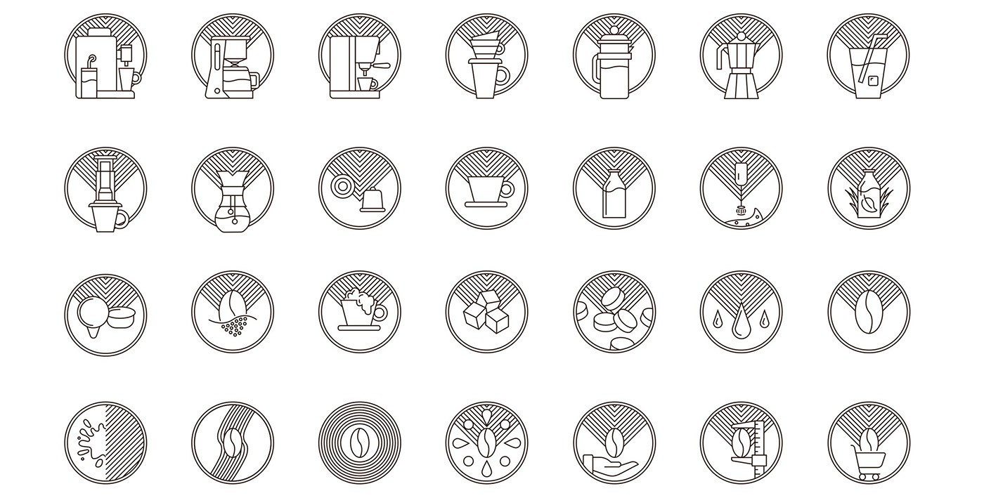
The color „Roastclub Red“ deduces of the brand name while also showing passion, warmth, self confidence, vitality and dynamic. The individual typeface underlines the human centered approach. The iconic icons are an important part in the branding. They combine playfulness with modern, geometrical effect. There are manny more parts of the branding like imagery, key visuals, usage of white space, user interface elements and so on. All the small pieces of puzzles work well together and create the feeling of a brand.
03
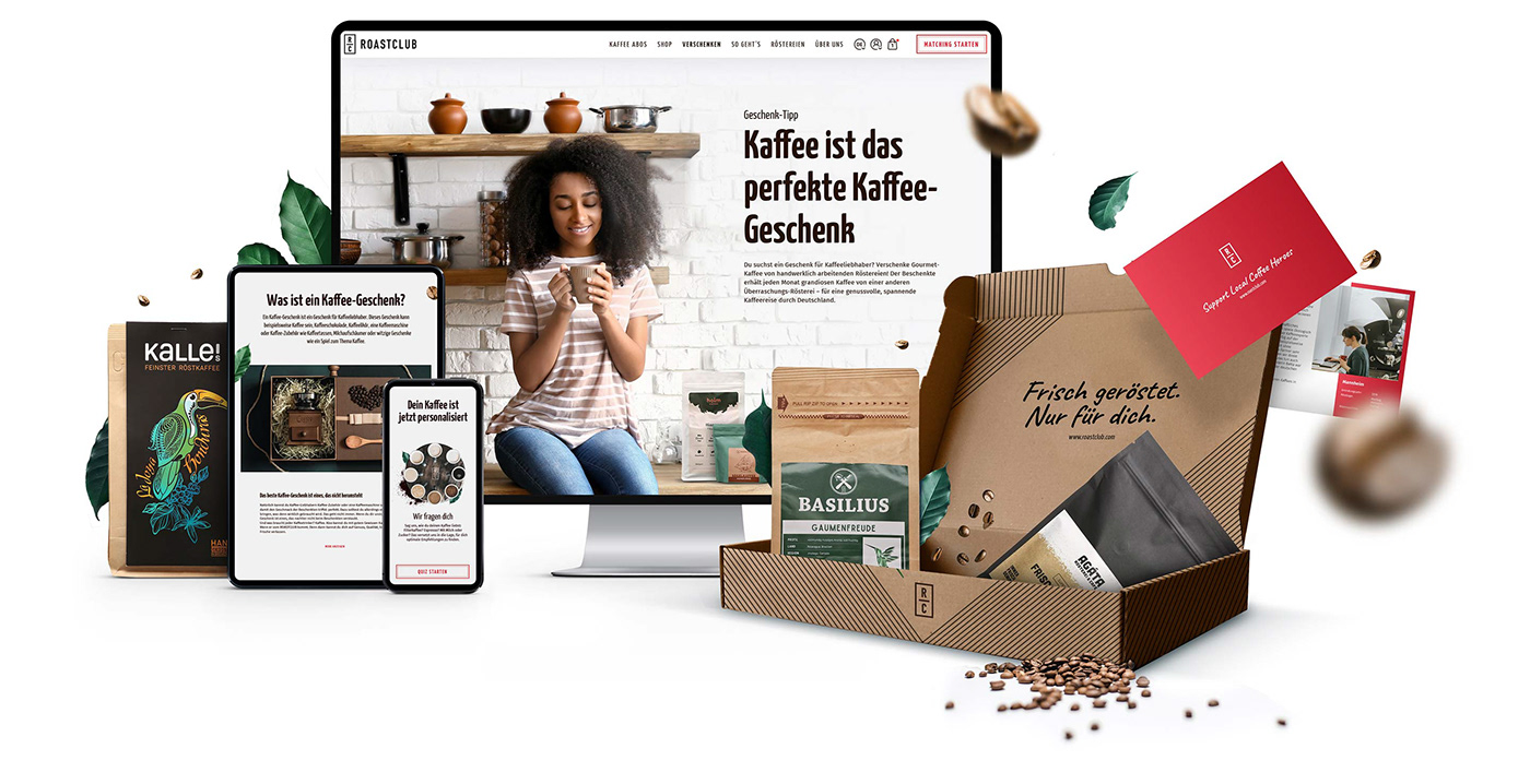
Website
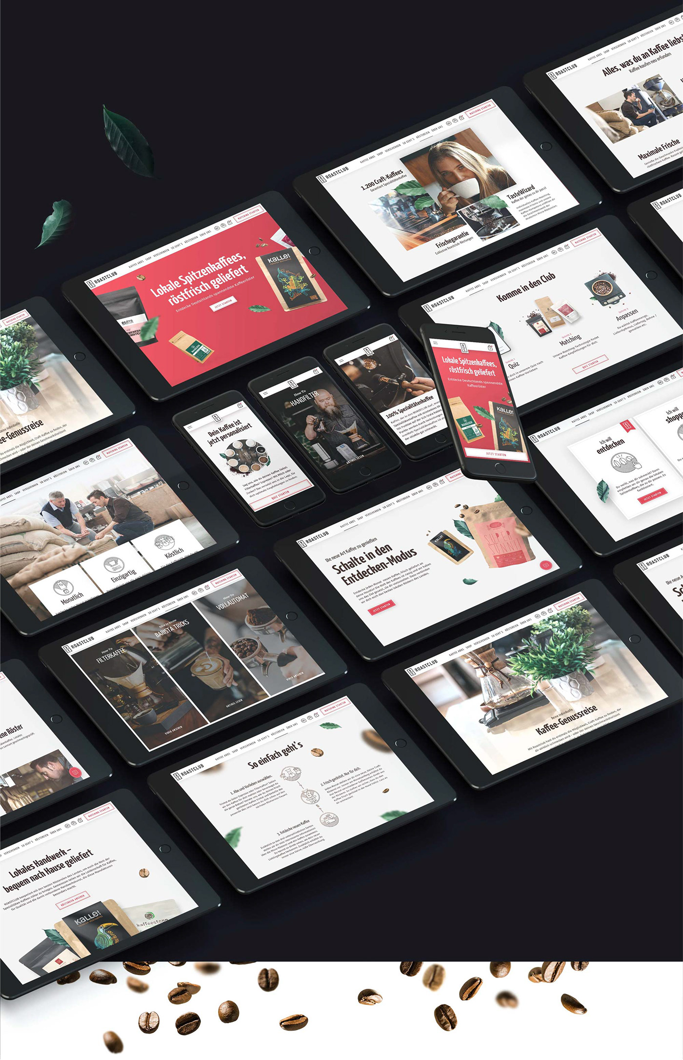
Besides social media, the responsive website is the most important touch point for people to interact with Roastclub. Therefore it is fun to go through the focused, friendly and modern site. Special technical highlights are the coffee matching functionality and shop with a subscription model.

04
Packaging
Recycled materials built the foundation of the packaging and that’s okay to being seen. The rough cardboard cover is supplemented by iconic lines that have their origins in the iconic icon style of the brand.
The personal message (which is seen by uplifting the lid) underlines the spirit of the brand „Freshly roasted. Only for you“. That makes the coffee beans even more tasty.


