


Emotion, integrity and overall aesthetics was kept in mind developing BEANSONS brand. It was intended for the trademark as well as packaging to communicate history and traditional values. It is successful position in todays market filled with contemporary and trendy trademarks. Even Beansons name sounds as if this brand existed since the middle of the 20th century.
After brand name was selected it inspired the style of the packaging leading us to merge classic and handcraft graphic styles into one. It is intended for the packaging to look like it came from historic times and was slightly refreshed to fit the modern shelves.
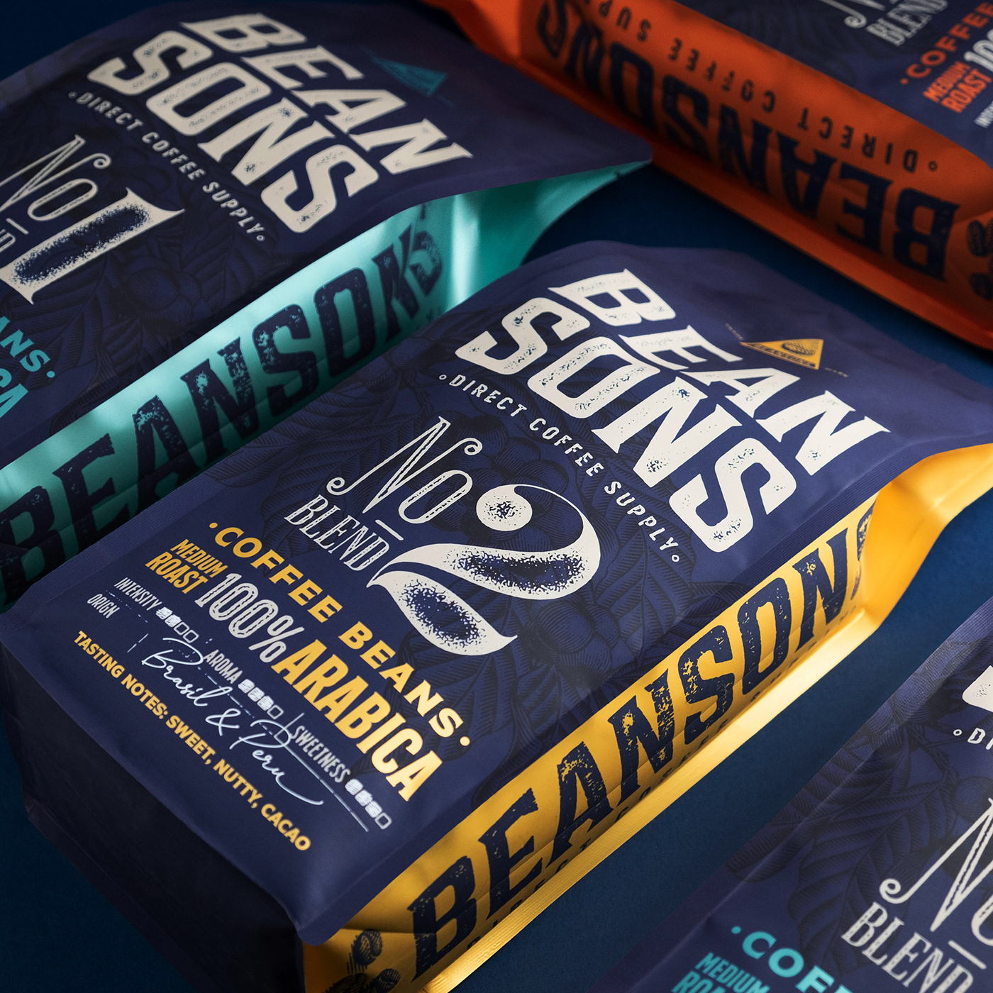
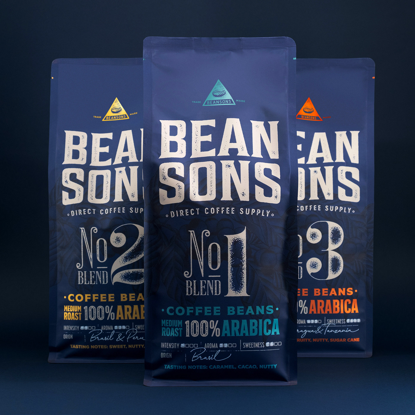
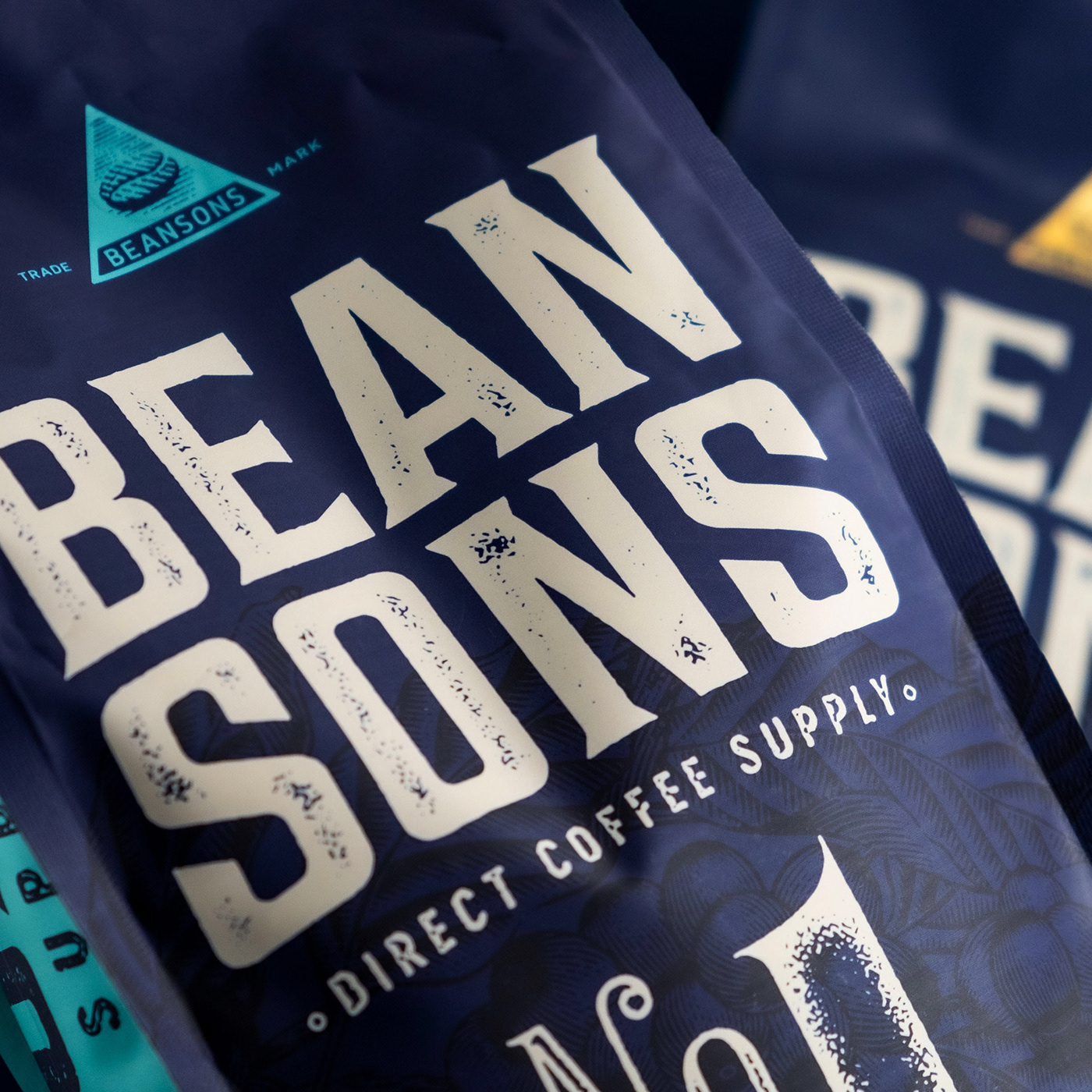
Main focus is set to a logotype which is classic wordmark with just a slight grunge texture. Giving a number to a different coffee blend lets the customer easily identify and remember which one is his favourite. Examining common customer habits we came to a decision to simplify coffee naming as much as possible as it is difficult for the buyer to remember long and fancy coffee names which otherwise just can be numbered. But not to make things too simple and uninformative we added a clear guide of coffee origin and tastes notes as well as best way to enjoy the specific blend in an informational box on the facade of the packaging, letting the customer to explore and familiarize with the product properties during the purchase decision.
Blue colour is classy simple and acceptable to the majority. And blue and white are two main colours with partial matte varnish dominating the facade. Different blends are decorated with different metallic elements that pops out and lets easily identify your most liked. Great deal of attention was paid to detail to give overall packaging vintage and hand made look.
Classic and elegant package which is focused on brand name informational table. Simple yet compelling design that speaks of history.


Client —Raida, UAB / Bold Brands
Services —Strategy, Naming, Logo & Packaging Design
Year — 2020
Agency — Bold Brands
Strategy & Creative Direction — Motiejus Gaigalas
Head Of Design & Graphic Design — Vytenis Petrusevičius
Potography — Motiejus Gaigalas
Retouch — Žydrūnas Šlajus
Head Of Design & Graphic Design — Vytenis Petrusevičius
Potography — Motiejus Gaigalas
Retouch — Žydrūnas Šlajus
T H A N K Y O U !


