

Redesign of Oldsmobile company logo! This is the process and research.


Brand analysis of logo and a consumer profile board.
Rebranding Oldsmobile is definitely out of my comfort zone. I don’t know much about cars so this took plenty of research. I am aware of people that dive in for the specs of cars and what makes them run as their hobby; therefore, cars hold a special place in their hearts. Olds hit their peak in the late 1950s but soon died down in 2000 by announcing their last model to come out in 2004. As years passed, their fan-favorite muscle cars held them up high but the “duds” had outweighed them and fell off.
Today the better muscle cars are collected and cherished by Olds Club fans. The most recent logo of Oldsmobile is similar to modern Infiniti, Hyundai, and Mazda. It is metallic silver with a sans serif black font. This circular shape is used on countless brands and can be easily confused (as I get confused on these logos as well). Strength is the meaning behind the shape: they reinvented the old rocket to go outside of the oval signifying their journey to go outside boundaries and the asymmetry is to show originality. Refreshing this brand will bring a new approach to their consumers who loved their entry-level luxury muscle cars.
For the latest Oldsmobile logo: surface propositions include the asymmetrical “O”, the double line that cuts and exists, and lastly the negative space within the ellipse. So about 3 surface propositions. As for deeper meanings, the asymmetry represents originality with the line being a rocket going outside the boundaries and its horizontal slant to go in a “new direction”. The idea of the “rocket” takes back to the dream rocket model by Oldsmobile. The negative space actually spells out the brand’s nickname, “Olds”. About 5 deeper propositions.
Still, the current logo is not recognizable to the old brands’ buyers. GM didn’t put the newest logo in the front of its models because they were trying to break ties from their failing models and this ended up contributed to its demise.
The 1940-1959 logo was a ringed globe. The globe was to represent Oldsmobile’s influence and the ring was a rocket trail. This logo was more straightforward but a little complex when it came to visuals. The next 1960-1996 logo was a rocket itself based on their popular V8 engine. Both of these logos were straightforward (meaning had about the same ratio of surface to deep meaning) but recognizable to the Oldsmobile brand.
Creative Brief
A brief history about the brand: Oldsmobile was a car brand that hit its peak mid-1940s till the 1980s by accomplishing many “firsts” in the automobile industry. It was bought by General Motors and soon fell off in 1996 by announcing its last model to come out in 2004.
What is the type of product or service defined by the brand?: Of the people who still recognize the Oldsmobile brand have said their favorites were the muscle cars. The entry-level luxury cars that ran fast and sturdy were the faces of the brand.
(Target Audience): To commemorate the rebrand/eventual relaunch, it is a given to attract those that have collected the old models and created associations dedicated to Oldsmobile. Also, any older generation that has the memory of what Oldsmobile was in its glory.
Demographic Lifestyle Analysis
Who is the customer?: Customers would be people over the age of 50 and the young generation interested in revamp/introduction of the old-style muscle car paired with modern technology.
What activities do they do?: Their hobbies would include collecting and researching the glory age of muscle cars and how cars have changed over time.
What colors, patterns, textures, design language feels familiar to them?: The older generation is familiar with the vintage style. Most likely has a story around the car. Smooth textures. As for the younger side, a dark, simple but bright colored design.
What things do they covet?: The consumers would want a car that shows off their hobbies (conversation starter) but is still reliable and affordable.
Brand alignment (what brands and style of brands do your brand's customers gravitate towards?): As for exterior style, Pontiac, Buick, and Chevy muscle cars are the most similar to the Golden Age of Oldsmobile. For the new direction that the brand is headed, Tesla, Mustang line, and Subaru dream cars.
What main message are we trying to convey? (Purpose/Value of brand): I want to portray to consumers that they are going to get the Oldsmobile rockin’ style of the muscle car with a reliable reinvented modern interior system/ engine.
Why does this matter? (To the audience & the world): Oldsmobile is coming back into the car competition better and more unique than any other cars on the market.
Deliverables possible: Local Guidebook ad, informational pamphlet, online ads, door signage, website/ website specs page, billboard, magazine ad, web banner, mail ad.
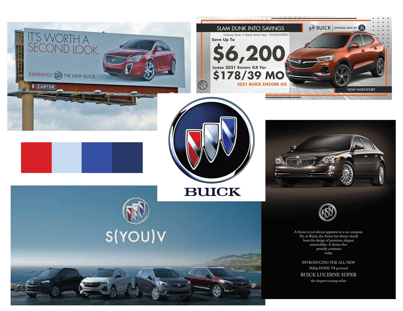
Rebrand Competitor Brand Analysis Board.
Back when Olds was still up and running, Buick was their competitor within the GM company. Their colors are patriotic and marketing to the upper class with their clean and luxurious feel.
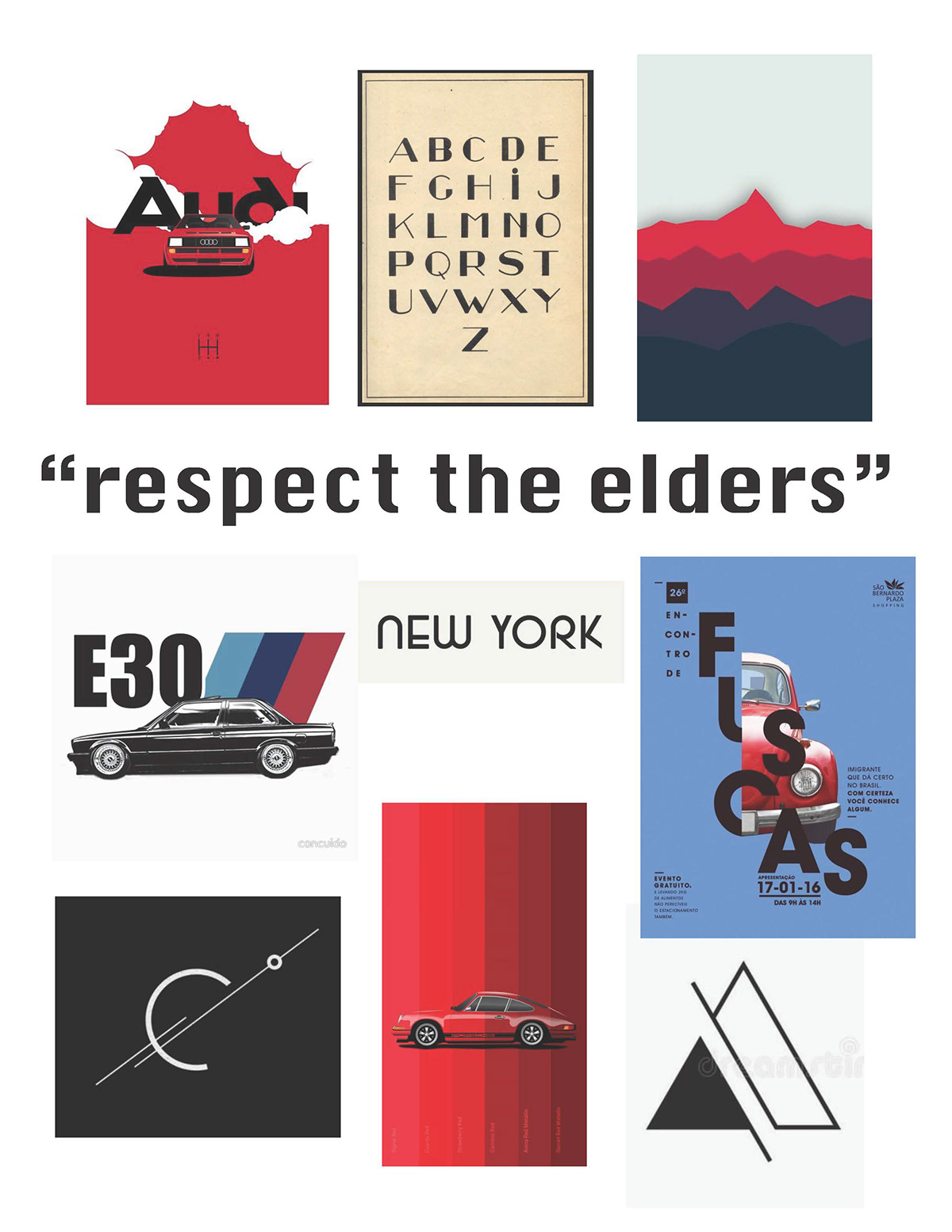
Initial mood board for Oldsmobile.
I wanted to go with a clean but smart look. By using red I would portray a strong and powerful brand.


Most left: First ideation of the logo redesign. I trying to keep the logo abstract while still attracting a mature audience. But it wasn't working because the shapes don't work together.
Second to left: Ideations for second try at logo. The rocket was iconic to Oldsmobile therefore I wanted to incorporate it somehow with an ellipse to represent the "O". but the rocket is too thin and sharp for how round the ellipse is.
Two most right side: Third ideation of logo. Including the rocket and partial ellipse didn't quite fit the bill with the direction of Olds. While the red hues signify fast and strong, Olds needs to be represented with it's history but still reliable.
Final Oldsmobile logo and deliverables!


Logo Breakdown:
This new logo works better for Oldsmobile because it still represents their signature rocket and letter "O" while moving towards a new age of electric cars. The extension of the shape at the top though the omega symbol still represents their abilities to go above and beyond. The difference in weight of the omega stroke shows flexibility and uniqueness while the sharp shape of the rocket is strong and dynamic. The yellow, orange, and black symbolizes going out of their comfort zone towards innovation.

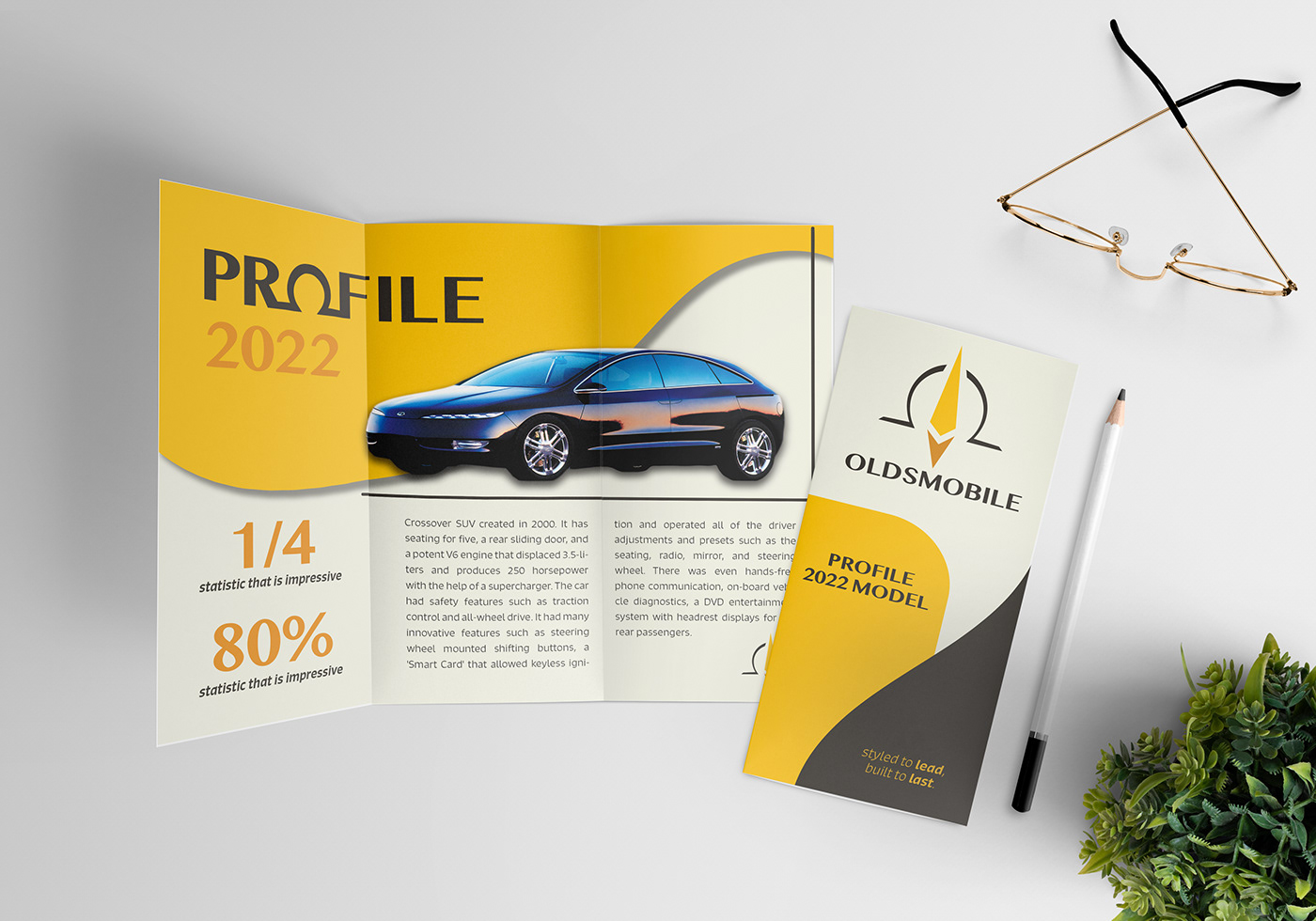
Print and web ads and info pamphlet for a mock model called "2022 Profile".


Emblem, air freshener, and building signage.


Assessment:
The new logo for Oldsmobile signifies the direction of the company which is towards electric powered vehicles. The sharp inside but rounded omega symbol represents their values while being recognizable to consumers. It’s shape also informs consumers of its luxury quality while the colors lean to it’s reasonable price point. Not a lot of car brands use yellow or orange in their identity so this sets Olds apart from them. The overall designs communicate a fresh beginning and innovative ideas to come for Olds.


