UBUNTU
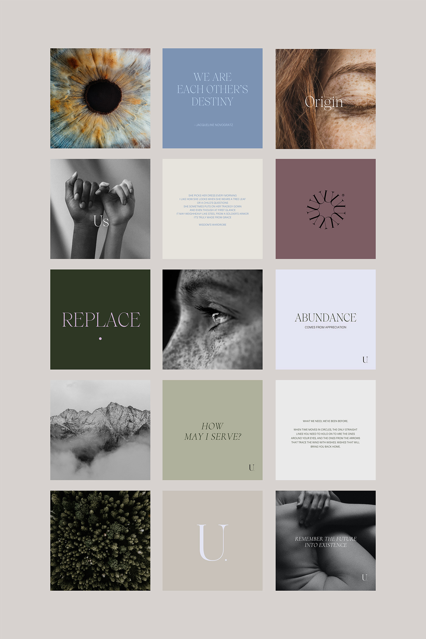
Ubuntu awakens wellbeing and reciprocity with our Self, our communities, and Earth through yoga, experiences, reflective dialogue, and business consulting.
Created by our partners: María, Janine, and Manuel.
Ubuntu was not an identity to be designed but a life path being unveiled in front of our very own hearts. It was through alchemy and fire that words became philosophy, and philosophy became reality. A magical adventure fueled by curiosity and wonder.
Our goal was to respect the word's origin and meaning: "I am because we are" stands upon the principle of interdependence, the realization that we are all connected to one another, and that within our unity and diversity lies our strength. Ubuntu is both origin and destination, a world view that for years has told the story of possibility, integrity, and truth.
The branding and website were the means and not only the final result. The vision for the project was always felt, though not always known. The philosophy became Truth in front of our eyes when in an effort to create a services website, Maria, Janine and Manuel found the words that described the project in its entirety and brought it to life.
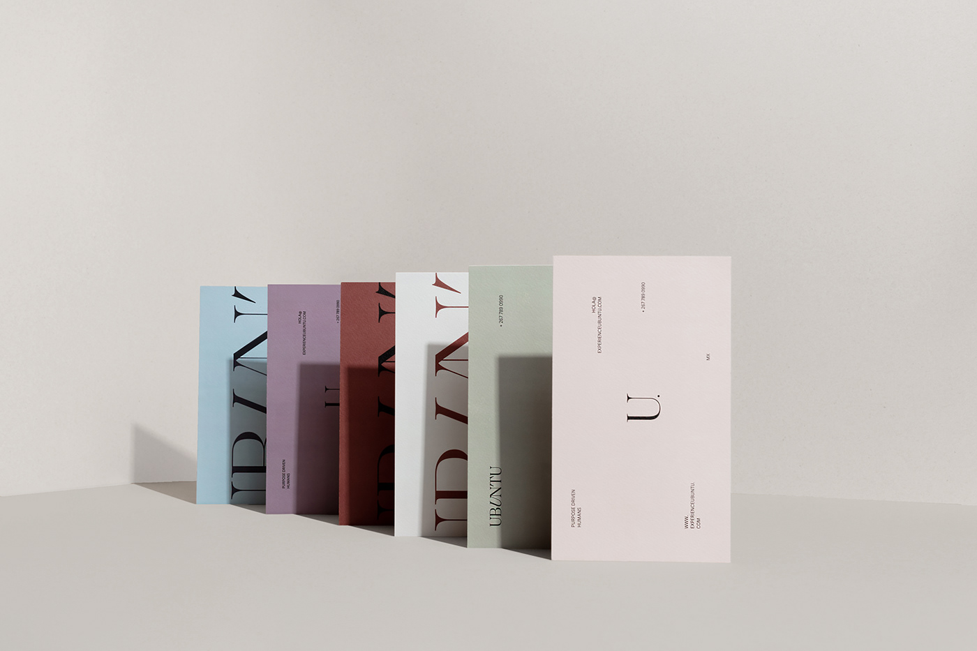
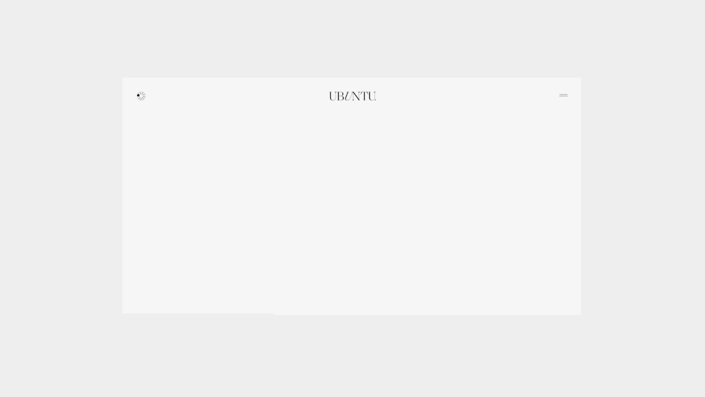
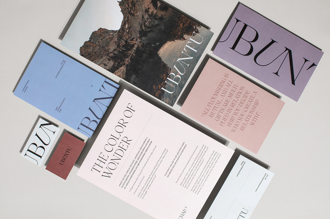
Ubuntu's logotype carries a meaningful message; the letters "U" and "N" connected and intertwined as a symbol of reconciliation. The website is filled with marvel and wonderments to be discovered.
We encourage you to explore this extraordinary project and enjoy the experience of having the audacity to imagine the world as it should be. The world as it might be. The world as it is.
Brand discovery· Concept creation · Identity Implementation · Web development