


Depicting craftsmanship, continuity and community, the marque as well as the chosen typeface with refined serifs complete a logo that reflects values and the vision of the brand. Cagliari by Jorge Cisterna, Latinotype.

An optimistic, sophisticated and versatile brand colour palette — that compliments any interior style and mood.

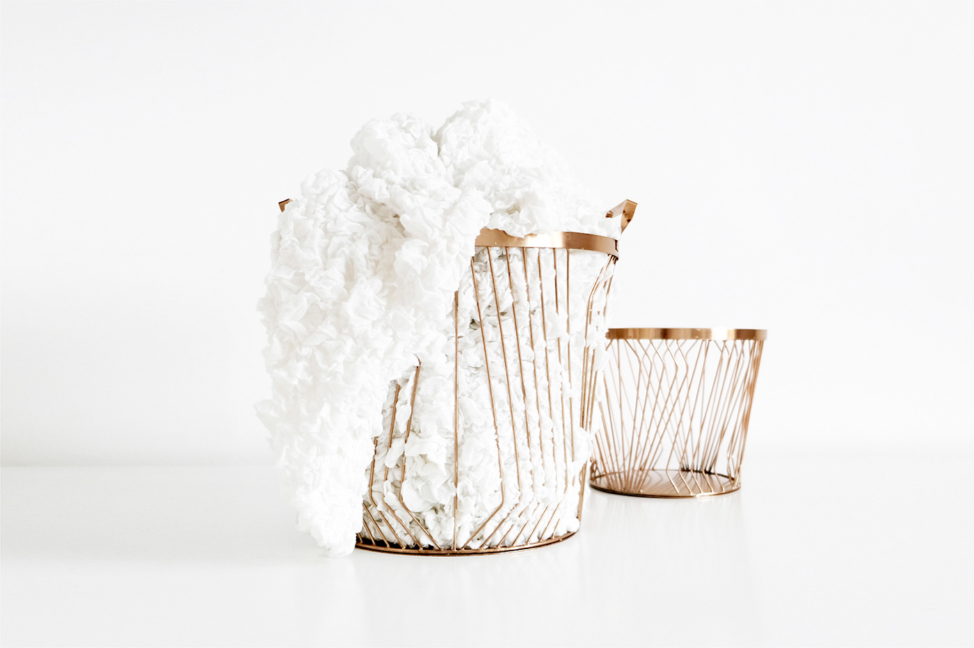
Showcasing products and their unique features as well as enhancing desirability through the style of staging — through elegant, clean and minimal art-directed product photography style.


Amplifying the brand through social media — the strategy focuses on brand awareness, sales and on empowering the audience through sharing Kolreve’s unique know-how.
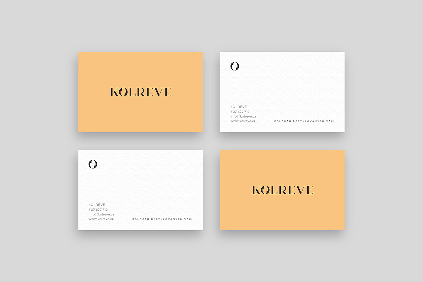

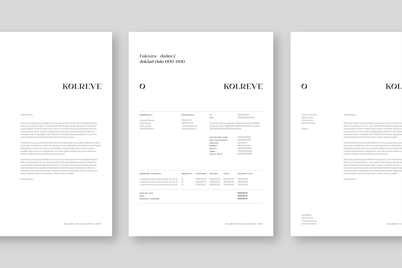


The entire brand is defined in the brand guidelines — from a compliment slip, social media template layout to a limited edition stamp usage.


Kolreve’s mission is to raise more awareness around sustainable living, and particularly around homeware. They understand that real change stems from leading by example — Kolreve sources, renovates and sells contemporary as well as antique homeware — through which they aspire to change our throw-away culture.
Kolreve needed a visual identity that would communicate their values and vision in an optimistic, relatable and accessible way, and a social media presence that would amplify their message. The branding included art-directed product photography and a focus on sharing their expertise through step-by-step renovation guides and interior design tips. This gave Kolreve an opportunity to help as well as inspire others to become a part of the movement.
BRANDING
ART DIRECTION
TONE OF VOICE
PHOTOGRAPHY
ANIMATION
SOCIAL MEDIA CONTENT
BRAND GUIDELINES


