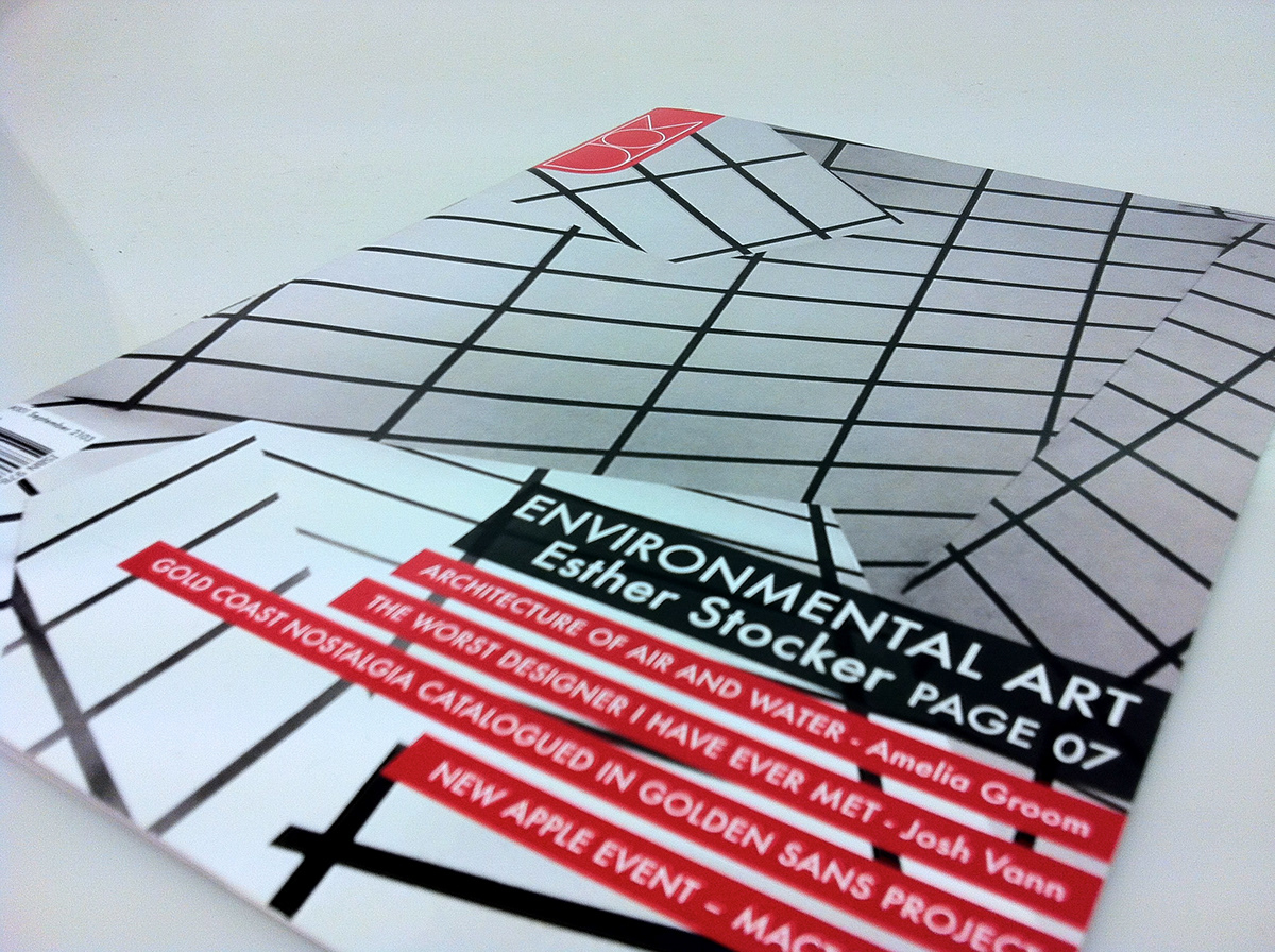
Masthead Development. The brown masthead's typeface was chosen because of its readability and feel. The colour may change across publications depending on what image is on the cover.
Join Behance
Sign up or Sign into view personalized recommendations, follow creatives, and more.
or
Join Behance
Sign up or Sign in to view personalized recommendations, follow creatives, and more.
This project entailed creating a new magazine called MOD. This magazine was to be targeted at creative people and reflect this in the articles ch Read More