
_ΕΛ
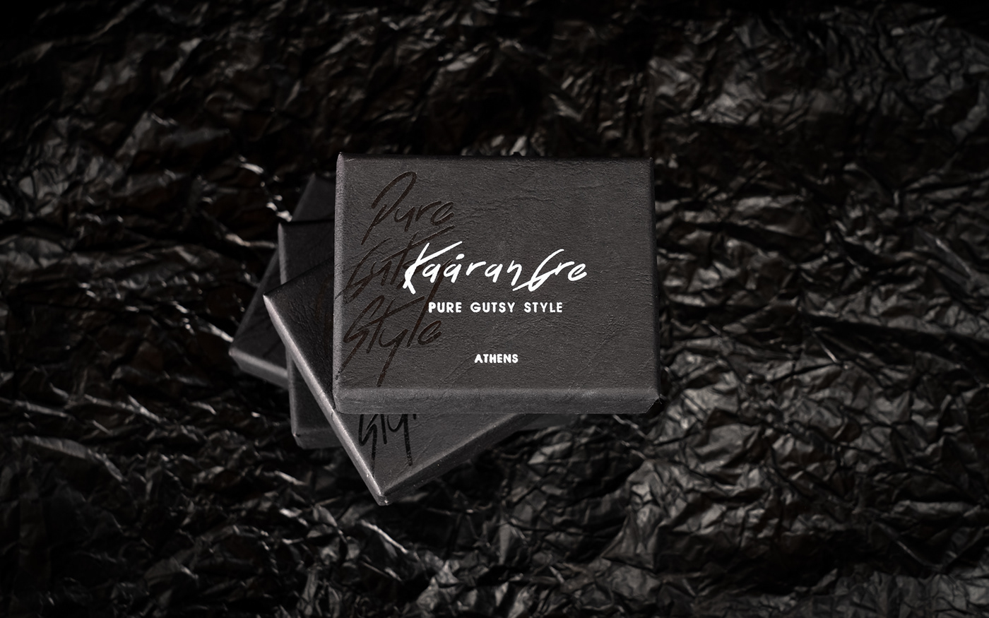
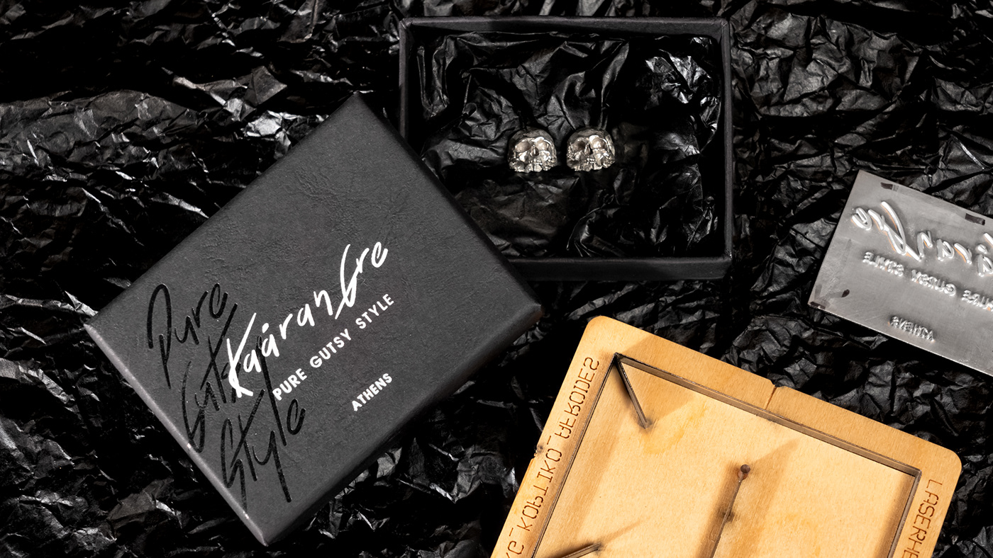
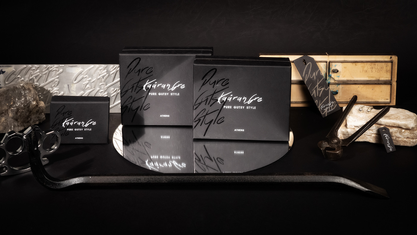
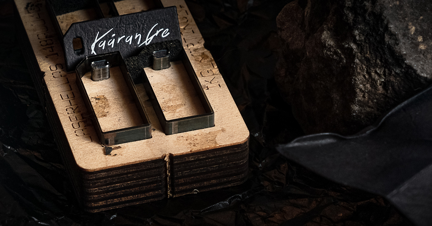
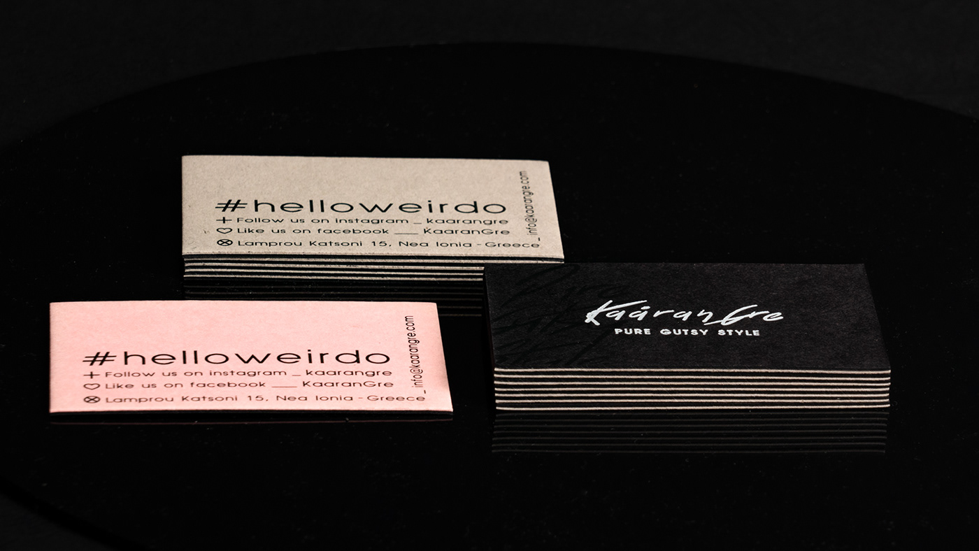
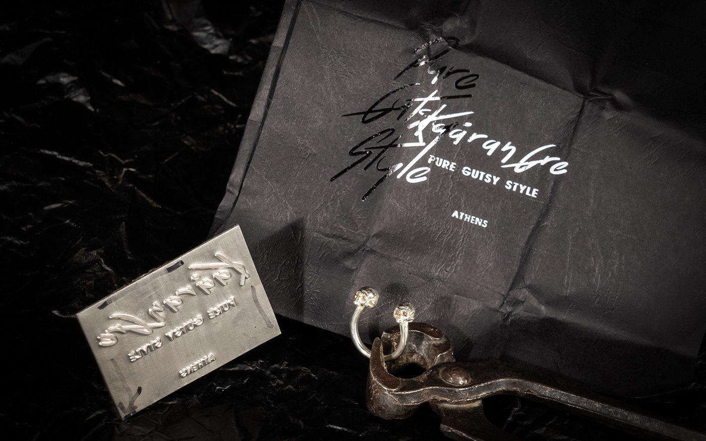
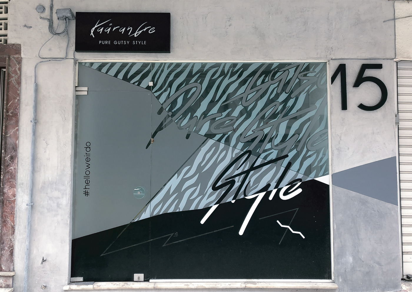
Για τον σχεδιασμό του λογοτύπου της KaaranGre, μιας νέας εταιρείας στον χώρο των αξεσουάρ μόδας, θελήσαμε να αποφύγουμε τις τρέχουσες τάσεις σχεδιασμού, στοχεύοντας σε μια διαχρονική μορφή με ξεκάθαρο χαρακτήρα στο πεδίο της μόδας και του στιλ. Η γραμματοσειρά που επιλέξαμε για το λογότυπο είναι η Blinkets ενώ για το tagline «Pure Gutsy Style», που αποτέλεσε και τον μπούσουλα για εμάς σε μια πιο επιθετική σχεδιαστική προσέγγιση και νότα, χρησιμοποιήσαμε την Ub-Front. Το χαρτί της επιλογής μας είναι το Leather Antelope Black / Chartorama Papers, στο οποίο αποτυπώνουμε τη μακέτα μας: το «Pure Gutsy Style» με μαύρη θερμοτυπία και από πάνω το λογότυπο με λευκή θερμοτυπία. Ακολουθήσαμε τη συγκεκριμένη μέθοδο αποτύπωσης της μακέτας μας τόσο στην εταιρική κάρτα δυο χρωματικών επιλογών (γκρι & ροζ) όσο και στα χειροποίητα κουτιά τριών διαστάσεων, με το κουτί μεσαίας διάστασης να έχει και εσωτερικό μπρονζέ κουτάκι ντυμένο με Majestic Medal Bronze / Chartorama Papers. Με τον ίδιο τρόπο κινηθήκαμε και στα ταμπελάκια, με κοπτικό δύο διαστάσεων (1,5 x 4 cm και 11,5 x 3,7 cm) σε τρεις εκδοχές τριών διαφορετικών hashtags στη μια όψη. Προχωρήσαμε επίσης στην επιλογή θήκης γυαλιών που φέρει το λογότυπο και σχεδιάσαμε τη μακέτα για το μαντιλάκι καθαρισμού που εσωκλείεται σε αυτή. Τέλος, αναλάβαμε τον σχεδιασμό για την αναμόρφωση της πρόσοψης του καταστήματος. Εφαρμόζοντας την τεχνοτροπία της πατητής τσιμεντοκονίας στους τοίχους, προχωρήσαμε στην τοποθέτηση της βιτρίνας με μεικτή τεχνική έμπροσθεν και όπισθεν αυτής με σχέδιο που επεκτείνεται στον τοίχο δεξιά και ολοκληρώσαμε τη διαμόρφωση της πρόσοψης του καταστήματος με τη σήμανση και την επιγραφή.
_EN
For the logo design of KaaranGre, a new brand of fashion accessories, we wanted to avoid the current design trends, aiming at a timeless form with a clear character in the field of fashion and style. The font we chose for the logotype is Blinkets while for the tagline "Pure Gutsy Style", which was our guide in a more aggressive design approach and touch, we used the UB-Front. The paper we chose is the Leather Antelope Black/Chartorama Papers, in which we print our custom format: the "Pure Gutsy Style" with black thermotype and on top the logo with white thermotype. We followed the specific method of imprinting our custom format on both the corporate card of two color options (gray & pink) as well as on the handmade boxes of three sizes, with the medium-sized box also having an inner bronze box lined with Majestic Medal Bronze / Chartorama Papers. The same method is followed for the labels as well, with a cut-out in two sizes (1,5 x 4 cm and 11,5 x 3,7 cm) in three versions of three different hashtags on one side. We also chose a glasses case that bears the logo and we designed the custom format for the cleaning cloth that is enclosed. Finally, we undertook the design for the reformation of the store’s facade. Applying the technique of the pressed cement mortar on the walls, we proceeded to install the storefront, using mixed technique on both its sides, with a pattern extending to the wall on the right. We completed the design of the store’s facade with the marking and the inscription.


#helloweirdo_facade


Graphic design: pi-o Creative Lab
Photography: Pantelis Konsolakis | Pikon photography


